Look Inside
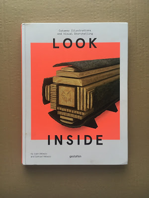
I'm pleased and honored to share my studio is featured in a new book on infographics by the incomparable Juan Velasco. The sumptuous and gorgeous book, "Look Inside", published by Gestalten, focuses on cut-away illustration.

I'm pleased and honored to share my studio is featured in a new book on infographics by the incomparable Juan Velasco. The sumptuous and gorgeous book, "Look Inside", published by Gestalten, focuses on cut-away illustration.
Here's an illustration we just finished for Scientific American illustrating the effects of sleep deprivation on the body.
An 80 page catalogue of my work from 2012 to the present is now available for purchase. A very special thanks to John Rennie, Miguel Carter Fisher, and Sandra Rendgen for their thoughtful and beautifully written contributions.You can purchase the bo...
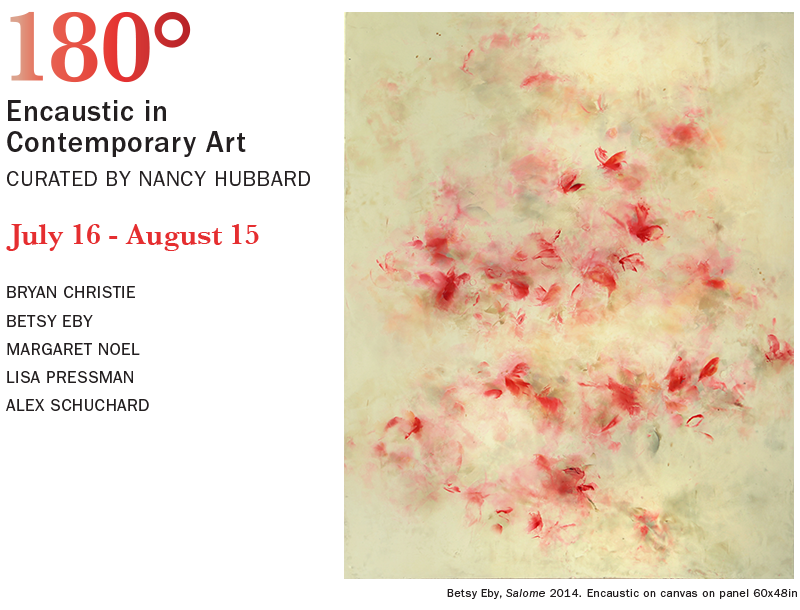
I'm happy to announce I'll be in an upcoming group show at The Curator Gallery in Chelsea. I'll be showing with four artists who also work in encaustic. I'm honored to be showing with these painters. The opening is on Wednesday, July 15th. Please RSVP ...
“Let the poet dream his dreams. Yet, the poet must look at the world; must enter into other men’s lives; must look at the earth and the sky; must examine the dust in the street; must walk through the world and his mirror.”–William Baziotes
When grapes turnto wine, they long for our ability to change.When stars wheelaround the North Pole,they are longing for our growing consciousness.Wine got drunk with us,not the other way.The body developed out of us, not we from it.We are bees,and our body is a honeycomb.We madethe body, cell by cell we made it.
 |
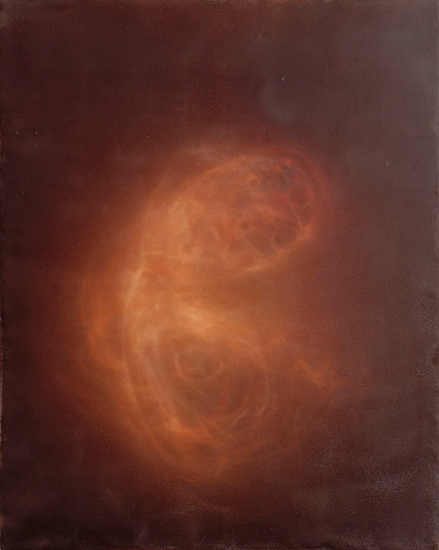
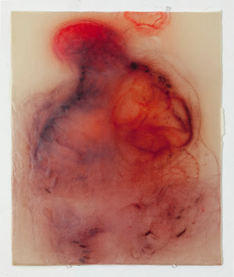
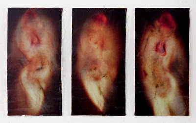
| Laughing At The Word Two (after Hafiz) 22"x28", silk and encaustic on panel, 2015 |
I'm honored to announce that this illustration we created for Scientific American has been selected to be the cover art for this year's Medical Illustration Source Book.
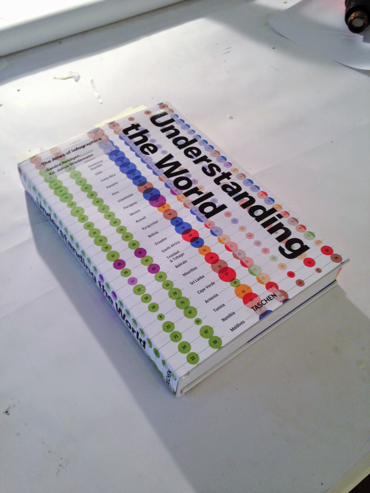
I'm honored to announce that six of our pieces are in the just published book, Understanding The World: The Atlas Of Infographics. Sandra Rendgen did a wonderful job writing and editing the book. The artists on my team, Joe Lertola and Jeong Suh, did b...
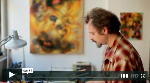
Bryan Galatis recently shot a video of me discussing the thinking and process behind my work.
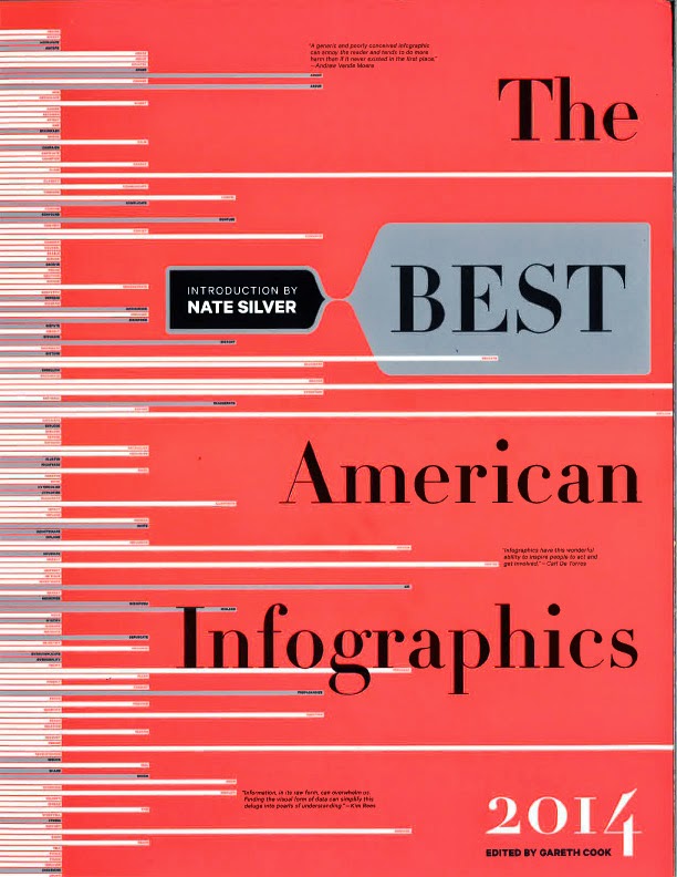
We're proud to have two of our pieces in the new edition of the The Best American Infographics. The soccer graphic was a collaboration with John Grimwade done for 8x8 and the baseball pitch graphic was done for ESPN the Magazine.
WIRED commissioned us to do a few illustrations for their recent 2014 design issue. We created the art of the inner workings that were married to Adam Voorhes beautiful photographs. (The downtown manhattan illustration is an escpetion; it employs no ph...
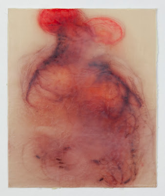
Each painting is 24" x 20", silk and encaustic on panel.
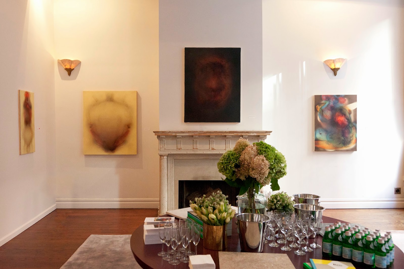
British American Household Staffing along with The Rug Company hosted a showing of my work in the BAHS offices on Mercer Street. They did a wonderful job organizing it. Here are some photos of the space. I'm happy with how the paintings live in this el...
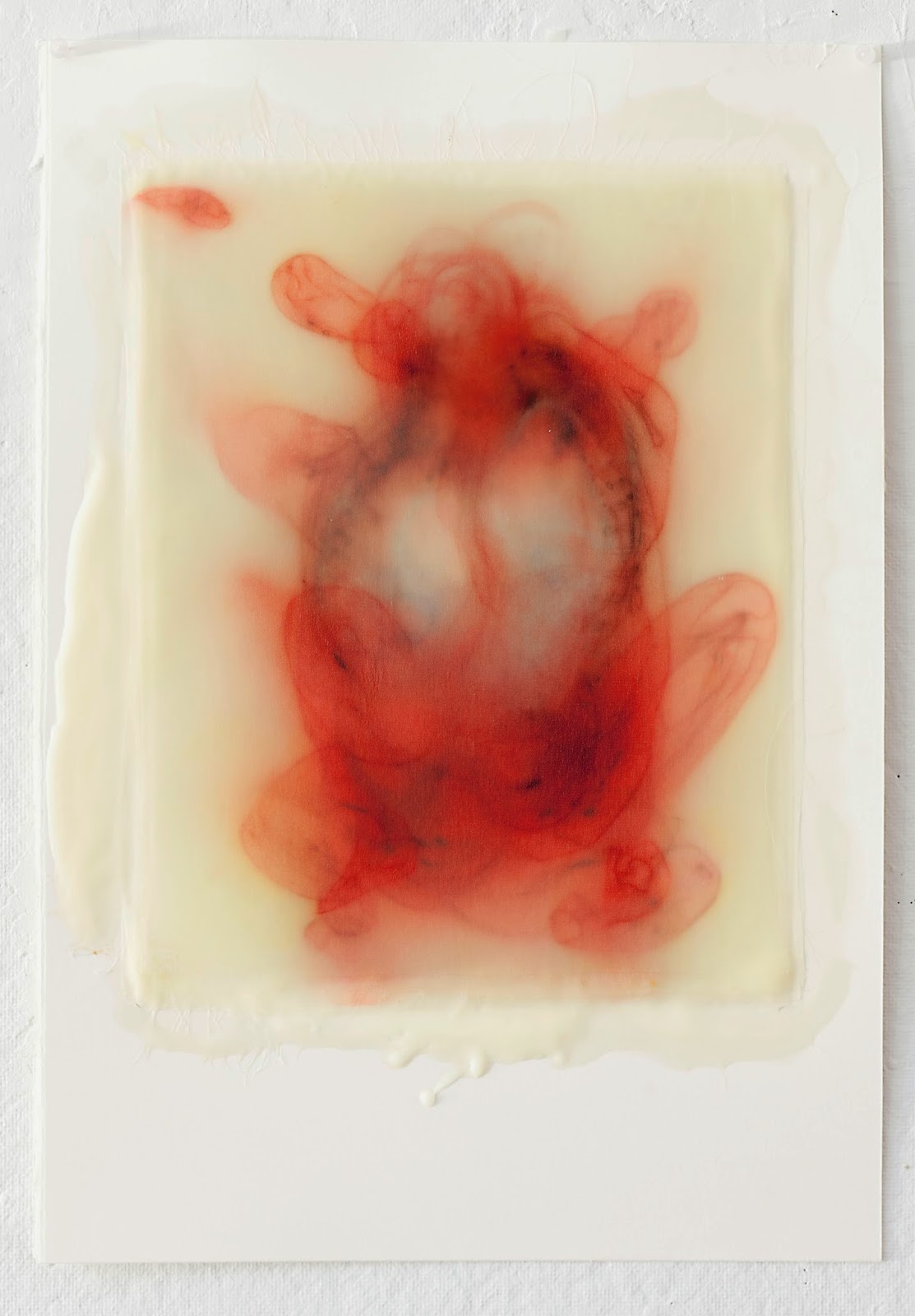
Here are a few pieces on paper I've made over the last month:
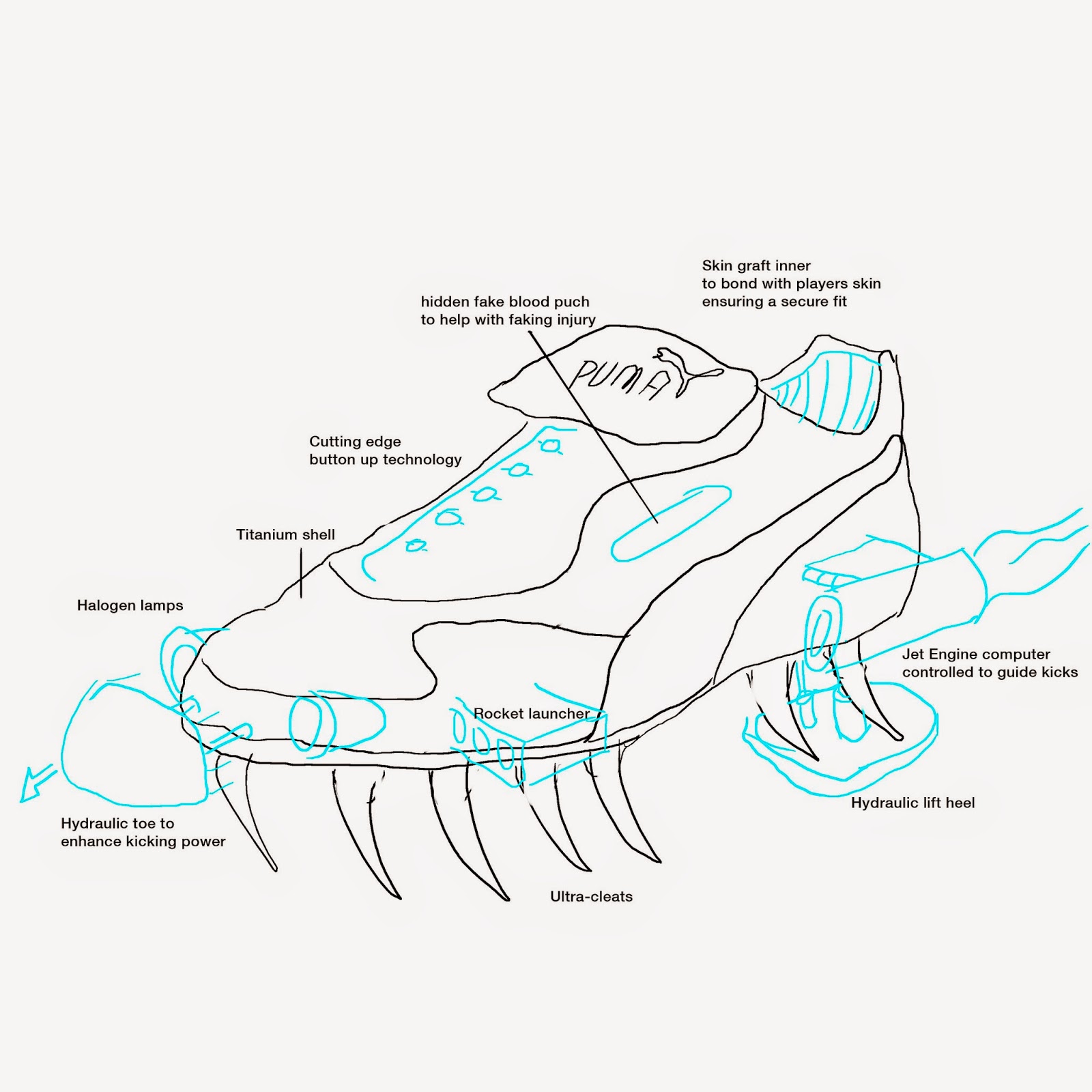
With the World Cup upon us I thought I'd discuss a commission we did last year for the soccer magazine Howler.Robert Priest and Grace Lee came to us with a humor piece about the soccer shoe of the future. They wanted something ridiculous.I put together...
After spending a few months painting abstracts, I've decided to return to the figure. Here are two new works on paper. The shapes in these pieces will most likely inform the next series of abstracts I make.

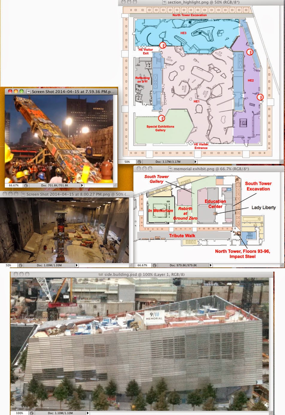
A graphic of ours is in this month's WIRED. It's of the WTC memorial. Here's some of the reference we were given:Here's how the sketches developed:I love the graphic shape of the one below. But it's a bit disorienting and hard to read:We added som...
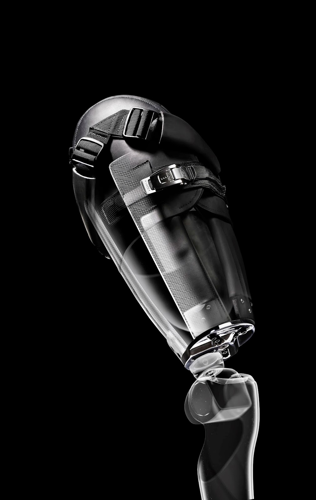
I believe we've been seduced by the digital medium. It is easy in digital 3D to make things glow, be reflective and shiny. We use every color imaginable in our work. I would like to see more restraint in what we do. Here's an anatomical illustration of...
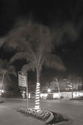
Thirty second exposure of a palm tree swayingWe live in motion. And without time there would be no motion. Everything moves, trembles, vibrates. Depth perception isn't possible without motion. In working in print we are in effect stopping motion. By st...
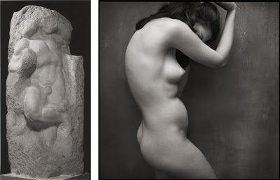
As I was taking pictures over the weekend it occurred to me that the act of taking a photograph is reductive. The same is true for sculpting with marble.Look at these two images:Michelangelo used chisels and hammers to chip into the block of marble in ...
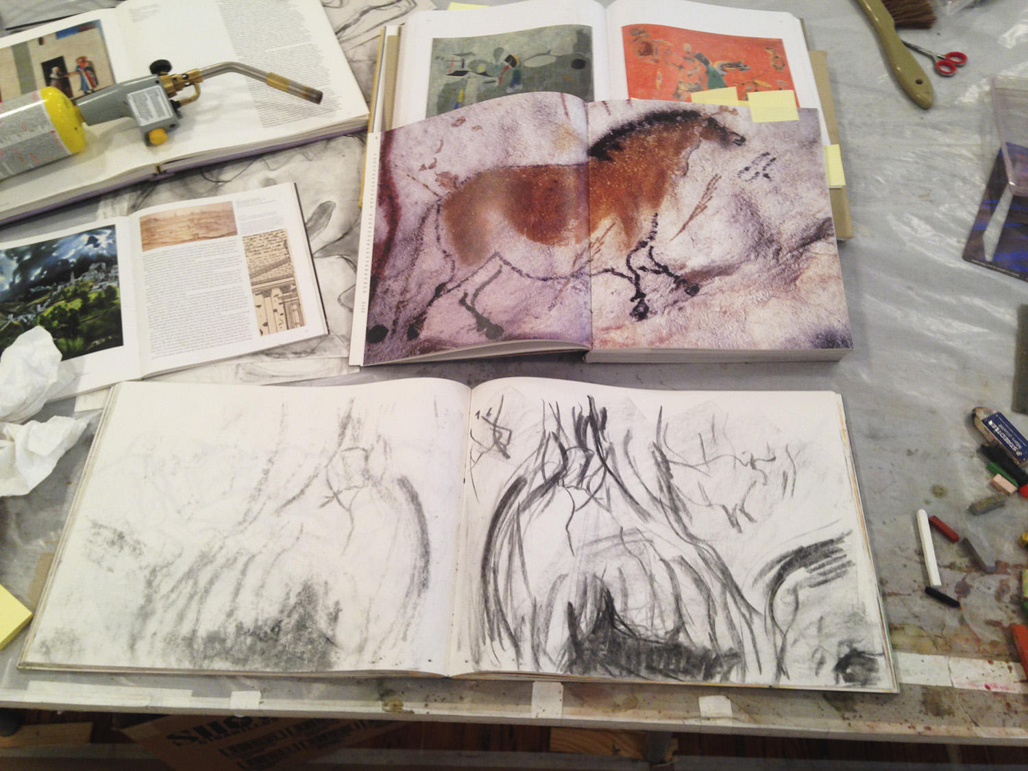
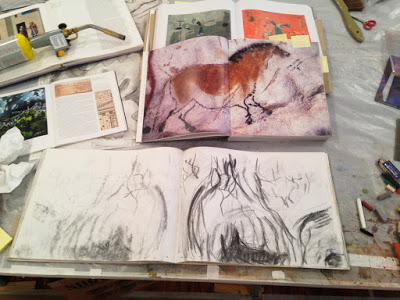
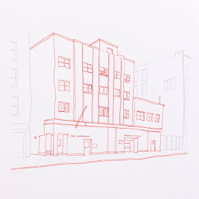
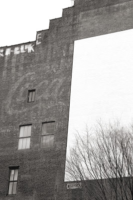
I've been taking pictures of the city that I use as reference for ink drawings.It's good to have ink on my fingers. It's good to smell materials other than the plastic and metal of my computer. It's good to have a tangible object in my hands after...
Eighty-one professionals were asked to create a visual definition of information graphics for a book that was published by the Society of News Designers Español.
When I was asked to do this, I froze. Talk about a blank canvas staring you in the face. An information graphic about an information graphic. How meta! My initial ideas involved illustrating the process of going from complexity to simplicity. I considered taking a photo of downtown NYC and then creating a 3-D rendering of the same area with one building highlighted in blue. Lame. One thing my father taught me is to throw out the first idea you come up with; it's usually too simple or surface oriented.
I continued to agonize over the assignment. I felt more and more that the only way to define an information graphic was through words. What are words anyway but organized collections of letters? And what are letters but symbols composed of abstract lines and geometric shapes?
Here's what I came up with:

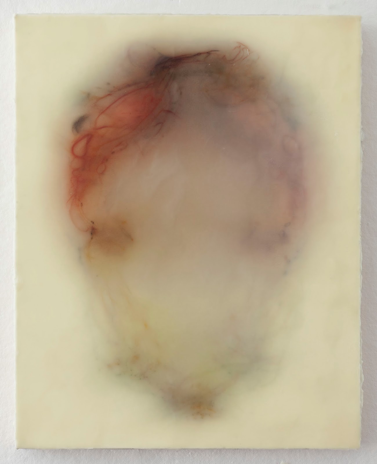
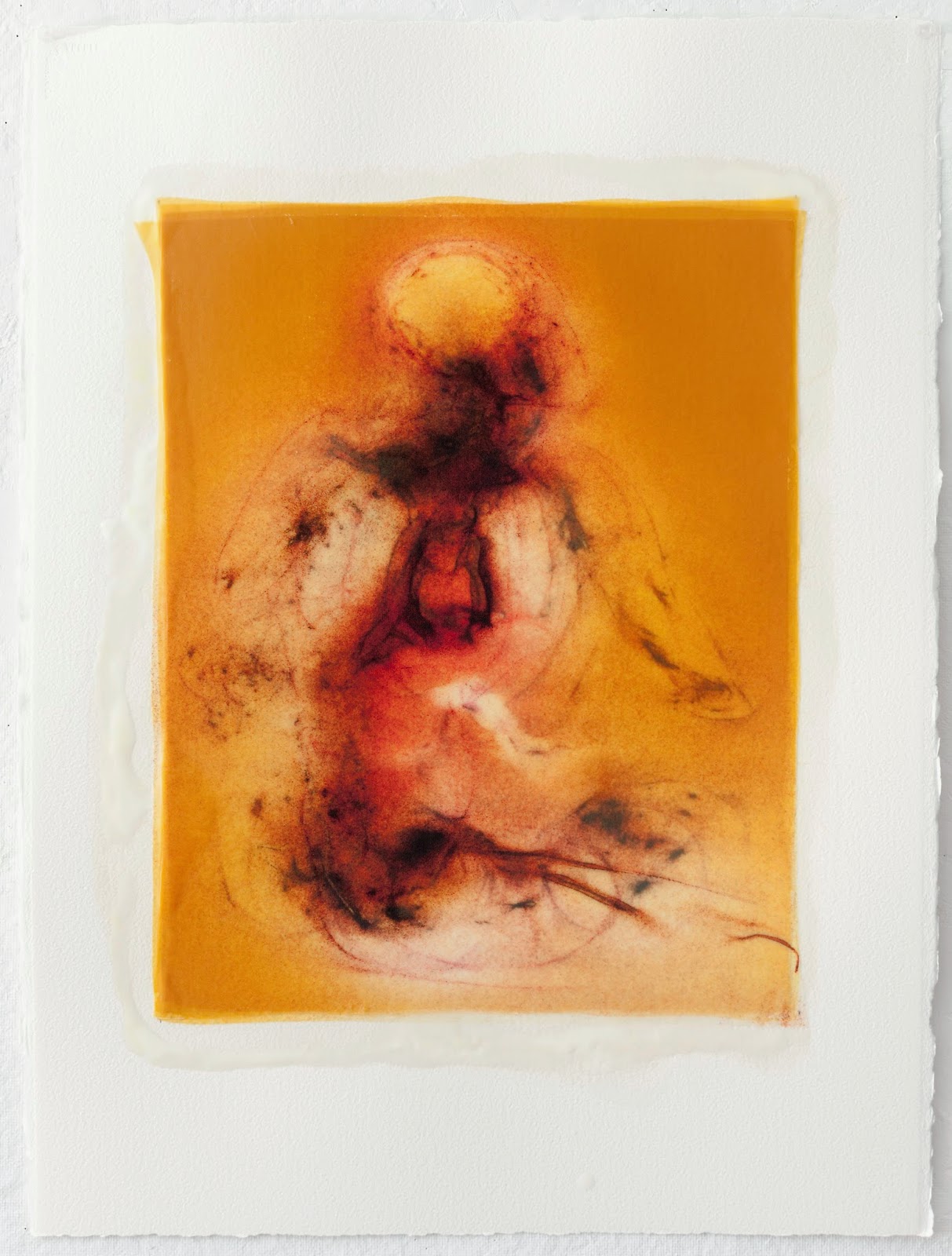
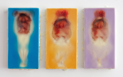
Each piece measures 22"x15". Silk and encaustic on paper.
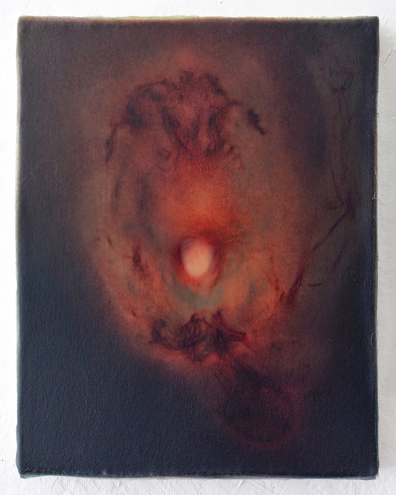
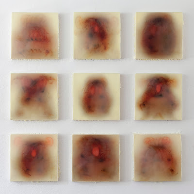
I've been reading Blake's The Book of Urizen. This new series draws inspiration from it. It's titled Permanence Lost. Each painting measures 14"x11". Silk and encaustic on panel.
Here are a few pieces I've been working on. The series is titled Every Angel is Terror. The name is a line from a Rumi poem I recently read. Each measures 20"x16". Encaustic and silk on panel.
I've decided to explore working with line:I'm using a paper support rather than a wood panel. I like the rough edges. These are more figurative than than the recent abstracted work I've been making. It's refreshing to go back to the figure.

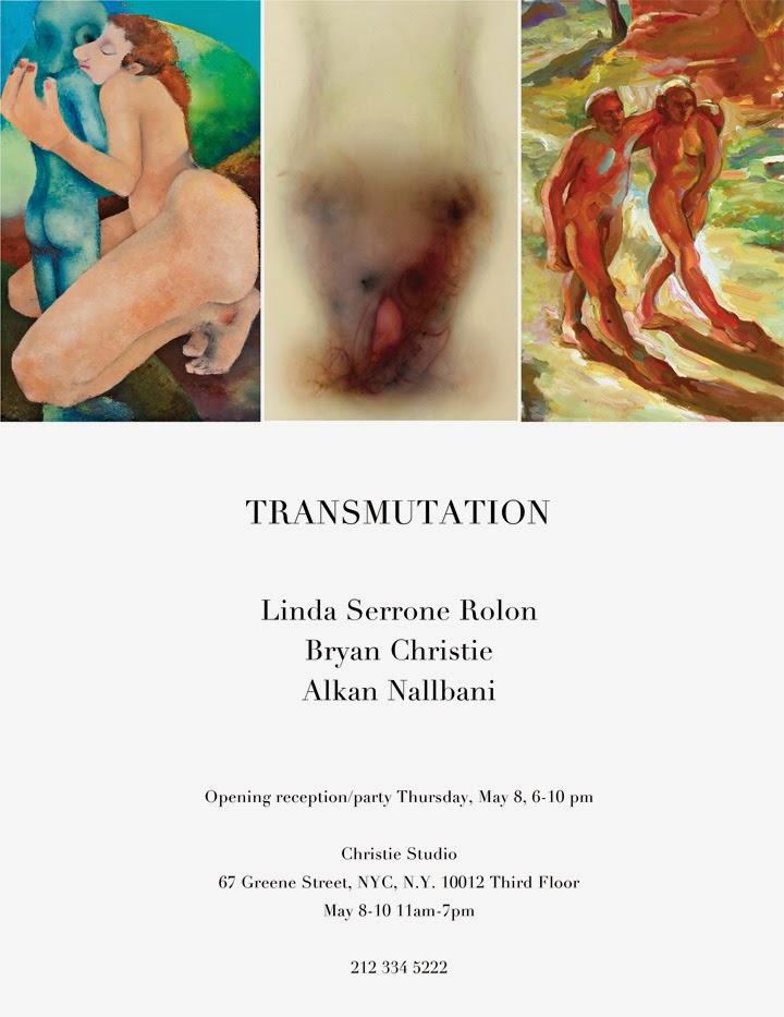
TRANSMUTATION
Please Join Us Thursday, May 8, 6-10pm
Christie Studio, 67 Greene Street, 3rd floor
New York City
Please accept this invitation to view the works by Linda Serrone Rolon, Bryan Christie, and Alkan Nallbani and their connection to Transmutation.
Linda Serrone Rolon's elements of Transmutation are a conversion of life, material, and imagination. Rolon has been painting Mother and Child as subject long before she even thought about being a mom. Each interpretation is a reflection of her own personal experience and a deep connection to others’ stories of being a mother and/or a child. “It is the surface that I need to keep clean and smooth. That feeling to make a terrible situation perfect, like in cinema—its nostalgic effort to turn an image into a life lesson.” From the boroughs of NYC, Rolon continues to work in Brooklyn with family in tow and has retired parts of her life to reconnect with the community in the only way she knows how (through her art).
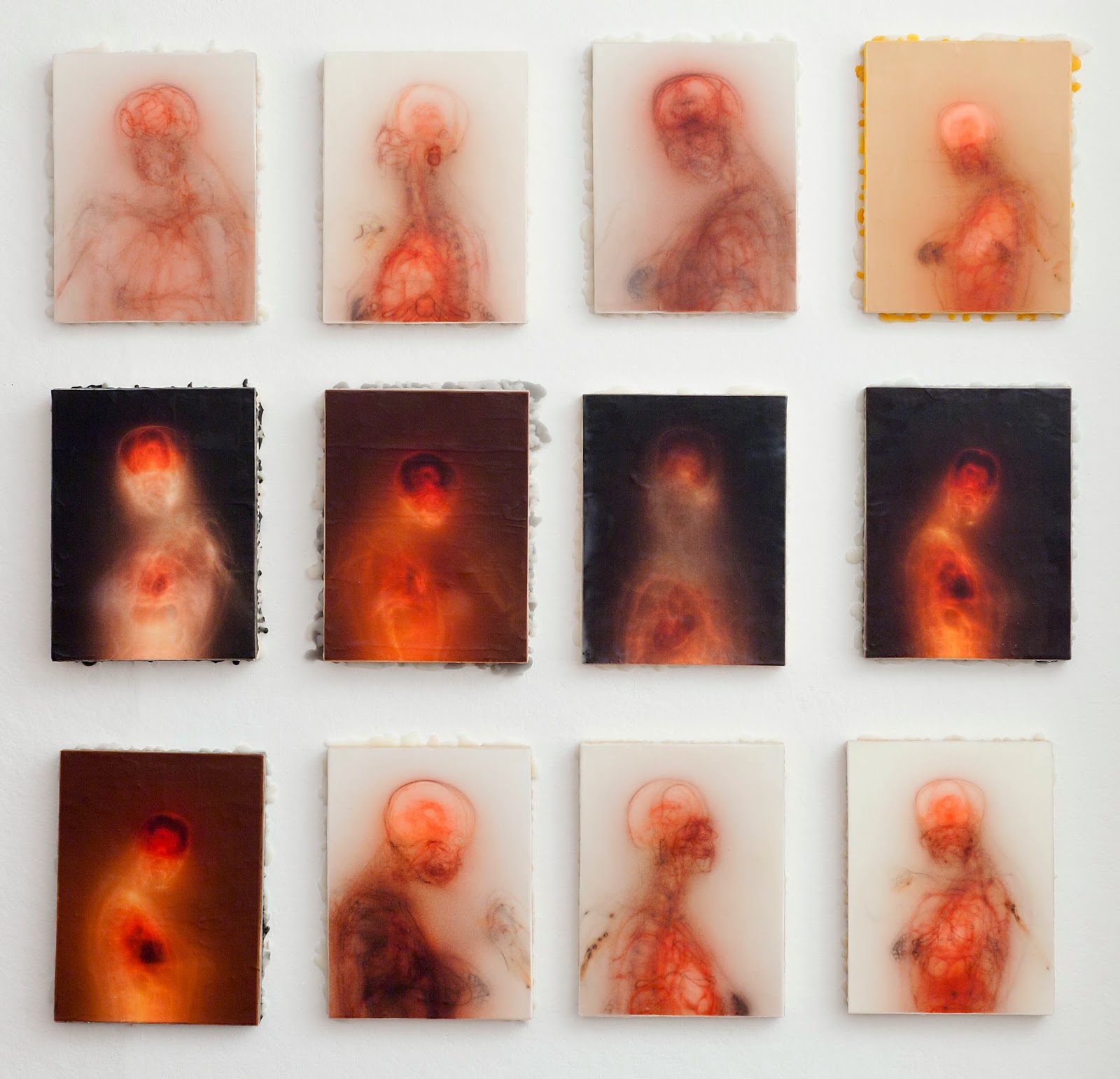
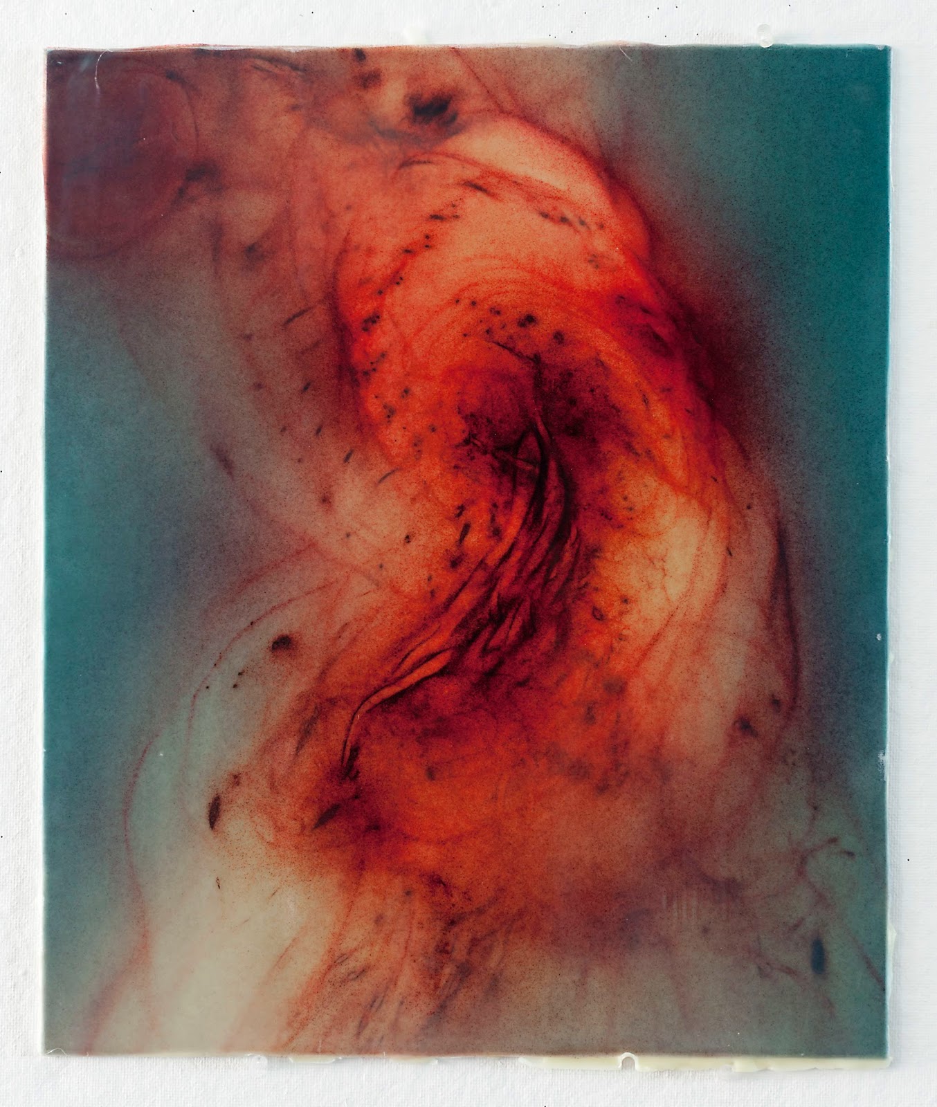
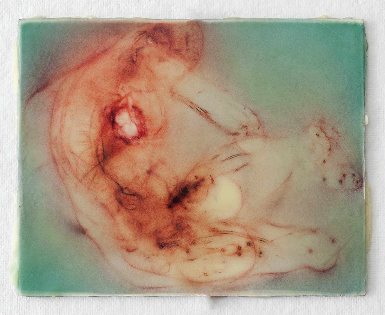
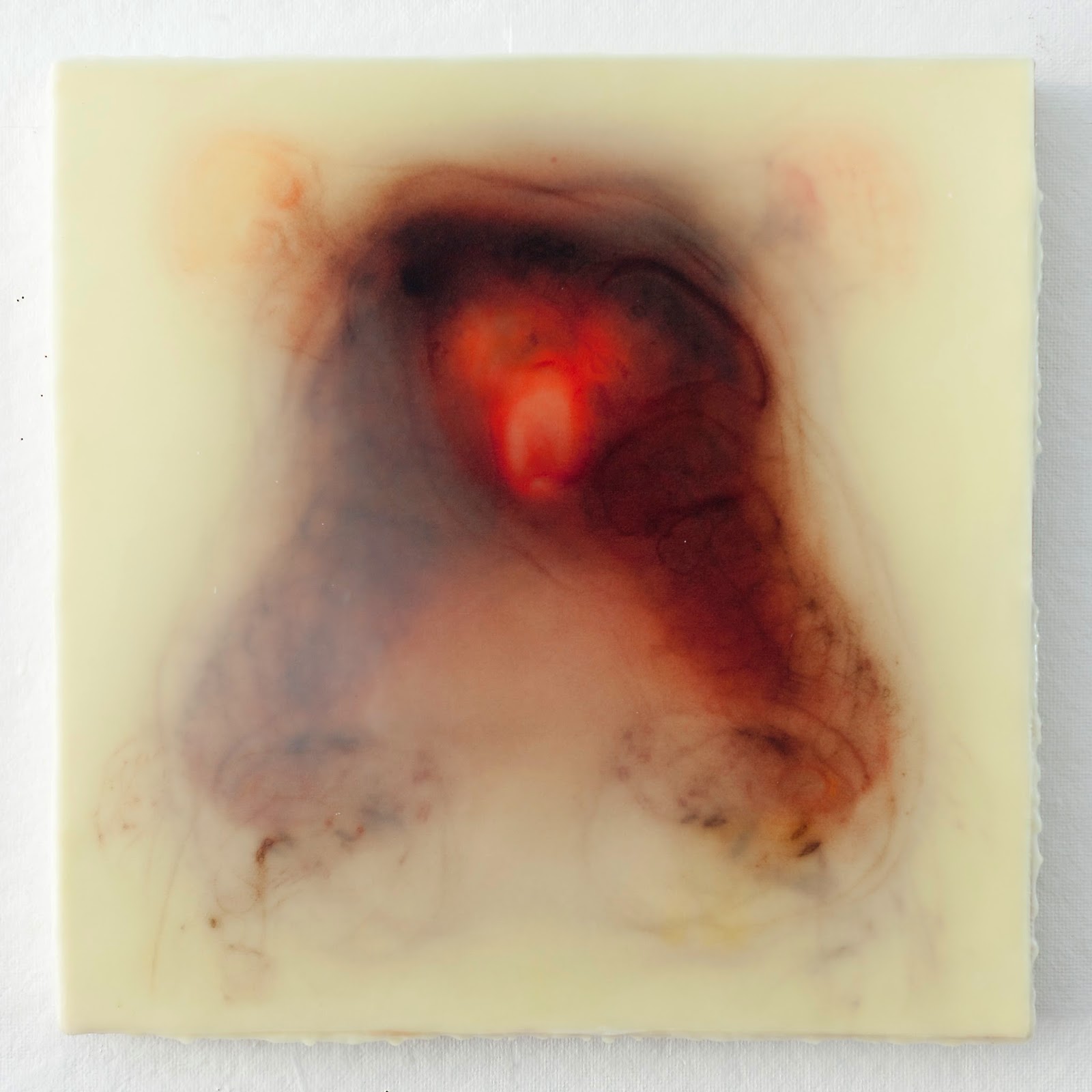
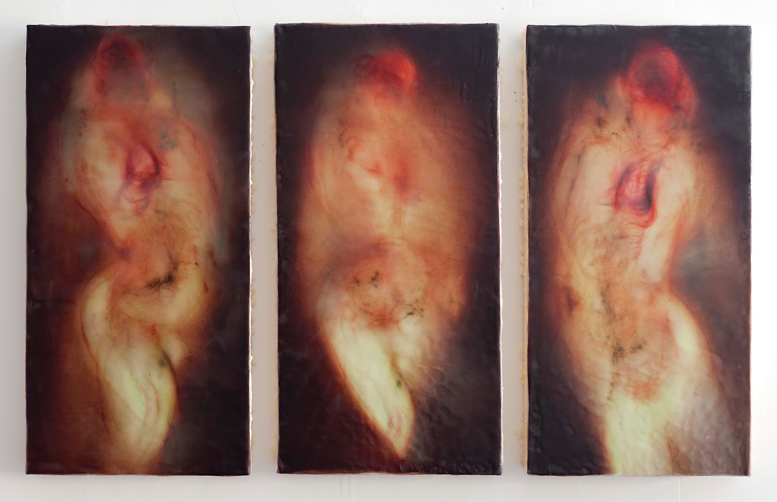
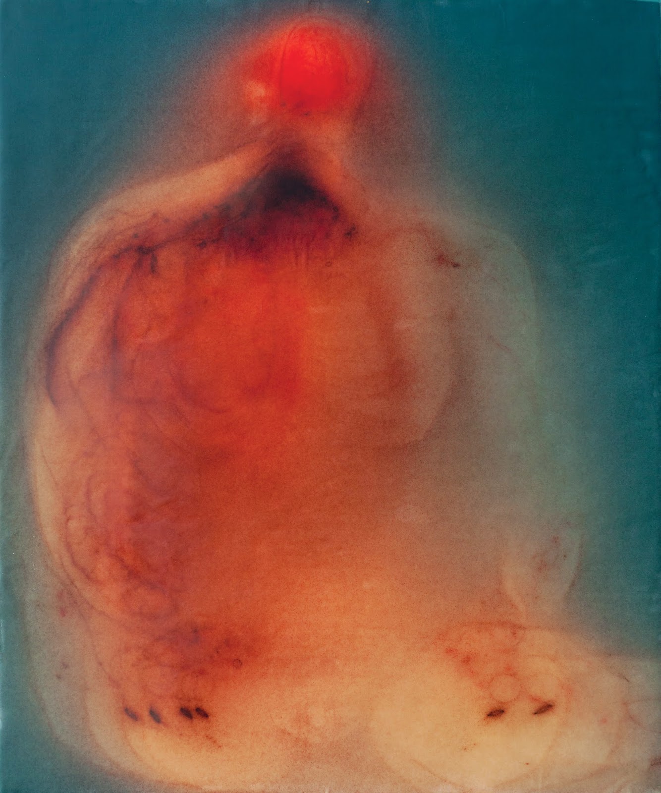
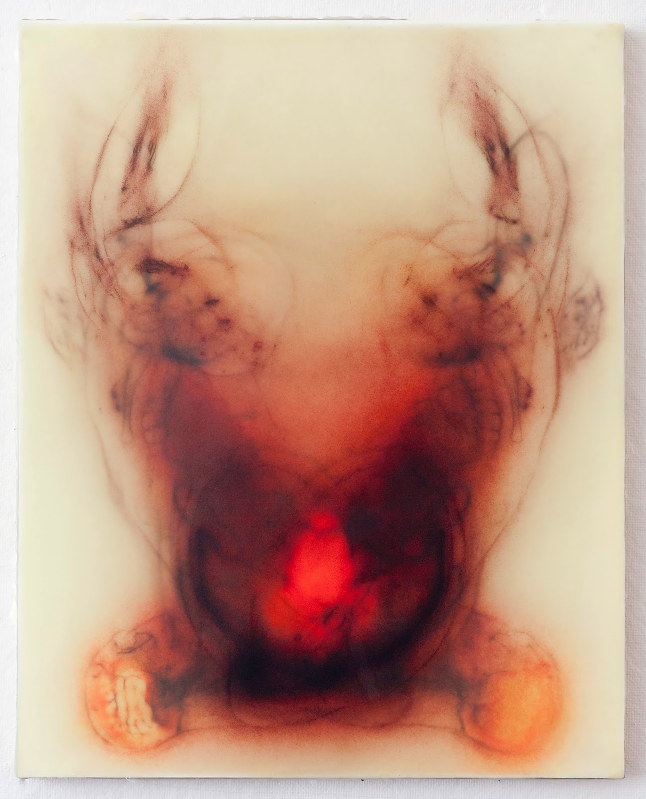
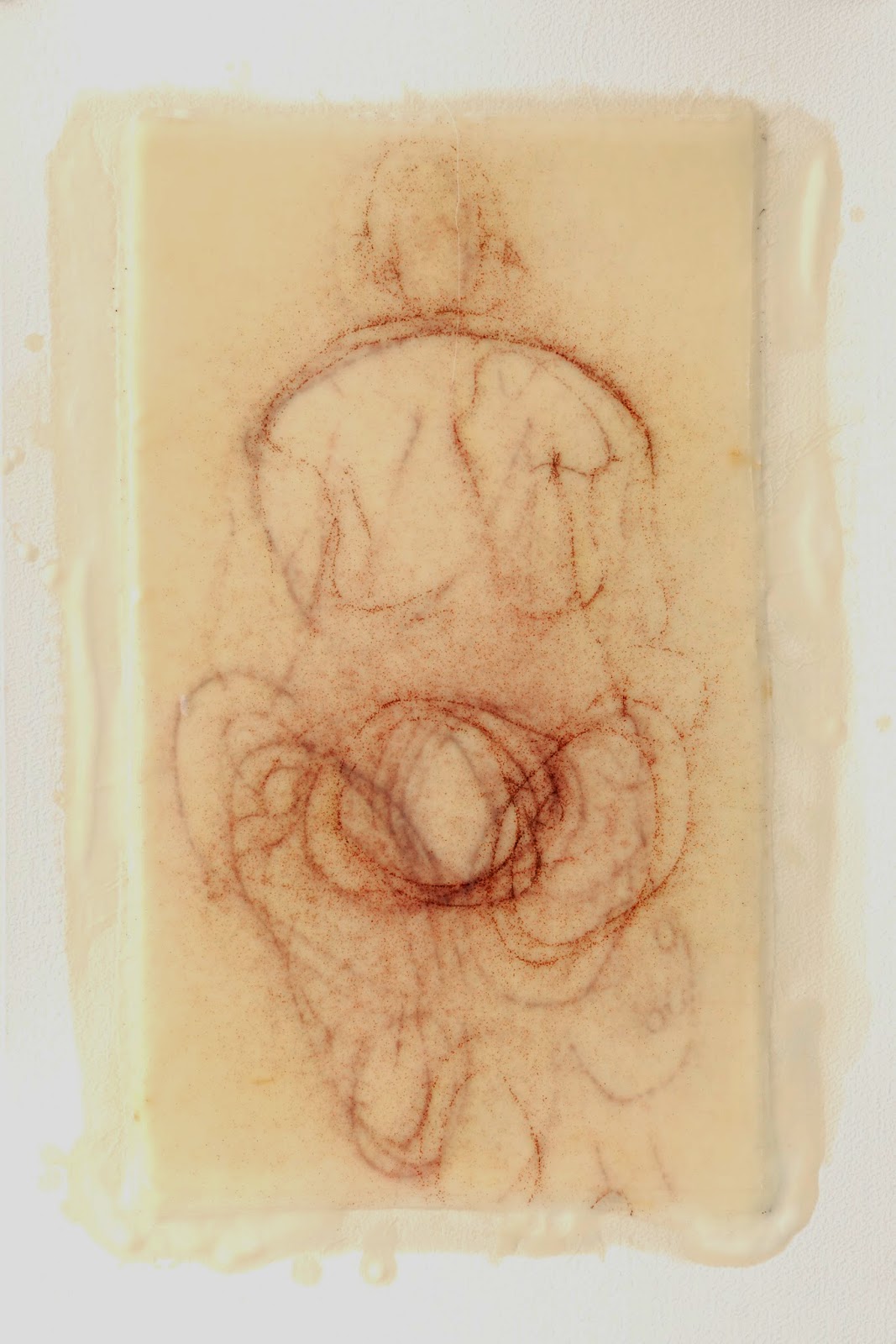
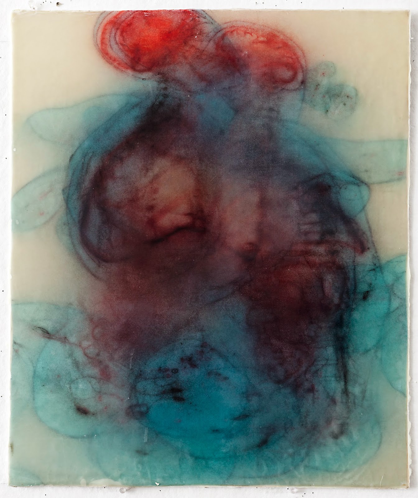
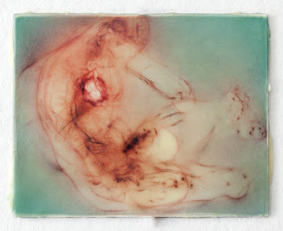
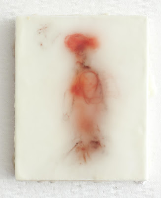
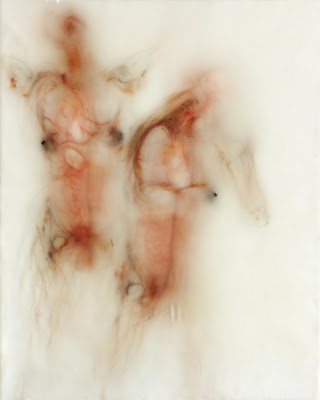
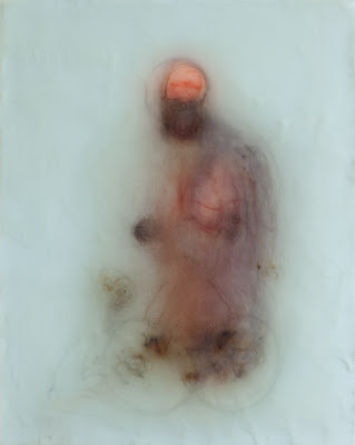
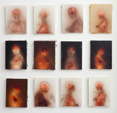
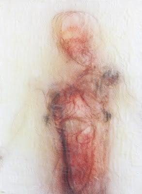
Bryan Christie’s work explores the spectrum of human experience. "Our lives start with trauma as we are brought into the world from the safety of our mother's womb. We eventually die, experiencing the loss of all that is dear to us. Yet transcendence and the experience of the sublime are rooted in this fleeting material existence. The divine is made evident through tangible and sensual experience; without our physical selves, we would not experience moments of wonder and the mysterious."
His work is an attempt to transform the lasting effects of his post-traumatic stress disorder from childhood abuse into a message of acceptance, love, and compassion. He ultimately believes that "the human body can express spiritual truths, and my work seeks to inspire a visceral experience of the ultimate love, truth, and beauty that lies in the heart of our world."
Christie’s paintings are created from multiple layers of silk bound together with encaustic, mounted on wooden panels. Many of the figures’ poses are derived from ancient classical sculpture and Renaissance paintings. Christie is inspired by these historical works because of the interplay between our flesh-and-blood existence and something less tangible—our soul.
Alkan Nallbani’s work presents simple images intended to suggest universal themes – humanity, sexuality, environment – raising questions about our existence along the continuum of time. “My journey from repression to freedom is essential to, and provides the context for, my work but does not constrain it. Although I cannot remain indifferent to the indelible mark imprinted upon me by such experiences, it is not specifically my identity as an Albanian or immigrant that interests me, but rather the transformative nature of the immigrant experience, inextricably linked with its timeless themes of dislocation, and the continuous challenge of humanity.”
A few months ago I made this piece:Something was happening. The entire picture plane was beginning to be used. So I began making more pieces in this vein. I was excited with what I was seeing. Yet all the pieces looked too similar. I was also hitting a...
I went to the Met the other day and spent a couple of hours in the Ancient Egyptian wing. I saw a lapis lazuli figurine that blew me away. It was small. But it filled the room with its energy. I keep seeing that vivid blue color in my mind's eye. ...
Here are some more in the Two Figure series. (I'll eventually get around to coming up with a more poetic name for this series.) Some of them may be a bit confused. But I am drawn to how the figures are filling the panels. I want this series to fee...
With the Reaching Mother series I've been noticing that there's a hint of two figures overlapping in some of the pieces. So I have decided to deliberately work with two figures. Here's one I made a few days ago. 24" x 20"
I just finished this:I can't stop staring at Piero della Franscesca's "Four Saints".The colors in his altarpiece may have no resemblance to my piece. Nonetheless the colors in this triptych are making me happy. It measures 12" x 20".
Here's another one from the Reaching Mother series.Looked as a group it's the largest piece I have done: 58" x 58" with each individual panel measuring 16" x 16". I'm happy with this scale; when I stand about four or five feet away it takes up most of ...
Below is a triptych I just finished. Each panel measures 24" x 12".As they interact there's a hint of motion I'm excited with. There's a more to explore here. For instance, I haven't tried using different color palettes within each group.I also made th...
I've decided to arrange the mother series as a group. The one composed of squares is working well. Maybe they need to be a little closer to one another. I'm not sure about the group of 8" x 10"s. I keep seeing a more vertical version of these. But I'm ...
For a while I've been struggling to integrate hard drawn lines within a glowing and mysterious painting. These are heading in this direction.I'd like to think that the crinkled surface is good and adds to the work. But this may be wishful thinking. I h...
A good friend of mine was struggling with a painting. Her professor asked her what her favorite part of the painting was. She Immediately told him she liked the head. "Well, I think you should cut of the head and see what happens." She did so and a bod...
I made the first piece below about a year and a half ago before going on a two month sabbatical. It's the piece that started the layered silk and encaustic process I've been working in for over the last year.Like many firsts, I believe it's the most re...
Last week my ten-year-old daughter and I were playing with clay. She made a flower and said, "It's not that good." I paused and then told her, "Lola, it doesn't matter if it's good or not. What matters is that you make things." She got a big smile on h...
I've begun working with the male form. The following are 10" x 8".I'm surprised by how different they feel compared to the women I have painted.The other day I bought a blow torch. It melts the wax much faster than the heat gun I use. It also doesn't b...
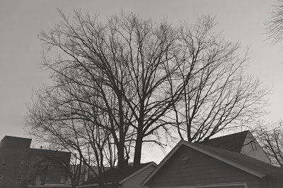
Here are a few photos I took this morning:
January 2012 was filled with hope as my wife and I reconciled. Yet the stress of everyday life, exacerbated by the grim reality of my recently excavated past, began to affect how I functioned in the world as a husband, father, creative director and artist. This tension culminated in April, leading to my semi-enforced two-month sabbatical.
I reentered the world in June reenergized. By August the honeymoon withered and died. But in October I began feeling a subtle, hard-won stability. I was standing on the new foundation that I had begun cobbling together in April.
If you have followed this blog over the past two or so years, you may have noticed a change in tone since I returned from my sabbatical. I am uncomfortable with how personal my older posts are. Since getting back I've swung to the other end of the spectrum. In the service of not being too personal I have cut off much of the lifeblood and passion with which I wrote. How I can retain some of my fire without being melodramatic will be a challenge for me in 2013.
One of my intentions for 2012 was to make a larger, more realized body of work. Now that the year has come to a close I'm happy and proud of what I have made. In 2013 I will be getting the work out there. (Given that you are reading this and—hopefully—looking at the pictures, the work is of course "out there." What I mean is getting the work in an appropriate gallery.) With this intention in mind I've redesigned my art website. It will be going live sometime in January. I've also produced a 36-page booklet that I will be sending to the galleries I can imagine my work in.
Here are three of the last pieces I made in 2012:


I've been working with multiple figures:A friend of mine, artist Jim Angell, said, "You're knocking on the door" when he looked at these. In introducing more than one woman the challenges of color, composition, and movement become more apparent. I'm ha...
I made this last week. It measures 24" x 20":I'm using two layers of silk instead of four or five. With this technique the line becomes clearer; it's a more graphic approach. When I finished this piece my initial feeling was that it was too literal. Bu...
A couple of posts ago I had written that I was starting a new series of panels measuring 20" x 16". Here are two I'm happiest with:I'm intrigued with the blue piece. It's hitting a sweet spot between representation and abstraction. After making this pi...
I've been taking pictures of the city that I use as reference for ink drawings.It's good to have ink on my fingers. It's good to smell materials other than the plastic and metal of my computer. It's good to have a tangible object in my hands after...
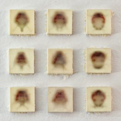
Jim Angell stopped by the other day for lunch and a studio visit. He was struck by the portraits I had started and given up on. He liked the way I had arranged them on my wall as a group. We did a little rearranging and editing and came up with this se...
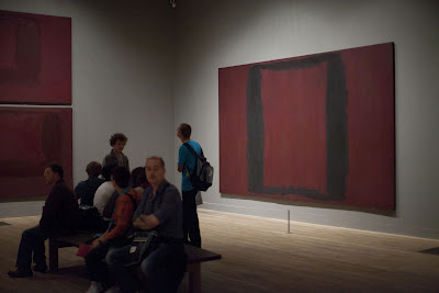
In London, in the Tate Modern, there's a room devoted to the canvases that Mark Rothko was commissioned to paint for the Four Seasons restaurant in the Seagram's building. When I entered the room, warmth and ease flooded my body. I was peerin...
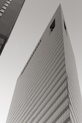
I was in Chicago with Erica Schwartz-Hall, our studio manager, last week. I spoke at the CUSP conference. More about CUSP tk soon.I took these shots of the city:
I just finished, or gave up on, this piece:It measures 40" x 30". Its the first time I've worked larger than 24" x 18" using the encaustic and organza process. Written down, it doesn't sound too big. But it is. I'm happy with how the art is holdin...


