

A graphic of ours is in this month’s WIRED. It’s of the WTC memorial.
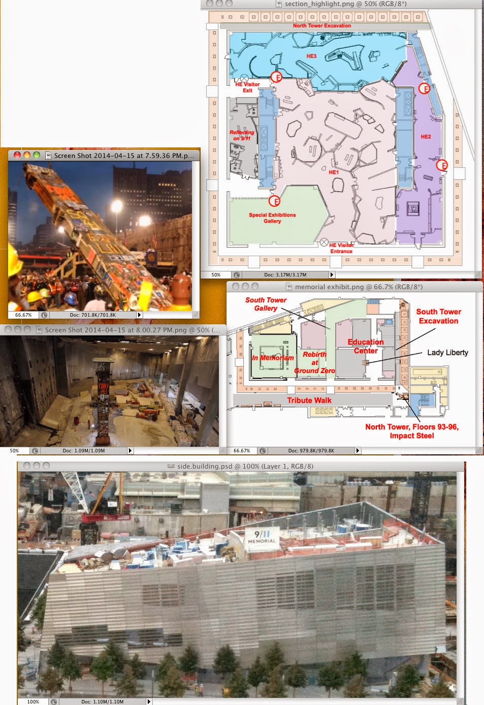
Here’s some of the reference we were given:
Here’s how the sketches developed:

I love the graphic shape of the one below. But it’s a bit disorienting and hard to read:

We added some above-ground architectural structures to give context. We decided to highlight the different areas using color:

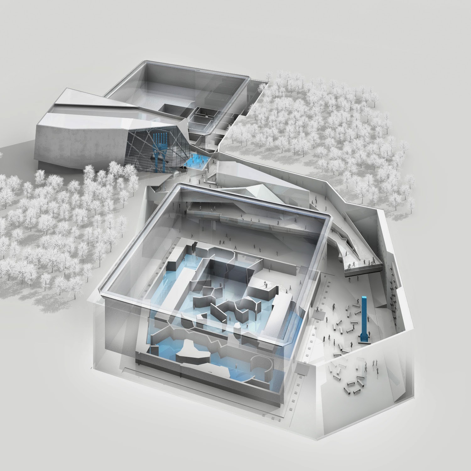
It was looking like what John Grimwade would call a “fruit salad.” NOT an appropriate tone for a graphic of a memorial. So we simplified the color palette and used cyan to highlight the areas:
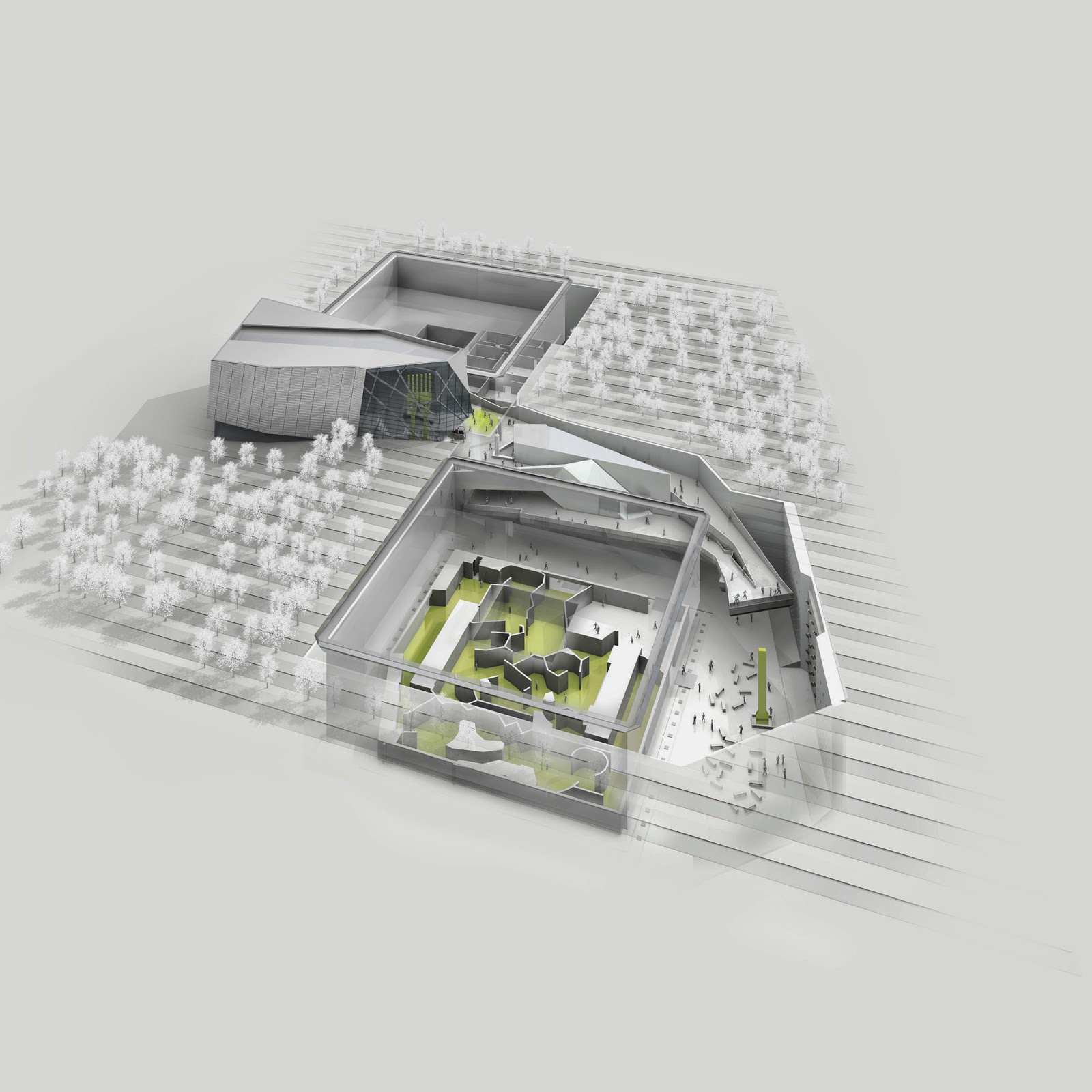
We tried green:
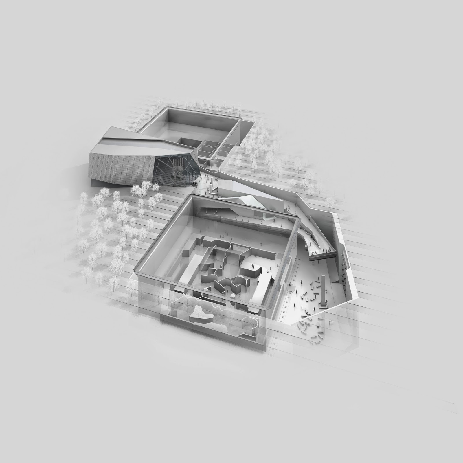
Caleb Bennett, the senior art director at WIRED who was working with us, had the great idea to make it monochromatic. We made a “final” sketch:
Here’s the final art in the layout:
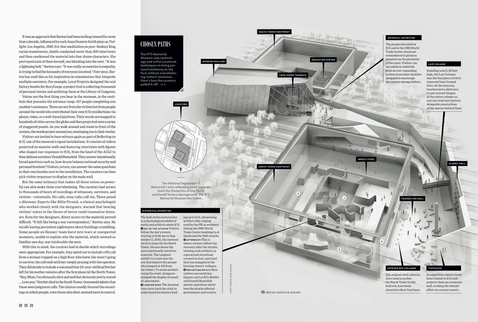
I’m happy with how this graphic came out. And I find it refreshing to work in grays; this graphic comes close to feeling like a drawing. And that is what our studio strives for.


