
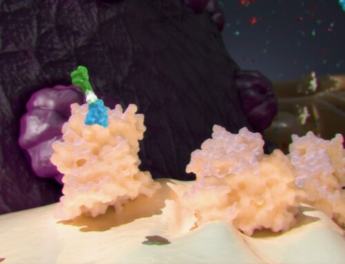
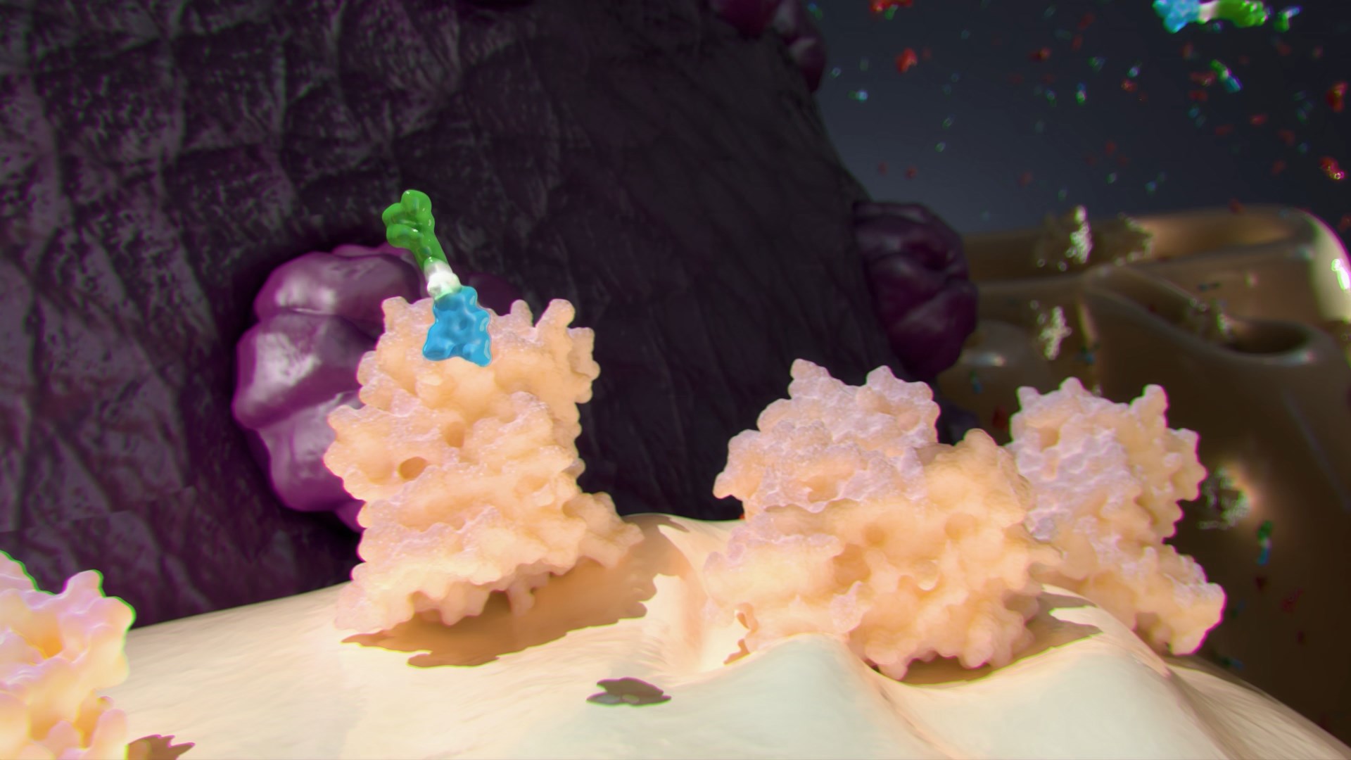
I believe we’ve been seduced by the digital medium. It is easy in digital 3D to make things glow, be reflective and shiny. We use every color imaginable in our work. I would like to see more restraint in what we do. Here’s an anatomical illustration of da Vinci’s:
This was drawn in the early 16th century. Look at how much information da Vinci is getting across with one color. He uses different strengths of shading to emphasize elements. Today we would most likely use different color to emphasize an area. The result would be something that looks like a fruit salad. Ingres said, “Drawing is the probity of art.” Most drawing utilizes many shades of one color. My printing teacher, Jay Seldin, once told me, “Color photography is about the clothes; black and white photography is about the soul.” I believe that we who work in digital 3D can take a lesson from this.
