Syndicated Content

“Color Line Light” Drawing exhibition at the National Gallery of Art

By |February 4th, 2013|Syndicated Content|


Yesterday I saw the new drawing exhibition, “Color, Line, Light,French Drawings, Watercolors and Pastels from Delacroix to Signac” at the National Gallery of Art in Washington, DC. The show was organized with Musée des Impressionnismes, Giverny and is on view in Washington, DC until May 26, 2013.


A wonderful antidote for the doldrums of winter this exhibition includes an impressive array of drawings, many in full color, from the mid 19th century to the early 20th century.  The 100 works, from the collection of James T. Dyke, show off many brilliant drawing techniques and subject matters ranging from landscape, still life to figures and portraits. Indeed this exhibition will make you reach for neglected art materials and experiment!


“Color Line Light” Drawing exhibition at the National Gallery of Art
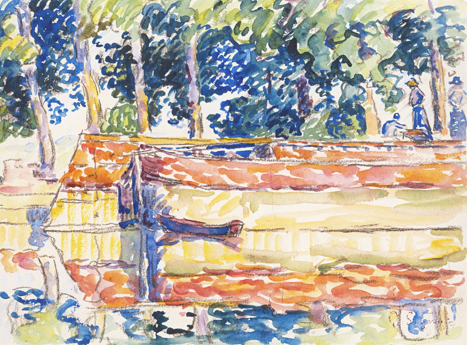
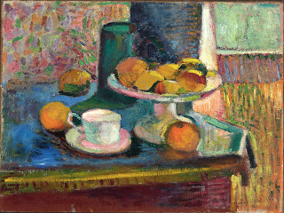
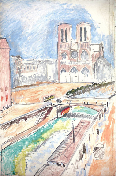
          Paul Signac, Barges on the Seine at Samois, 1900, Watercolor and gouache.

The drawing techniques showcased in this broadly ranging show includes watercolor, gouache, pen and ink, charcoal, pastel and mixed medium. The periods of art represented include romanticism, realism, impressionism, postimpressionism, pointillism (neoimpressionism), symbolism and the Nabis.


“Color Line Light” Drawing exhibition at the National Gallery of Art
                                   Paul Huet, A Meadow at Sunset, pastel.


Watercolor techniques range from the tightly rendered paintings of Alexandre Calame, the confident brushwork of Gustave Dore, to the fresh and freely painted pointillist works by Paul Signac.


“Color Line Light” Drawing exhibition at the National Gallery of Art
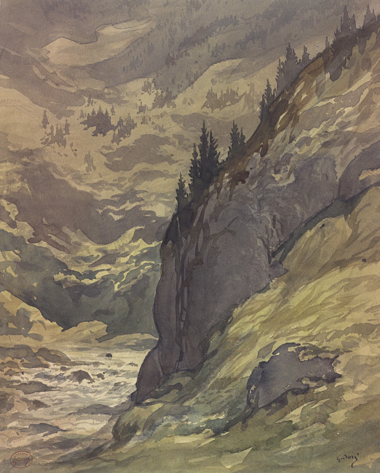
                     Gustave Dore, A River Gorge in a Mountain Landscape, watercolor.

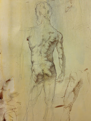
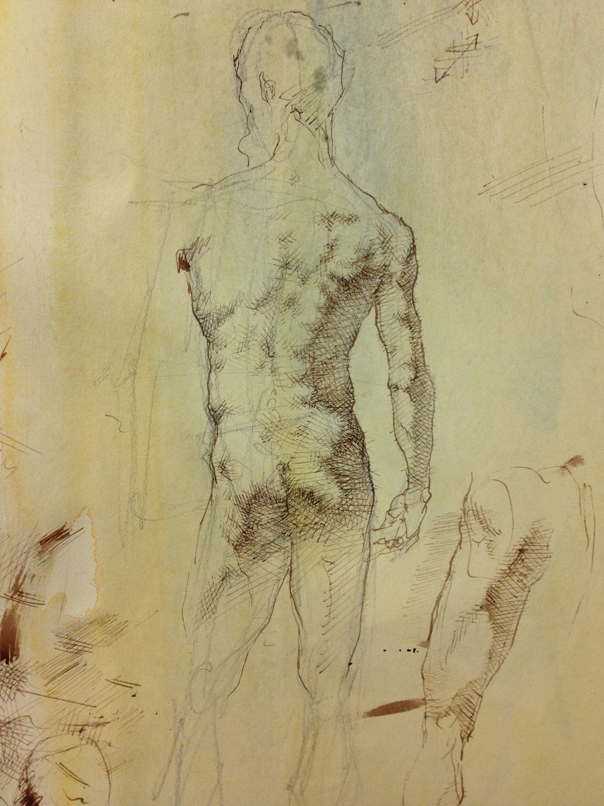
Charcoal drawings range from a luminous figure study by Albert Besnard to the dark, ominous, tonal work of Charles Angrand and sensitive realism of Leon Augustin Lhermitte.


“Color Line Light” Drawing exhibition at the National Gallery of Art
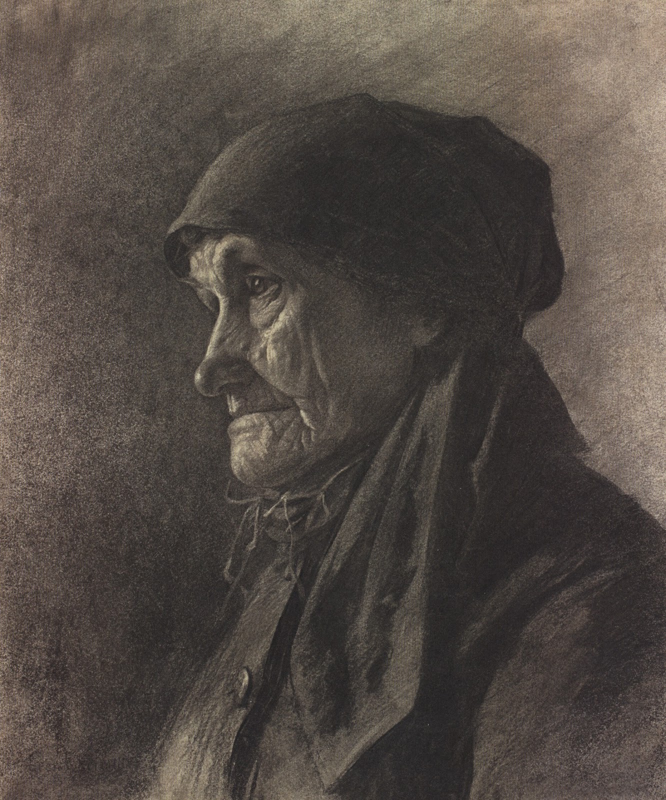
Leon Augustin Lhermitte, An Elderly Peasant Women, charcoal.

The show features the use of pastels, which in the 19thcentury became a favored medium by many artists thanks to the development of richer pigmented chalk pastels.  Paul Huet uses a bright palette to layer color in describing a meadow at sunset.  While Auguste Louis Lepere uses an analogous palette of pastels to draw a pastoral scene.


“Color Line Light” Drawing exhibition at the National Gallery of Art

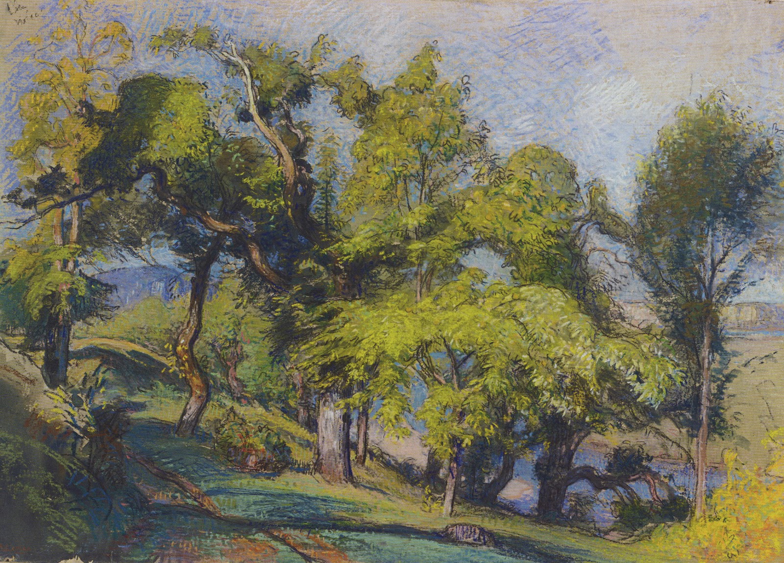
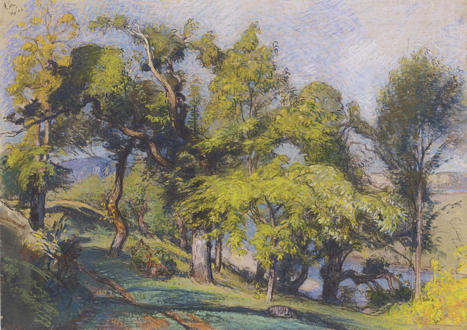
                Auguste Louis Lepere, Chestnut Trees above a River, 1900, pastel.


It is often thought that the impressionist artists didn’t create many drawings as they painted spontaneously from life. This show offers many opportunities to see impressionist works on paper. An atmospheric pastel drawing by Claude Monet was done in London while he waited for his oils paints to arrive. Edgar Degas is one of many impressionist artists who enjoyed drawing techniques.  The exhibition includes a few masterful drawings by Degas they are inspired in their use of the compositional space and in there animated effects.


“Color Line Light” Drawing exhibition at the National Gallery of Art
                       Edgar Degas, A Dancer at the Bar, charcoal and white chalk.

I recommend an excursion to the National Gallery of Art to see this inspired exhibition.  I also recommend the exhibition catalog.

Drawing the Figure with Pen and Ink

By |January 28th, 2013|Syndicated Content|


I am taking a class at the Art League in Alexandria, Virginia with instructor Robert Liberace. Liberace is an accomplished painter, sculptor and draughtsman. The class, “Figure and Portrait: A Modern Approach to Classical Drawing”, explores drawing the figure through master techniques, such as silverpoint, pen and ink, charcoal, red chalk and graphite.  I hope to post on these various techniques in the coming weeks.


Drawing the Figure with Pen and Ink
                             Robert Liberace, Figure Study in pen and ink, 2012.

The past two weeks we have been using pen and ink with watercolor washes to create a three dimensional drawing of the figure.  Pen and ink, using flexible nibs, allows the artist to create energetic, dynamic sketches. Rembrandt’s pen and ink drawings, characterized by his calligraphic line, are great examples of this technique.


Drawing the Figure with Pen and Ink
          Rembrandt van Rijn Woman Having Her Hair Combed, pen and ink, 1637

Pen and ink can also be used for longer more detailed studies.  It was a favored medium of Michelangelo, Leonardo, Durer and many other masters. Liberace recommends using a slightly textured text weight paper such as Twinrocker in “Calligraphy Cream”.  To add warmth to the paper he coats it with a light watercolor wash using yellow ochre or raw sienna. Since pen and ink is an unforgiving medium (erasing is difficult if not impossible) most artists begin with a simple pencil sketch of their subject. 


Drawing the Figure with Pen and Ink
                Michelangelo Buonarroti, Studies of the Holy Family, pen and ink, 1505.

When ready to start drawing Liberace recommends using a sepia ink, such as seen in master drawings, with flexible nibs. The nibs allow the artist to create lines that go from thick to line as pressure is put on the nib. Rob also uses Micron technical pens as he draws. Technical pens (which store their ink in the pen) allow for a more consistent line.


Drawing the Figure with Pen and Ink

                        Marie Dauenheimer, Figure Study, pen and ink, 2013.


I highly recommend experimenting with his wonderful medium!


"Bernini Sculpting in Clay" at the Metropolitan Museum of Art

By |January 21st, 2013|Syndicated Content|


“You need to draw using your eye-that is, imprint everything in your mind-and always make sketches and drawings of your different ideas…”


So said sculptor and architect Gian Lorenzo Bernini (1598-1680) in 1673.  Bernini is best known for his dramatic sculptures that adorn his native city of Rome. Bernini is credited with starting the Baroque movement in sculpture, a hallmark of which is his masterpiece “Ecstasy of Saint Theresa”created in 1652.  This piece can be viewed in the Cornaro Chapel, in the church Santa Maria della Vittoria, Rome.


"Bernini Sculpting in Clay" at the Metropolitan Museum of Art
                   "Ecstasy of St. Theresa", 1652, Santa Maria della Vittoria, Rome.

When you see Bernini’s theatrical and life like sculptures it is natural to wonder what his process was. In December I saw a comprehensive exhibition that shed light on the way Bernini worked.  The exhibition was “Bernini Sculpting inClay” at the Metropolitan Museum of Art and it featured 39 terracotta models, or “three-dimensional sketches”, created by the the master.  These small clay models are bold, expressive and animated. Numerous drawings accompany the models and aid in understanding Bernini’s thought process.


"Bernini Sculpting in Clay" at the Metropolitan Museum of Art
                         Terracotta bozetto for "Ecstasy of St. Theresa", 1647-1652.

One of the most impressive “bozettos” in the show is a lion modeled for the “Fountain of Four Rivers” (1651) in Piazza Navona in Rome.  As Bernini suggests in the above quote he modeled the lion from his "mind’s eye", a naturalistic lion exaggerated in its anatomy and expression!


"Bernini Sculpting in Clay" at the Metropolitan Museum of Art
              Terracotta bozetto for the Lion on the "Fountain of Four Rivers", 1649-1650.

The largest terracotta in the show is a bozetto for the “Fountain of the Moor”, 1655, Piazza Navona, Rome. This dramatic, twisting piece embodies the energy of the figure and highlights Bernini’s way of describing textures-muscle, skin, hair, shell, dolphin and scales.  


"Bernini Sculpting in Clay" at the Metropolitan Museum of Art

                          Terracotta bozetto for "Fountain of the Moor" 1653.


It has been suggested that Bernini made 1000s of these terracotta sculptures, however not considering them finished works of art, but rather ‘sketches” he didn’t preserve them.  Only 52 remain intact.


For more info on Bernini’s life view this video from the Simon Schama BBC series “The Power of Art”.

http://www.youtube.com/watch?v=95_7l87prmI


I recommend the exhibition catalog "Bernini Sculpting in Clay" by C.D. Dickerson, III, Anthony Sigel and Ian Wardropper.

"Matisse, In Search of True Painting” at the Metropolitan Museum of Art

By |January 14th, 2013|Syndicated Content|


In 1949 art critic Clement Greenberg wrote of Matisse “A self assured master who can no more help painting well than breathing.”  Indeed when I look at Matisse’s paintings they show a confidence and bravado in the brushwork, colorful palette and composition.  It was surprising to learn that painting never came easy to Matisse who "reworked, questioned and repainted".


"Matisse, In Search of True Painting” at the Metropolitan Museum of Art
                Still Life with Compote, Apples and Oranges by Henri Matisse1899

The exhibition “Matisse: in Search of True Painting”, at the Metropolitan Museum of Art , explores how Matisse used his canvasses as tools, repeating compositions in order to "compare effect, gauge his progress" and “push further and deeper into true painting.”


By creating multiple paintings of the same subject matter Matisse experimented with different techniques to explore the subject.  He often copied the same image over and over varying the treatment of the canvas and handling of the paint.


In his series of paintings of the “Young Sailor” Matisse used graphite pencil to block in the figure, he followed with black paint to re-inforece the outline.  His final step was to use vivid paint, allowing it to drip and run, to emphasize the two dimensional aspect of the surface. 


"Matisse, In Search of True Painting” at the Metropolitan Museum of Art
                                     Young Sailor I by Henri Matisse, 1906

"Matisse, In Search of True Painting” at the Metropolitan Museum of Art
                                      Young Sailor II by Henri Matisse, 1906

A series of three canvasses of “Le Luxe” dominate the exhibition.  Influenced by Ingres and Cezanne, Matisse sought to convey the essential qualities of his figures.  Using various materials, such as charcoal, distemper (a water based medium with a matte surface like fresco) and oil, Matisse created a dramatic series of figure studies that work independently, but when together create a powerful series that echo the forms of the figures.


"Matisse, In Search of True Painting” at the Metropolitan Museum of Art
Three versions of Le Luxe by Henri Matisse, the first using charcoal, the second in oil and third using distemper, 1907-08

Another series of paintings by Matisse, highlighted in the exhibition, are of Notre Dame.  They are based on the view from his Paris apartment. “I never tire of it, for me it is always new”.  The series, as you can see moves from a traditional view of the cathedral to one that becomes more abstract.  These later paintings giving way and influencing a new generation of artists seeking “true painting”.


"Matisse, In Search of True Painting” at the Metropolitan Museum of Art
                                         Notre Dame by Henri Matisse, 1900

"Matisse, In Search of True Painting” at the Metropolitan Museum of Art
Notre Dame by Henri Matisse , 1941

"Matisse, In Search of True Painting” at the Metropolitan Museum of Art
                                        Notre Dame by Henri Matisse, 1914

I highly recommend this exhibition which is at the Metropolitan Museum of Art through March 17, 2013.  I also recommend the catalog edited by Dorthe Aagesen and Rebecca Rabinow.

"Beatrix Potter, the Picture Letters" at the Morgan Library

By |January 7th, 2013|Syndicated Content|


Beatrix Potter (1866-1943) is known to many as the creator of The Tale of Peter Rabbit and many other children’s stories. What may not be know is that Beatrix Potter was an accomplished scientific illustrator and an astute businesswoman.  Both of these attributes added to her success as a children’s book author and illustrator.


"Beatrix Potter, the Picture Letters" at the Morgan Library
                          Beatrix Potter and her pet rabbit "Benjamin Bouncer" 

Beatrix Potter was born in London in 1866 into an affluent family.  She enjoyed time at her family’s city home and in the countryside.  Beatrix and her brother Bertram had a menargie that included mice, rabbits and a hedgehog.  When the family travelled to the countryside Beatrix was fascinated with her natural surroundings and explored them through drawing.


"Beatrix Potter, the Picture Letters" at the Morgan Library
                        Beatrix Potter's watercolor drawing of "Boar Fish", 1895.

"Beatrix Potter, the Picture Letters" at the Morgan Library
   Beatrix Potter watercolor and pen and ink drawing of "Studies of a Dead Thrush", 1902.

The “Beatrix Potter, The Picture Letters” exhibition at the Morgan Library in New York is a must see for any Potter enthusiast.  The show focuses on Beatrix Potter’s many beautifully illustrated letters she wrote to children.  She corresponded with over forty children including her former governesses’ family.  Perhaps her most important correspondence was with young Noel Moore for whom she wrote the Tale of Peter Rabbit complete with lively pen and ink drawings.  The model for Peter was Beatrix Potter’s own pet rabbit that she described as “An affectionate companion and quite friend.”


"Beatrix Potter, the Picture Letters" at the Morgan Library
                           Beatrix Potter's sketches of her pet rabbit Peter, 1899.

Beatrix attributed her success to the fact that her stories were written for “real children"- indeed a particular child.  Her studies of animals from life and scientific investigation of mushrooms, plants and landscape add an unusual freshness to her illustrations.  The animals are not mawkish or oversentimental.  Her animal characters keep a sense of the animal they are drawn from.


         Beatrix Potter's illustrated letter "Peter's Dream of a Comfortable Bed" 1899.


The exhibition includes early board games, stuffed animals and figurines based on the various Potter stories, ever the businesswoman Potter kept copyright and control of her famous characters.


"Beatrix Potter, the Picture Letters" at the Morgan Library
            Beatrix Potter's watercolor and pen and ink drawing "His mother put him to bed, 
            and made some camomille tea", 1907.

I highly recommend a visit to the Morgan Library to enjoy this delightful exhibition!


The usefulness of uselessness

By |January 6th, 2013|Syndicated Content|

The usefulness of uselessness

"All art is quite useless." 
Oscar Wilde 

In the late eighties and early nineties I was a student at La Guardia High School of the Arts. My life was devoted to music. Thelonious Monk, Sonny Rollins and Lester Young were my idols. At eighteen I began gigging with my quintet in small venues in New York City. I wrote music and played tenor saxophone with a passion; I would end a gig or practice session in physical pain and emotional exhaustion.

Jazz clubs were dropping like flies. Swing and bebop had been a vital aspect of American culture. Yet the glory years of the thirties, forties and fifties, with places like NYC's 52nd street, didn't exist anymore. The music I was playing was disconnected from the times I was living in; I was rehashing a music that had died decades before. I was tired of pouring my heart into something that felt useless. I stopped playing.

At twenty I began working at my father's illustration and animation studio, Slim Films. There I learned that illustration and information graphics serve a specific purpose and have a defined goal. It was a revelation to be doing something concretely useful. After a couple of years working as a freelance illustrator I took a job as an assistant art director at Scientific American magazine. The editors worked with a passion that was eye-opening—even as they were writing about the most obscure subjects, like a particle physics theory that had no perceived relevance in our daily lives. It was as if I were surrounded by artists and musicians.

This reignited my desire to make music. I decided to leave Scientific American and go back to Manhattan School of Music, the conservatory I had dropped out of a few years earlier. I quickly learned that I didn't have what it would take to make it as a professional musician. It seemed as if the pinnacle of success was getting into the pit band of a Broadway show. The prospect of playing the same music day in and day out was a nightmare. At the time I was earning, and enjoying, a decent living as a freelance illustrator. Once again I stopped playing.

Over the years I became relatively successful as an illustrator. Five years ago I began to hire people and transition from a freelance illustrator to the creative director of my own studio. Two and a half years ago we moved the studio from Maplewood, N.J., to New York City.

I reentered the world of the useless; I decided to devote a significant part of my time and energy to creating fine art. Creating something that is of no use is an exercise in frustration. The other day I was complaining to an artist friend about this. Shaking his head he said, "People have no idea how hard this is. It's awful. Just awful."

And then, a couple of weeks ago I downloaded an album from iTunes of Barry Harris and Charles Davis, two of the teachers I studied with years ago. At the first notes my knees buckled. Time stopped and joy welled in my heart. It didn't matter what year it was. It didn't matter that what I defined as jazz had died years ago. What mattered was that for this brief time it was alive and well in my studio as I listened and danced.

Why I do what I do.

By |January 5th, 2013|Syndicated Content|

I am constantly amazed at the human body — the interconnectedness of its many layers and parts, its mechanical marvels and beauty, the way it grows, changes and repairs itself. Even after 25 years of drawing human anatomy, I am still moved by its wonder and mystery. […]

The post Why I do what I do. appeared first on Clark Medical Illustration.

Why I do what I do.

By |January 5th, 2013|Syndicated Content|

I am constantly amazed at the human body — the interconnectedness of its many layers and parts, its mechanical marvels and beauty, the way it grows, changes and repairs itself. Even after 25 years of drawing human anatomy, I am still moved by its wonder and mystery. My first real exposure to anatomy was drawing [...]

Topics for 2013

By |January 2nd, 2013|Syndicated Content|


Happy New Year!  As we begin the new year I have been brainstorming about blogging topics for 2013.  I was in New York for a few days and I plan on blogging about some amazing exhibitions I saw and plan on visiting.  Among them are the “Bernini, Sculpting in Clay” and “Matisse: True Painting” at the Metropolitan Museum of Art


Topics for 2013
Bernini's terracotta sculpture model for the "Lion on Four Rivers Fountain" 1649-50. From the  exhibition at the Metropolitan Museum of Art.


The “Beatrix Potter, The Picture Letters” and “Durer to de Kooning” exhibitions at the Morgan Library are worth discussion and exploration.  The Frick’s “Mantegna to Matisse, Master Drawings from the Courtauld Gallery” and MoMA’s “Inventing Abstraction” look fascinating.  The National Gallery of Art’s upcoming French drawing exhibition “Color, Line, Light: French Drawings, Watercolors, and Pastels from Delacroix to Signac” is much anticipated for it’s varied collection.


Topics for 2013
Pastel drawing by Auguste Louis Lepere, 1900.  From exhibition "Color, Line, Light: French Drawings from Delacroix to Signac" at the National Gallery of Art.


 I plan on continuing to blog about master drawing techniques , such as pen and ink and wash and red chalk.  As I prepare my 2014 Vesalius Trust“Art and Anatomy” tour to Greece and Italy I will continue to blog about Andreas Vesalius whose 500th anniversary is next year! To reflect the focus of my blog I have added "Art and Anatomy" to my title.


Topics for 2013
Pen and ink drawing by Jacques Bellange, 1610. From the "Durer to de Kooning" exhibition at the Morgan Library.


Thanks for reading, commenting and joining me on my art and anatomy travels! 

Looking forward, and the year in review

By |January 1st, 2013|Syndicated Content|

January 2012 was filled with hope as my wife and I reconciled. Yet the stress of everyday life, exacerbated by the grim reality of my recently excavated past, began to affect how I functioned in the world as a husband, father, creative director and artist. This tension culminated in April, leading to my semi-enforced two-month sabbatical. 

I reentered the world in June reenergized. By August the honeymoon withered and died. But in October I began feeling a subtle, hard-won stability. I was standing on the new foundation that I had begun cobbling together in April.

If you have followed this blog over the past two or so years, you may have noticed a change in tone since I returned from my sabbatical. I am uncomfortable with how personal my older posts are. Since getting back I've swung to the other end of the spectrum. In the service of not being too personal I have cut off much of the lifeblood and passion with which I wrote. How I can retain some of my fire without being melodramatic will be a challenge for me in 2013.

One of my intentions for 2012 was to make a larger, more realized body of work. Now that the year has come to a close I'm happy and proud of what I have made. In 2013 I will be getting the work out there. (Given that you are reading this and—hopefully—looking at the pictures, the work is of course "out there." What I mean is getting the work in an appropriate gallery.) With this intention in mind I've redesigned my art website. It will be going live sometime in January. I've also produced a 36-page booklet that I will be sending to the galleries I can imagine my work in.

Here are three of the last pieces I made in 2012:


Looking forward, and the year in review

Looking forward, and the year in review

Looking forward, and the year in review

When people see my work I want them to feel connected to their highest self. That said, I've come to the painful realization that I can't control what people think or feel. Attempting to make a person think or feel a specific way is the domain of advertising, not art. (There is a strong argument against this; just look at all the masterpieces that were commissioned by the Catholic Church during the Renaissance.) What I do have control over is my attempt to find and clarify my intentions. This carries through to how I wish to live my life in the world as a husband, father, creative director and artist.

Happy New Year!

Michelangelo’s "David-Apollo" at the National Gallery of Art

By |December 17th, 2012|Syndicated Content|


On Friday I had the privilege of seeing Michelangelo’s sculpture ”David-Apollo” (1530) at the National Gallery of Art in Washington, DC.  This beautiful marble sculpture is on loan from the Museo Nazionale del Bargello, in Florence, to celebrate 2013, the Year of Italian Culture.  The name of the sculpture alludes to the conflicting stories that the figure is David, slayer of Goliath or Apollo, god of light and sun.


Michelangelo's "David-Apollo" at the National Gallery of Art
                                 Michelangelo's "David-Apollo", marble, 1530.

Michelangelo's "David-Apollo" at the National Gallery of Art
                                       Michelangelo's "David-Apollo" Detail

Michelangelo (1474-1564) was a master of the High Renaissance and best known for his colossal masterpiece “David” (1501-1504) which dominates the Galleria dell’ Accademia in Florence. Michelangelo is considered to be one of the greatest artists of all time.  His creations in painting, sculpture, architecture and drawing are among the greatest masterpieces of Western art.


Michelangelo's "David-Apollo" at the National Gallery of Art
                                  Michelangelo's "David", marble, 1501-1504

While “David” is a large, highly polished piece the “David-Apollo” is an unfinished, smaller than life size sculpture.  This unfinished quality allows the viewer insight into Michelangelo’s process.  According to the National Gallery of Art,  Michelangelo used a point chisel to rough out the forms and a claw chisel to refine the figure.  The roughened areas formed with the point chisel can be seen on the back of the figure and the tree stump.  This juxtaposition of the refined and roughened marble later inspired 19th century French artist Auguste Rodin.  Below is one of Rodin’s sculptures to demonstrating this technique.


Michelangelo's "David-Apollo" at the National Gallery of Art
                                    Auguste Rodin, "Galatea", marble, 1889

While Michelangelo posed his “David” in a position of contrapposto, “David-Apollo” displays a twisting pose called serpentinata. 


I highly recommend a visit to the National Gallery Art before March 3, 21013 when “David-Apollo” returns to Florence.


Silverpoint Drawing, History and Technique

By |December 9th, 2012|Syndicated Content|


Silverpoint is a drawing technique with roots that go back to the time of the Renaissance.  The technique involves drawing on prepared paper with a small wire of silver sharpened to a point, much like a hard graphite pencil. As the stylus is dragged across the paper it leaves a mark of silver.  The layering of these hatched and crosshatched silver lines build up to create a soft value study. The technique is unique in that over time the drawing changes and becomes luminous as the silver tarnishes. 


Silverpoint Drawing, History and Technique
         Leonardo Study of the Head of a Girl, 1483, silverpoint on brown prepared paper

Leonardo, Raphael and Durer are all Renaissance masters who experimented with silverpoint.  Durer’s father was a metal smith and likely introduced his young son to this technique. Silverpoint is a delicate, but somewhat unforgiving medium; but with some practice the results can be remarkable.  


Silverpoint Drawing, History and Technique
                   Leonardo, Horse Studies, 1493, silverpoint on blue prepared paper

Contemporary artists using silverpoint begin the process, much as the Renaissance masters did, by preparing their paper with a ground.  The ground can be anything from house paint to commercially prepared grounds such as Golden’s Artists Supply“Silverpoint/ Drawing Ground”.  Watercolor can be added to the ground to create a toned surface. Using a rag paper the ground is applied with a brush and allowed to dry for at least 24 hours.


According to artist/author Juliette Aristides Lord Frederic Leighton worked on this rather large (21 x 15.5 inches) silverpoint drawing "from morning to evening for a full week".  

Silverpoint Drawing, History and Technique
 Lord Frederic Leighton, Study of a Lemon Tree, 1858, silverpoint on white prepared paper

Silverpoint Drawing, History and Technique
             Marie Dauenheimer, Portrait Study, 2010, silverpoint on white prepared paper

Silverpoint Drawing, History and Technique
           Marie Dauenheimer, Figure Study, 2012, silverpoint on white prepared paper

Silverpoint Drawing, History and Technique
             Marie Dauenheimer, Figure Study, 2012, silverpoint on white prepared paper

If you are interested in learning more about how to prepare paper for silverpoint and about this technique watch this instructional video from Golden (scroll down).


I highly recommend this technique!  It is enjoyable and the results can be brilliant!

Durer and Beyond, Central European Drawings, 1400-1700

By |December 2nd, 2012|Syndicated Content|


In August while at the Metropolitan Museum of Art I saw two amazing drawings exhibitions.  One, which I blogged about last week, featured the plant drawings of minimalist Ellsworth Kelly.  These drawings were so beautiful and elegant for their simple use of line and negative and positive shape.


The “Durer and Beyond” exhibition featured many drawings also created with line.  Albrecht Durer’s energetic ink lines with layers of hatching and crosshatching were a great contrast to the Kelly drawings!


Albrecht Durer, (1471-1528) of Nuremberg, Germany, is regarded as the greatest artist of the Northern Renaissance.  While still in his twenties Durer became famous for his woodcuts, such as “Four Horsemen of the Apocalypse”.  He went on to create many masterful paintings, but his drawings are among his most famous works.  Amid his most revered pieces are “The Great Piece of Tuft”, “The Praying Hands” and “Wing of a Roller”  Many of these drawings are in the Albertinain Vienna.


Durer and Beyond, Central European Drawings, 1400-1700
          Albrecht Durer, pen and ink on prepared paper, "The Praying Hands", 1508

Durer and Beyond, Central European Drawings, 1400-1700
                      Albrecht Durer, watercolor and gouache, "Wing of a Roller", 1518

Throughout his life Durer was known for his detailed and complex self-portraits.  The exhibition drawing below “Self Portrait and Studies of the Artist’s Left Hand and a Pillow” features such a self-portrait with it’s penetrating gaze.  On the verso of this drawing is a series of whimsical drawings of a pillow.  The series almost reads like an animation!


Durer and Beyond, Central European Drawings, 1400-1700
Albrecht Durer, pen and ink, "Self Portrait and Studies of the Artist's Left Hand and a Pillow", 1493

Durer and Beyond, Central European Drawings, 1400-1700
                              Albrecht Durer, pen and ink, "Six Studies of a Pillow", 1493

The exhibition featured 100 drawings created between 1400-1700 by artists from Germany, Austria, Switzerland, Czech Republic among others.  A charming study of a hedgehog by Hans Hoffman (1530-1592) created with watercolor and gouache, highlights this artist’s love of observing nature down to the smallest detail!


Durer and Beyond, Central European Drawings, 1400-1700
                          Hans Hoffman, watercolor and gouache drawing of a hedgehog, 1584

If you enjoy looking at master drawings there are two current exhibitions that you might want to visit.  "The Mantegna to Matisse” exhibition at the Frick Collection, will be up through January 27, 2013 and the “Durer to de Kooning: 100 Master Drawings from Munich” is on view through January 6, 2013 at the Morgan Library.  I plan on blogging about both these exhibitions.


Ellsworth Kelly’s "Plant Drawings" exhibition

By |November 25th, 2012|Syndicated Content|


This past summer, while in New York, I saw two amazing and very diverse drawing exhibitions at the Metropolitan Museum of Art. The shows were “Ellsworth Kelly Plant Drawings, 1948-2010” and  “Durer and Beyond, Central European Drawings, 1400-1700”.  Both exhibitions highlighted an abundance of drawings created using line.


Ellsworth Kelly's "Plant Drawings" exhibition
                                                Sunflower, 1957 watercolor

Ellsworth Kelly is an American artist born in 1923 and best known for his minimalist works.  Kelly embraced the Color Field School in the 1960s and became known for his vibrant, clean minimalist paintings and sculptures. Regarding his interest in simple, minimal shapes and contours Kelly stated " I'm not interested in the texture of a rock, but it's shadow."

Ellsworth Kelly's "Plant Drawings" exhibition
                                                       Hyacinth, 1949, ink

The exhibition at the Met focused on Kelly’s plant drawings, created over a sixty year period. These simple elegant drawings, made with graphite or ink on paper or with watercolor, are stunning for their simple use of line and shape.  Kelly is a master of composition, integrating negative and positive shape and keen observation skills.  Indeed, his drawings read as portraits of an individual plant.

Ellsworth Kelly's "Plant Drawings" exhibition
                                        Study for "Plant I", 1949, ink and pencil


While most of the pieces are 18 x 20 inches, there are some monumental drawings that utilize a strong vertical composition.  The overlapping of shapes and form create a sense of motion.

Ellsworth Kelly's "Plant Drawings" exhibition
                                           Four Sunflowers, 1957, pencil


I highly recommend the exhibition catalog  “Ellsworth Kelly Plant Drawings” by Michael Semff and Marla Prather.  It is a beautiful publication and includes a comprehensive interview with Kelly conducted by Marla Prather in 2011.


I will be posting about the “Durer and Beyond” exhibition in the near future.


More from the 20" x 16" series and working large

By |November 21st, 2012|Syndicated Content|

A couple of posts ago I had written that I was starting a new series of panels measuring 20" x 16". Here are two I'm happiest with:I'm intrigued with the blue piece. It's hitting a sweet spot between representation and abstraction. After making this pi...

Craniopharyngioma

By |November 14th, 2012|Syndicated Content|

This illustration was produced for the Johns Hopkins University’s Suburban Hospital Magazine, New Directions, Fall 2012 issue. A craniopharyngioma is a benign tumor that develops near the pituitary gland (a small endocrine gland at the base of the brain). This tumor most commonly affects children 5 – 10 years of age. Adults can sometimes be […]

Cancer “Smart Bomb” Art Featured in The Huffington Post and The Mirror

By |July 17th, 2012|Syndicated Content|

It’s not everyday that science illustration gets picked up by publications as varied as the The Huffington Post and The Mirror. In this instance a story about a cancer “smart bomb” seems to have sparked some interest. It’s a funny thing, creating artwork … Continue reading

How It Works – Extinction, Ecosystems, & Traffic Jams

By |June 4th, 2012|Syndicated Content|

These new illustrations by Sayo-Art for How It Works Magazine demonstrate the ways graphics and text can be integrated to create features that are simultaneously compelling and educational. SayoStudios works hard to create illustrations custom fit to your layout and … Continue reading

How do I begin a medical illustration project?

By |May 10th, 2012|Syndicated Content|

The first thing we do when contacted about a project is arrange a time to talk through the details with our client. Usually this is a phone conversation or email, but sometimes we’ll meet face-to-face. We ask about the project, how the illustrations will be used, what […]

The post How do I begin a medical illustration project? appeared first on Clark Medical Illustration.

Why use medical illustration?

By |May 9th, 2012|Syndicated Content|

Medical illustration and multimedia can help your company or practice communicate complex medical concepts. A medical illustrator can help you or your company: Enhance your patient education and advertising materials or web site with accurate medical illustrations and animated graphics. Communicate a concept that isn’t visible to […]

The post Why use medical illustration? appeared first on Clark Medical Illustration.

Why use medical illustration?

By |May 9th, 2012|Syndicated Content|

Medical illustration and multimedia can help your company or practice communicate complex medical concepts. A medical illustrator can help you or your company: Enhance your patient education and advertising materials or web site with accurate medical illustrations and animated graphics. Communicate a concept that isn’t visible to the human eye. Create editorial illustrations to explain [...]

Early Solar System Artwork in Science News Magazine

By |April 26th, 2012|Syndicated Content|

Check-out the cover art and opener for the “Born Gas Giants” article in Science News Magazine, describing recent developments in our understanding of the solar system. You can see more of the art up-close here: SayoStudio and read the Science … Continue reading

What training do medical illustrators receive?

By |April 18th, 2012|Syndicated Content|

Medical illustrators usually have a master’s degree from an accredited university. In the United States and Canada, there are only five accredited graduate schools for medical illustration, and each one admits from three to 12 students per year. The Association of Medical Illustrators has a complete list of accredited […]

The post What training do medical illustrators receive? appeared first on Clark Medical Illustration.

How are the prices set for a medical illustration?

By |March 15th, 2012|Syndicated Content|

Medical illustration is typically priced per illustration. Factors that affect the cost include: How many illustrations are needed? A discount may be given for large projects. Will the illustration be in color or black & white? How will the illustration be used? Is it for a print […]

The post How are the prices set for a medical illustration? appeared first on Clark Medical Illustration.

Social Week

By |November 11th, 2011|Syndicated Content|

Social Week at Shoemaker Medical is November 14-18, 2011 Help Shoemaker Medical celebrate our first anniversary! We were officially launched Nov. 8, 2010 and I can't believe a year could go by so quickly. We'll be giving away anatomy t-shirts, illustra...

Challenges

By |October 14th, 2011|Syndicated Content|

I always try to share the more uplifting elements of my life and business - however, I am going to let you in on my challenges today. I just finished checking and answering emails (and that's ALL I've done), and it's already noon! What the? Usually I a...

Expanding

By |September 23rd, 2011|Syndicated Content|

I used to think I could and should do EVERYTHING myself. I would be a renaissance Maya. With my first business (a retail art supply shop) I took control of everything and accomplished... not a lot. I hired people but didn't give them meaningful work to...

june 5 schedule

By |May 31st, 2011|Syndicated Content|

Sunday, June 5 - Medical Illustrators' Art Day! 10am Still-life drawing or painting. Bones, produce, flowers. Noon Warm-up with clothed gesture drawing. (Maya, Clint, whoever wants to take turns posing.) We can get reference photos of each other if we...