Artists' Blogs

Necrotizing Fasciitis

By |April 2nd, 2014|Syndicated Content|

Necrotizing fasciitis (NF), commonly known as flesh-eating disease or Flesh-eating bacteria syndrome, is a rare infection of the deeper layers of skin and subcutaneous tissues, easily spreading across the fascial plane within the subcutaneous tissue.

The post Necrotizing Fasciitis appeared first on Clark Medical Illustration.

Long Bone Anatomy

By |April 2nd, 2014|Syndicated Content|

Long bone anatomy consists of a layer of connective tissue called the periosteum. The outer shell of the long bone is compact bone with a deeper layer of cancellous bone (spongy bone) which contains red bone marrow. The interior part of the long bone is the medullary cavity with the […]

The post Long Bone Anatomy appeared first on Clark Medical Illustration.

Weight Loss in the Elderly

By |March 31st, 2014|Syndicated Content|

This editorial illustration was created for a May 2014 cover of American Family Physician. The image summarizes Unintentional Weight Loss in Elderly. Elderly patients with unintentional weight loss are at higher risk for infection, depression and death. The leading causes of involuntary weight loss are depression (especially in residents of long-term care facilities), cancer (lung […]

Dysmenorrhea

By |March 31st, 2014|Syndicated Content|

Diagnosis and Initial Management of Dysmenorrhea AMIMI S. OSAYANDE, MD, and SUARNA MEHULIC, MD, University of Texas Southwestern Medical Center, Dallas, Texas Am Fam Physician. 2014 Mar 1;89(5):341-346. Dysmenorrhea is one of the most common causes of pelvic pain. It negatively affects patients’ quality of life and sometimes results in activity restriction. A history and physical examination, including […]

Cloud publishing: the new editorial publishing model and its practicality

By |March 12th, 2014|Syndicated Content|

Learn more about the new model in Cloud publishing, its practicality and editorial usage in medicine. Cloud publishing allows for faster information anywhere and on any device and is quickly becoming popular also for the medical and scientific publishing industry. A cloud publishing environment allows for remote access to programs, files and services on the internet, and it is possible to access these on any device with internet access. Google Docs is an excellent example

Medical device branding

By |March 5th, 2014|Syndicated Content|

Portable Organ Perfusion is a startup company innovating with a truly disposable portable organ perfusion system. We offered all support needed to build up the visual identity from scratch. The branding of the startup needed to be taken care thoroughly. So we set up appointments to understand the client’s needs and made up a strategy. We rolled into the team’s daily schedule to make it happen, time was not on the team’s side. Startups are constantly busy planning the latest

Odontologic illustration

By |February 28th, 2014|Syndicated Content|

We recently concurred to start a exciting project. The Client looked for an illustration agency able to commit with sharp deadlines and listen to multiple associates feedbacks. We created the right recipe for a branded medical dental illustration collection supporting their content. The client is creating an online global reference portal illustrating procedures, making material available to professionals worldwide. The dental illustrations developed should aid the understanding of articles by providing a visual educational reference to the techniques used. We pitched with

The Dying Gaul from the Capitoline Museum, Rome

By |January 29th, 2014|Syndicated Content|


In celebration of 2013, the Year of Italian Culture, the National Gallery of Art was lent the masterpiece The Dying Gaul.  On loan from the Capitoline Museum in Rome this magnificent sculpture was at the National Gallery of Art until January 26. 2014.  I had the opportunity to see this masterpiece of pathos and beauty.

The Dying Gaul from the Capitoline Museum, Rome
      The Dying Gaul, marble sculpture at the National Gallery of Art, Washington, DC.

The Dying Gaul, a marble sculpture created in the first or second century AD, features a soldier dying from a fatal knife wound. The Dying Gaul is a Roman copy of a Hellenisticbronze.  The marble was discovered during an excavation of the Villa Ludovisi gardens in 1621-1623.  When first found it was described as a dying gladiator, but in the 18thcentury scholars found that it was probably a Gallic warrior due to the knotted hair and torque around his neck. According to this quote from the historian Polybius in the second century BC:


“. they fought wearing nothing but their weapons…Very terrifying too were the appearance and gestures of the naked warriors…all in the prime of life and finely built men.”


The fame of The Dying Gaul spread as it was copied and reproduced as etchings and bronzes, commemorated in a poem by Lord Bryon and celebrated by painters from Velasquez to David who incorporated the famous pose into their work.


The Dying Gaul from the Capitoline Museum, Rome
                      Jacques-Louis David, Male Nude Study, 1780, oil on canvas.

In 1775 The Dying Gaulwas further immortalize by sculptor Agastino Carlini and anatomist John Hunter.  They posed the flayed corpse of an executed smuggler into the famous pose and cast it in plaster for the students to draw.  The piece known as “Smugglerius” in on view today in Royal Academy of Arts in London.


The Dying Gaul from the Capitoline Museum, Rome
William Pink after Agastino Carlini, Smugglerius, 1834 (original cast 1775), plaster.

Artists continue to find inspiration in this ancient masterpiece as seen in the work of modern artist John De Andrea (1941- ). In 1984 this photorealist sculptor created a contemporary dying gaul when he cast a human model and created a hyperrealistic sculpture using polyvinyl, oil paint and acrylic hair. The contrast between De Andrea’s modern, realist figure and the idealized, classical pose of The Dying Gaul is a surprising juxtaposition!


The Dying Gaul from the Capitoline Museum, Rome
           John De Andrea, The Dying Gaul, 1984, polyvinyl, oil paint and acrylic hair.

Vincent Van Gogh in Arles, St. Remy and Auvers, 1888-1890 PART III

By |January 13th, 2014|Syndicated Content|


In May 1890, after spending a year at the asylum in St. Remy, Van Gogh left Provence and moved to Normandy.  He wanted to be closer to his brother Theo, but he felt life in Paris would be too stressful. On the advice of fellow painter Camille Pissarro, Van Gogh found lodging in the small hamlet of Auvers-sur-Oiseabout 20 miles from Paris in the countryside. This would be Van Gogh’s last home.

Vincent Van Gogh in Arles, St. Remy and Auvers, 1888-1890 PART III
           Vineyards with a View of Auvers, 1890, oil on canvas, Vincent Van Gogh.

Auvers was the home of painter Charles Francois Daubigny who built a house and studio there in 1857.  Cezanne, Monet, Pissarro, Daubigny, Corot and Gauguin were among the many artists who have portrayed the village of Auvers.  Now Van Gogh would paint the charming village full of thatched roof cottages and beautiful gardens.  Van Gogh would write, “Auvers is decidedly very beautiful.”


Vincent Van Gogh in Arles, St. Remy and Auvers, 1888-1890 PART III
                     Daubigny's Garden, 1890, oil on canvas, Vincent Van Gogh

Van Gogh lived in Auvers the last 70 days of his life.  It was his most prolific time; he created 75 paintings and 50 drawings.  His subjects included the local landscape, gardens, Daubigny’s home and gardens, the town church, wheat fields and portraits of his physician Dr. Gachet, his family and other friends.


Vincent Van Gogh in Arles, St. Remy and Auvers, 1888-1890 PART III
                            Vincent Van Gogh's room at the Ravoux Inn in Auvers.

Van Gogh lived in a small cell like room at the Ravoux Inn.  The inn and its café have been restored and are open to the public.  Van Gogh’s room was a small cell like space on the third floor illuminated by a small window.


Vincent Van Gogh in Arles, St. Remy and Auvers, 1888-1890 PART III
                        Church at Auvers, 1890, oil on canvas, Vincent Van Gogh

On July 29, 1890 Van Gogh died of a gun shot wound to the chest, he was 37 years old. Van Gogh is buried in the cemetery in Auvers long side his brother Theo, who passed away six months later.

The National Gallery of Art recently acquired one of Van Gogh’s last paintings.  This stunning canvas, called Green Wheat Fields, Auvers bears the hallmaks of Van Gogh’s work- brilliant palette, rich impasto and energetic brushwork.


Vincent Van Gogh in Arles, St. Remy and Auvers, 1888-1890 PART III
               Green Wheat Fields, Auvers, 1890, oil on canvas, Vincent Van Gogh

To learn more about visiting Auvers and the House and Studio of Vincent Van Gogh visit http://www.maisondevangogh.fr/en/.


Inspiration at the Met’s Ancient Egyptian wing

By |December 3rd, 2013|Syndicated Content|

I went to the Met the other day and spent a couple of hours in the Ancient Egyptian wing. I saw a lapis lazuli figurine that blew me away. It was small. But it filled the room with its energy. I keep seeing that vivid blue color in my mind's eye. ...

Vincent Van Gogh in Arles, St. Remy and Auvers, 1888-1890 PART II

By |December 2nd, 2013|Syndicated Content|


In my last post I mentioned that the last two years of Vincent van Gogh’s life were his most prolific.  During those last years he lived in Arles and St. Remy in Provence and Auvers in Normandy. My last post discussed his time in Arles before moving to St. Remy, where he lived from May 1889-May 1990.
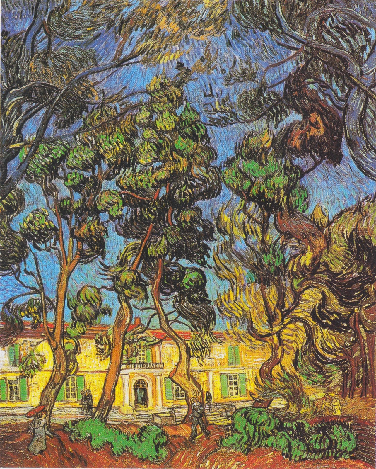
Vincent Van Gogh in Arles, St. Remy and Auvers, 1888-1890 PART II
      "Garden at Saint-Paul-de-Mausole"by Vincent van Gogh, 1889, oil on canvas

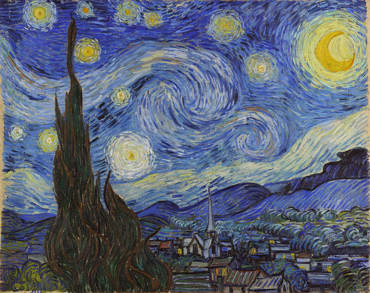
When van Gogh arrived in St. Remy he entered the asylum of Saint-Paul-de–Mausole.  Because of his fragile mental health van Gogh was not permitted to leave the grounds of the asylum. It’s walled gardens, filled with pine trees, lilacs, roses and irises, gave van Gogh a peaceful place to paint directly from nature. He wrote his brother Theo “When you receive the canvases I’ve done in the garden you’ll see that I’m not too melancholy here”. The masterpieces he created on the asylum grounds include “The Irises” and “Starry Night”.  
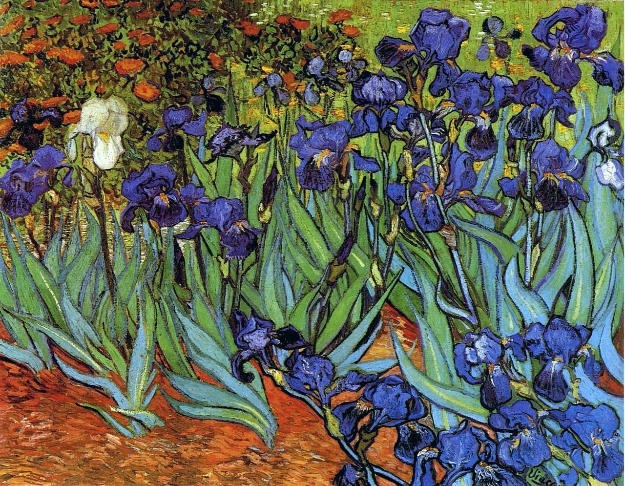


Vincent Van Gogh in Arles, St. Remy and Auvers, 1888-1890 PART II
                           "Irises" by Vincent van Gogh, 1889, oil on canvas.

Many of the paintings van Gogh created in St. Remy are from direct observation. However  “Starry Night”, which represents the nighttime view from his hospital room, was painted during the day and from memory.  Considered by many to be van Gogh’s most important work “Starry Night” shows his comfort with using the landscape to inspire his imagination.


Vincent Van Gogh in Arles, St. Remy and Auvers, 1888-1890 PART II
                            "Starry Night" by Vincent van Gogh, 1889, oil on canvas.
After a few months van Gogh was allowed beyond the asylum grounds to paint in the surrounding countryside. The resulting masterpieces include “Olive Trees” and “Cypresses”.


Vincent Van Gogh in Arles, St. Remy and Auvers, 1888-1890 PART II
                     "Olive Trees" by Vincent van Gogh, 1889, oil on canvas.

From his room van Gogh painted some of his most beloved still lives including the “Still Life: Vase with Pink Roses”.  The roses were originally pink and contrasted with the stark green background.  Over time the pink has faded and left a stunning, subtle painting of white roses. 


Vincent Van Gogh in Arles, St. Remy and Auvers, 1888-1890 PART II
        "Still Life:Vase with Pink Roses" by Vincent van Gogh, 1889, oil on canvas.

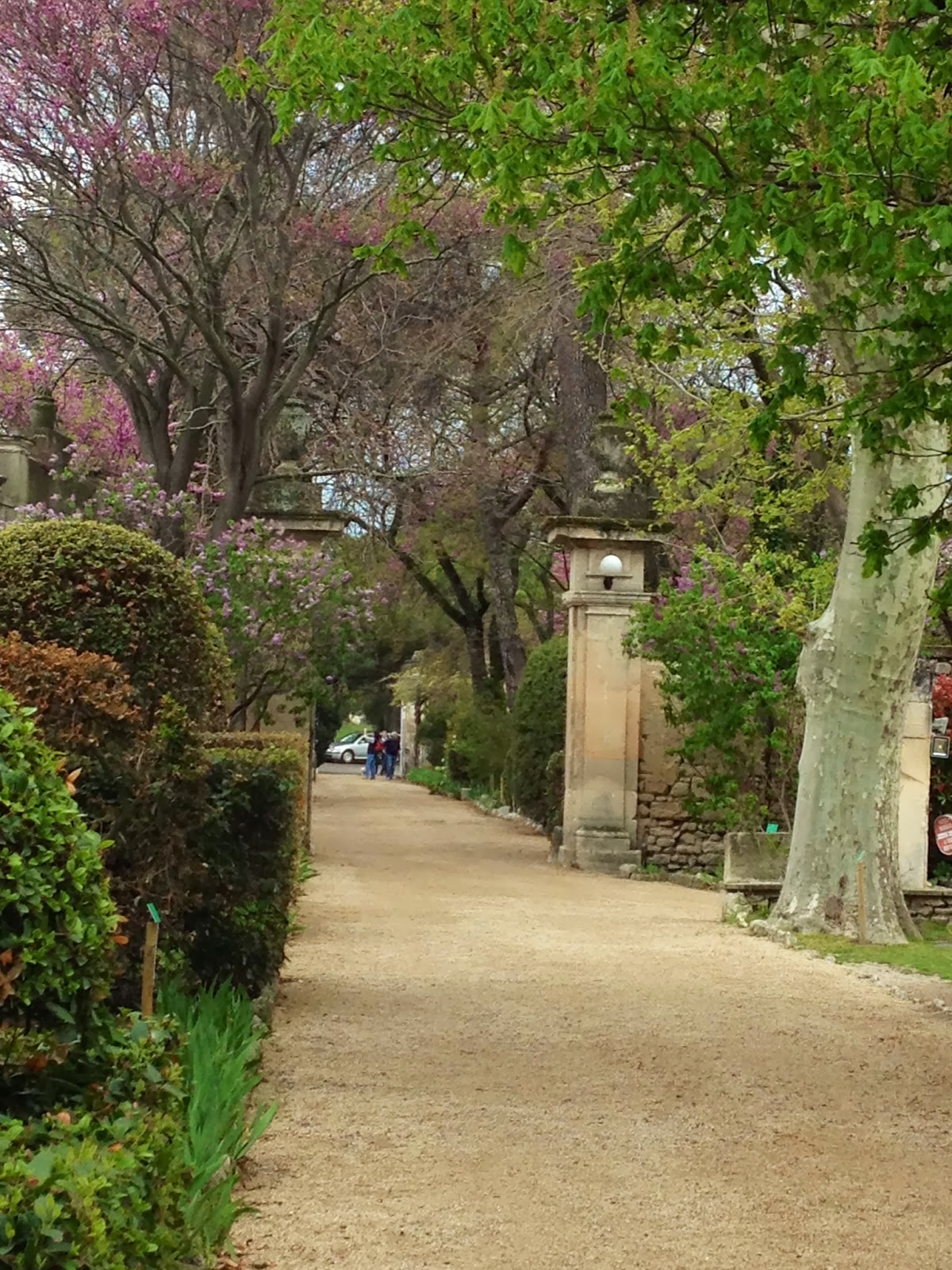
The asylum at Saint-Paul-de-Mausole is still in existence and open to the public.  I visited there in the spring of 2012 and was able to walk the lovely gardens that inspired van Gogh. I also visited his small room where so many masterpieces were created!


Vincent Van Gogh in Arles, St. Remy and Auvers, 1888-1890 PART II
   View of the garden at Saint-Paul-de-Mausole, 2012. Photo by Marie Dauenheimer.
In May of 1890 van Gogh decided to leave the asylum at St. Remy and move north.  Afraid that living in Paris would be too difficult he sought the council of painter Camille Pissarro.  Pissarro suggested van Gogh move to Auvers-sur-Oise in Normandy, about 20 miles from Paris.  It was here that he would become a patient of Dr. Gachet, live out the last months of his life, and experience his most prolific painting interval.
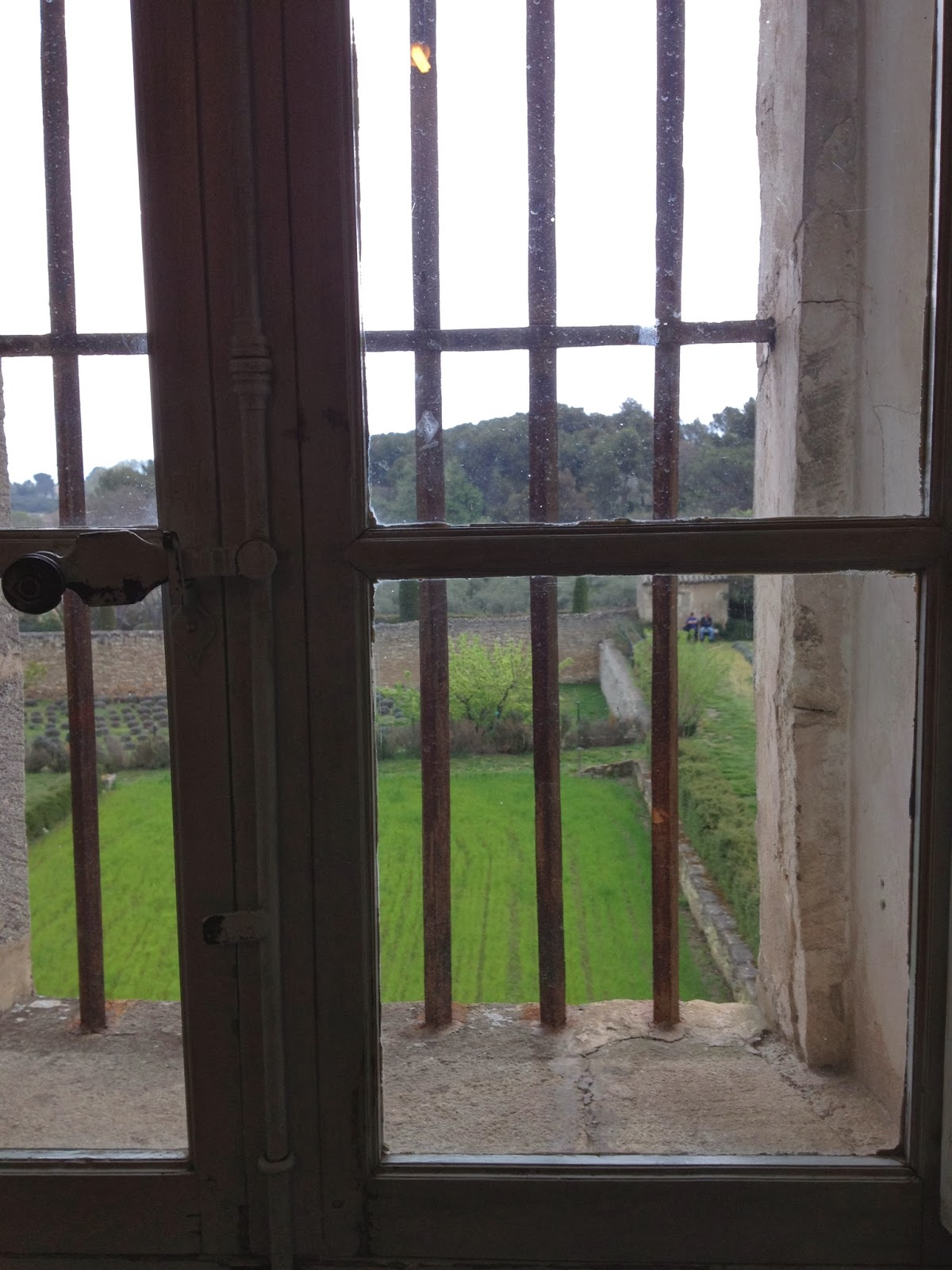

Vincent Van Gogh in Arles, St. Remy and Auvers, 1888-1890 PART II
View from Vincent van Gogh's room at Saint-Paul-de-Mausole, 2012. Photo by Marie Dauenheimer

For more information about visiting St. Remy and the asylum

http://www.tripadvisor.com/ShowUserReviews-g187256-d246640-r136912609-St_Paul_de_Mausolee-Saint_Remy_de_Provence_Bouches_du_Rhone_Provence.html


I toured Arles and St. Remy with tour guide Marlene Boyer of Experience Provence

I highly recommend touring Arles and St. Remy with Marlene!

Adjusting Work Motivations – Freelancing as a New(ish) Parent Part 2

By |November 19th, 2013|Syndicated Content|

In my last post on balancing parenthood with freelancing I talked about maternity leave logistical realities. This week I want to talk a little bit more about the emotional side of things. After defining myself by my work for so … Continue reading

Maternity Leave – Freelancing as a New(ish) Parent

By |November 5th, 2013|Syndicated Content|

Since becoming a full-time freelance illustrator 6 years ago, I’ve had 2 beautiful children (the pterodactyls, because that’s what they sound like when they cry). That means 2 x 9 = 18 months of hormone-induced sleepiness, and over two years … Continue reading

Vincent van Gogh in Arles, St. Remy and Auvers, 1888-1890 PART I

By |September 30th, 2013|Syndicated Content|


The last two years of Vincent van Gogh’s life were his most prolific.  He lived in three different towns during this time, Arles and St. Remy (in Provence), and Auvers-sur-Oise(Normandy).  I have had the opportunity to visit these three locations.  I enjoyed the insight these unique places brought to my understanding of Van Gogh and his work.


Vincent van Gogh in Arles, St. Remy and Auvers, 1888-1890 PART I
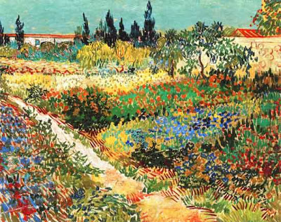
                      "Garden at Arles" by Vincent van Gogh, 1888, Oil on canvas.

 On February 20, 1888 van Gogh moved, from Paris, to Arles in the south of France.  He was attracted to the countryside, calling it  “The land of blue tones and gay colors”.  Funded by his brother Theo, Vincent moved into the now famous “Yellow House” and set up a studio and a room for a guest artist.

Vincent van Gogh in Arles, St. Remy and Auvers, 1888-1890 PART I
                    "The Yellow House" by Vincent van Gogh, 1888, oil on canvas.


While in Arles van Gogh was inspired to paint the local farmhouses and gardens.  His paintings from this period feature confident impasto brushstrokes and a brilliant palette.  Indeed, van Gogh wrote “Ah, these farmhouse gardens with lovely big red Provence roses, the vines, the fig trees; it’s quite poetic.”


Vincent van Gogh in Arles, St. Remy and Auvers, 1888-1890 PART I
              "View of Arles with Irises" by Vincent, van Gogh, 1888, oil on canvas.

On October 23, 1888 Paul Gauguin  (1848-1903) arrived and stayed with Vincent. Together the two artists painted, and unfortunately argued. During the two months they lived together unrest grew between them. On December 23, 1888, after a confrontation with Gauguin, van Gogh mutilated his left ear with a razor.  Van Gogh was admitted to the Hospital in Arles, as Gauguin fled for Paris. 


Vincent van Gogh in Arles, St. Remy and Auvers, 1888-1890 PART I
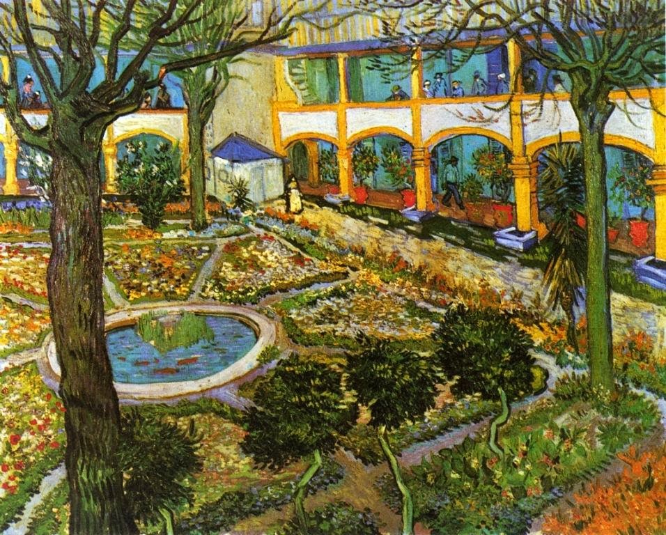
      "Courtyard at the Hospital at Arles" by Vincent van Gogh, 1888, oil on canvas.

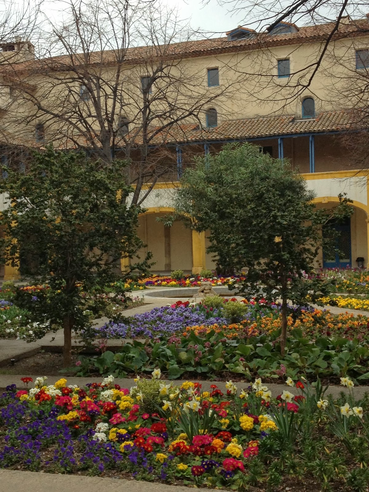
While at the hospital van Gogh did two paintings of the lovely flower filled courtyard.  After being released from the hospital van Gogh returned to the yellow house, but due to demands from locals he was forced to leave the city.  In February 1889 van Gogh moved 15 miles northeast to the asylum of Saint-Paul-de–Mausolein St. Remy.  It was here that he would create his most inspired works including “Starry Night” and the “Irises”.


Vincent van Gogh in Arles, St. Remy and Auvers, 1888-1890 PART I
      Courtyard of the Hospital in Arles as it is today, photo by Marie Dauenheimer, 2013.

 I plan to do future blog postings about van Gogh's work and life in St. Remy and Auvers-sur-Oise. In the meantime if you are interested in van Gogh's work there is an upcoming exhibition at the Phillips Collection in Washington, DC.  "Van Gogh Repetitions" will be up from October 12, 2013-January 26, 2014.


Sir Alfred James Munnings Exhibition “Out in the Open” at the National Sporting Library and Museum

By |September 16th, 2013|Syndicated Content|


Located in the beautiful Virginia countryside, in the historic town of Middleburg, is a remarkable museum and library dedicated to the art, literature and culture of horse and field sports, it is called the National Sporting Library and Museum.

Sir Alfred James Munnings Exhibition “Out in the Open” at the National Sporting Library and Museum
                           National Sporting Library and Museum in Middleburg, Virginia.
         
I recently had the opportunity to visit this museum and view an outstanding exhibition called “Out in the Open”, featuring approximately 70 paintings by British artist Sir Alfred James Munnings (1878-1959).  Munnings is best known for his paintings of horses and race scenes. I was familiar with some of his work, but this comprehensive exhibition made me appreciate the brilliance of this artist.


Sir Alfred James Munnings Exhibition “Out in the Open” at the National Sporting Library and Museum
The Morning Ride, Florence Munnings on Horseback, Sir Alfred Munnings, 1913, oil on canvas.

Munnings did most of his work outside, en plein air. His confident, rapid brushwork is reminiscent of John Singer Sargent and Joaquin Sorolla and their depictions of sun soaked landscapes and figures. Munnings paintings, created outdoors from direct observation, are brilliant and nuanced.  Indeed, Munnings biographer wrote, “The call of the sun was one of the strongest forces in his career.”


Sir Alfred James Munnings Exhibition “Out in the Open” at the National Sporting Library and Museum
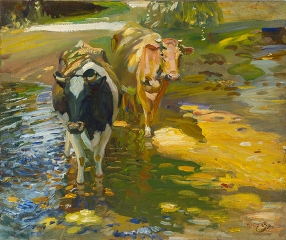
          Impressions of Cows in a Stream, Sir Alfred Munnings, 1912, oil on canvas.

The son of a miller, Munnings was born in 1878 in Mendham, Great Britain.  In 19thcentury England horses were part of every life, but it was the gift of a toy horse that got Munnings interested in this magnificent animal and its portrayal.


Sir Alfred James Munnings Exhibition “Out in the Open” at the National Sporting Library and Museum
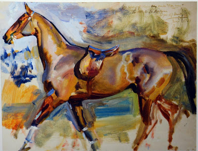
     Study of a Clipped Bay Hunter "Bitter Sweet", Sir Alfred Munnings, 1923, oil on panel.

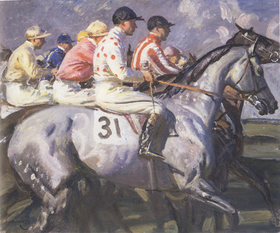
Among the various themes painted by Munnings was his depiction of horse races.  One in particular reminded me of Edgar Degas and his race scenes.  “Almost Away” is a tightly composed painting featuring a contrasting riot of jockey silk colors. This painting, the color and expression of the horses evokes the raw energy of the race.


Sir Alfred James Munnings Exhibition “Out in the Open” at the National Sporting Library and Museum
                            Almost Away, Sir Alfred Munnings, 1945, oil on canvas.

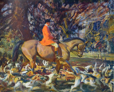
In many of the paintings Munnings juxtaposes highly polished passages with abstract ones.  In the piece “In the Covert” he paints the horse and rider in a refined manner and surrounds them with a futurist like depiction of the hounds and landscape.


Sir Alfred James Munnings Exhibition “Out in the Open” at the National Sporting Library and Museum
                             In the Covert, Sir Alfred Munnings, 1920, oil on canvas.

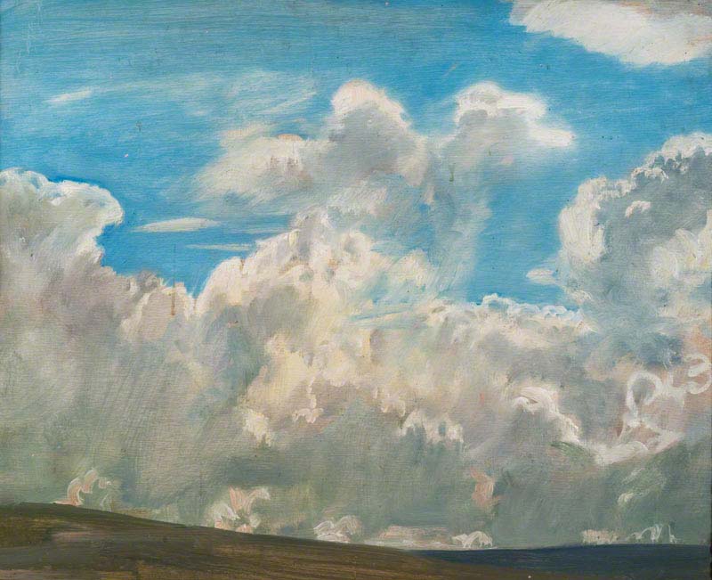
Castle Hill in Essex, Munnings’ elegant home for forty years, is a museum dedicated to his work. It houses a collection of over 600 works by Munnings including numerous landscapes and cloud studies of the surrounding countryside.


Sir Alfred James Munnings Exhibition “Out in the Open” at the National Sporting Library and Museum
                         Cloud Study by Sir Alfred Munnings, oil on canvas.

This extraordinary exhibition closed on September 15, 2013. The National Sporting Library and Museum was its only venue.  I was very fortunate to see this exhibition before it closed.  I would recommend that if you are interested in learning more about this fascinating artist you read the exhibition catalog “Munnings, Out in the Open”’ published by the National Sporting Museum and Library.  There is a movie called “Summer in February”, based on the 1996 book by Jonathan Smith of the same title, about Munnings that is soon to be released.

Vesalius Trust Art and Anatomy Tour to Southern Greece in August/September 2014

By |September 5th, 2013|Syndicated Content|


2014 will mark the 500th anniversary of the birth of  anatomist Andreas Vesalius

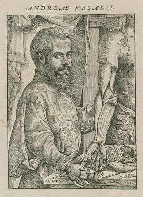
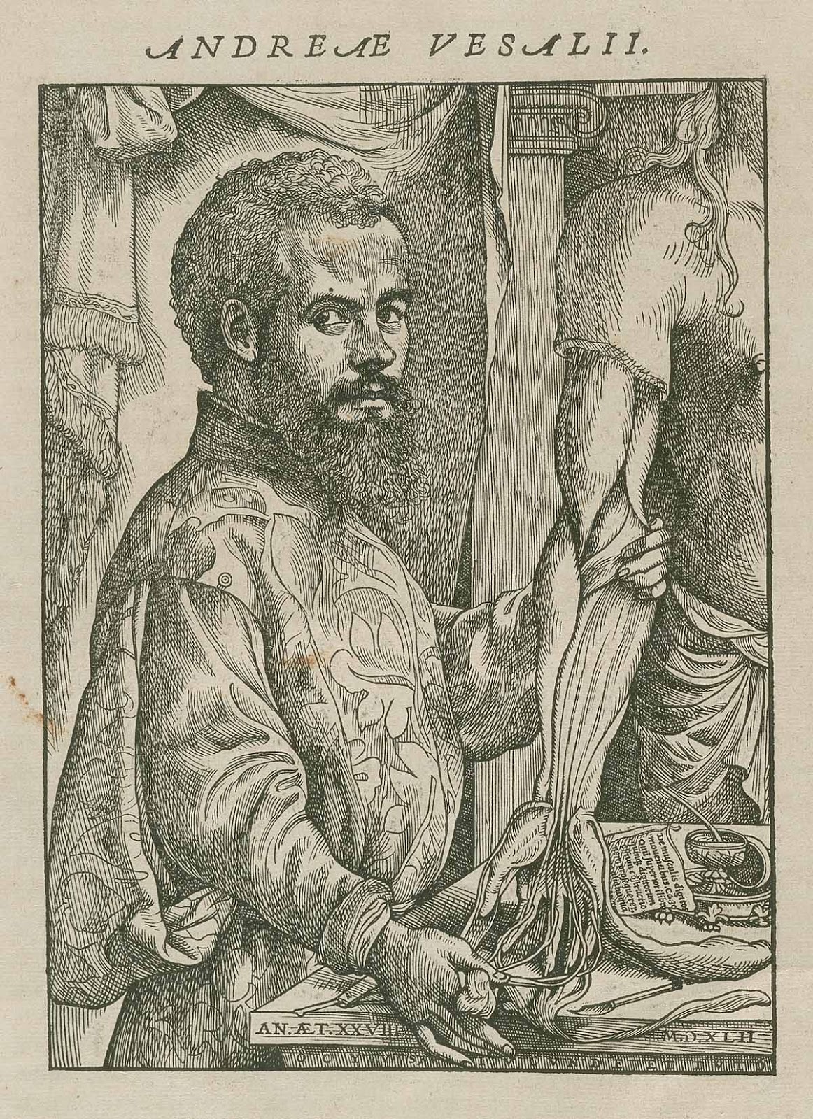
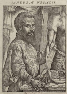
Vesalius, for whom the Vesalius Trust is named, was a Renaissance physician famous for his pioneering treatise De humani corporis fabrica  (On the Fabric of the Human Body) published in 1543. Considered the father of modern anatomy Vesalius was just 29 years old when his iconic work was published. The beautifully illustrated De Fabrica transformed the field of anatomy and how the human body was viewed and understood.

Vesalius Trust Art and Anatomy Tour to Southern Greece in August/September 2014
            Portrait of Vesalius, the frontispiece from De human corporis fabrica, 1543.

Since 1997 the Vesalius Trust has been sponsoring educational travel opportunities. These “Art and Anatomy” tours have transported attendees to exciting venues in Italy, France, The Netherlands, Belgium, Scotland and England. Each tour has included the Association Européenne des Illustrateurs Médicaux et Scientifiques (AEIMS)conference. These tours offer the opportunity to explore artistic and anatomical points of interest with like-minded colleagues.  Attendees have visited rare anatomy book collections, anatomical theatres, medical museums and art collections, some open to the public, but many exclusive. 
  

To commemorate the upcoming Vesalius birthday celebration I am working with a consortium of artistic, medical and cultural organizations in Europe to build the next Art and Anatomy tour. These organizations include Association Européenne des Illustrateurs Médicaux et Scientifiques.  This next tour will be to Southern Greece from August 29-September 9, 2014. 


Vesalius Trust Art and Anatomy Tour to Southern Greece in August/September 2014
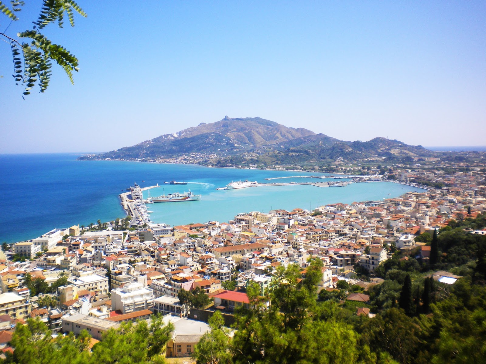
                        Panorama view of Zante Town on the island of Zakynthos.

Andreas Vesalius was born in Flanders, present day Belgium, on December 31, 1514.  He died on October 15, 1562 on the small island of Zakynthos, in the Ionian Sea. After much research and discussion the committee organizing the celebration chose Zakynthos as the venue for their conference.  Vesalius died when his ship wrecked in the Ionian Sea and he ended up on island of Zakynthos. This island, well aware of the importance of Vesalius, features many statues, monuments and streets commemorating the famous physician.


Vesalius Trust Art and Anatomy Tour to Southern Greece in August/September 2014
                                       Parthenon from the south, Athens.

The twelve-day Art and Anatomy Tour, “Traversing Southern Greece”, will begin with arrival in the ancient city of Athens, a bustling metropolis and home to the Acropolis.  The first day will comprise a walking tour of Athens including visits to the Hephaisteion, and the Doric temple of Thespian one of the best-preserved temples from ancient Greece.  The following day will be devoted to a guided tour of the Acropolis, including the Parthenon, the Temple of Athena Nike and the Porch of the Caryatids, which offer stunning views of Athens.  The day will conclude with a tour of the Acropolis Museum and free time to explore this fascinating city.


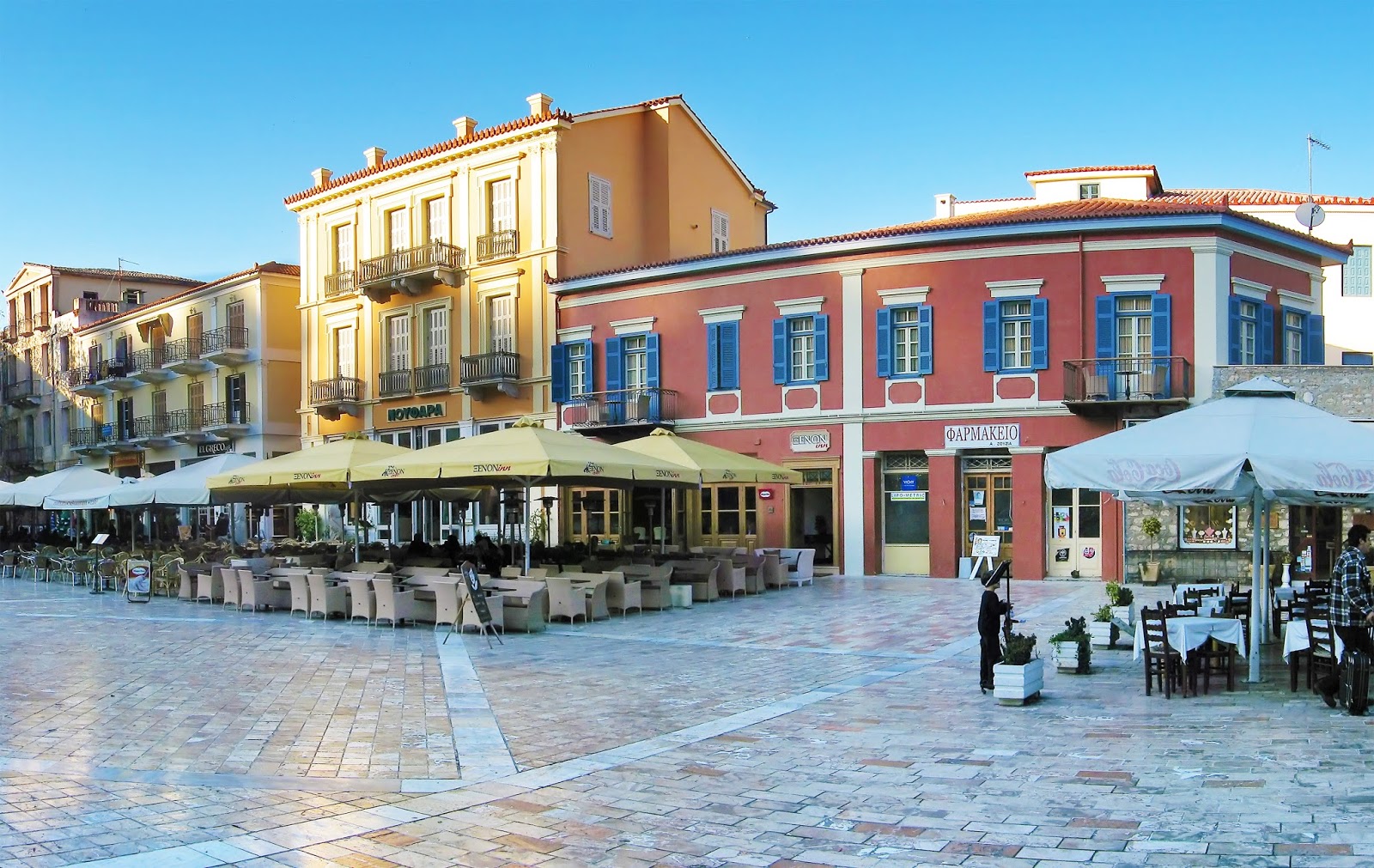
The next few days of the tour will include travel to the sophisticated town of Nafplion in the Peloponnese. This port city features polished old world streets lined with elegant Venetian castles and neoclassical manors. Enroute to Nafplion we will visit the ancient city of Corinth and its Greek and Roman ruins.


Vesalius Trust Art and Anatomy Tour to Southern Greece in August/September 2014
                                       The beautiful port city of Nafplion


Prior to the Vesalius Conference in Zakynthos the attendees will explore the ancient citadel of Mycenae and Epidaurus and its early theatre designed by sculptor Polykleitos, famous for his masterful sculptures of the human form.


The group will travel to the beautiful island of Zakynthos via ferry, cruising the Ionian Sea as Vesalius did in 1514.  The group’s home for the next four days will be the Palatino Hotel, walking distance to the conference site. 


A few days will be devoted to the “Vesalius Continuum” commemorating the 500thanniversary of Andreas Vesalius’ birth.  The conference schedule includes lectures about Vesalius' work, life and influences by famous medical scholars such as Ruth Richardson, author of Death, Dissection and the Destitute and The Making of Gray's Anatomy, and Professor Martin Kemp of the History of Art at University of Oxford. Kemp is considered one of the world's leading authorities on Leonardo da Vinci and he has written extensively about science and art.  Facial reconstruction artist Richard Neave, famous for his reconstruction of the iceman, will also be presenting.


After the conference the group will enjoy a special day of touring the island of Zakynthos.  Private boats will take attendees to the breathtaking Blue Caves, the uninhabited island of Marathonisi and the charming village of Volimes, known for it lace work and beautifully woven wool rugs.


Vesalius Trust Art and Anatomy Tour to Southern Greece in August/September 2014
                                       Island of Marathonisi, Zakythnos

The tour will end after a flight from Zakynthos to Athens with an independent day to enjoy the city or do an excursion.  A farewell dinner, near the Acropolis, will end the exciting journey before flights back to the US the next day.


For more information on this tour, including a detailed itinerary and pricing please contact Marie Dauenheimer at dauenheimer@erols.com or 571.216.1472.


Watch for future blog postings highlighting details about the tour and the Vesalius conference.

Albrecht Durer: Master Drawings, Watercolors and Prints from the Albertina

By |September 3rd, 2013|Syndicated Content|


The Albertina in Vienna, Austria is a museum known for it outstanding collection of works on paper.  The Albertina maintains a large collection of watercolors, drawings and prints by the Northern Renaissance master Albrecht Durer (1471-1528). This past spring the Albertina lent this vast and impressive collection to the National Gallery of Art in Washington, DC.


Albrecht Durer: Master Drawings, Watercolors and Prints from the Albertina
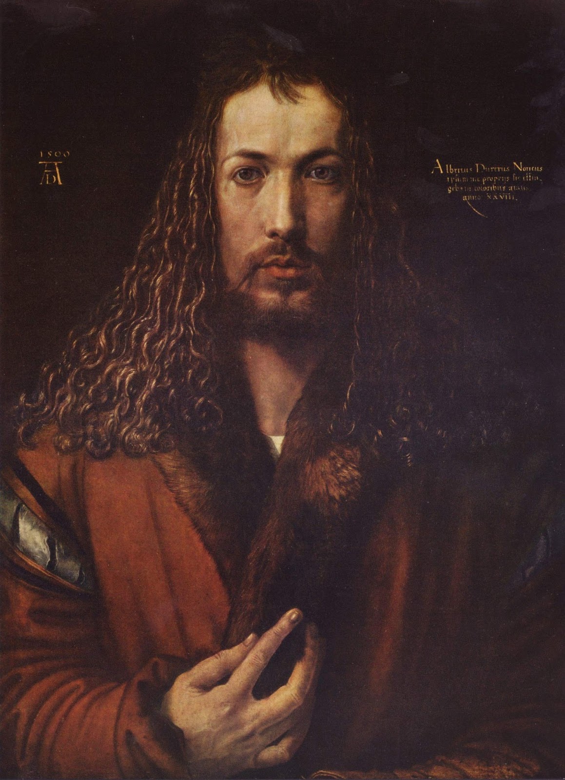
                                Self-portrait by Albrecht Durer, 1500, oil painting.

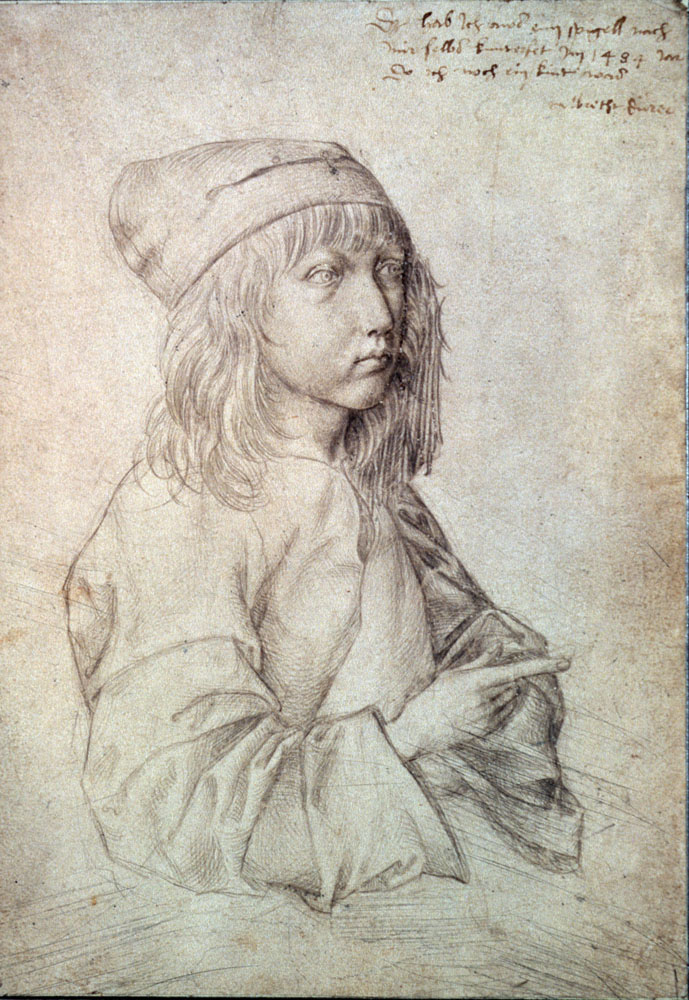
Durer is known in the history of art for his intense self-portraits, thought by many scholars to be the first self-portraits ever created. Indeed what scholars believe is the first self portrait made by an artist is in the exhibition. It is  a small detailed silverpoint drawing completed by Durer when he was just 13 years old.  (For more information about the silverpoint technique see my blog posting:mariedauenheimer.blogspot.com/.../silverpoint-drawing-history-and.html‎)

Albrecht Durer: Master Drawings, Watercolors and Prints from the Albertina
                    Self-portrait by Albrecht Durer, 1484, silverpoint on prepared paper.

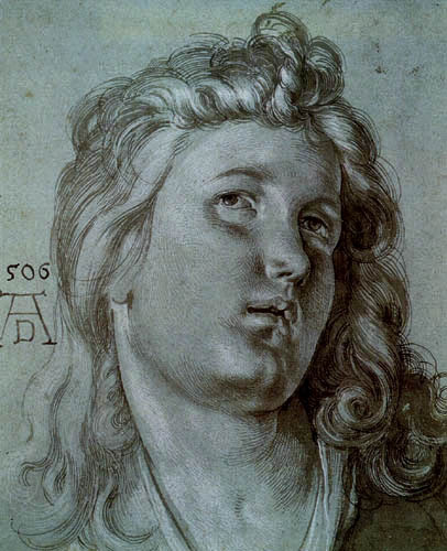
In 1505 Durer travelled to Venice and developed one of his most elegant drawing techniques.Using a medium blue Venetian paper (made from blue rags) Durer drew with white gouache and dark ink to create luminous, chiaroscuro drawings. 


Albrecht Durer: Master Drawings, Watercolors and Prints from the Albertina
The Head of an Angel by Albrecht Durer, 1506, brush and ink with wash, heightened with white on blue paper.

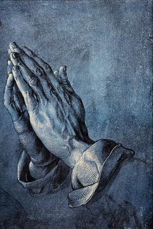
When Durer traveled back to Germany he did not take this Venetian paper with him, but started making his own paper prepared with a ground, usually blue, but sometimes green and gray. This is how Durer made one of his most icon drawings “The Praying Hands”. The drawing was created in 1508 as a study for an altarpiece for a Frankfurt church (which burned down in 1724). The drawing was done as a part of a larger study of one of the apostles. The drawing was later cut down and made into two separate drawings.  (see below).


Albrecht Durer: Master Drawings, Watercolors and Prints from the Albertina
Praying Hands by Albrecht Durer, 1508, brush and wash, heightened with white on blue prepared paper.

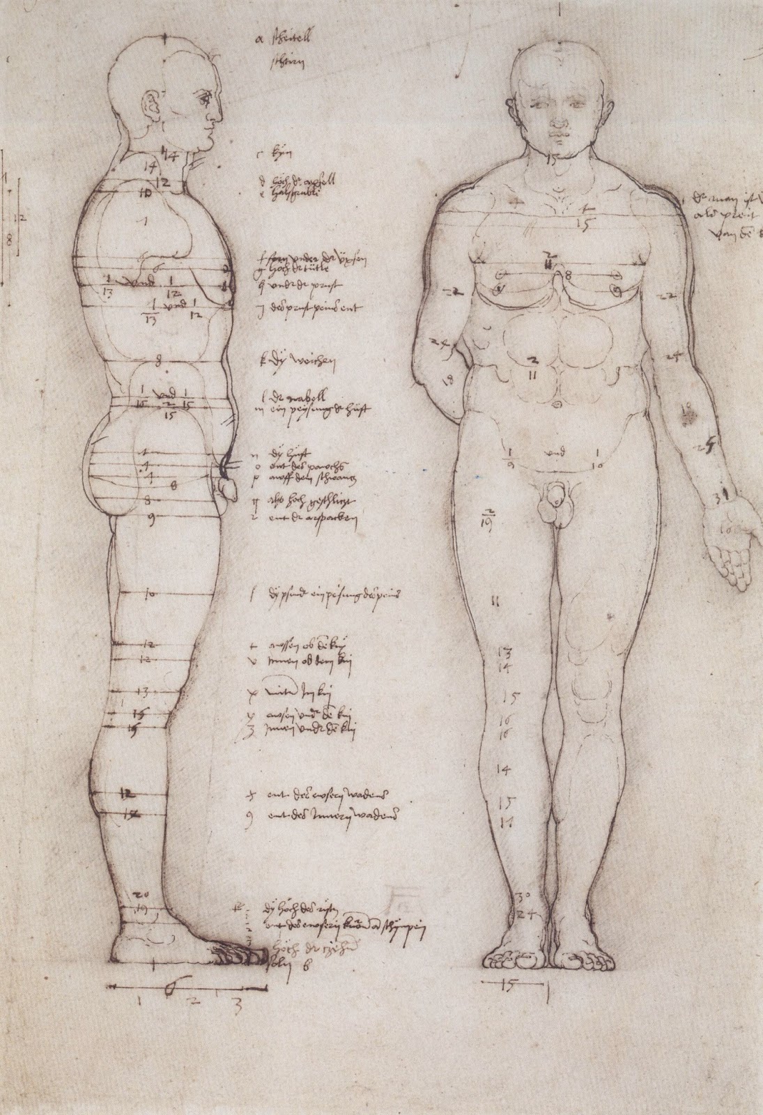
Durer introduced many important artistic traditions to his Northern European colleagues. His use of linear perspective, masterfully complex woodcuts and engravings transformed printmaking. Durer’s treatises on human anatomy and proportion transformed the way artists depicted the figure. Finally, like Leonardo, Durer was fascinated with the overlap of science and art.


Albrecht Durer: Master Drawings, Watercolors and Prints from the Albertina
                         Male Nude by Albrecht Durer, 1513, pen and brown ink on paper.

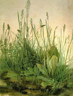
Indeed in Durer’s sublime watercolor “The Great Piece of Turf” (1503) his art “creates a balance between scientific observation and artistic poetry”.


Albrecht Durer: Master Drawings, Watercolors and Prints from the Albertina
The Great Piece of Turf  by Albrecht Durer, 1503, watercolor and gouache on paper.

In 1514 Durer experienced a personal crisis when his mother died. During his mourning he created his “master prints” about despair and death. They include his print of St. Jerome for which he did his magnificent study.


Albrecht Durer: Master Drawings, Watercolors and Prints from the Albertina
An Elderly Man of Ninety-Three Years by Albrecht Durer, 1521, brush and ink, heightened with white on gray-violet  prepared paper.

The National Gallery of Art exhibits closed in June. However I highly recommend the superb catalog published by the National Gallery of Art.It is called "Albrecht Durer, Master Drawings, Watercolors and prints from the Albertina" by Andrew Robison and Klaus Albrecht Schroder.


Otitis Media

By |August 19th, 2013|Syndicated Content|

This editorial illustration was created for a September 2013 cover of American Family Physician. The image summarizes Otitis Media, infection of the middle ear. Although several subtypes of otitis media are distinguished, the term is often used synonymously with acute otitis media. It is very common in childhood. An integral symptom of acute otitis media […]

Anatomy of Sports Day 2013

By |August 17th, 2013|Syndicated Content|

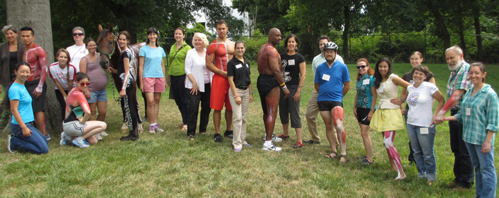
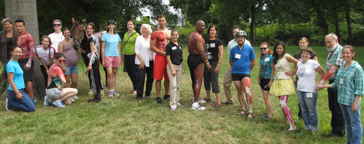
Group picture of the participants in Anatomy of Sports day 2013. Medical illustrators, athletes and physical therapists. Athletes, physical therapists and medical illustrators at the National Museum of Health and Medicine in Silver Spring outside of Washington, DC. Planning out and sketching muscles on lower leg. Athlete for running couldn't make it last minute so we had a gracious volunteer jump in to fill the void. We are highlighting the muscles involved in running so that [...]

The Office Purge

By |August 16th, 2013|Syndicated Content|

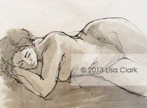
I began an office purge today and found some old figure drawings that reminded me why I started drawing in the first place. Almost everything I do now is fairly neat and tidy. Diagrammatic. Instructional. Careful. Exact. I had almost forgotten how much fun it was to be […]

The post The Office Purge appeared first on Clark Medical Illustration.

The Office Purge

By |August 16th, 2013|Syndicated Content|

I began a purge of the office today and found some old figure drawings that reminded me why I started drawing in the first place. Almost everything I do now is fairly neat and tidy. Diagrammatic. Instructional. Careful. Exact. I had almost forgotten how much fun it was to be loose with ink and charcoal. Those [...]

3D Imagery and the Role of the Biomedical Visual Communicator in Biotechnology

By |July 29th, 2013|Syndicated Content|

Seeing is believing…or more importantly, understanding. The saying is never truer than when the content that you have to believe in, or understand, involves complex, scientific processes that, in real life, you could never see with the naked eye. Not only would those processes be nearly impossible for the average person to see (barring state-of-the-art imaging technology such as electron microscopes), but, if by some chance you could actually see them, it would also be very difficult to interpret what they were doing.

Such is often the problem in the biotechnology and pharmacology industries, whose researchers are working on innovative new drugs, cures, and instrumentation that operate on the cellular level. The right content specialist can play a vital role in ensuring that these clients do not miss their ZMOT.

When the client’s message involves proving to the FDA that their product should be approved, or to a prospective investor that they are not taking too great a risk, that ZMOT could make the difference between life and death for a company. So, when that message also involves a microscopic process that neither investor nor FDA official can see or understand, they need something more than a written explanation. They need a clear, visual story to explain the complexities of that process. Here is where 3D imagery can play an important role.

The right content specialist in such a case can, not only illustrate or animate the process, but can also translate the information into a language of visuals that the audience crucial to the ZMOT can understand. There is a very specialized field made up of medically and scientifically trained illustrators and animators that create visuals such as these every day. They are Biomedical Visual Communicators, more commonly known as Medical Illustrators. Having spent several years studying alongside medical students to learn the fundamentals of science, medicine, and anatomy these specialists are trained to help biotechnologists, pharmacologists, and physicians to communicate their message in the clearest way possible, using 3D imagery, traditional illustrations and animations.

Every day, millions of people treat their medical conditions by taking medications to alleviate symptoms or use internal devices to regulate conditions such as Parkinson’s disease. In many cases, those treatments are available on the market today because a biomedical visual communicator worked very closely with the companies developing them, creating imagery that illustrates exactly how that treatment affects the body.

Medications as common as acetaminophen or ibuprofen work at very specific cellular sites in the body, prompting cascades of effects that need to be understood in order for those medications to be deemed safe. Even external treatments such as radio-frequency therapy used to treat sports injuries trigger cascades of metabolic processes that must be evaluated before they can be released into the market. A biomedical illustrator can help clarify these mechanisms of action, speeding up the process of approval and bringing these treatments more readily to the market by assuring that the information—the content—is clear at that ZMOT.

About the Author

Myriam Kirkman-Oh
Guest Blogger & M.S. Medical Illustration

Myriam Kirkman-Oh is a medical illustrator and animator in the Bay Area. She is co-owner of KO Studios Medical Animation and Illustration, a company that produces award winning, high-end images in all media for the Biotechnology, Pharmacology, and Healthcare industries, among others. KO Studios can be found by visiting www.kostudios.com.

Permalink

Richard Diebenkorn, the Berkeley Years 1953-1966

By |July 14th, 2013|Syndicated Content|


I have always enjoyed the “Ocean Park” series of abstract paintings by Richard Diebenkorn (1922-1993). These paintings were done when Diebenkorn moved to Los Angeles and comprise his signature style. These large canvasses evoke the light and landscape of southern California.


Richard Diebenkorn, the Berkeley Years 1953-1966
                                        Ocean Park No. 54, 1972 oil on canvas.

While in San Francisco last month I had an opportunity to visit an exhibition of Diebenkorn’s early work, specifically the pieces created from 1953-1966 when he lived in Berkeley. The exhibition is at the de Young Museum in Golden Gate Park and is very comprehensive and enlightening. 


Richard Diebenkorn, the Berkeley Years 1953-1966
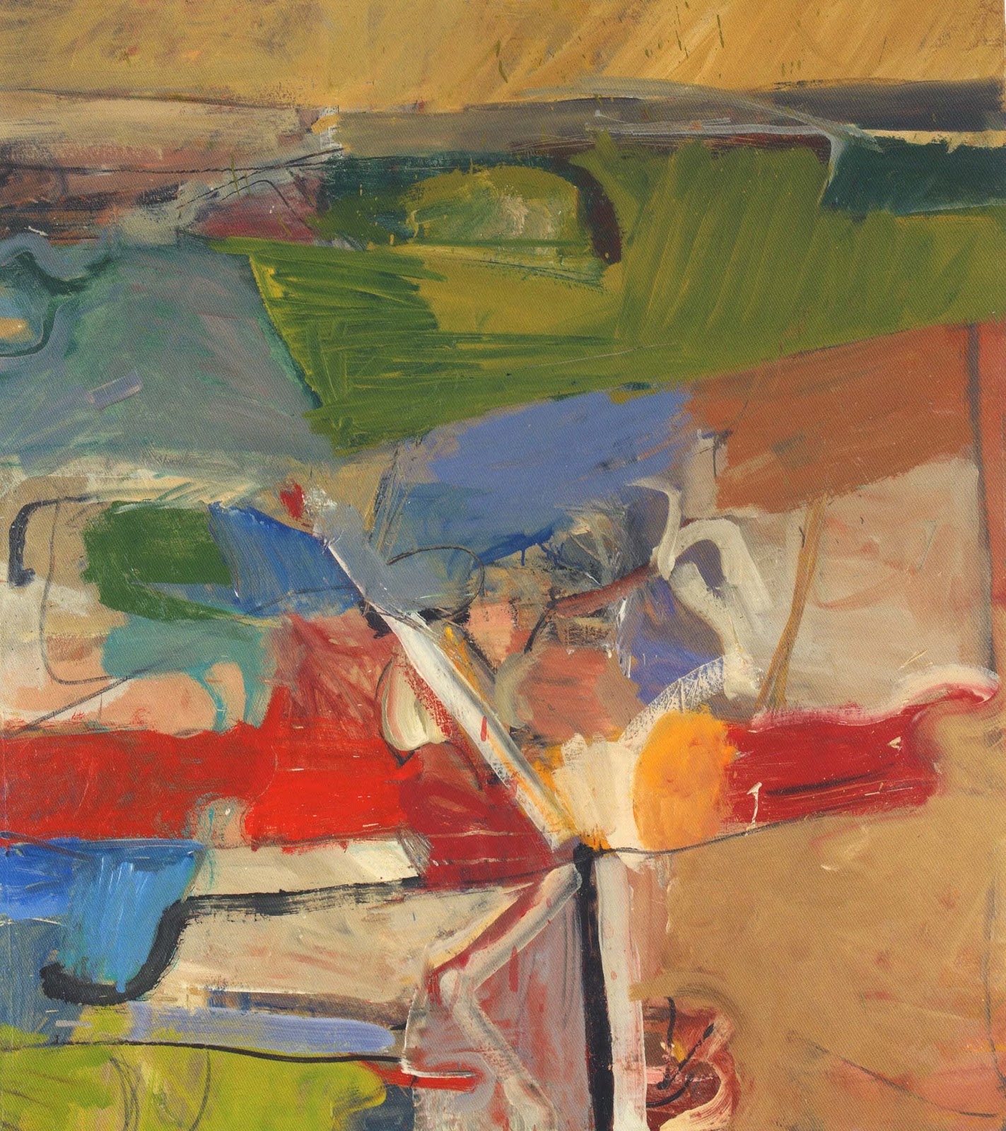
                                        Berkeley No. 13, 1954, oil on canvas.
                         
The earliest works in the exhibition are indeed abstract, graffiti like ink drawings, influenced by the abstract expressionists, specifically de Kooning. As time passes Diebenkorn’s work, much praised by the art community for its energetic, abstract qualities, becomes more figurative.

Richard Diebenkorn, the Berkeley Years 1953-1966
                                            Untitled (Berkeley), 1954, ink on paper.

 In 1955 he created “Chabot Valley” his first representational landscape. His shift to figurative work shocked the art world.  In 1957 Diebenkorn wrote, “Temperamentally perhaps I had always been a landscape painter.” He further commented, “Abstract literally means to draw from or separate.  In this sense every artist is abstract… a realistic or non-objective approach makes no difference.  The result is what counts.”


Richard Diebenkorn, the Berkeley Years 1953-1966
                                   Chabot Valley, 1955, oil on canvas.

Throughout these years Diebenkorn returns to drawing from the figure. His 1958 piece “Woman in Profile” uses energetic layers of impasto  to describe a woman. Diebenkorn paints the organic shapes of the figure and juxtaposes them to the landscape outside; the grid pattern of the windows unites the two worlds.


Richard Diebenkorn, the Berkeley Years 1953-1966
                                 Woman in Profile, 1958, oil on canvas.

Diebenkorn’s figure studies or “exercises in seeing” as he describes them reveal his thought process and works to come. While visiting Leningrad in 1965 his works take on a Matisse like quality using pattern and flat color. These works anticipate the “Ocean Park” series.


Richard Diebenkorn, the Berkeley Years 1953-1966
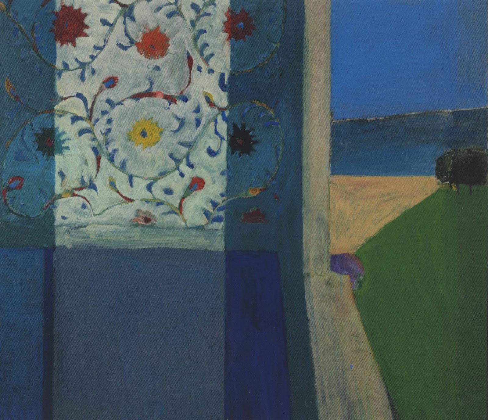
                           Recollections of a Visit to Leningrad, 1965, oil on canvas.

Diebenkorn is a unique American artist.  This exhibition of his early work enlightens and informs our undertsanding of his signature work. I highly recommend a visit to the de Young Museum for this impressive exhibition.The exhibition catalog, with essays by Emma Acker, Steven A. Nash and Timothy Anglin Burgard, is excellent.


Nanolipogel Art: Winner of AOI Illustration Awards 2013 Research & Knowledge

By |June 10th, 2013|Syndicated Content|

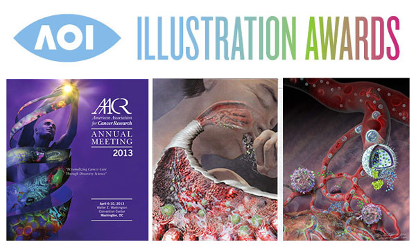
I’m pleased–and surprised and humbled–to announce that my artwork created for Dr. Tarek Fahmy’s laboratory and the National Science Foundation won in the Research & Knowledge category of the 2013 AOI illustration awards. www.aoiimages.com From the AOI: Visual showcase for recently published … Continue reading

Gustave Moreau Home and Studio in Paris

By |June 6th, 2013|Syndicated Content|


In March I had the occasion to visit the home and studio of French Symbolist painter Gustave Moreau (1826-1898), now the Gustave Moreau National Museum and open to the public. Located in the 9tharrondissement of Paris, on a residential street, is this wondrous artists’ home. 

Gustave Moreau Home and Studio in Paris
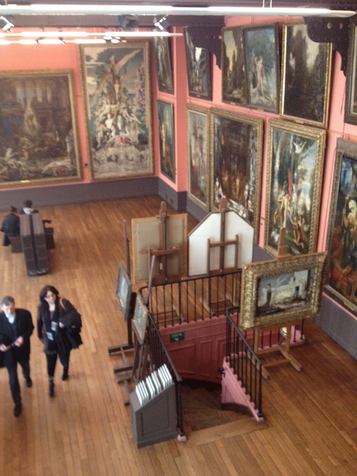
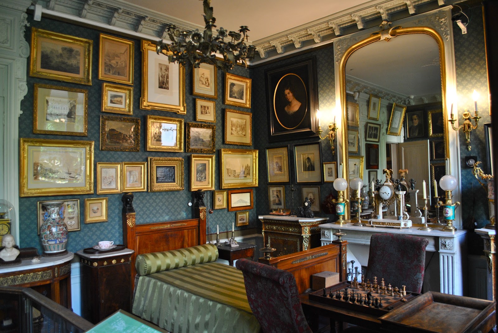
                                         Interior of Gustave Moreau's home


Gustave Moreau lived and worked in this beautiful setting from 1852, until his death in 1898. The living quarters are small and lavishly decorated with artwork, fine furniture and ceramics. 


Gustave Moreau Home and Studio in Paris
                                             View of the second floor studio

To visit the studio, located on the second and third floors, is to be transported to Moreau’s world.  The space is large and well lit by large windows and ample wall space for the numerous large-scale works. Moreau’s thousands of framed drawings are handsomely preserved throughout the studio in flat files and in cases behind drapes (to keep them from direct light exposure.)


Gustave Moreau Home and Studio in Paris
                 Spiral staircase that leads to the third floor studio and exhibition space.

Gustave Moreau was a most prolific artist creating an estimated 10,000 paintings drawings, sculptures and watercolors. His focus was large-scale biblical and mythological scenes.  His studio is a treasure trove of drawings, preparatory sketches and sculptures made in planning his paintings.  These preparatory objects offer insight into Moreau’s process. 


Gustave Moreau Home and Studio in Paris
                 Horse sculptures by Moreau, created as studies for his paintings.

While studying at the Ecole des Beaux-Arts Moreau was influenced by master painters such as Michelangelo and Rembrandt as well as ancient and medieval art.  He would go on to have an effect on the work of Matisse and the Fauves, as well as the surrealists and even the abstract expressionists.


Gustave Moreau Home and Studio in Paris
                   "Jupiter and Semele", 1895, oil painting by Gustave Moreau.

While still in his thirties Moreau wrote, “I think of my death and the fate of all these works and compositions I have taken such trouble to collect.  Separately they will perish, but taken as a whole they give an idea of what kind of an artist I was and in what kind of surroundings I chose to live my dreams.”
Gustave Moreau Home and Studio in Paris


                                  Third floor studio and exhibition space.

Moreau’s home opened to the public in 1903.  I highly recommend a trip to this fascinating collection.  I also recommend two books that contain chapters about the museum and collection.  “Artists in Residence” by Dana Micucci, this amazing book has inspired me to visit many artists’ homes,  in including those of Delacroix, Bonheur, Daubigny, Van Gogh and Monet. The book “Artists Houses” by Gerard-Georges Lemaire is also fascinating.


 All photographs by Marie Dauenheimer.


Science Art Gets Some Love: AOI Shortlisted Illustrations

By |May 31st, 2013|Syndicated Content|

Us science artists don’t get no respect… at least that’s what I thought until now. When I heard that the AOI (Association of Illustrators) added a Research & Knowledge category to their prestigious, international ‘Images’ competition, I was stoked to have … Continue reading

MEDinART

By |April 21st, 2013|Syndicated Content|

MEDinART is a site created and Directed by Vaisa Hatzi, PhD as an initiative of TEDMEDLive in Athens. The main goal of MEDinART is to highlight biomedical issues through different forms of art, connect med-inspired artists, educate the general public and trigger biomedical scientists to communicate scientific issues using inspiring and innovative ways.A video created from the work of medical inspire [...]

MEDinART

By |April 21st, 2013|Syndicated Content|

MEDinART is a site created and Directed by Vaisa Hatzi, PhD as an initiative of TEDMEDLive in Athens. The main goal of MEDinART is to highlight biomedical issues through different forms of art, connect med-inspired artists, educate the general public and trigger biomedical scientists to communicate scientific issues using inspiring and innovative ways.A video created from the work of medical inspired artists (myself included) was used to open the TEDMED conference in Athens. I'm a big TED fan so [...]

Diverticulitis

By |March 27th, 2013|Syndicated Content|

This editorial illustration was created for a May 2013 cover of American Family Physician. The image summarizes Diverticulitis, a common digestive disease which involves the formation of pouches (diverticula) within the bowel wall. This process is known as diverticulosis, and typically occurs within the large intestine, or colon, although it can occasionally occur in the […]

“Hands Free” Femoral Retraction

By |March 27th, 2013|Syndicated Content|

The illustration posted in this example was created for the April 2013 issue of Orthopaedics feature and peer-reviewed article, Technical Trick: Simple, No-Hands Retraction for Lateral Approach to the Proximal Femur. A simple technique is described that allows the orthopaedic surgeon to perform no-hands retraction during the lateral approach to the proximal femur during fixation […]

MenoDepression

By |March 27th, 2013|Syndicated Content|

The illustration depicted was created for the April 2013 26(4) issue of JAAPA feature article, Treatment options for major depression during the menopausal (Bobbie Posmontier, PhD, CNM, PMHNP-BC). Compared to men, women experience 1.7 times the prevalence of depression, largely because of fluctuations in reproductive hormones. Even without a prior history of depression, vulnerability to […]

The Philadelphia Chromosome

By |March 26th, 2013|Syndicated Content|

This illustration was created for JAAPA, February 2013 • 26(2). The Philadelphia chromosome is formed when a piece of chromosome 9 exchanges places with a piece of chromosome 22, resulting in a balanced translocation t(9;22)(q34;q11) and the formation of an abnormal fusion gene BCR-ABL1. Chronic myeloid leukemia (CML) is a myeloproliferative neoplasm. The American Cancer […]

Blogging from Paris

By |March 19th, 2013|Syndicated Content|


Tomorrow I fly to Paris with my daughter Lily.  We plan on sketching and visiting museums we have heard about, but never had the opportunity to see.  I hope to blog about these collections from my iPad.


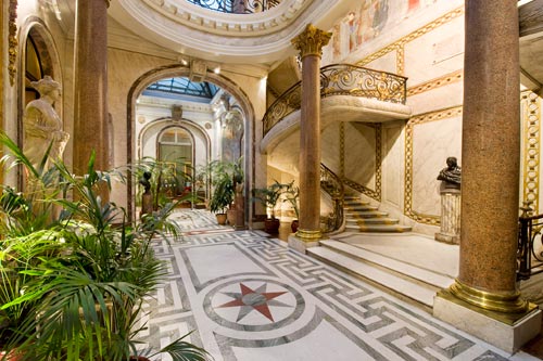
As a preview here are a few of the museums we hope to visit. At the top of the list is the Musee Jacquemart Andre, recommended by friends Laura Primrose and Avery Fullerton.  This late 19th century mansion houses what looks to be an exceptional collection of paintings, sculptures and decorative arts.  The museum is currently the venue for a Eugene Boudin landscape painting exhibition.


Blogging from Paris
                                     Inside the Musee Jacquemart Andre

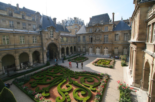
Also on the list is Musee Carnavalet, set in two Renaissance style mansions in the Marais section of Paris, this museum highlights the history of Paris.


Blogging from Paris

                                       Central garden at Musee Carnavalet


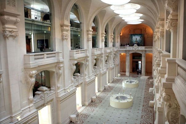
The Musee des Arts Decoratifs is know for their elegant exhibitions of fashion history. The collection offers furniture and fashion designs from the Middle Ages through the present day.  While there Lily and I hope to see the current exhibition “Fashioning Fashion: Two Centuries of European Fashion 1700–1915”.


Blogging from Paris
                                      Inside Musee des Arts Decoratifs.

Finally we hope to visit Musee Gustave Moreau, the former home and studio of 19th century symbolist Guatve Moreau with thousands of his works on view.


Blogging from Paris
                                         Inside Musee Gustave Moreau.

If time permits we hope we return to the Musee D’Orsay, and visit the Petite Palais and Musee Eugene Delacroix.

Watercolor Wash Drawing with Robert Liberace

By |March 10th, 2013|Syndicated Content|


As many of you know I frequently blog about master drawings and the process of how they were created.  I am currently taking a master drawing techniques class at the Art League in Alexandria, Virginia.  The instructor, the renowned Robert Liberace, is an accomplished painter, draughtsman and sculptor.


Watercolor Wash Drawing with Robert Liberace

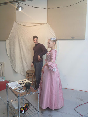
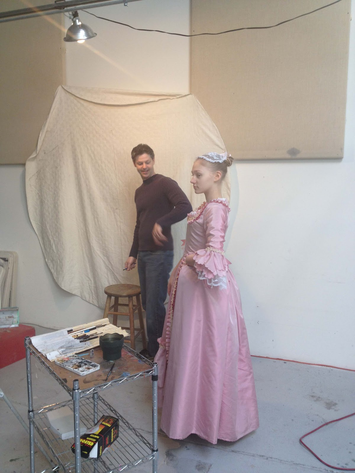
                   Model Lily Dunlap with Robert Liberace as he sets up the pose.


In todays class Liberace created two very different portraits using watercolor washes.  The portraits were of my husband and daughter who modeled in 18th costume.


Watercolor Wash Drawing with Robert Liberace
              Robert Liberace working on painting of Lily in 18th century costume.

For Liberace the process starts with setting up the pose and lighting.  As he choreographs the pose he thinks about the light, form, pattern and composition.  For the watercolor painting he did of Lily he used a monochromatic watercolor wash on Twinrocker handmade paper.  Watercolor wash, unlike ink wash, can be moved around and manipulated, ink wash tends to stain the paper.


Watercolor Wash Drawing with Robert Liberace

                         Watercolor wash painting of Lily by Robert Liberace.


As Liberace builds up the form he is conscious of not over working the dress, he wants to keep the image fresh and fluid.  He lets the white of the paper show through as the highlights and lighter values. he uses dark accents to describe areas of shadow.  The fluidity of his brushwork is remeniscent of Tiepolo. The figure’s dress and pose recall Rococo artists such as Watteauand Fragonard.


Watercolor Wash Drawing with Robert Liberace

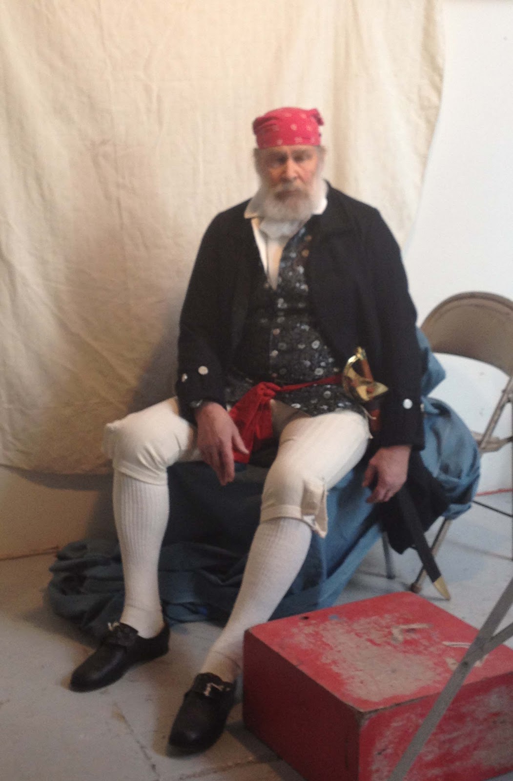
                                      Sam Dunlap posing as a buccaneer.


For the watercolor portrait of Sam, as a buccaneer, Liberace started with a light graphite sketch and progressed to blocking in the flat areas of color with light washes.  As he worked he carefully observed the model and the nuances of light, shadow and color temperature.  The resulting portrait is a sensitive study, done with a confident and energetic brushwork, that captures the character of the sitter.


Watercolor Wash Drawing with Robert Liberace
                      Watercolor wash portrait of Sam by Robert Liberace.

Dissecting Art, Intersecting Anatomy

By |March 9th, 2013|Syndicated Content|

Dissecting Art, Intersecting Anatomy: Merging contemporary art with the works of Pauline Lariviere. This exhibit was organized by a small group of esteemed Chicago-based artists and entrepreneurs interested in medical art, and guest-curated by the ever fabulous Vanessa Ruiz of Street Anatomy. [...]

Dissecting Art, Intersecting Anatomy

By |March 9th, 2013|Syndicated Content|

Dissecting Art, Intersecting Anatomy: Merging contemporary art with the works of Pauline Lariviere. This exhibit was organized by a small group of esteemed Chicago-based artists and entrepreneurs interested in medical art, and guest-curated by the ever fabulous Vanessa Ruiz of Street Anatomy."The exhibition is an homage to Pauline Lariviere (1906–1988), a French-Canadian artist whose fame came from her extensive work in medical and anatomical illustration. Lariviere had a very di [...]

Visiting Cezanne’s Studio in Aix en Provence, France

By |March 4th, 2013|Syndicated Content|


“This house in which there was no furniture or ornaments, was filled up by the presence of the artist, there existed a visible harmony between the two.”  Georges Riviere, art critic


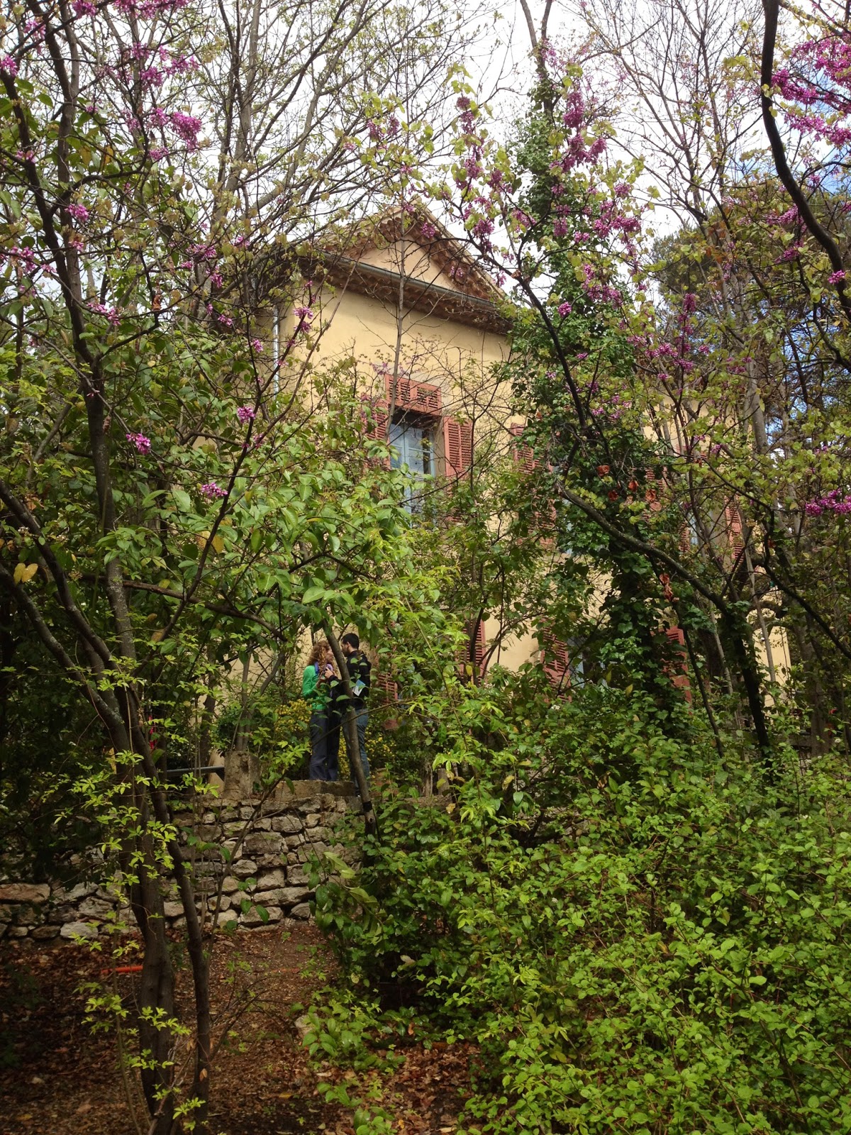
             Cezanne's studio in Aix en Provence.  Photo by Marie Dauenheimer.


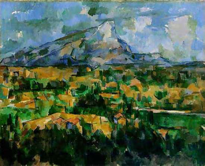
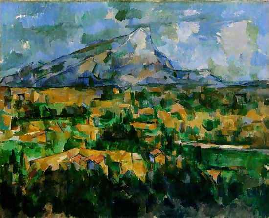
Last year I had the unique experience of visiting Paul Cezanne’s (1839-1906) studio in Aix en Provence, France.  It was the last studio Cezanne would have and he would spend four productive years painting there.  The studio was build under Cezanne’s direction and completed in 1902.  The plot of land was selected to offer a view of Cezanne’s muse and often-painted motif, Mont Sainte Victoire.  It is estimated that Cezanne painted his beloved mountain over 100 times.


Visiting Cezanne’s Studio in Aix en Provence, France
                                Painting by Cezanne of Mont Sainte Victoire.

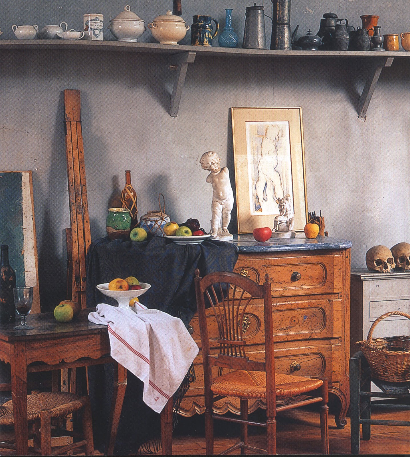
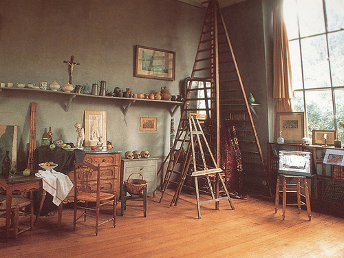
I visited with my daughter on a drizzly afternoon in April. Lilacs and other flowering trees were blooming outside the studio. The building is a solid structure, with a yellow stucco exterior and muted salmon colored shutters.  While none of Cezanne’s paintings are on view at the studio you get a sense of the artist through what is left behind, his still life props, easel and other accouterments.  This presence and sense of the artist is the reason I love visiting artist’s studios and homes. 


                                            Cezanne's studio, interior view.

Cezanne is said to have kept regular business hours for painting.  He arrived at the studio in the morning and worked until evening surrounded by the blue gray walls and the cherished objects, bowls, sculptures and skulls, that fill his canvasses.  Large windows offered both southern and northern exposures.


Visiting Cezanne’s Studio in Aix en Provence, France

                                       Cezanne's studio, interior view.


After Cezanne’s death in 1906 the studio was not used for 15 years. Cezanne’s son sold the studio in 1921 and finally the studio opened to the public in 1952.


Visiting Cezanne’s Studio in Aix en Provence, France
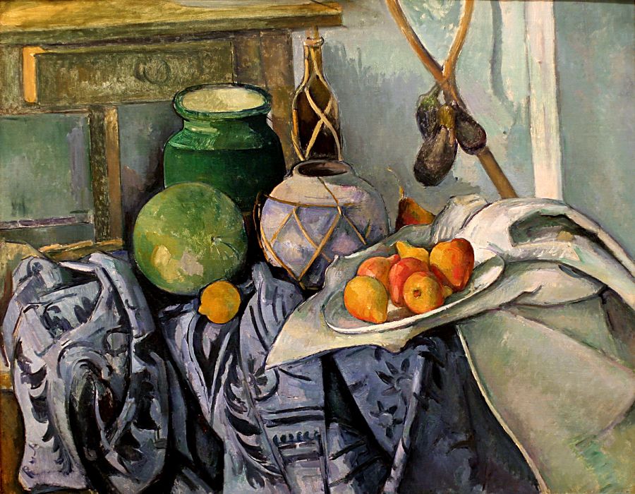
                     A still life painting by Cezanne featuring objects in his studio.

If you are in Provence I highly recommend a visit to the studio as a homage to Cezanne and his masterful works. For more information on visiting the studio go to 

www.atelier-cezanne.com

Painting on Paper, Josef Albers in America

By |February 25th, 2013|Syndicated Content|


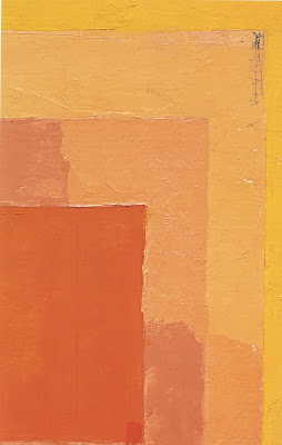
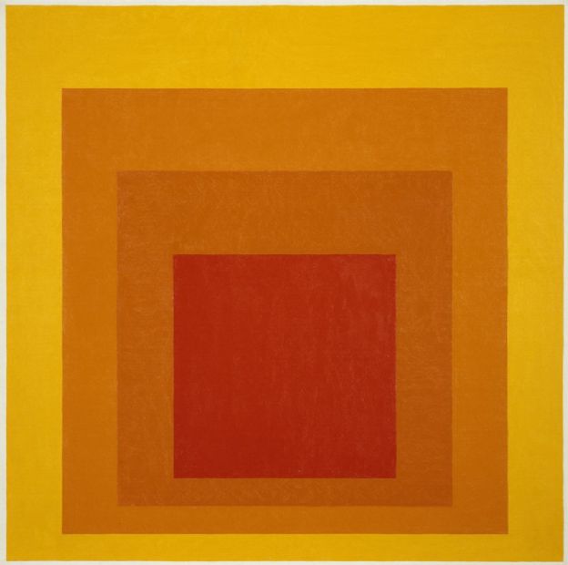
“Color is fooling us all the time”, so said color theorist and painter extraordinaire Josef Albers.  Josef Albers (1888-1976) a German painter, who taught at the Bauhaus, is best known for this minimalist paintings, advances in art education and influence in the study of color theory.


Painting on Paper, Josef Albers in America
      Color study for Homage to the Square by Josef Albers , oil on paper, date unknown.

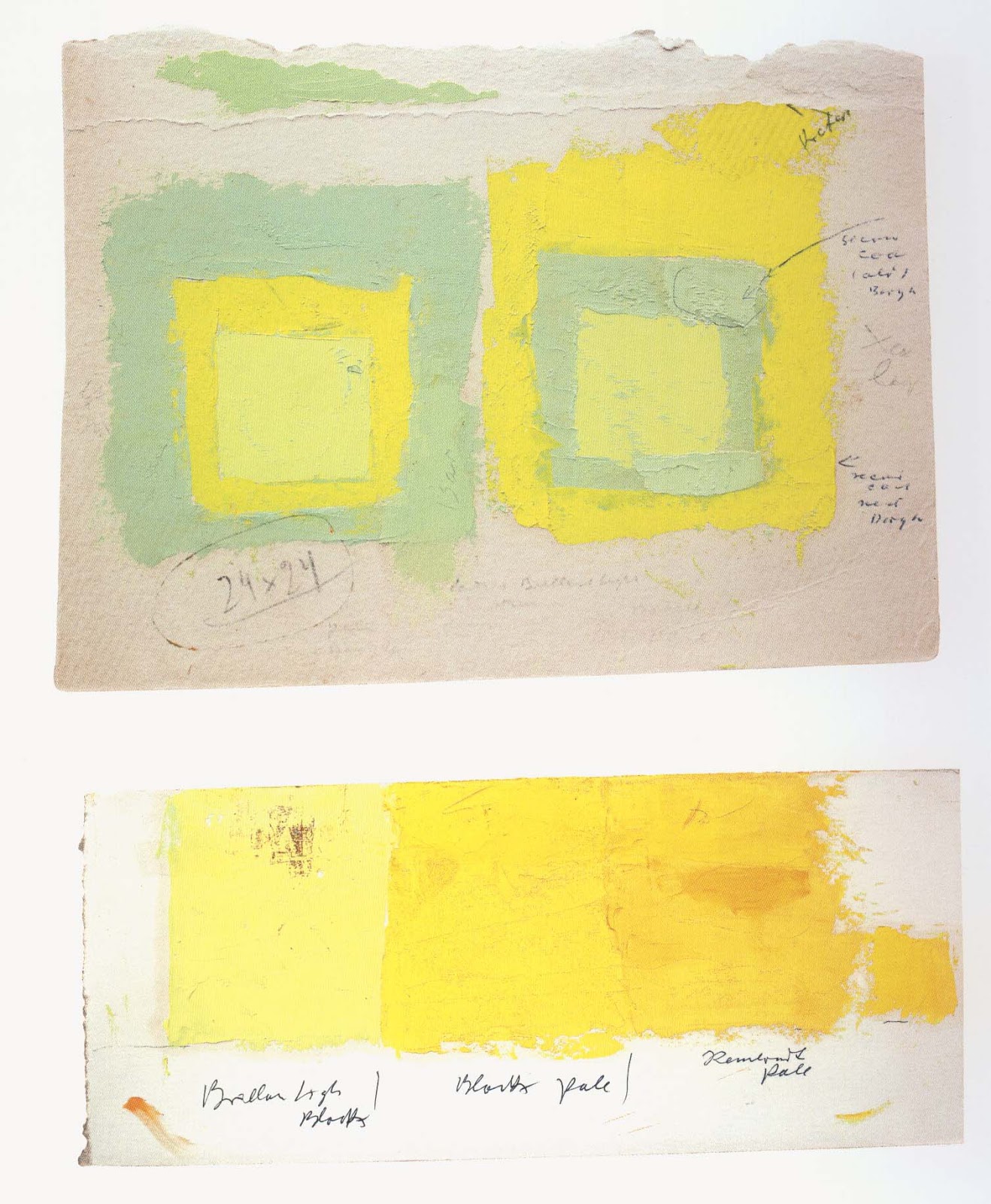
In September I had the pleasure of attending an exhibition of Albers’ works on paper at the Morgan Library in New York.  The show was  intriguing in that it featured eighty of Albers’ works on paper.  His working sketches if you will.  They offered insight into his process of his signature style geometric painting.


Painting on Paper, Josef Albers in America
  Color study for Homage to the Square by Josef Albers , oil on paper, date unknown.

Josef Albers had a stellar career in art education transforming ideas on color theory. He taught at the Bauhaus, from 1923-1933, with such luminaries as Wassily Kandinsky, Oskar Schlemmer and Paul Klee, under the direction of Walter Gropius. In 1933 he emigrated to the United States and became director at the Black Mountain College in North Carolina, where his students included Robert Rauschenberg and Cy Twombly.  Finally in 1950 he landed at Yale Universityfor the duration of his career. This is where he would spend the next 25 years experimenting with color and his geometric paintings.

Painting on Paper, Josef Albers in America
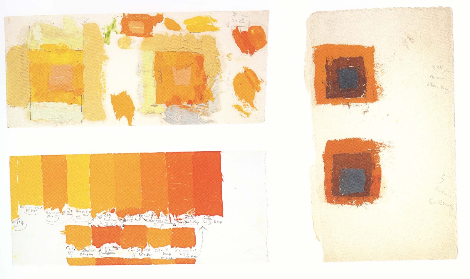
 Color study for Homage to the Square by Josef Albers , oil on paper, date unknown.

Albers is best known for his abstract painting of overlapping squares featuring color harmonies.  He never mixed his colors, but rather used color directly from the tube applied carefully with a palette knife.  His small scale, hard edge, symmetrical compositions were a response to the large and gestural works of the abstract expressionists and he would go on to influence movements such as minimalism and op art.


Painting on Paper, Josef Albers in America
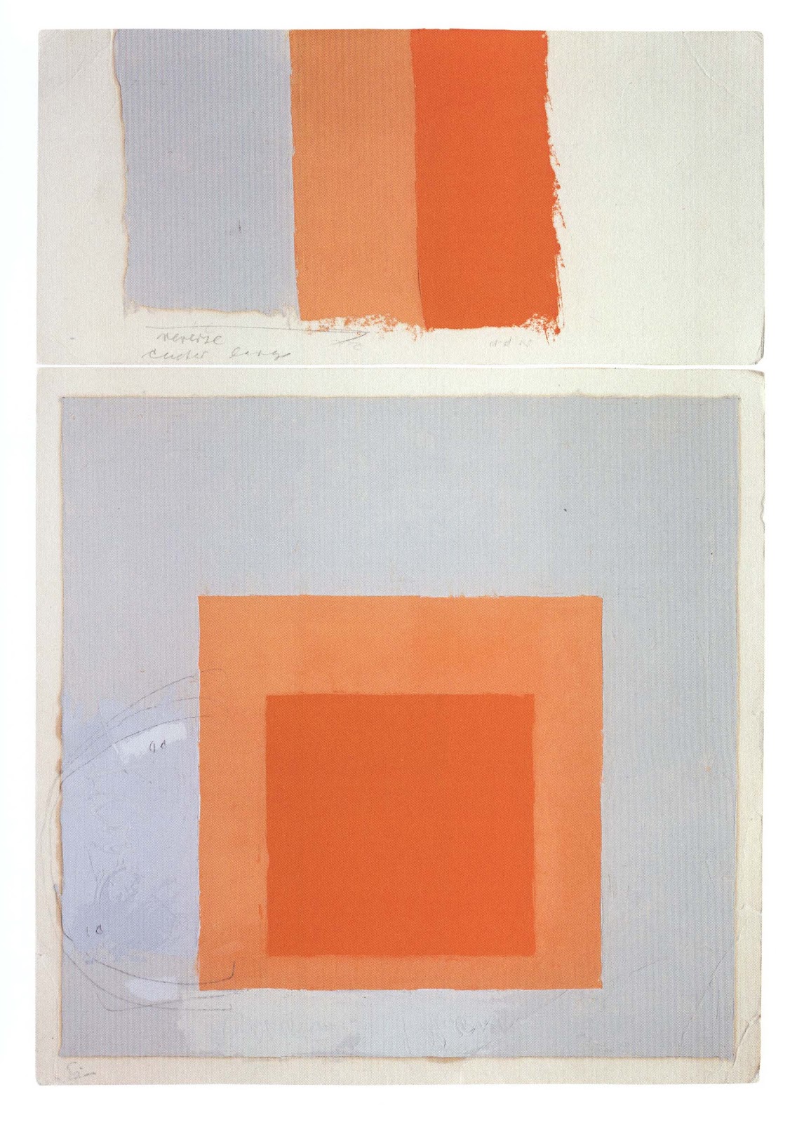
Color study for Homage to the Square by Josef Albers , oil on paper, date unknown.

From 1950 until 1976 Albers focused on his homage to the square or as he said “I am not paying “homage to the square”.   It’s only the dish I serve my craziness about color in”.


Painting on Paper, Josef Albers in America
 Color study for Homage to the Square by Josef Albers , oil on paper, date unknown.

Indeed Albers was not crazy, but methodical in his observations on color harmonies.  He noted on each piece what colors he used and what manufacturer made the paint, he annotated his use of varnish and other medium  “I am not an acrobat in my painting.  I am a cook”.


Painting on Paper, Josef Albers in America
                  Josef Albers, oil on canvas, Hirschhorn Museum, date unknown.

The catalog for this exhibition “Painting on Paper, JosefAlbers in America” includes a few fascinating essays by Heinz Liesbroc, Michael Semff and Isabelle Dervaux.


"Durer to de Kooning" Master Drawings at the Morgan Library

By |February 11th, 2013|Syndicated Content|


It was a pleasure to view the “Durer to de Kooning, 100 Master Drawings from Munich” exhibition at the Morgan Library in New York.  The Morgan is a wonderful, intimate museum and often features master drawings exhibitions.

Those of you who follow my blog known I have a passionate interest in master drawings.  I enjoy looking, studying and copying them.  I enjoy using master drawings techniques in my work. Since I have been using pen, ink and wash, charcoal, and red chalk as of late I decided to focus on drawings in the exhibition that utilize these materials.


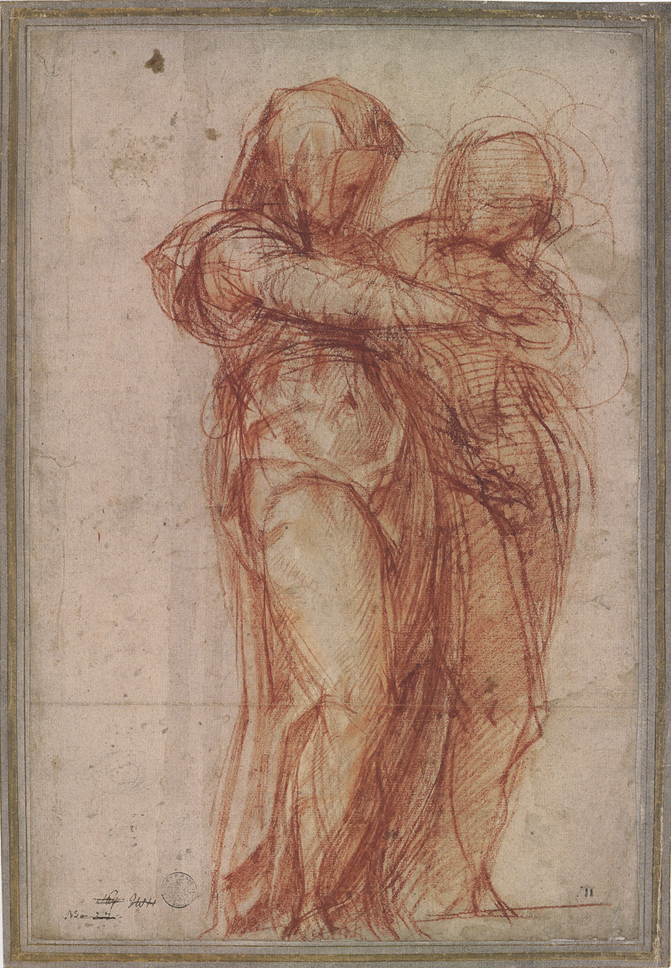
All the drawings in this exhibition were truly masterful and compelling in their own way.  The ones I was most attracted to were done in a rapid visualization style and showcase an energetic rather than meticulous style.   Jacopo Pontormo’s (1494-1557) red chalkdrawing Two Standing Women, (1530) is stunning for its sense of animation and confident three dimensional rendering.  I love the way Pontormo suggests the fluidity of the gowns without over rendering.  This short hand of line allows the viewer to wonder and speculate about who these women are.


"Durer to de Kooning" Master Drawings at the Morgan Library
                 Red chalk drawing Two Standing Women by Jacopo Pontormo, 1530.

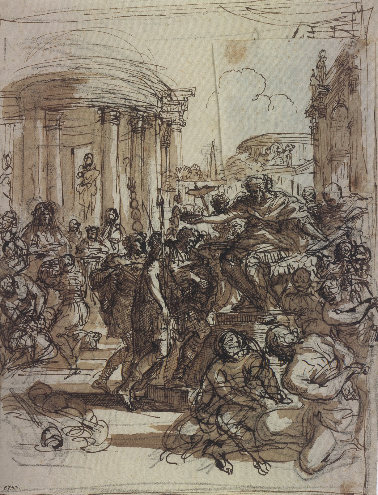
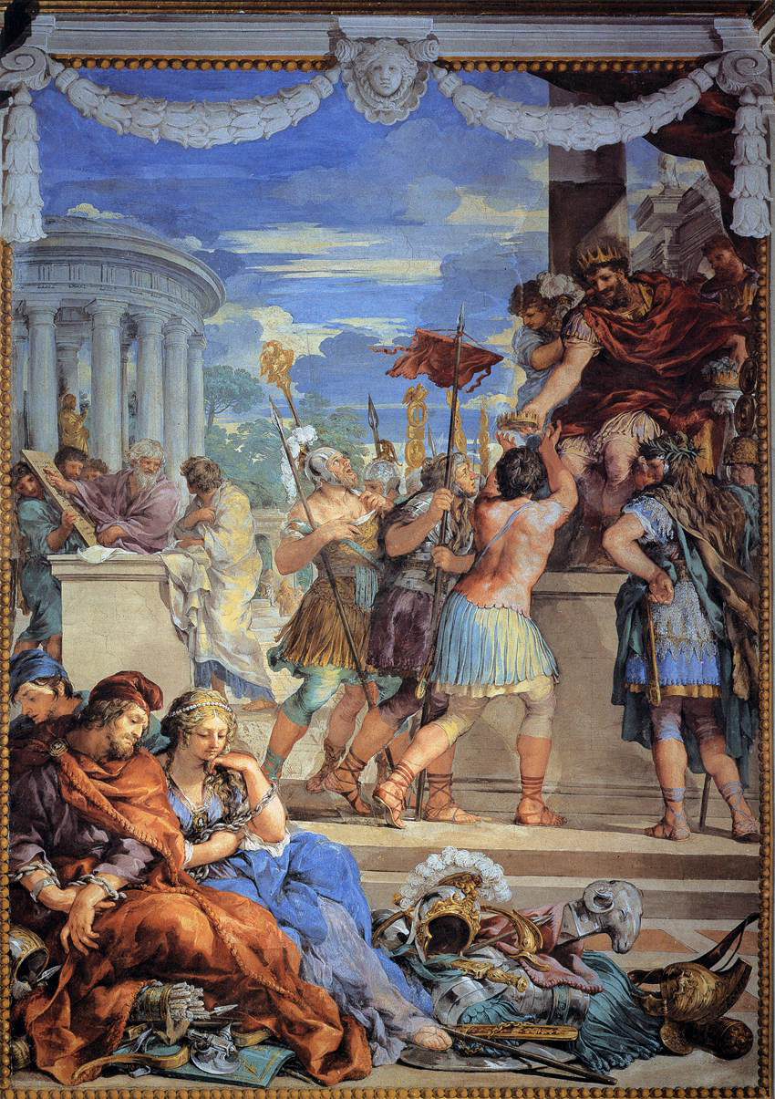
Pietro da Cortona (1596-1669), whose anatomical drawings I have long admired, surprised me with this dynamic pen and ink and wash portrayal of Age of Bronze: Design for a Mural in the Pitti Palace, (1641). As you can see from the finished fresco, Cortona worked out many of the compositional elements in this initial sketch.  A pentimento by Cortona can be seen in the upper right hand corner.


"Durer to de Kooning" Master Drawings at the Morgan Library
                       Pen and ink drawing Age of Bronze by Pietro da Cortona, 1641.

"Durer to de Kooning" Master Drawings at the Morgan Library
                            Fresco Age of Bronze by Pietro da Cortona, 1641.

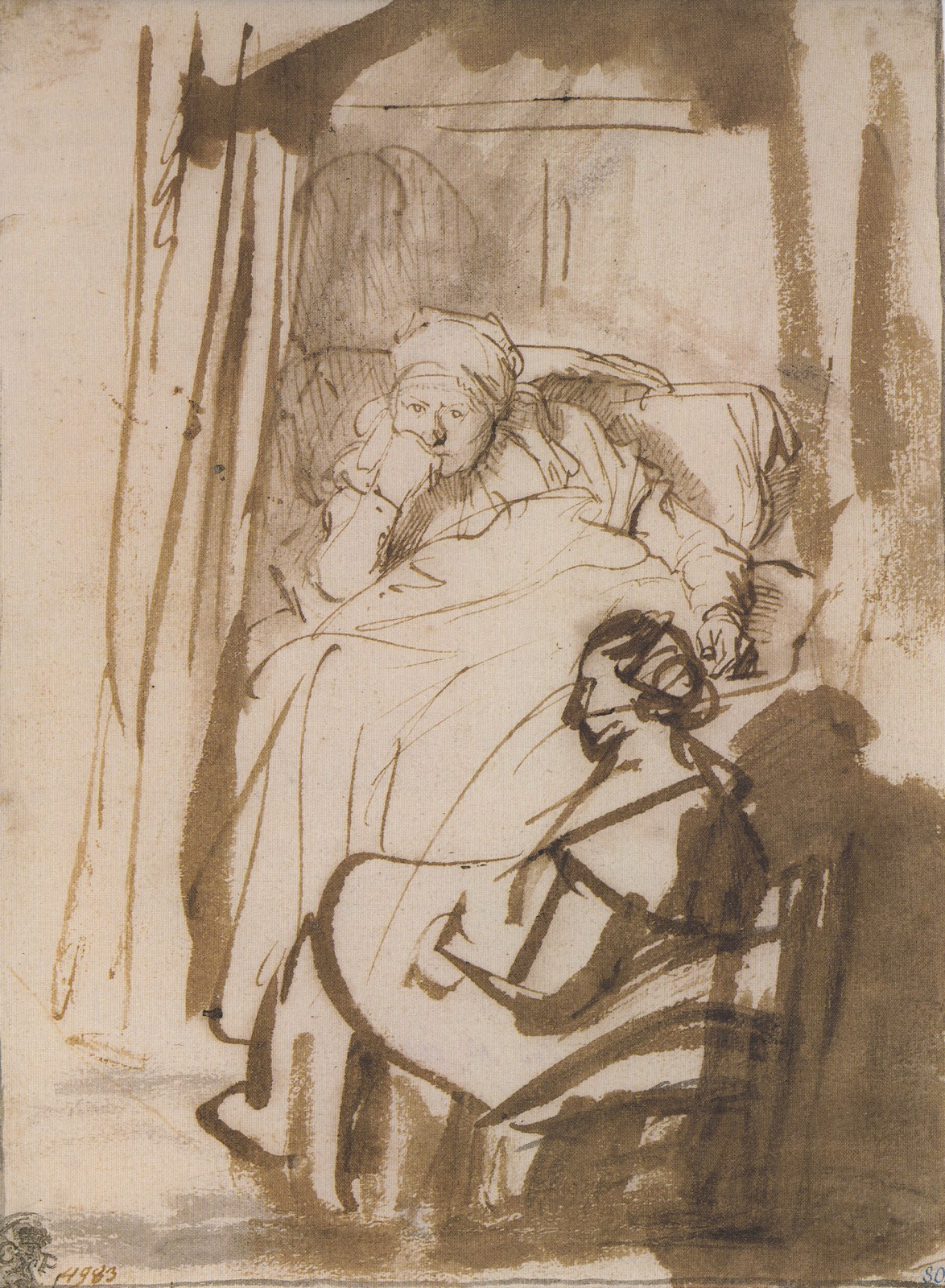
Rembrandt’s (1606-1669) pen, ink and brush drawings have an energy mirrored by his brushstrokes and layering of paint!  In his rapid sketch Saskia Lying in Bed, A Woman at Her Feet (1638) the focus is on Saskia (Rembrandt's wife) and her contemplative facial expression.  She is drawn with delicate, decisive pen lines, while the bedroom and maid are loosely described with swift brushstrokes.


"Durer to de Kooning" Master Drawings at the Morgan Library
 Pen, ink and brush drawing, Saskia Lying in Bed, A Woman at Her Feet by Rembrandt, 1638. 

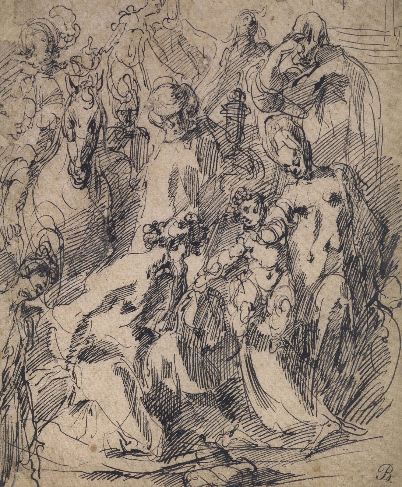
The pen and ink drawing Adoration of the Magi (1610) by Jacques Bellange (1575-1616) displays lively networks of hatched and crosshatched lines, which draw the viewer’s eye around this forceful drawing! 


"Durer to de Kooning" Master Drawings at the Morgan Library
         Pen and ink drawing, Adoration of the Magi by Jacques Bellange, 1610.

I wish I could share all 100 drawings with you!  I highly recommend the exhibition catalog by William M. Griswold and Michael Semff. And an excursion to the Morgan Library, always a delight!


“Color Line Light” Drawing exhibition at the National Gallery of Art

By |February 4th, 2013|Syndicated Content|


Yesterday I saw the new drawing exhibition, “Color, Line, Light,French Drawings, Watercolors and Pastels from Delacroix to Signac” at the National Gallery of Art in Washington, DC. The show was organized with Musée des Impressionnismes, Giverny and is on view in Washington, DC until May 26, 2013.


A wonderful antidote for the doldrums of winter this exhibition includes an impressive array of drawings, many in full color, from the mid 19th century to the early 20th century.  The 100 works, from the collection of James T. Dyke, show off many brilliant drawing techniques and subject matters ranging from landscape, still life to figures and portraits. Indeed this exhibition will make you reach for neglected art materials and experiment!


“Color Line Light” Drawing exhibition at the National Gallery of Art
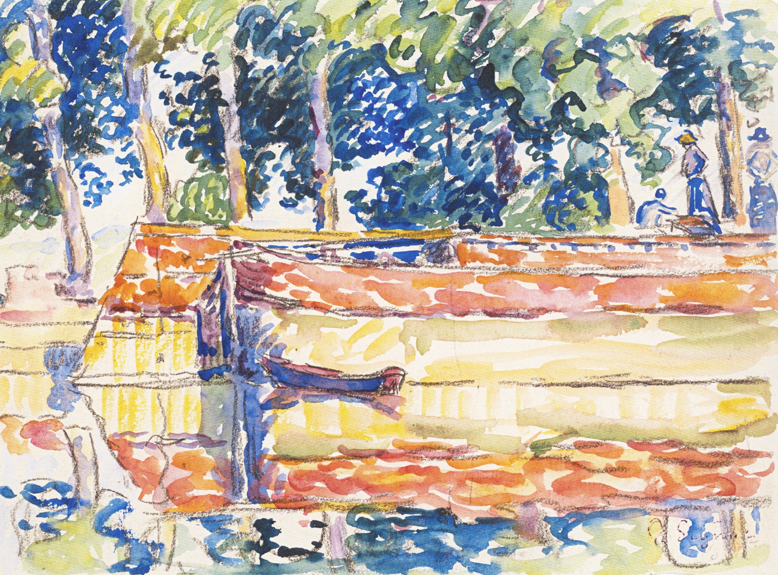
          Paul Signac, Barges on the Seine at Samois, 1900, Watercolor and gouache.

The drawing techniques showcased in this broadly ranging show includes watercolor, gouache, pen and ink, charcoal, pastel and mixed medium. The periods of art represented include romanticism, realism, impressionism, postimpressionism, pointillism (neoimpressionism), symbolism and the Nabis.


“Color Line Light” Drawing exhibition at the National Gallery of Art
                                   Paul Huet, A Meadow at Sunset, pastel.


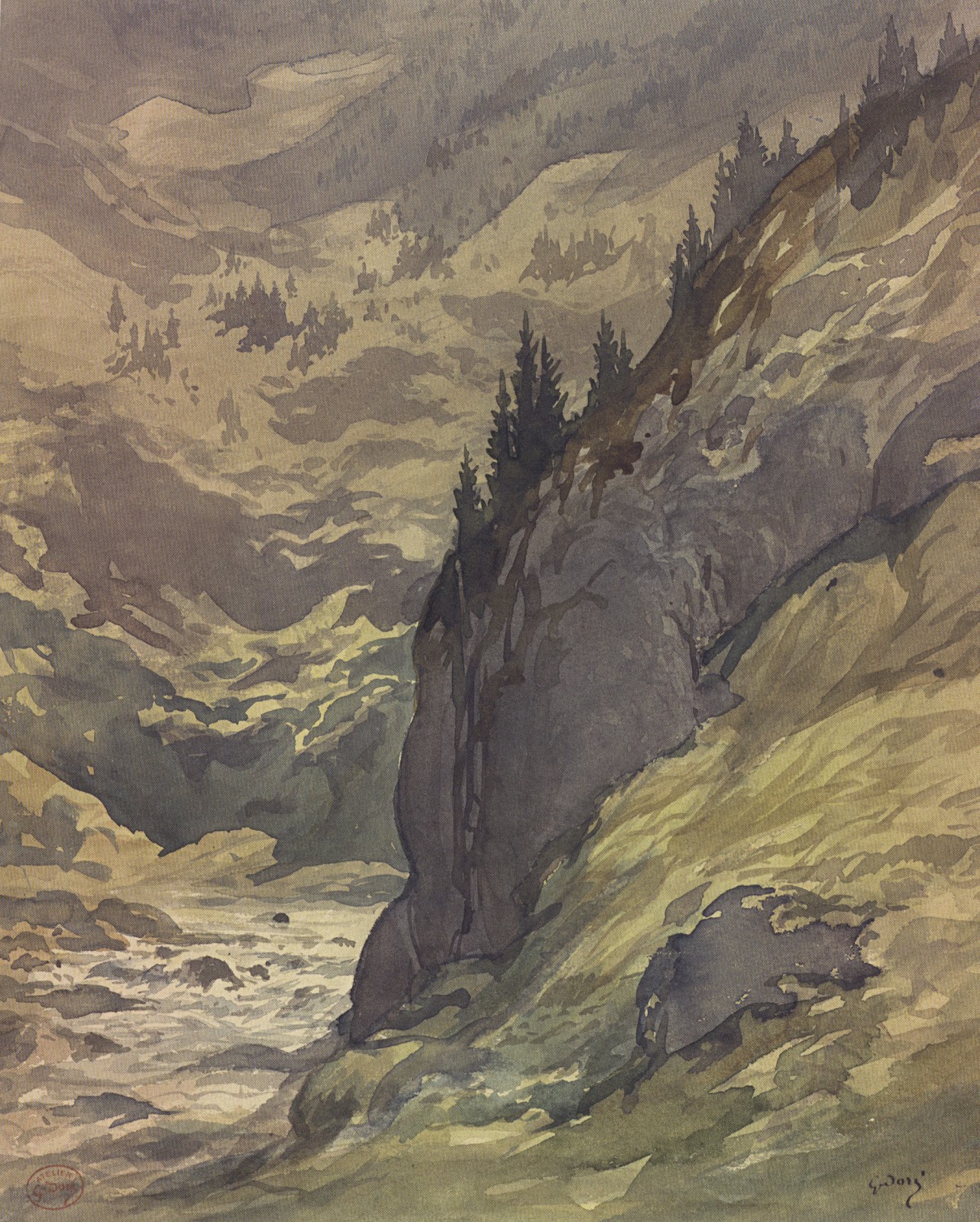
Watercolor techniques range from the tightly rendered paintings of Alexandre Calame, the confident brushwork of Gustave Dore, to the fresh and freely painted pointillist works by Paul Signac.


“Color Line Light” Drawing exhibition at the National Gallery of Art
                     Gustave Dore, A River Gorge in a Mountain Landscape, watercolor.

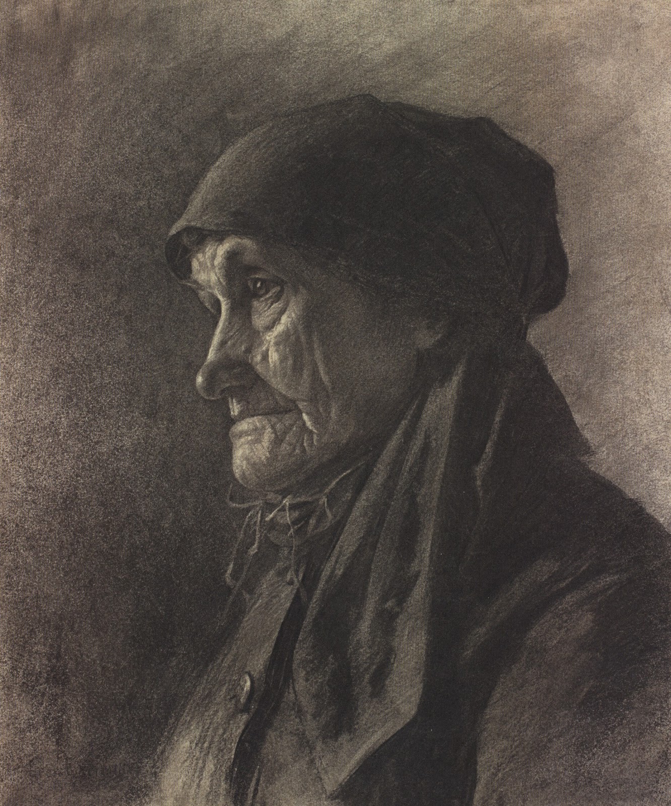
Charcoal drawings range from a luminous figure study by Albert Besnard to the dark, ominous, tonal work of Charles Angrand and sensitive realism of Leon Augustin Lhermitte.


“Color Line Light” Drawing exhibition at the National Gallery of Art
Leon Augustin Lhermitte, An Elderly Peasant Women, charcoal.

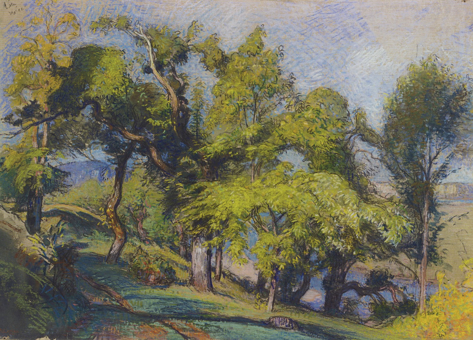
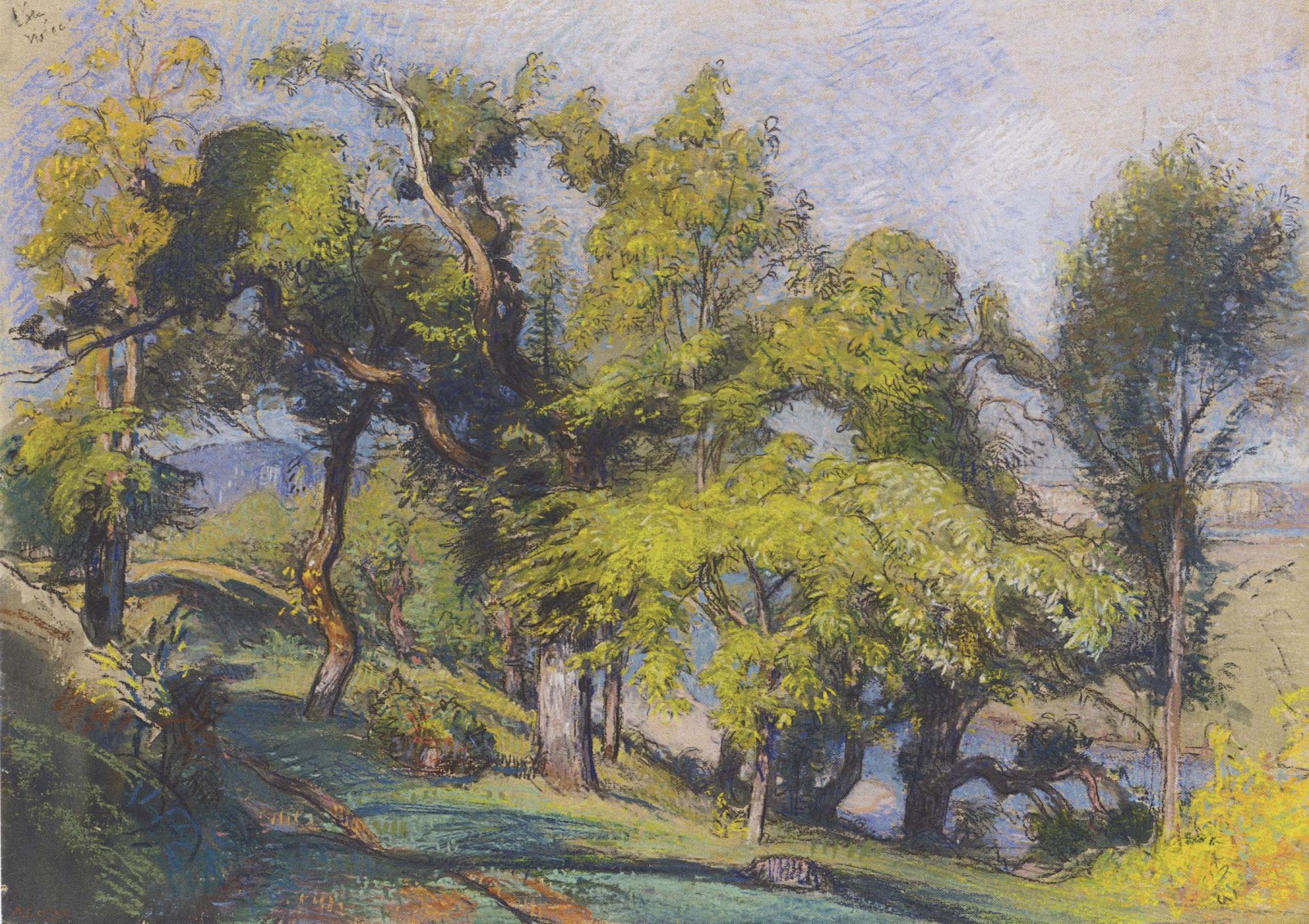
The show features the use of pastels, which in the 19thcentury became a favored medium by many artists thanks to the development of richer pigmented chalk pastels.  Paul Huet uses a bright palette to layer color in describing a meadow at sunset.  While Auguste Louis Lepere uses an analogous palette of pastels to draw a pastoral scene.


“Color Line Light” Drawing exhibition at the National Gallery of Art

                Auguste Louis Lepere, Chestnut Trees above a River, 1900, pastel.


It is often thought that the impressionist artists didn’t create many drawings as they painted spontaneously from life. This show offers many opportunities to see impressionist works on paper. An atmospheric pastel drawing by Claude Monet was done in London while he waited for his oils paints to arrive. Edgar Degas is one of many impressionist artists who enjoyed drawing techniques.  The exhibition includes a few masterful drawings by Degas they are inspired in their use of the compositional space and in there animated effects.


“Color Line Light” Drawing exhibition at the National Gallery of Art
                       Edgar Degas, A Dancer at the Bar, charcoal and white chalk.

I recommend an excursion to the National Gallery of Art to see this inspired exhibition.  I also recommend the exhibition catalog.

Drawing the Figure with Pen and Ink

By |January 28th, 2013|Syndicated Content|


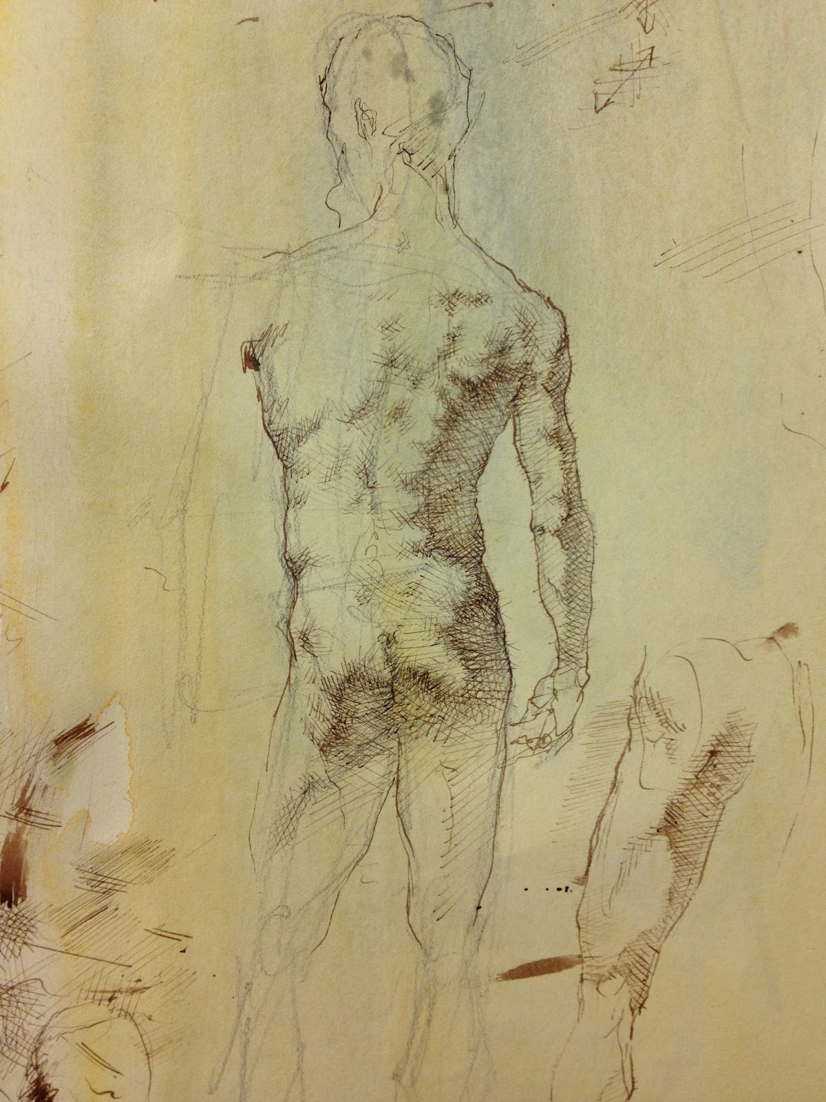
I am taking a class at the Art League in Alexandria, Virginia with instructor Robert Liberace. Liberace is an accomplished painter, sculptor and draughtsman. The class, “Figure and Portrait: A Modern Approach to Classical Drawing”, explores drawing the figure through master techniques, such as silverpoint, pen and ink, charcoal, red chalk and graphite.  I hope to post on these various techniques in the coming weeks.


Drawing the Figure with Pen and Ink
                             Robert Liberace, Figure Study in pen and ink, 2012.

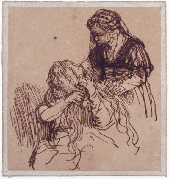
The past two weeks we have been using pen and ink with watercolor washes to create a three dimensional drawing of the figure.  Pen and ink, using flexible nibs, allows the artist to create energetic, dynamic sketches. Rembrandt’s pen and ink drawings, characterized by his calligraphic line, are great examples of this technique.


Drawing the Figure with Pen and Ink
          Rembrandt van Rijn Woman Having Her Hair Combed, pen and ink, 1637

Pen and ink can also be used for longer more detailed studies.  It was a favored medium of Michelangelo, Leonardo, Durer and many other masters. Liberace recommends using a slightly textured text weight paper such as Twinrocker in “Calligraphy Cream”.  To add warmth to the paper he coats it with a light watercolor wash using yellow ochre or raw sienna. Since pen and ink is an unforgiving medium (erasing is difficult if not impossible) most artists begin with a simple pencil sketch of their subject. 


Drawing the Figure with Pen and Ink
                Michelangelo Buonarroti, Studies of the Holy Family, pen and ink, 1505.

When ready to start drawing Liberace recommends using a sepia ink, such as seen in master drawings, with flexible nibs. The nibs allow the artist to create lines that go from thick to line as pressure is put on the nib. Rob also uses Micron technical pens as he draws. Technical pens (which store their ink in the pen) allow for a more consistent line.


Drawing the Figure with Pen and Ink

                        Marie Dauenheimer, Figure Study, pen and ink, 2013.


I highly recommend experimenting with his wonderful medium!


"Bernini Sculpting in Clay" at the Metropolitan Museum of Art

By |January 21st, 2013|Syndicated Content|


“You need to draw using your eye-that is, imprint everything in your mind-and always make sketches and drawings of your different ideas…”


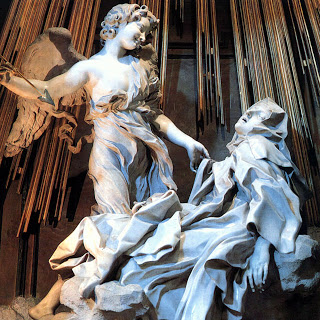
So said sculptor and architect Gian Lorenzo Bernini (1598-1680) in 1673.  Bernini is best known for his dramatic sculptures that adorn his native city of Rome. Bernini is credited with starting the Baroque movement in sculpture, a hallmark of which is his masterpiece “Ecstasy of Saint Theresa”created in 1652.  This piece can be viewed in the Cornaro Chapel, in the church Santa Maria della Vittoria, Rome.


"Bernini Sculpting in Clay" at the Metropolitan Museum of Art
                   "Ecstasy of St. Theresa", 1652, Santa Maria della Vittoria, Rome.

When you see Bernini’s theatrical and life like sculptures it is natural to wonder what his process was. In December I saw a comprehensive exhibition that shed light on the way Bernini worked.  The exhibition was “Bernini Sculpting inClay” at the Metropolitan Museum of Art and it featured 39 terracotta models, or “three-dimensional sketches”, created by the the master.  These small clay models are bold, expressive and animated. Numerous drawings accompany the models and aid in understanding Bernini’s thought process.


"Bernini Sculpting in Clay" at the Metropolitan Museum of Art
                         Terracotta bozetto for "Ecstasy of St. Theresa", 1647-1652.

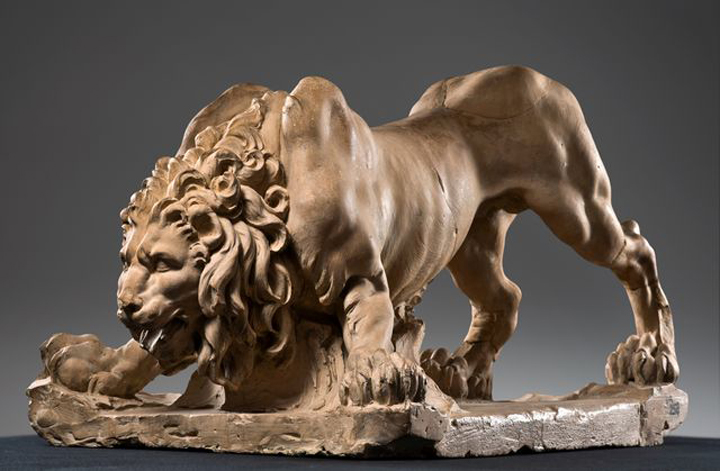
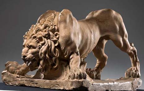
One of the most impressive “bozettos” in the show is a lion modeled for the “Fountain of Four Rivers” (1651) in Piazza Navona in Rome.  As Bernini suggests in the above quote he modeled the lion from his "mind’s eye", a naturalistic lion exaggerated in its anatomy and expression!


"Bernini Sculpting in Clay" at the Metropolitan Museum of Art
              Terracotta bozetto for the Lion on the "Fountain of Four Rivers", 1649-1650.

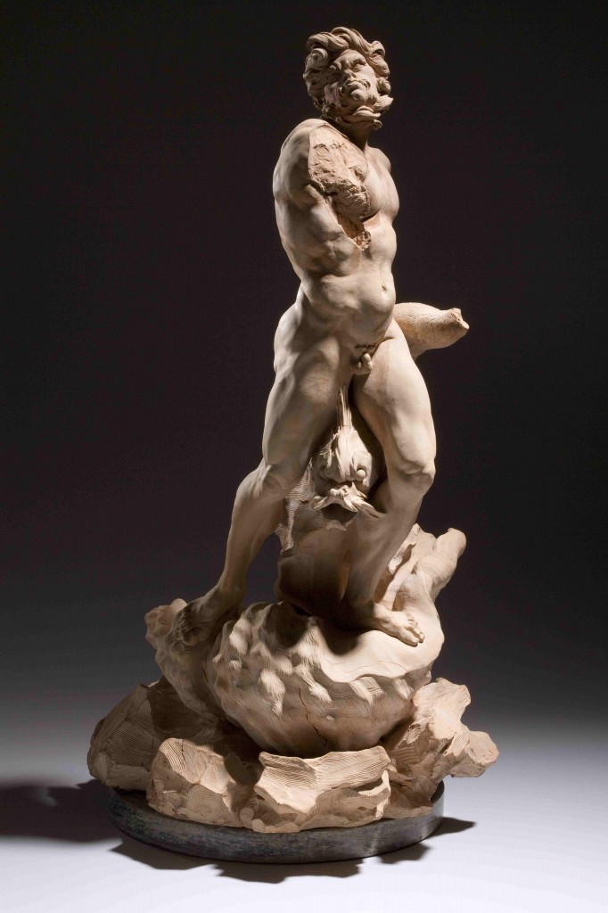
The largest terracotta in the show is a bozetto for the “Fountain of the Moor”, 1655, Piazza Navona, Rome. This dramatic, twisting piece embodies the energy of the figure and highlights Bernini’s way of describing textures-muscle, skin, hair, shell, dolphin and scales.  


"Bernini Sculpting in Clay" at the Metropolitan Museum of Art

                          Terracotta bozetto for "Fountain of the Moor" 1653.


It has been suggested that Bernini made 1000s of these terracotta sculptures, however not considering them finished works of art, but rather ‘sketches” he didn’t preserve them.  Only 52 remain intact.


For more info on Bernini’s life view this video from the Simon Schama BBC series “The Power of Art”.

http://www.youtube.com/watch?v=95_7l87prmI


I recommend the exhibition catalog "Bernini Sculpting in Clay" by C.D. Dickerson, III, Anthony Sigel and Ian Wardropper.

"Matisse, In Search of True Painting” at the Metropolitan Museum of Art

By |January 14th, 2013|Syndicated Content|


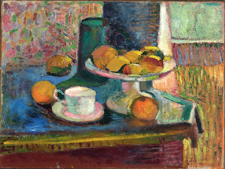
In 1949 art critic Clement Greenberg wrote of Matisse “A self assured master who can no more help painting well than breathing.”  Indeed when I look at Matisse’s paintings they show a confidence and bravado in the brushwork, colorful palette and composition.  It was surprising to learn that painting never came easy to Matisse who "reworked, questioned and repainted".


"Matisse, In Search of True Painting” at the Metropolitan Museum of Art
                Still Life with Compote, Apples and Oranges by Henri Matisse1899

The exhibition “Matisse: in Search of True Painting”, at the Metropolitan Museum of Art , explores how Matisse used his canvasses as tools, repeating compositions in order to "compare effect, gauge his progress" and “push further and deeper into true painting.”


By creating multiple paintings of the same subject matter Matisse experimented with different techniques to explore the subject.  He often copied the same image over and over varying the treatment of the canvas and handling of the paint.


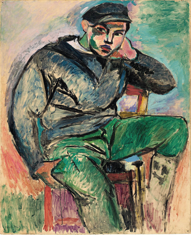
In his series of paintings of the “Young Sailor” Matisse used graphite pencil to block in the figure, he followed with black paint to re-inforece the outline.  His final step was to use vivid paint, allowing it to drip and run, to emphasize the two dimensional aspect of the surface. 


"Matisse, In Search of True Painting” at the Metropolitan Museum of Art
                                     Young Sailor I by Henri Matisse, 1906

"Matisse, In Search of True Painting” at the Metropolitan Museum of Art
                                      Young Sailor II by Henri Matisse, 1906

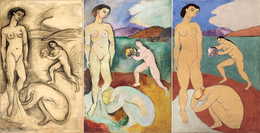
A series of three canvasses of “Le Luxe” dominate the exhibition.  Influenced by Ingres and Cezanne, Matisse sought to convey the essential qualities of his figures.  Using various materials, such as charcoal, distemper (a water based medium with a matte surface like fresco) and oil, Matisse created a dramatic series of figure studies that work independently, but when together create a powerful series that echo the forms of the figures.


"Matisse, In Search of True Painting” at the Metropolitan Museum of Art
Three versions of Le Luxe by Henri Matisse, the first using charcoal, the second in oil and third using distemper, 1907-08

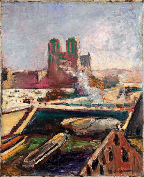
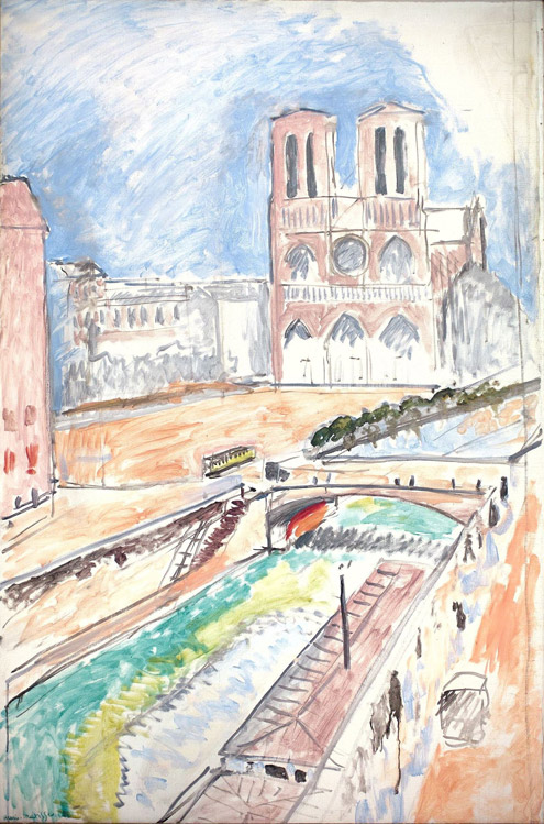
Another series of paintings by Matisse, highlighted in the exhibition, are of Notre Dame.  They are based on the view from his Paris apartment. “I never tire of it, for me it is always new”.  The series, as you can see moves from a traditional view of the cathedral to one that becomes more abstract.  These later paintings giving way and influencing a new generation of artists seeking “true painting”.


"Matisse, In Search of True Painting” at the Metropolitan Museum of Art
                                         Notre Dame by Henri Matisse, 1900

"Matisse, In Search of True Painting” at the Metropolitan Museum of Art
Notre Dame by Henri Matisse , 1941

"Matisse, In Search of True Painting” at the Metropolitan Museum of Art
                                        Notre Dame by Henri Matisse, 1914

I highly recommend this exhibition which is at the Metropolitan Museum of Art through March 17, 2013.  I also recommend the catalog edited by Dorthe Aagesen and Rebecca Rabinow.

"Beatrix Potter, the Picture Letters" at the Morgan Library

By |January 7th, 2013|Syndicated Content|


Beatrix Potter (1866-1943) is known to many as the creator of The Tale of Peter Rabbit and many other children’s stories. What may not be know is that Beatrix Potter was an accomplished scientific illustrator and an astute businesswoman.  Both of these attributes added to her success as a children’s book author and illustrator.


"Beatrix Potter, the Picture Letters" at the Morgan Library
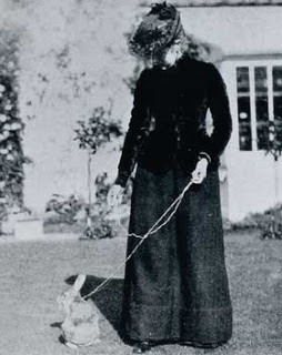
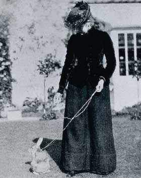
                          Beatrix Potter and her pet rabbit "Benjamin Bouncer" 

Beatrix Potter was born in London in 1866 into an affluent family.  She enjoyed time at her family’s city home and in the countryside.  Beatrix and her brother Bertram had a menargie that included mice, rabbits and a hedgehog.  When the family travelled to the countryside Beatrix was fascinated with her natural surroundings and explored them through drawing.


"Beatrix Potter, the Picture Letters" at the Morgan Library
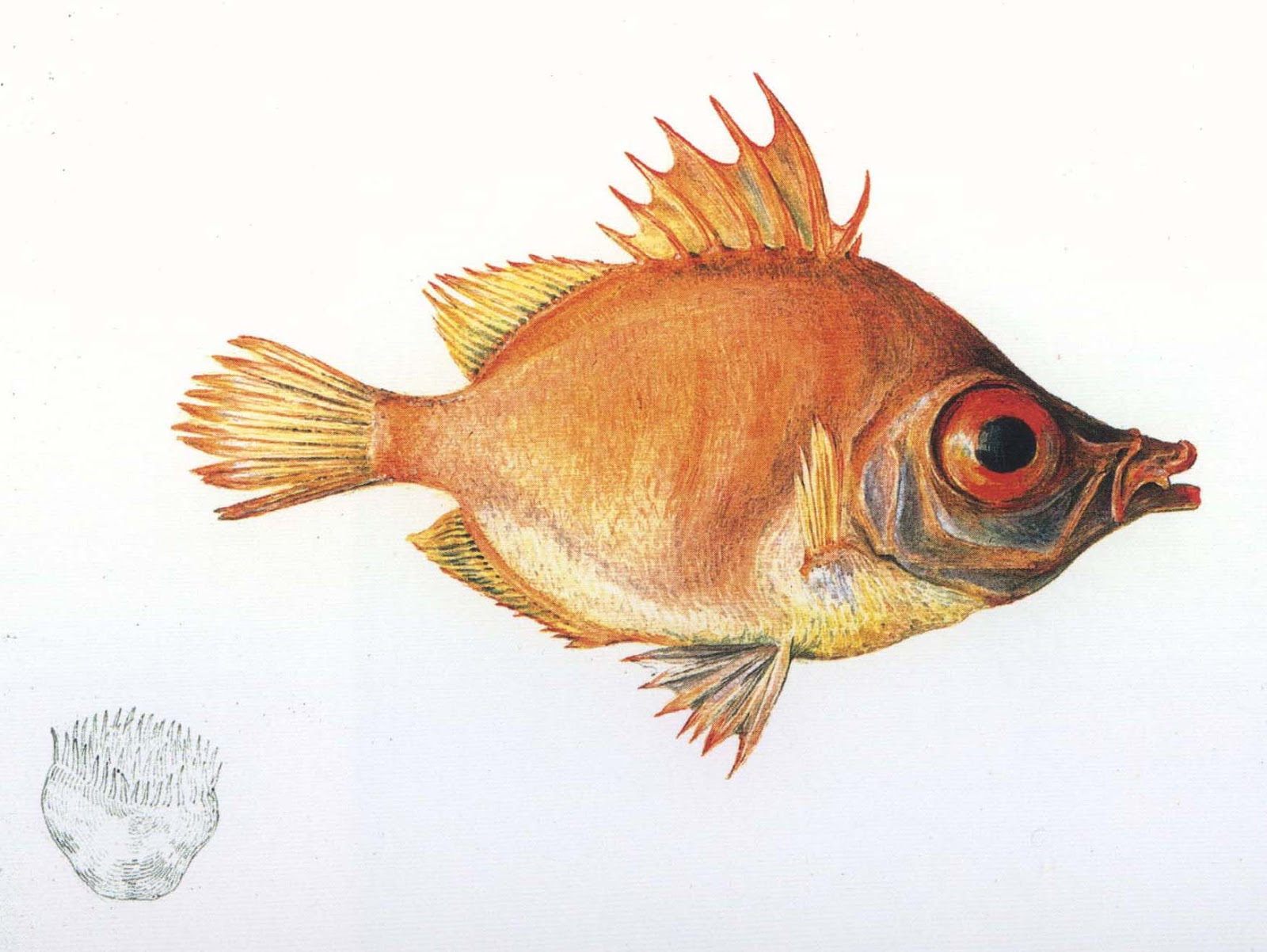
                        Beatrix Potter's watercolor drawing of "Boar Fish", 1895.

"Beatrix Potter, the Picture Letters" at the Morgan Library
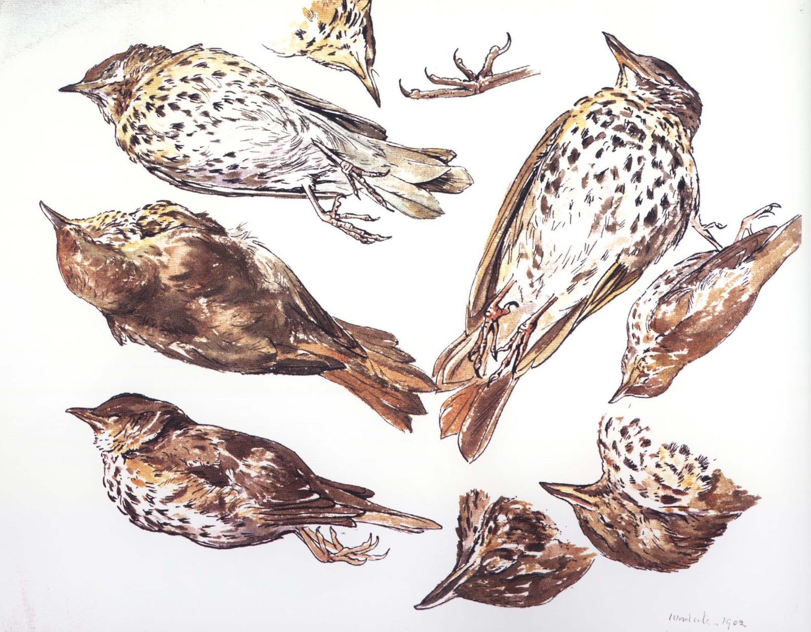
   Beatrix Potter watercolor and pen and ink drawing of "Studies of a Dead Thrush", 1902.

The “Beatrix Potter, The Picture Letters” exhibition at the Morgan Library in New York is a must see for any Potter enthusiast.  The show focuses on Beatrix Potter’s many beautifully illustrated letters she wrote to children.  She corresponded with over forty children including her former governesses’ family.  Perhaps her most important correspondence was with young Noel Moore for whom she wrote the Tale of Peter Rabbit complete with lively pen and ink drawings.  The model for Peter was Beatrix Potter’s own pet rabbit that she described as “An affectionate companion and quite friend.”


"Beatrix Potter, the Picture Letters" at the Morgan Library
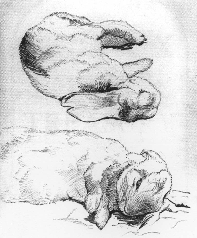
                           Beatrix Potter's sketches of her pet rabbit Peter, 1899.

Beatrix attributed her success to the fact that her stories were written for “real children"- indeed a particular child.  Her studies of animals from life and scientific investigation of mushrooms, plants and landscape add an unusual freshness to her illustrations.  The animals are not mawkish or oversentimental.  Her animal characters keep a sense of the animal they are drawn from.


         Beatrix Potter's illustrated letter "Peter's Dream of a Comfortable Bed" 1899.


The exhibition includes early board games, stuffed animals and figurines based on the various Potter stories, ever the businesswoman Potter kept copyright and control of her famous characters.


"Beatrix Potter, the Picture Letters" at the Morgan Library
            Beatrix Potter's watercolor and pen and ink drawing "His mother put him to bed, 
            and made some camomille tea", 1907.

I highly recommend a visit to the Morgan Library to enjoy this delightful exhibition!


The usefulness of uselessness

By |January 6th, 2013|Syndicated Content|

The usefulness of uselessness

"All art is quite useless." 
Oscar Wilde 

In the late eighties and early nineties I was a student at La Guardia High School of the Arts. My life was devoted to music. Thelonious Monk, Sonny Rollins and Lester Young were my idols. At eighteen I began gigging with my quintet in small venues in New York City. I wrote music and played tenor saxophone with a passion; I would end a gig or practice session in physical pain and emotional exhaustion.

Jazz clubs were dropping like flies. Swing and bebop had been a vital aspect of American culture. Yet the glory years of the thirties, forties and fifties, with places like NYC's 52nd street, didn't exist anymore. The music I was playing was disconnected from the times I was living in; I was rehashing a music that had died decades before. I was tired of pouring my heart into something that felt useless. I stopped playing.

At twenty I began working at my father's illustration and animation studio, Slim Films. There I learned that illustration and information graphics serve a specific purpose and have a defined goal. It was a revelation to be doing something concretely useful. After a couple of years working as a freelance illustrator I took a job as an assistant art director at Scientific American magazine. The editors worked with a passion that was eye-opening—even as they were writing about the most obscure subjects, like a particle physics theory that had no perceived relevance in our daily lives. It was as if I were surrounded by artists and musicians.

This reignited my desire to make music. I decided to leave Scientific American and go back to Manhattan School of Music, the conservatory I had dropped out of a few years earlier. I quickly learned that I didn't have what it would take to make it as a professional musician. It seemed as if the pinnacle of success was getting into the pit band of a Broadway show. The prospect of playing the same music day in and day out was a nightmare. At the time I was earning, and enjoying, a decent living as a freelance illustrator. Once again I stopped playing.

Over the years I became relatively successful as an illustrator. Five years ago I began to hire people and transition from a freelance illustrator to the creative director of my own studio. Two and a half years ago we moved the studio from Maplewood, N.J., to New York City.

I reentered the world of the useless; I decided to devote a significant part of my time and energy to creating fine art. Creating something that is of no use is an exercise in frustration. The other day I was complaining to an artist friend about this. Shaking his head he said, "People have no idea how hard this is. It's awful. Just awful."

And then, a couple of weeks ago I downloaded an album from iTunes of Barry Harris and Charles Davis, two of the teachers I studied with years ago. At the first notes my knees buckled. Time stopped and joy welled in my heart. It didn't matter what year it was. It didn't matter that what I defined as jazz had died years ago. What mattered was that for this brief time it was alive and well in my studio as I listened and danced.

Why I do what I do.

By |January 5th, 2013|Syndicated Content|

I am constantly amazed at the human body — the interconnectedness of its many layers and parts, its mechanical marvels and beauty, the way it grows, changes and repairs itself. Even after 25 years of drawing human anatomy, I am still moved by its wonder and mystery. […]

The post Why I do what I do. appeared first on Clark Medical Illustration.

Why I do what I do.

By |January 5th, 2013|Syndicated Content|

I am constantly amazed at the human body — the interconnectedness of its many layers and parts, its mechanical marvels and beauty, the way it grows, changes and repairs itself. Even after 25 years of drawing human anatomy, I am still moved by its wonder and mystery. My first real exposure to anatomy was drawing [...]

Topics for 2013

By |January 2nd, 2013|Syndicated Content|


Happy New Year!  As we begin the new year I have been brainstorming about blogging topics for 2013.  I was in New York for a few days and I plan on blogging about some amazing exhibitions I saw and plan on visiting.  Among them are the “Bernini, Sculpting in Clay” and “Matisse: True Painting” at the Metropolitan Museum of Art


Topics for 2013
Bernini's terracotta sculpture model for the "Lion on Four Rivers Fountain" 1649-50. From the  exhibition at the Metropolitan Museum of Art.


The “Beatrix Potter, The Picture Letters” and “Durer to de Kooning” exhibitions at the Morgan Library are worth discussion and exploration.  The Frick’s “Mantegna to Matisse, Master Drawings from the Courtauld Gallery” and MoMA’s “Inventing Abstraction” look fascinating.  The National Gallery of Art’s upcoming French drawing exhibition “Color, Line, Light: French Drawings, Watercolors, and Pastels from Delacroix to Signac” is much anticipated for it’s varied collection.


Topics for 2013
Pastel drawing by Auguste Louis Lepere, 1900.  From exhibition "Color, Line, Light: French Drawings from Delacroix to Signac" at the National Gallery of Art.


 I plan on continuing to blog about master drawing techniques , such as pen and ink and wash and red chalk.  As I prepare my 2014 Vesalius Trust“Art and Anatomy” tour to Greece and Italy I will continue to blog about Andreas Vesalius whose 500th anniversary is next year! To reflect the focus of my blog I have added "Art and Anatomy" to my title.


Topics for 2013
Pen and ink drawing by Jacques Bellange, 1610. From the "Durer to de Kooning" exhibition at the Morgan Library.


Thanks for reading, commenting and joining me on my art and anatomy travels! 

Looking forward, and the year in review

By |January 1st, 2013|Syndicated Content|

January 2012 was filled with hope as my wife and I reconciled. Yet the stress of everyday life, exacerbated by the grim reality of my recently excavated past, began to affect how I functioned in the world as a husband, father, creative director and artist. This tension culminated in April, leading to my semi-enforced two-month sabbatical. 

I reentered the world in June reenergized. By August the honeymoon withered and died. But in October I began feeling a subtle, hard-won stability. I was standing on the new foundation that I had begun cobbling together in April.

If you have followed this blog over the past two or so years, you may have noticed a change in tone since I returned from my sabbatical. I am uncomfortable with how personal my older posts are. Since getting back I've swung to the other end of the spectrum. In the service of not being too personal I have cut off much of the lifeblood and passion with which I wrote. How I can retain some of my fire without being melodramatic will be a challenge for me in 2013.

One of my intentions for 2012 was to make a larger, more realized body of work. Now that the year has come to a close I'm happy and proud of what I have made. In 2013 I will be getting the work out there. (Given that you are reading this and—hopefully—looking at the pictures, the work is of course "out there." What I mean is getting the work in an appropriate gallery.) With this intention in mind I've redesigned my art website. It will be going live sometime in January. I've also produced a 36-page booklet that I will be sending to the galleries I can imagine my work in.

Here are three of the last pieces I made in 2012:


Looking forward, and the year in review

Looking forward, and the year in review

Looking forward, and the year in review

When people see my work I want them to feel connected to their highest self. That said, I've come to the painful realization that I can't control what people think or feel. Attempting to make a person think or feel a specific way is the domain of advertising, not art. (There is a strong argument against this; just look at all the masterpieces that were commissioned by the Catholic Church during the Renaissance.) What I do have control over is my attempt to find and clarify my intentions. This carries through to how I wish to live my life in the world as a husband, father, creative director and artist.

Happy New Year!

Michelangelo’s "David-Apollo" at the National Gallery of Art

By |December 17th, 2012|Syndicated Content|


On Friday I had the privilege of seeing Michelangelo’s sculpture ”David-Apollo” (1530) at the National Gallery of Art in Washington, DC.  This beautiful marble sculpture is on loan from the Museo Nazionale del Bargello, in Florence, to celebrate 2013, the Year of Italian Culture.  The name of the sculpture alludes to the conflicting stories that the figure is David, slayer of Goliath or Apollo, god of light and sun.


Michelangelo's "David-Apollo" at the National Gallery of Art
                                 Michelangelo's "David-Apollo", marble, 1530.

Michelangelo's "David-Apollo" at the National Gallery of Art
                                       Michelangelo's "David-Apollo" Detail

Michelangelo (1474-1564) was a master of the High Renaissance and best known for his colossal masterpiece “David” (1501-1504) which dominates the Galleria dell’ Accademia in Florence. Michelangelo is considered to be one of the greatest artists of all time.  His creations in painting, sculpture, architecture and drawing are among the greatest masterpieces of Western art.


Michelangelo's "David-Apollo" at the National Gallery of Art
                                  Michelangelo's "David", marble, 1501-1504

While “David” is a large, highly polished piece the “David-Apollo” is an unfinished, smaller than life size sculpture.  This unfinished quality allows the viewer insight into Michelangelo’s process.  According to the National Gallery of Art,  Michelangelo used a point chisel to rough out the forms and a claw chisel to refine the figure.  The roughened areas formed with the point chisel can be seen on the back of the figure and the tree stump.  This juxtaposition of the refined and roughened marble later inspired 19th century French artist Auguste Rodin.  Below is one of Rodin’s sculptures to demonstrating this technique.


Michelangelo's "David-Apollo" at the National Gallery of Art
                                    Auguste Rodin, "Galatea", marble, 1889

While Michelangelo posed his “David” in a position of contrapposto, “David-Apollo” displays a twisting pose called serpentinata. 


I highly recommend a visit to the National Gallery Art before March 3, 21013 when “David-Apollo” returns to Florence.


Silverpoint Drawing, History and Technique

By |December 9th, 2012|Syndicated Content|


Silverpoint is a drawing technique with roots that go back to the time of the Renaissance.  The technique involves drawing on prepared paper with a small wire of silver sharpened to a point, much like a hard graphite pencil. As the stylus is dragged across the paper it leaves a mark of silver.  The layering of these hatched and crosshatched silver lines build up to create a soft value study. The technique is unique in that over time the drawing changes and becomes luminous as the silver tarnishes. 


Silverpoint Drawing, History and Technique
         Leonardo Study of the Head of a Girl, 1483, silverpoint on brown prepared paper

Leonardo, Raphael and Durer are all Renaissance masters who experimented with silverpoint.  Durer’s father was a metal smith and likely introduced his young son to this technique. Silverpoint is a delicate, but somewhat unforgiving medium; but with some practice the results can be remarkable.  


Silverpoint Drawing, History and Technique
                   Leonardo, Horse Studies, 1493, silverpoint on blue prepared paper

Contemporary artists using silverpoint begin the process, much as the Renaissance masters did, by preparing their paper with a ground.  The ground can be anything from house paint to commercially prepared grounds such as Golden’s Artists Supply“Silverpoint/ Drawing Ground”.  Watercolor can be added to the ground to create a toned surface. Using a rag paper the ground is applied with a brush and allowed to dry for at least 24 hours.


According to artist/author Juliette Aristides Lord Frederic Leighton worked on this rather large (21 x 15.5 inches) silverpoint drawing "from morning to evening for a full week".  

Silverpoint Drawing, History and Technique
 Lord Frederic Leighton, Study of a Lemon Tree, 1858, silverpoint on white prepared paper

Silverpoint Drawing, History and Technique
             Marie Dauenheimer, Portrait Study, 2010, silverpoint on white prepared paper

Silverpoint Drawing, History and Technique
           Marie Dauenheimer, Figure Study, 2012, silverpoint on white prepared paper

Silverpoint Drawing, History and Technique
             Marie Dauenheimer, Figure Study, 2012, silverpoint on white prepared paper

If you are interested in learning more about how to prepare paper for silverpoint and about this technique watch this instructional video from Golden (scroll down).


I highly recommend this technique!  It is enjoyable and the results can be brilliant!

Durer and Beyond, Central European Drawings, 1400-1700

By |December 2nd, 2012|Syndicated Content|


In August while at the Metropolitan Museum of Art I saw two amazing drawings exhibitions.  One, which I blogged about last week, featured the plant drawings of minimalist Ellsworth Kelly.  These drawings were so beautiful and elegant for their simple use of line and negative and positive shape.


The “Durer and Beyond” exhibition featured many drawings also created with line.  Albrecht Durer’s energetic ink lines with layers of hatching and crosshatching were a great contrast to the Kelly drawings!


Albrecht Durer, (1471-1528) of Nuremberg, Germany, is regarded as the greatest artist of the Northern Renaissance.  While still in his twenties Durer became famous for his woodcuts, such as “Four Horsemen of the Apocalypse”.  He went on to create many masterful paintings, but his drawings are among his most famous works.  Amid his most revered pieces are “The Great Piece of Tuft”, “The Praying Hands” and “Wing of a Roller”  Many of these drawings are in the Albertinain Vienna.


Durer and Beyond, Central European Drawings, 1400-1700
          Albrecht Durer, pen and ink on prepared paper, "The Praying Hands", 1508

Durer and Beyond, Central European Drawings, 1400-1700
                      Albrecht Durer, watercolor and gouache, "Wing of a Roller", 1518

Throughout his life Durer was known for his detailed and complex self-portraits.  The exhibition drawing below “Self Portrait and Studies of the Artist’s Left Hand and a Pillow” features such a self-portrait with it’s penetrating gaze.  On the verso of this drawing is a series of whimsical drawings of a pillow.  The series almost reads like an animation!


Durer and Beyond, Central European Drawings, 1400-1700
Albrecht Durer, pen and ink, "Self Portrait and Studies of the Artist's Left Hand and a Pillow", 1493

Durer and Beyond, Central European Drawings, 1400-1700
                              Albrecht Durer, pen and ink, "Six Studies of a Pillow", 1493

The exhibition featured 100 drawings created between 1400-1700 by artists from Germany, Austria, Switzerland, Czech Republic among others.  A charming study of a hedgehog by Hans Hoffman (1530-1592) created with watercolor and gouache, highlights this artist’s love of observing nature down to the smallest detail!


Durer and Beyond, Central European Drawings, 1400-1700
                          Hans Hoffman, watercolor and gouache drawing of a hedgehog, 1584

If you enjoy looking at master drawings there are two current exhibitions that you might want to visit.  "The Mantegna to Matisse” exhibition at the Frick Collection, will be up through January 27, 2013 and the “Durer to de Kooning: 100 Master Drawings from Munich” is on view through January 6, 2013 at the Morgan Library.  I plan on blogging about both these exhibitions.


Ellsworth Kelly’s "Plant Drawings" exhibition

By |November 25th, 2012|Syndicated Content|


This past summer, while in New York, I saw two amazing and very diverse drawing exhibitions at the Metropolitan Museum of Art. The shows were “Ellsworth Kelly Plant Drawings, 1948-2010” and  “Durer and Beyond, Central European Drawings, 1400-1700”.  Both exhibitions highlighted an abundance of drawings created using line.


Ellsworth Kelly's "Plant Drawings" exhibition
                                                Sunflower, 1957 watercolor

Ellsworth Kelly is an American artist born in 1923 and best known for his minimalist works.  Kelly embraced the Color Field School in the 1960s and became known for his vibrant, clean minimalist paintings and sculptures. Regarding his interest in simple, minimal shapes and contours Kelly stated " I'm not interested in the texture of a rock, but it's shadow."

Ellsworth Kelly's "Plant Drawings" exhibition
                                                       Hyacinth, 1949, ink

The exhibition at the Met focused on Kelly’s plant drawings, created over a sixty year period. These simple elegant drawings, made with graphite or ink on paper or with watercolor, are stunning for their simple use of line and shape.  Kelly is a master of composition, integrating negative and positive shape and keen observation skills.  Indeed, his drawings read as portraits of an individual plant.

Ellsworth Kelly's "Plant Drawings" exhibition
                                        Study for "Plant I", 1949, ink and pencil


While most of the pieces are 18 x 20 inches, there are some monumental drawings that utilize a strong vertical composition.  The overlapping of shapes and form create a sense of motion.

Ellsworth Kelly's "Plant Drawings" exhibition
                                           Four Sunflowers, 1957, pencil


I highly recommend the exhibition catalog  “Ellsworth Kelly Plant Drawings” by Michael Semff and Marla Prather.  It is a beautiful publication and includes a comprehensive interview with Kelly conducted by Marla Prather in 2011.


I will be posting about the “Durer and Beyond” exhibition in the near future.


More from the 20" x 16" series and working large

By |November 21st, 2012|Syndicated Content|

A couple of posts ago I had written that I was starting a new series of panels measuring 20" x 16". Here are two I'm happiest with:I'm intrigued with the blue piece. It's hitting a sweet spot between representation and abstraction. After making this pi...

Craniopharyngioma

By |November 14th, 2012|Syndicated Content|

This illustration was produced for the Johns Hopkins University’s Suburban Hospital Magazine, New Directions, Fall 2012 issue. A craniopharyngioma is a benign tumor that develops near the pituitary gland (a small endocrine gland at the base of the brain). This tumor most commonly affects children 5 – 10 years of age. Adults can sometimes be […]