

One of my favorite shows on TV is How It’s Made. I love the behind the scenes play-by-play they give for everything from apple pies to zeppelins (okay, maybe they have never actually done zeppelins but I did see one on apple pies). I just enjoy seeing the process. So when I received a job last week to illustrate an article about the link between inflammation and depression I thought it would be fun to document all the steps it takes to get to a final illustration.
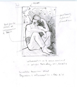 After reading the article the client sent, this is my initial idea sketch. The art director and the editor thought the person just looked bummed out and not really depressed so I played around to come up with a more despondent pose.
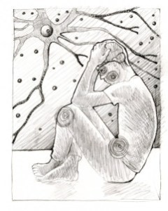
I liked this one but the side view really led to a pretty flat illustration. I was afraid I would have to spend a lot of effort battling the flatness of the composition to work up a nice final so I kept this one to myself and…
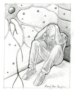 I ended up coming up with a 3/4 pose which I thought captured the mood and gave a more dramatic composition. And yes, I scribble a lot when I sketch.
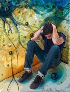
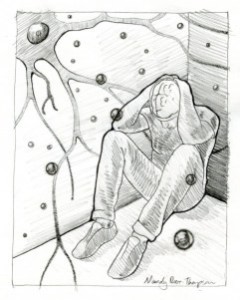 Then I enlarged some of the pro inflammatory cytokines to give it some more depth. The art director was very happy with this one.
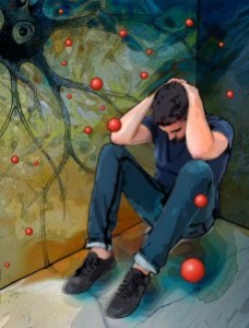
 Next I roughed in the color around the initial scribble…er, I mean sketch.
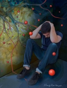
 I did the drawing of the figure and the circles and scanned both of them in. I kept developing the color in layers. I love Photoshop layers.
 Photoshop layers is probably the greatest gift to artist since paint in a tube. It beats the heck out of traditional airbrushing and oil painting (I’m sure several artist were rolling over in their graves as I wrote that – sorry Leonardo but it’s true). It allows you to try different approaches without destroying the work you have already done.
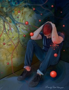
Here I have redrawn, scanned and painted the neuron and cleaned the figure up quite a bit. I have also darkened most of piece to give a more depressive feel. At this point I was getting a bit bummed out and had to go play with the dog for a while.
 This is the last JPG save I did before the final.
I added the areas of inflammation and the brain and if you look real carefully I have pushed back the dendrite coming off of the neuron in the corner above the figures head. Compare it to the image above and you will notice that it doesn’t pop out any longer.
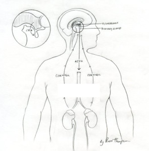 This is the sketch for the schematic that will go along with the article describing the mechanism of action.
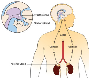
And below is the final done in Adobe Illustrator. The final is pretty much the same as the sketch but in color. I didn’t have any in between pieces to show you for this. I know, it’s kind of like those old drawing books where they would tell you to draw a circle…and then make it into an owl. Easy.
Anyhow, that’s how it’s made. At least this time.
