
I’ve always loved periwinkle flowers, Vinca major. The blue is such a delicate shade, and I relish the juxtaposition between the dark, glossy leaves and the powdery blue petals.
I thought I’d do a quick step by step on how to go about mixing the colours, and illustrating this flower, not least because blue flowers pose their own challenges.
Pencil rough
I draw direct onto hot press watercolour paper, which has a very smooth surface. This time I’m using Arches hot press. I like to use mechanical pencils like the Pentel P205, with H or HB leads. I use a soft eraser; those made by Factis are good.
First, draw up the flower. Think about what shape you’d get if you drew a circle from the outside edges of the five petals. It’d be more or less circular. Bear this in mind as you plot the petals, but remember to draw the individual shape and folds of each one.
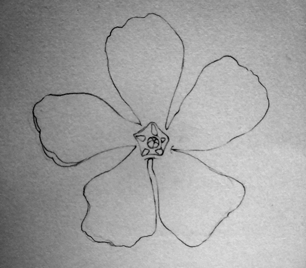
Draw the centre of the flower and note the pentagon with the stamens and sepal at the centre, There are small triangles of blue tucked in there too.
When you’re happy with the pencil drawing, you can move onto mixing your paint.
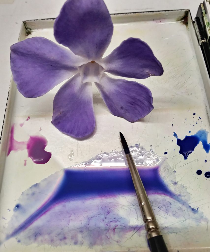
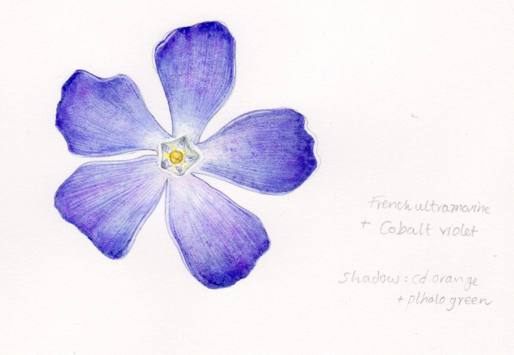
Mixing the Blue
Rather surprisingly, the colour of this flower is really easy to mix. I just mixed French ultramarine with Cobalt violet, and made a paler tint by diluting it with water. I favour Winsor and Newton watercolour pans, and always use their Series 7 sable brushes (in this case a no. 1 size).
Avoid trying to make a watercolour mix paler by adding white; this changes the colour massively and makes it thick, non-transparent, and heavy. Always dilute it with clean water instead.
Laying down the colour
I build up the colour with lots of tiny lines, following the line of growth of the petals. There’s a clear gradation on each petal, from pale at the centre out to a darker mauve on the petal edges. Each line painted echoes this.
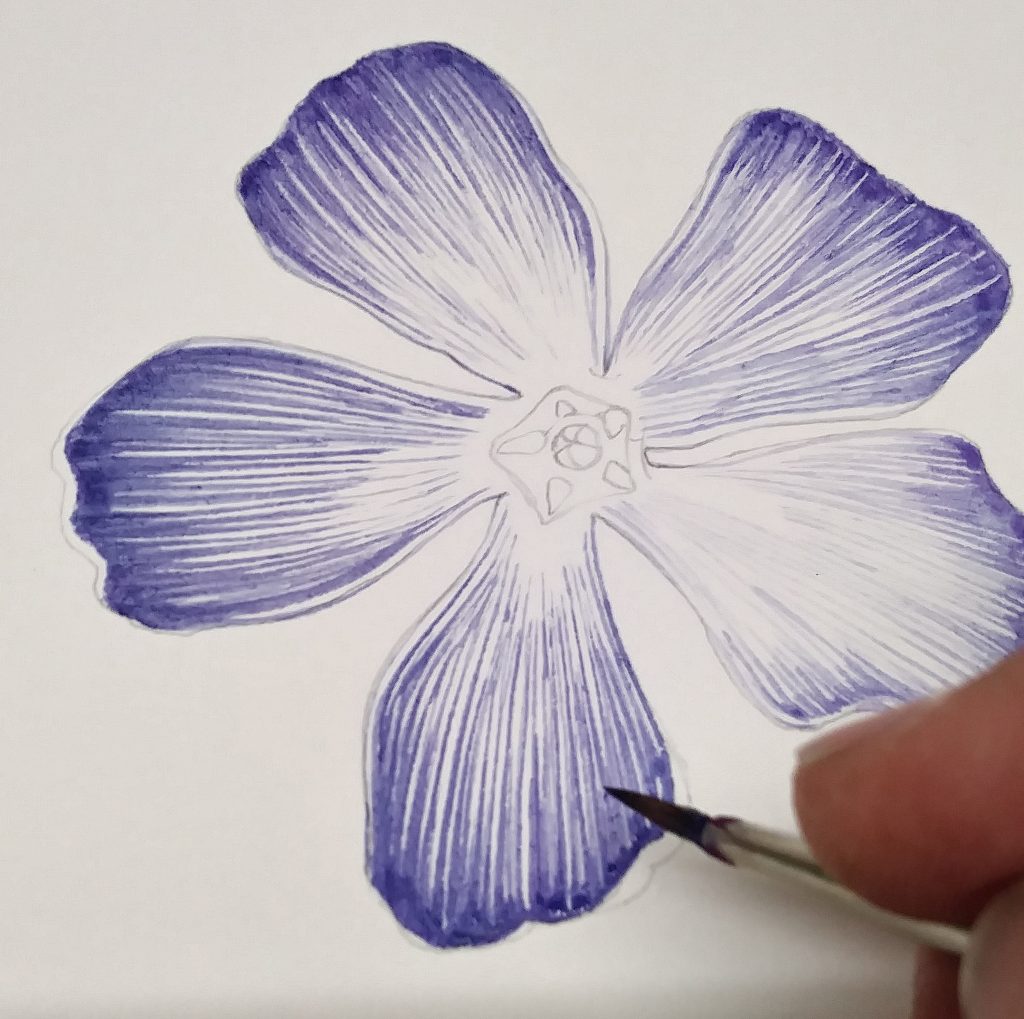
The edge of each petal is marginally paler than the body of the petal. Remember to leave these edges as white paper.
Try to keep the ends of your brush strokes to the petal edges, this is where the colour is deepest.
First top wash
Using the same mix or Cobalt violet and French ultramarine, dilute the colour with clear water. Paint this over the lower half of each petal, leaving it really wet on the page. Try to emphasize the gradation from white centre to purple edges by being subtle with this top wash. It won’t lift all the lines you’ve painted, but will soften them, and add depth to the blue of the flower.
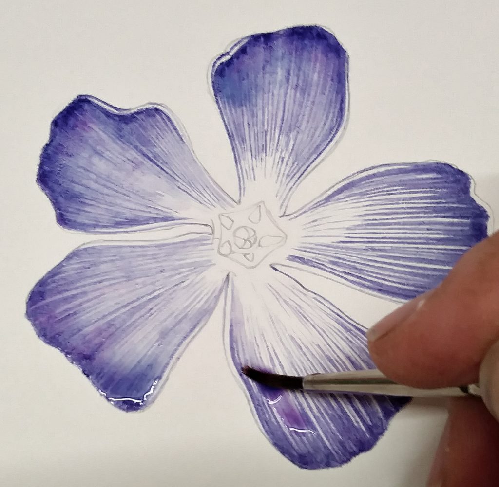
Be patient, and let the paint dry fully. You can use a hair dryer or a fan heater to speed up the process if you’d like.
Second top wash
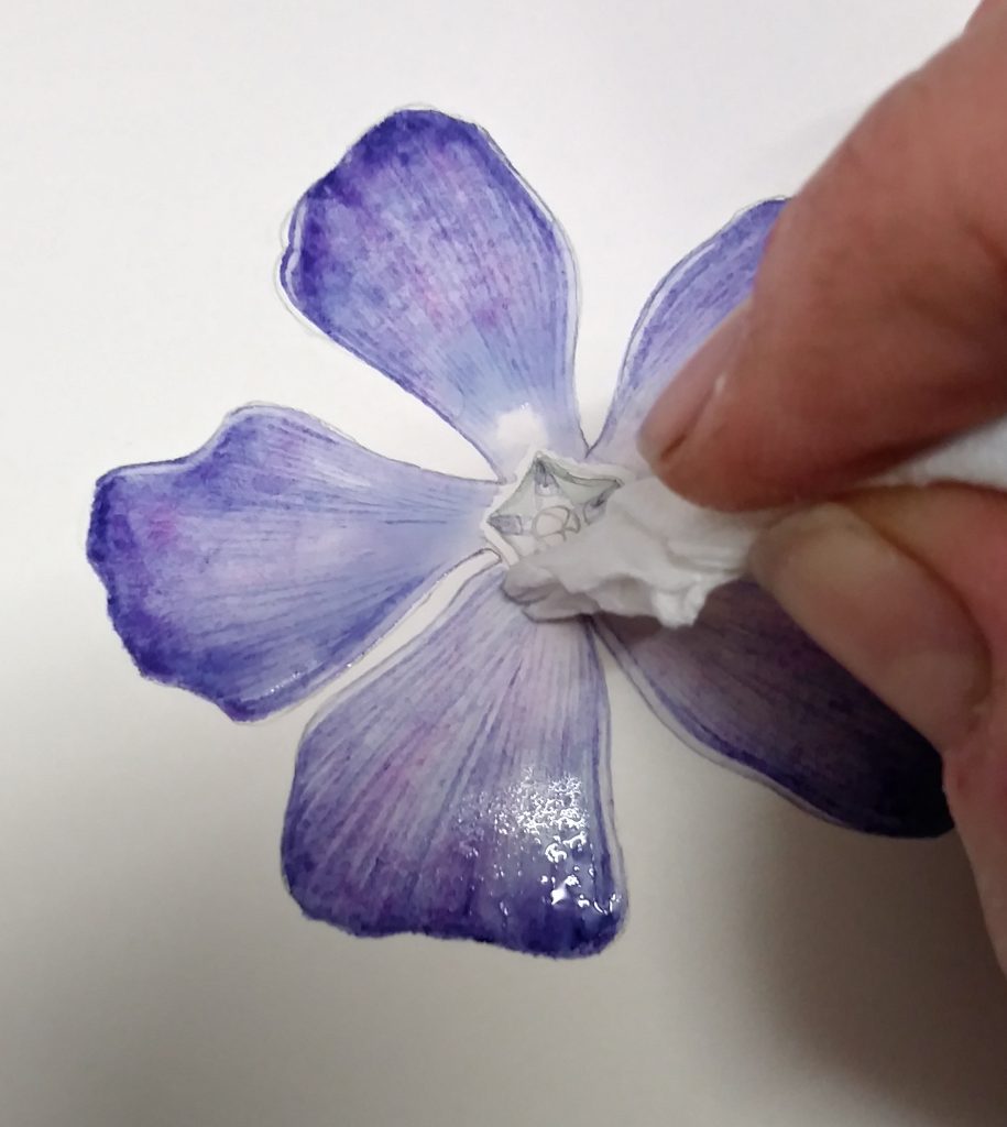
Once fully dry, dilute your purple-blue colour further (with clean water). Apply this over the entire flower, except for the very centre. Cover up those white petal margins with the pale wash, and the areas closer to the middle of the flower. Lift off surplus paint with a twist of loo roll or tissue to make sure the centre of the flower is still significantly paler than the petals.
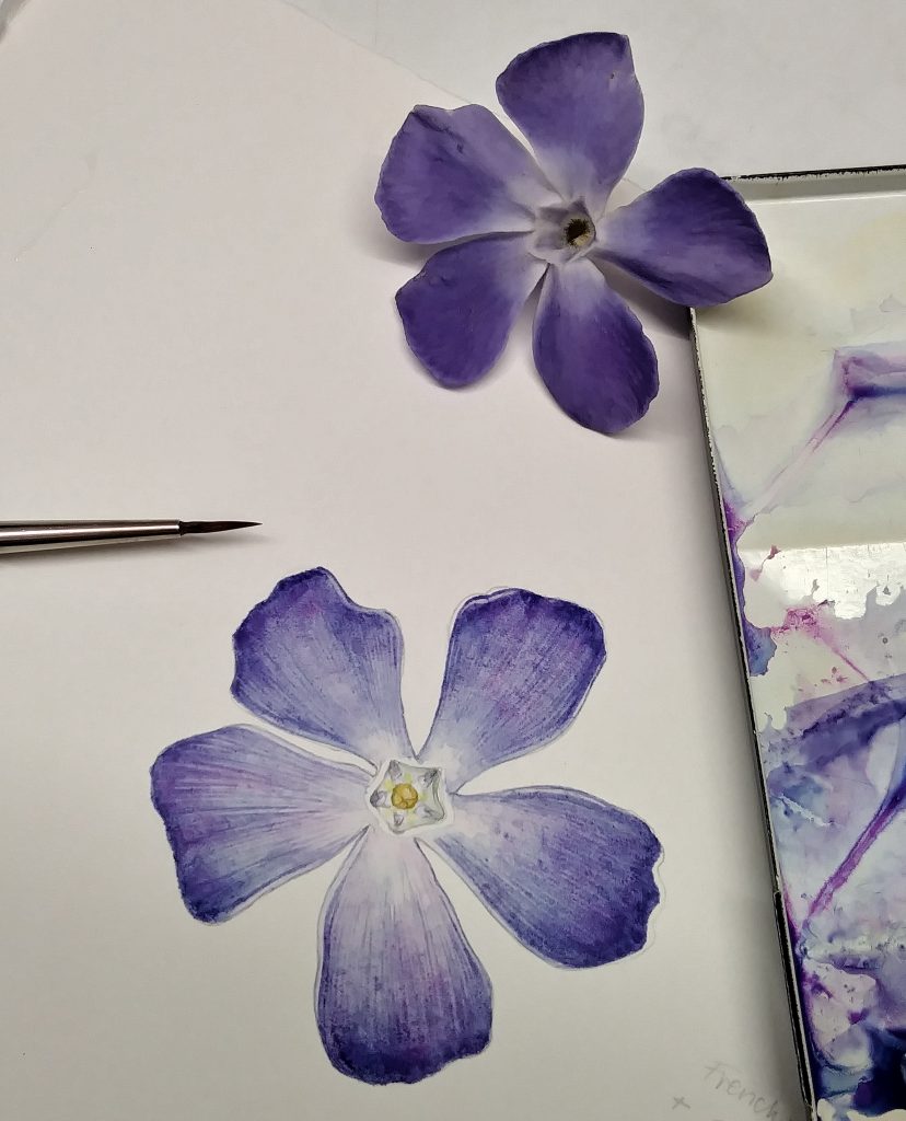
It goes without saying that everything you paint and draw needs to be informed by the flower in front of you. It’s so much easier to illustrate something right there, rather than a photo! (Saying that, sometimes you need to use photo reference. For more on how to do this, check out my blog.)
Allow this wash to dry completely.
Painting the centre of the flower
The middle of the periwinkle is a clear pentagon. Inside the corolla tube, you can see five little blue-purple triangles. Paint these in, paying close attention to their size and shape, and how they’re paler as you move further from the petals.
You’ll notice shadow within the pentagon. Mix a neutral colour to plot in these areas. I used Pthalo green and Cadmium orange. (If you mix colours which are more or less opposite on the colour wheel, they tend to make wonderful neutral tints.)
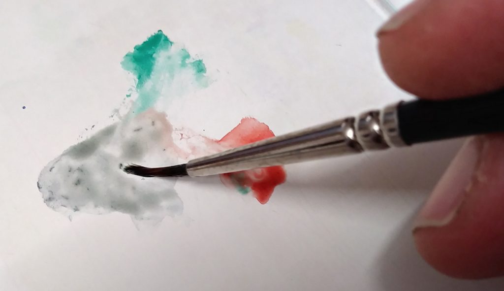
I diluted this thoroughly with water, then plotted in the shadow; darker at the top of the corolla tube.
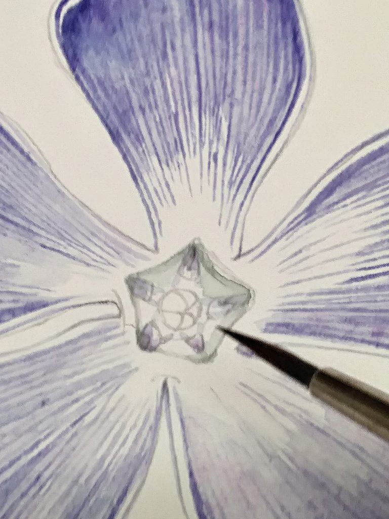
Finally, it’s time to paint the centre of the flower, the pistil and stamens. This is a pale yellow colour.
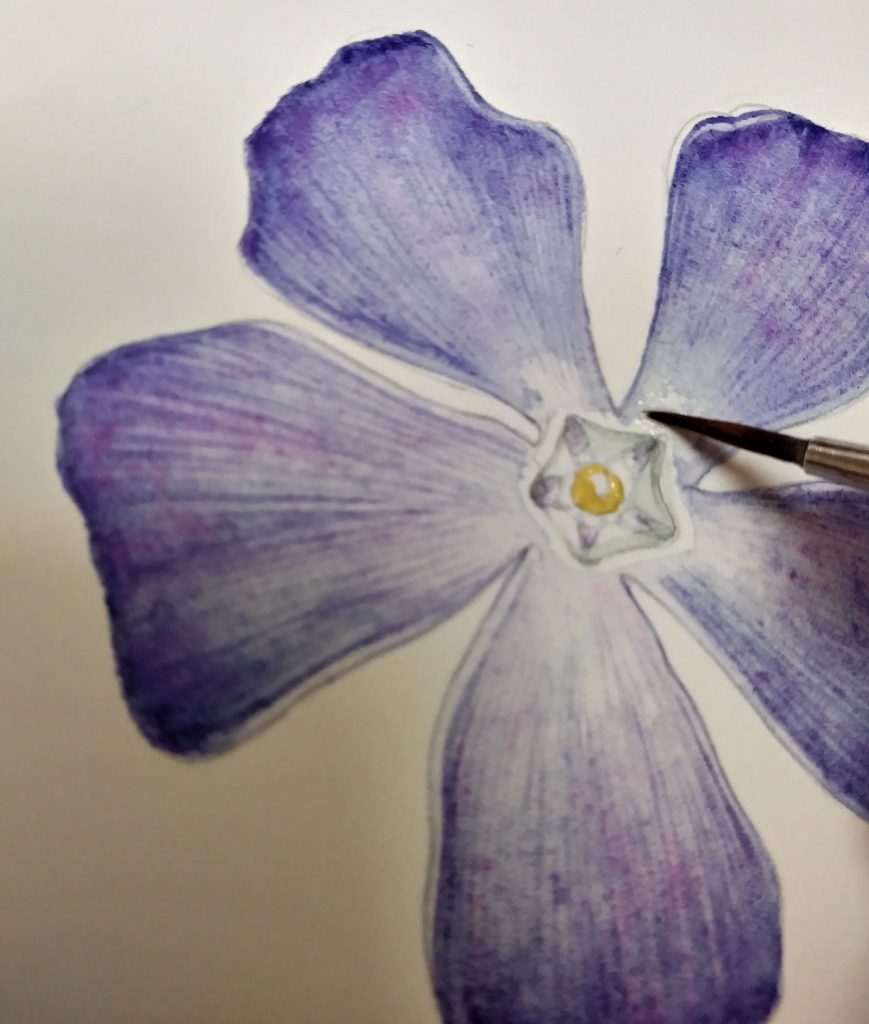
I used Naples yellow with a touch of cadmium yellow for this. Leave a highlight in the centre, then pop an incredibly light yellow tint on top of the whole of this tiny yellow area. You might see a bit of pale yellow coming up the corolla tube; plot this in too, being very careful not to make it too obvious.
Finishing up
Double check your illustration against the flower. Are the edges of the petals dark enough? Is the centre pale enough? Have your washes dried smoothly or left unsightly edges? In my case, the wet washes had left a tide mark on two of the petals. I eased this effect with a dry-ish brush, used in tiny little circles. It lifts enough of the colour to remove the stark line.
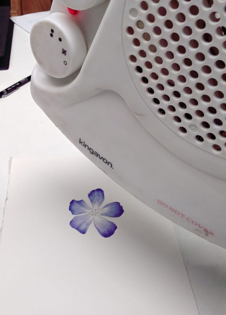
Finished. This is a quick sketch, and I didn’t draw in leaves, the pink-flushed stem, or any flowers showing their beautiful shape from the side. However, it was a real pleasure to work on, and despite being such lovely and delicate shade of blue, getting a colour match was really straight-forward.
For a brief guide to this step by step, all on one handy sheet, please visit my Pinterest site. Thanks.
The post Step by Step Periwinkle flower botanical illustration appeared first on Lizzie Harper.


