
Whenever I paint a plant, I tend to use the same approach. This blog is a step by step look at how I paint the False Virginia Creeper, Parthenoccissus inserta.
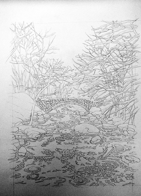
Pencil Rough
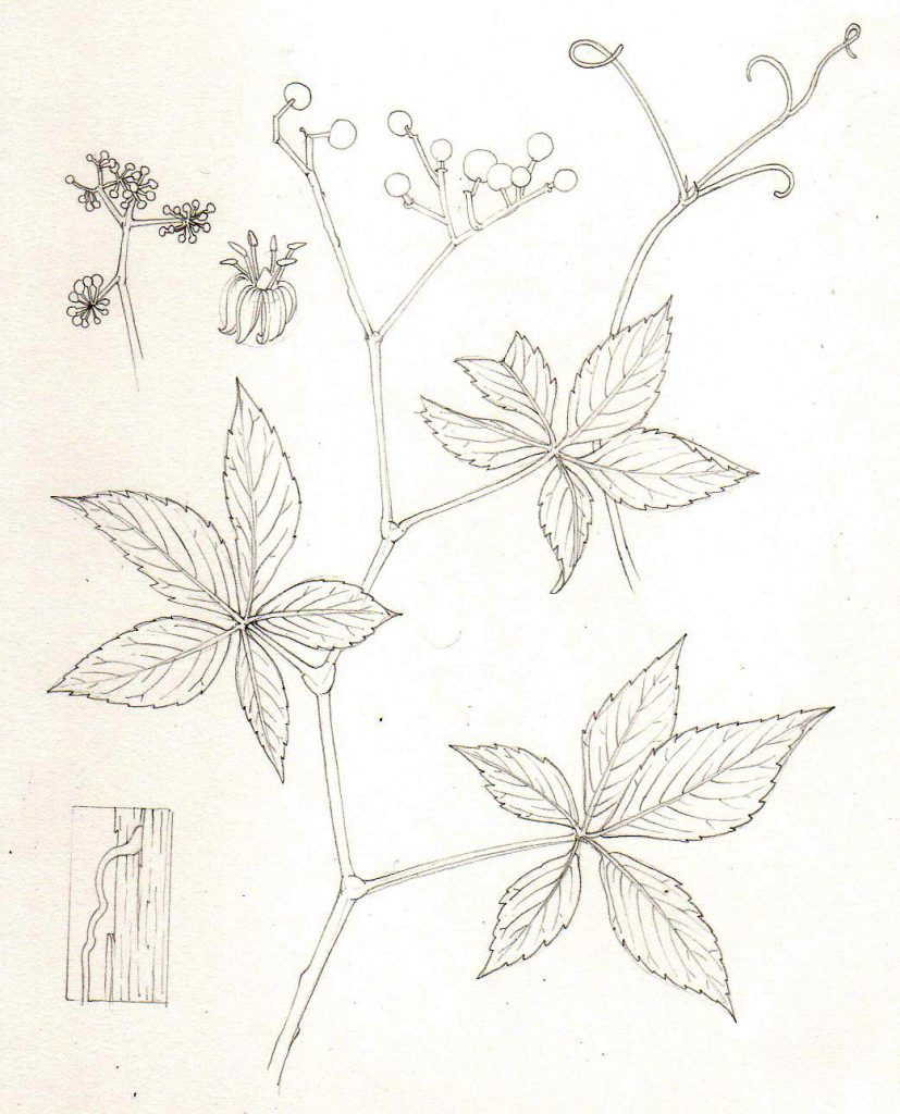
Once you’ve assembled your reference (preferably from life as it’s much easier than working from photos), draw up a pencil rough. This needs to include all the botanically pertinent features of the plant species. It also needs to look good, so take some time considering how to place the plant on the page, and the composition of your illustration. (For more on how to do this, have a look at my blog on illustrating winter jasmine.)
I love mechanical pencils because you don’t need to stop drawing to sharpen them. You just break the tip of the lead against the desk, and there’s a sharp new point. I favour the Pentel P205, with an H or HB lead.
Having had a lot of trouble finding a replacement watercolour paper to work on (the quality of my go-to brand, Fabriano, plummeted), I now like Fluid 100 HP. This hot press paper is available in the UK.
Plotting in the darkest darks
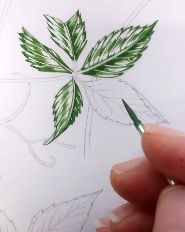
Next, I look carefully at the leaves. I look for the areas of darkest shadows, and try and see what shapes these are. Sometimes it can be hard to make out, so you need to use a little logic too. Every shadow is there because something has cast that shadow. Consider the bulges and uplifts of the veins and the leaf blade as you look for tonality in each leaf.
I also try to decide which side of each leaflet is darker. This tends to be the one which has shadows right up next to the mid rib.
I mix a medium green, and plot in the shadows. When you mix watercolour paint, be sure the consistency is right. Too watery and you get no colour. Too dry and your paint goes all all scratchy. Unpleasant as it is, I say the right consistency is about the same as that of blood.
Also, when you use watercolour, be sure to follow the brush as you paint. If you push upwards, the hairs bend and give a scruffy, messy line. If you allow the tip of the brush to complete the line, that line will be crisp and clear. I adore Winsor & Newton series 7 brushes. I generally have a number 2, a number 1, and a 000 on the go. My default size is a number 1. I love this brand because they not only hold their tips better than any other brush I’ve used, but they also hold quite a bit of paint, so you don’t have to spend your whole time re-filling them from the paintbox.
As always, when you paint, the harder you press the thicker the line.
This green is a mix of Viridian, cadmium yellow light, Cobalt blue, and yellow ochre. I like to use Winsor and Newton pans, but will top them up from tubes. If Daniel Smith or Daler Rowney have a better version of a colour, I’ll use that. Whatever works best!
(More on mixing greens can be found in my blog).
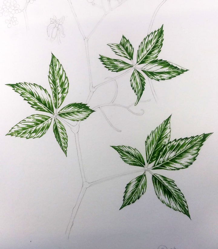
Repeating steps across the whole plant
I like working across the entire plant, so complete each stage before moving onto the next. This also makes sure that the colour mixes will be more or less consistent. You also get a feel for how the illustration is evolving.
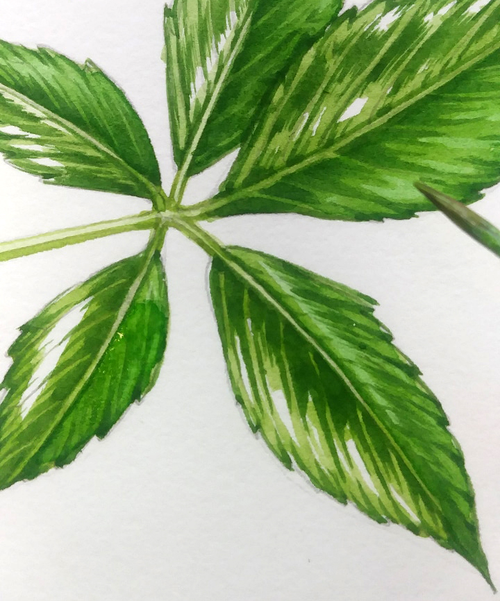
The picture below shows the False VA creeper with the darkest shadows of every leaf painted in, and allowed to dry. Each leaflet has one side which is darker, and the margins of the leaves are clearly delineated.
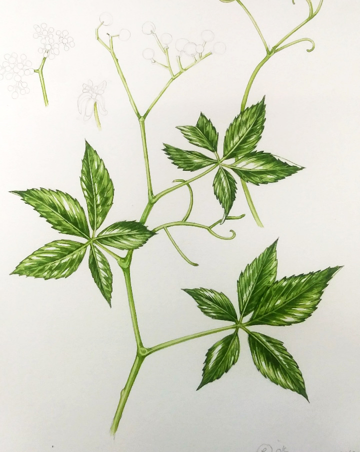
Midtones
Next, I mix up a slightly paler and a slightly yellower version of my green. This means adding more water, and a bit more cadmium yellow light. Never be tempted to lighten watercolour by adding white paint, it entirely changes the colour and makes the paint thick and muddy. Ugh.
I go over the leaves with this mix, painting over the areas which are already painted and dried, as well as creeping a little further into the white of the page. You might want to make the transition between paint and clear paper a bit gradual. You can do this with lots of tiny brush marks. Be sure to follow the direction of leaf growth whenever you pop paint onto your painting.
Be careful not to cover all the white paper. These areas are vital, they provide light and highlights; they give depth to the finished painting. Painting the whole area green will give you a flat finished illustration.
Also remember that with watercolour you can always go darker, but you can’t make it lighter once paint’s been put down.
Allow the paint to dry fully.
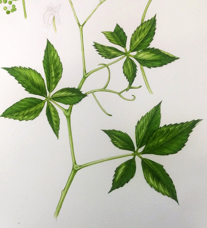
Adding a top wash
Now I mix up a very dilute version of the mid-tone green. This simply involves diluting it a bit, using clean water.
I pop this over the whole of the darker side of the leaflet, allowing the paint to be very wet and to dry on the page. I also add some to the other side of each leaflet, but ensuring the white paper is still visible in the brightest areas of high-light.
Add a pale top wash
Once this wash has dried completely, mix an even paler and more watery wash. Mine tend to have a lot of yellow ochre in them, and I apply them very wet. They unite the entire leaf, and give an extra layer of colour and depth. Often, this is the first time the veins of the leaves will have colour put on them. If things have gone to plan, it’ll definitely be the first time your white paper highlights have had colour put on.
Pick out your darkest darks
Once the top layer has dried, you’ll almost be there. You may want to get a little more depth into your darkest areas, though.
I mix up a very dark green, often adding winsor blue, purple, and vandyke brown to another green mix. The colour tends to be somewhere between dark blue-green and purple. With a very careful touch, pick out the tiniest areas of dark. These are often the edge of the mid-rib, the tips of the teeth along the leaf margin, the apex of the leaf, and the base of the leaf. Make sure you’re always using your reference to inform your decisions.
Be really careful not to overdo it!
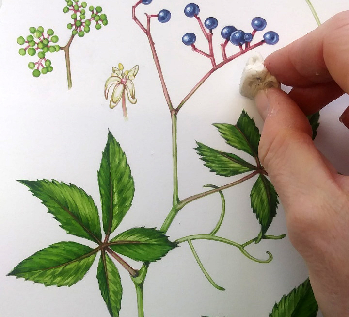
Rubbing out
Once the paint has dried completely (err on the side of caution here. I know from bitter experience what a nightmare it is to try and rub out paper with moist paint on. It’s not an experience that I’d reccomend anyone to share…) rub out your pencil lines.
A lot of people are surprised that this works, and it does depend on what paper and what eraser you use. I use a soft one, Factis seem to be my favourite. You can rub the page quite hard and the paint isn’t compromised at all. The pencil line will go. (If you’ve got a lot of layers of paint on top of the pencil, or if you pressed hard when doing the pencil lines, it may not be as successful.)
Get rid of the rubbed out bits of eraser. Some artists use a soft brush for this. I use my hand, but please make sure your hand is dry and clean first!
Finished!
There we are, completed! Below is a scan of the completed illustration.
It’s worth taking a minute to look for the areas of the leaf that were left as white paper for the longest. With the pale top-wash on, they look pretty much like part of the leaf, but (hopefully) provide a bit of depth too.

For more of my step by steps, please check out the Botanical step by step category of my blogs. And for more about the False versus the true Virginia creeper, take a look at my blog which will be published shortly.
The post Step by Step: False Virginia Creeper appeared first on Lizzie Harper.