
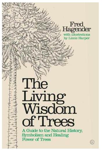
The Living Wisdom of Trees: Commission
In the summer, I completed more than a hundred pen and ink illustrations of trees for “The Living Wisdom of Trees” by Fred Hageneder.
The commission involved illustrating 54 species of fully grown tree, along with details such as blossom, leaves, or fruit. Illustrating the botanical details was straight forward (here’s a separate blog on this), but as for the trees themselves…
Challenges
Now I love working in pen and ink, but this job presented me with a new challenge. How to represent something as big as a tree in this exacting and detailed medium?
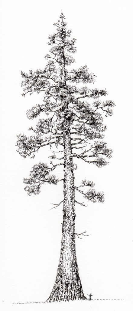
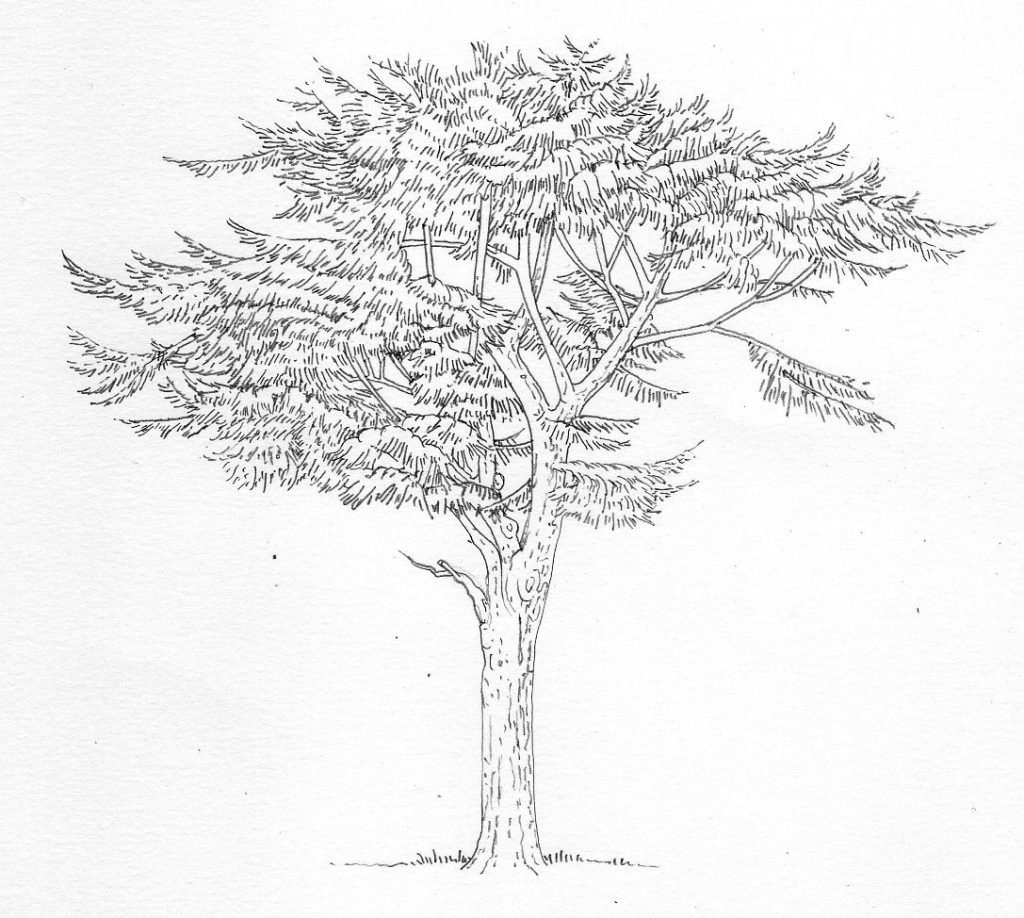
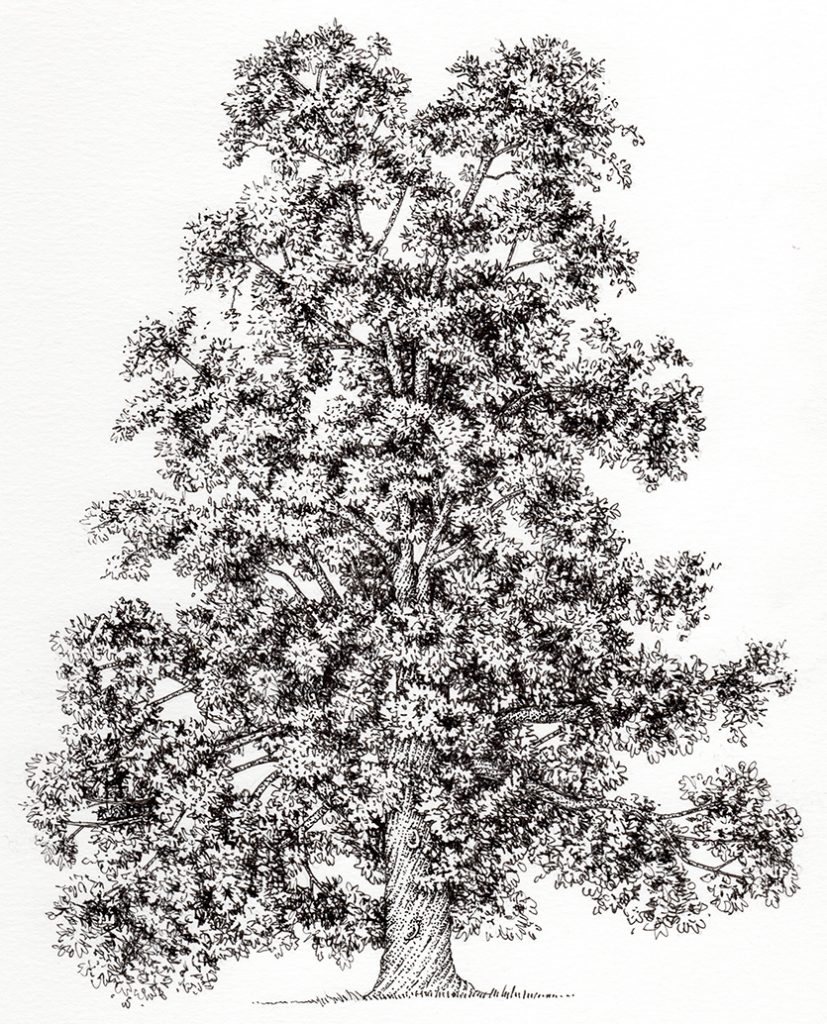
Giant Redwood Sequoia sempevirnes
I’ve always struggled with trees; I find capturing their bulk as well as the depths of shadow in their foliage tricky. My illustrations often look flat, and getting the lights and darks balanced in a way that makes the tree look three dimensional has occupied me for years. I take inspiration from sources like Rembrandt’s etchings, and engravings from old natural history books.
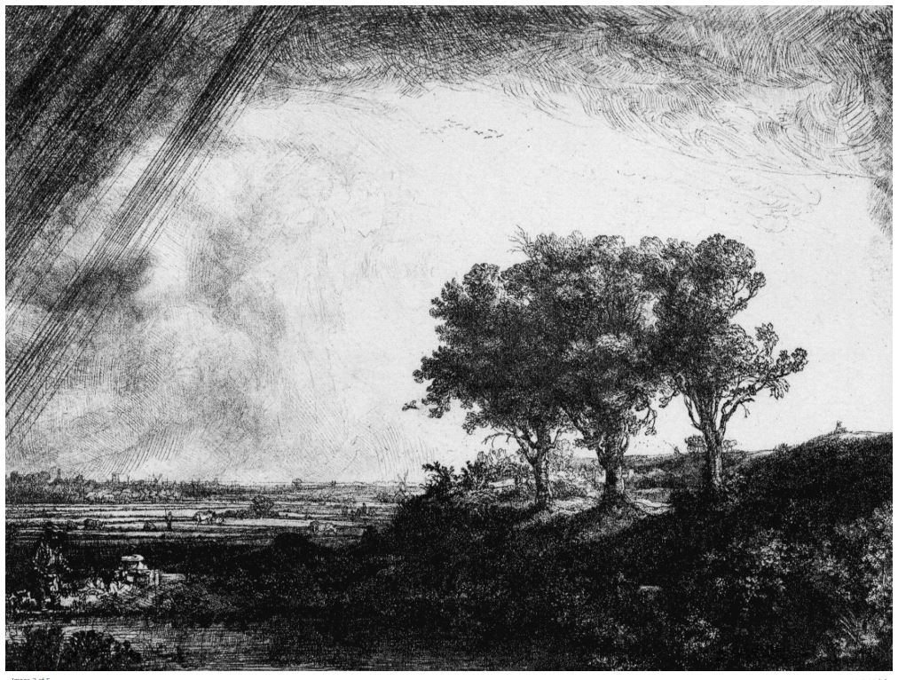
Rembrandt, The Three Trees (1643) Etching with drypoint and burin on paper
Another challenge was the need to make each tree look species-specific, a type specimen. Part of the challenge here is knowing how each tree “feels”; easy enough for native species, but much tougher for species which are new to me, like the Peepal and Kuari.
Luckily, Google images presents a plethora of sources to refer to, including some invaluable links to global arboretums and university arboriculture courses.
I had a lot of fun driving around Herefordshire looking for the perfect “type” specimen of willows, oaks, limes, ashes and innumerable other UK species. I’d take photos, sketches, and written notes to work from. I also have my sketchbooks to work from, an invaluable resource.
However, the need to make the pen and ink illustrations of trees look significantly different from one another remains. This became more pronounced with species which are alphabetically proximate in the book!
Kauri Agathis australis
Pencil Roughs
The first step is always to produce pencil line drawing roughs. These get sent to the publisher (Watkins) where the art director considers them and asks for changes. In most cases the trees were approved with no changes required.
Cedar of Lebanon Cedrus libani pencil rough
Blackthorn Prunus spinosa pencil rough
With some, they needed altering. Again, you return to your source material and exaggerate the characteristics that make that species distinct. I found this quite difficult, but I like a good challenge. I think about 15 trees needing tweaking. All the altered trees were approved.
You can see with the pear tree below that the second rough (on the right) has been made far more lop-sided and bends more. Branches have been thinned. The tree trunk is elongate and thinner than before. The foliage has been made less dense. I kept a note of all the changes I made on an Excel spreadsheet that I submitted with my revisions; if I’d not done so I would have forgotten the details that were tweaked.
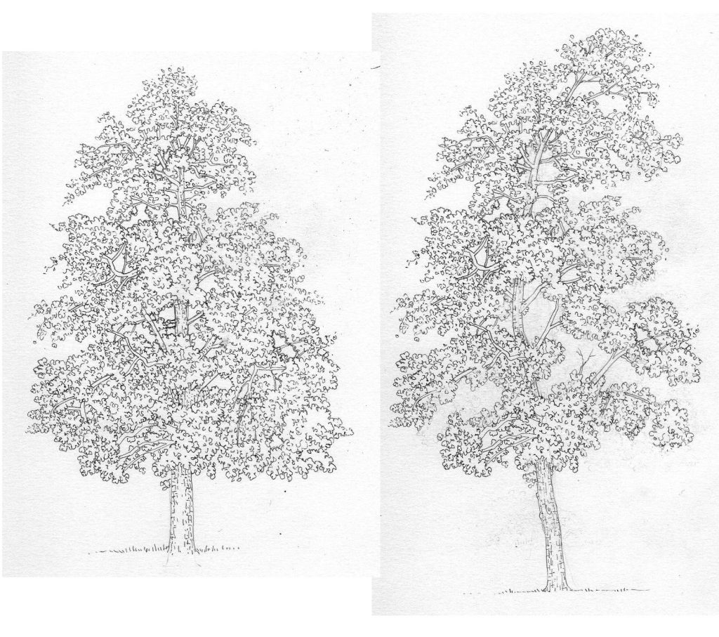
Pear tree roughs Pyrus domestica
Pen and Ink illustration of trees finals
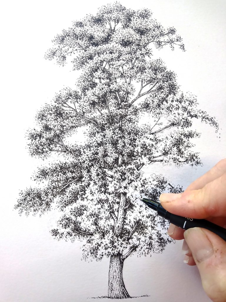
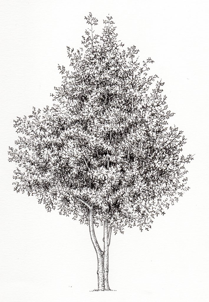
Once approved, I began the task of getting the illustrations inked in. This requires building up tonality with lots and lots of tiny marks. These need to echo the shape of the leaves, but obviously you need to avoid trying to illustrate each individual leaf. With conifers this is easy – a lot of straight lines show pine needles admirable.

Yew tree Taxus baccata
With the deciduous species it’s tougher. Make the marks too big and the whole picture looks blunt. Make them too small and you end up taking days on one lone tree. Below is the Laurel, one of the illustrations that has that “blunt” feeling. There are about four more trees that I feel are too blunt, but I’m not going to tell you which ones they are!
Laurel Prunus laurocerasus
There was also a nasty moment when I came to rub out my initial pencil lines. When I removed them, I also removed a whole lot of shadow and depth! It didn’t take long for me to realise I could erase the perimeter pencil lines and leave the pencil marks on the rest of the illustration. This kept the illustrations more nuanced.
Sweet chestnut Castanea sativa
I love the way the bark of the Sweet chestnut spirals, it’s a dead give away for identifying this species even in the depths of winter.
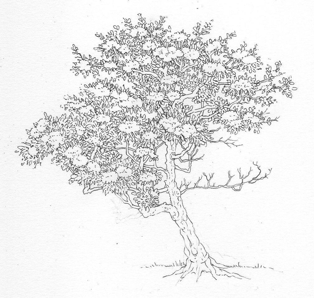
In some cases I left some pencil lines on the trunk too, as with the Hawthorn.
Hawthorn Crataegus monogyna
Working in Pen and Ink
The actual act of working in pen and ink is straight forward. I bought up tons of disposable permanent ink pens, in this case Unipin fine liners. A variety of widths means you can vary the weight of the line. Tree trunks and branch outlines were done with an 0.2mm, leaves and externals shapes and detail required an 0.1mm nib, while the fine stippling detail and cross hatching was done with a very fine 0.05mm pen.
Stippling an elm
Initially I only used tiny marks to build up darks; but pretty soon I realised I needed more texture and depth. I added cross hatching, lots of tiny squiggly lines, scribbling; anything to build into those darkest shadows and make them feel leafy.
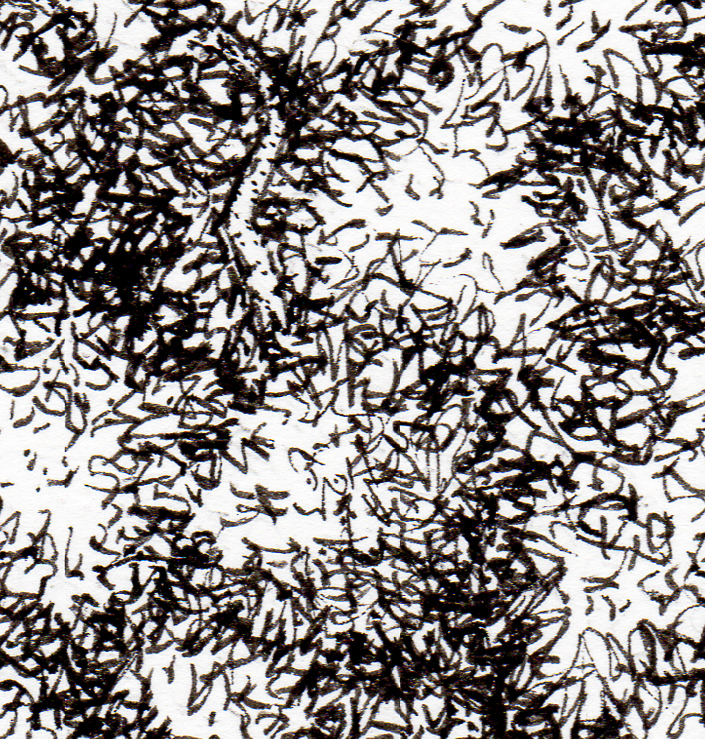
Detail of ink marks on London Plane Plantanus x hispanica
I also clocked that adding more detailed leaf shapes to the perimeter of the tree helped suggest these leaf shapes would continue into the bulk of the foliage. For trees like the Holly this was particularly important. You can see some residual pencil marks in the detail of the holly tree.
Holly Ilex aquifolium
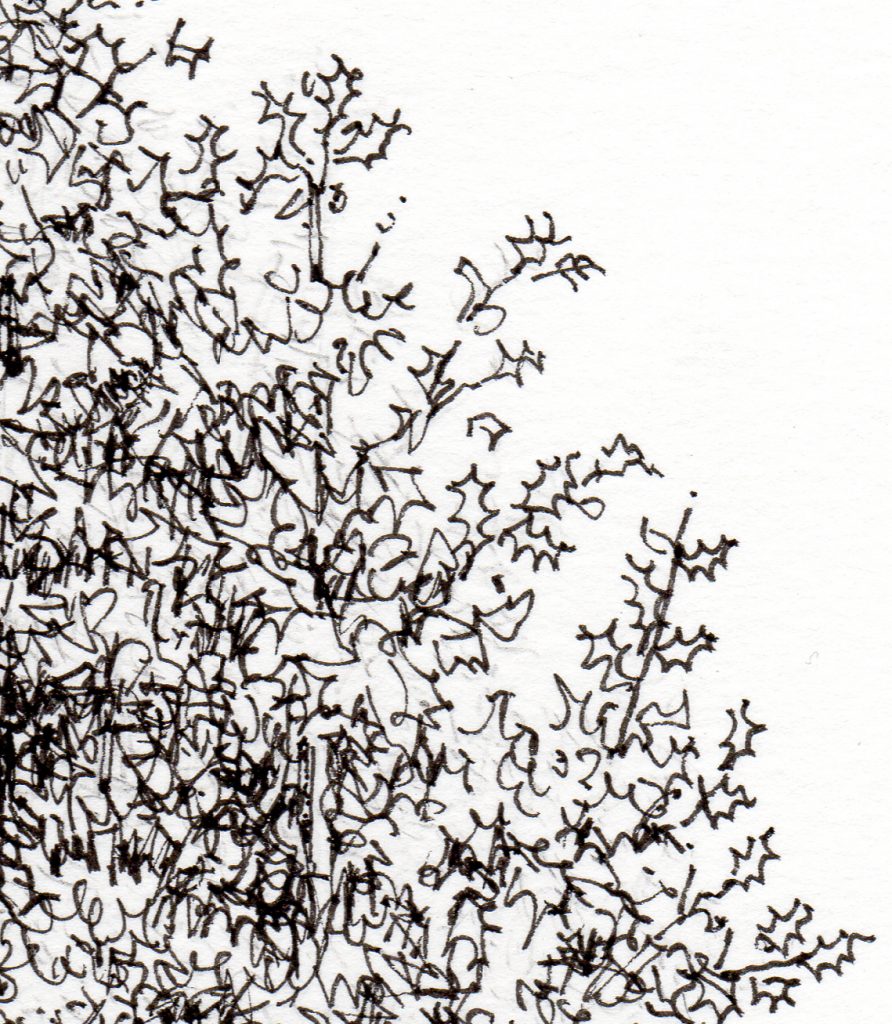
Holly Ilex aquifolium detail
The tree trunks were easier, and I used a lot more stippling to give them the required texture and curvature.
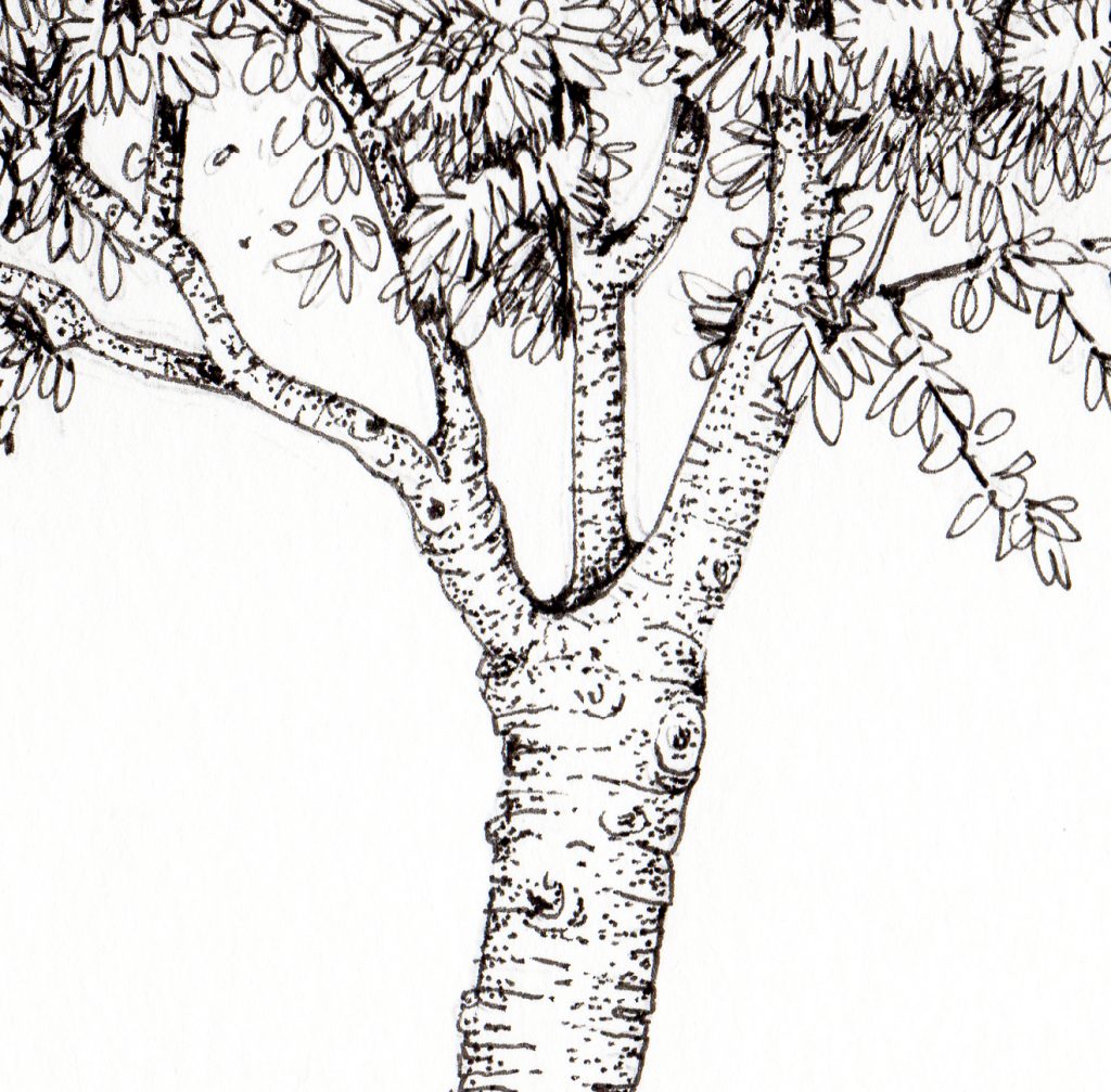
Detail of tree trunk of Cherry Prunus avium
Again, the conifers were simple. Lots of tiny straight lines built up texture, shape, and tone.
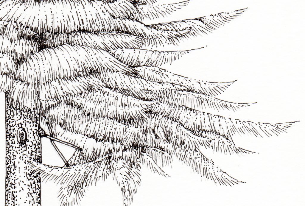
Detail of Larch Larix decidua
Physical challenges
Deadlines are ever present, and although Watkins had given me plenty of time to work up the finals, summer holiday and associated child care approached. This meant I had to work long hours. I’d estimated each tree would take 2 hours to complete. This turned out to be more like 5 or 6 hours per tree, with the knock on effect on my time frame.
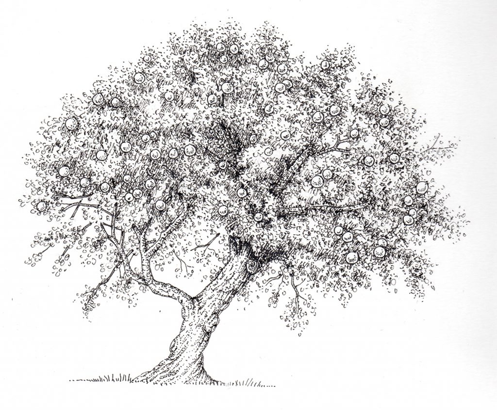
Apple Malus domestica
I like working long into the night, there’s something snug and cosy about being alone with the radio in my studio at 2am.
No, the problem wasn’t working late. It was my hand!
I guess the minute repeated action of millions of dots and weeny lines takes its toll; by the end of each day my hand would ache like anything, which made it hard to go on drawing. I did though, and eventually completed the tree illustrations. Over summer, despite not lifting a pencil, my hand continued to ache on and off for three weeks. A troubling event for a free-lance illustrator! (It’s better now).
Favourites
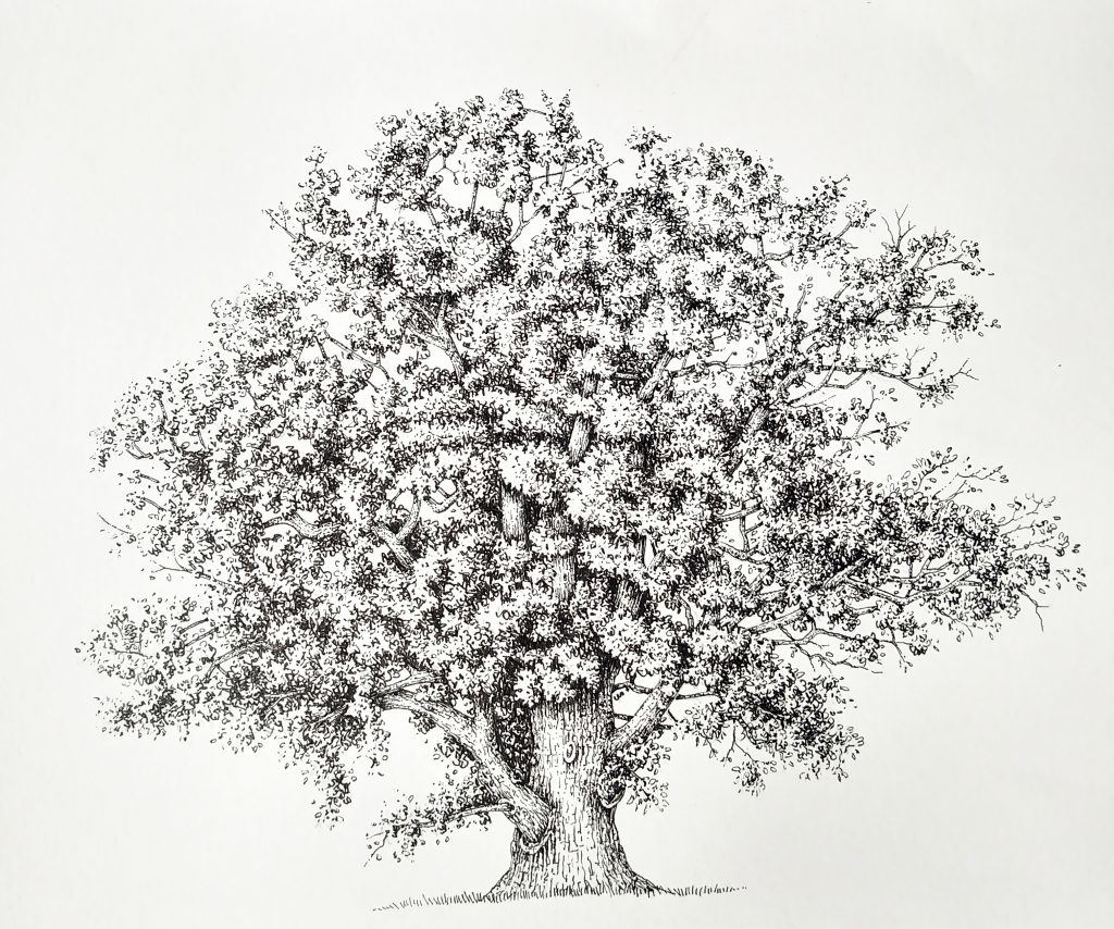
Overall I was pleased with my pen and ink illustrations of trees. There are a couple of “blunt” ones, but the majority work well.
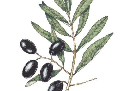
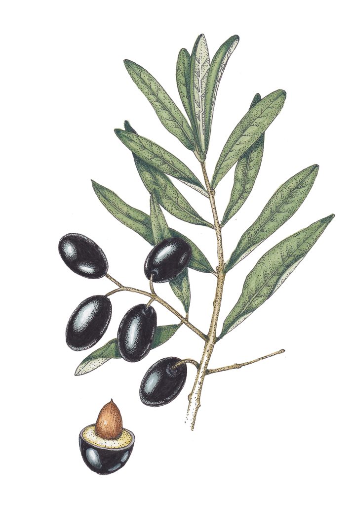
Particular favourites are the Baobab, Olive and Scots Pine. I liked the Orange too, even though it had required a full re-draw at rough stage.
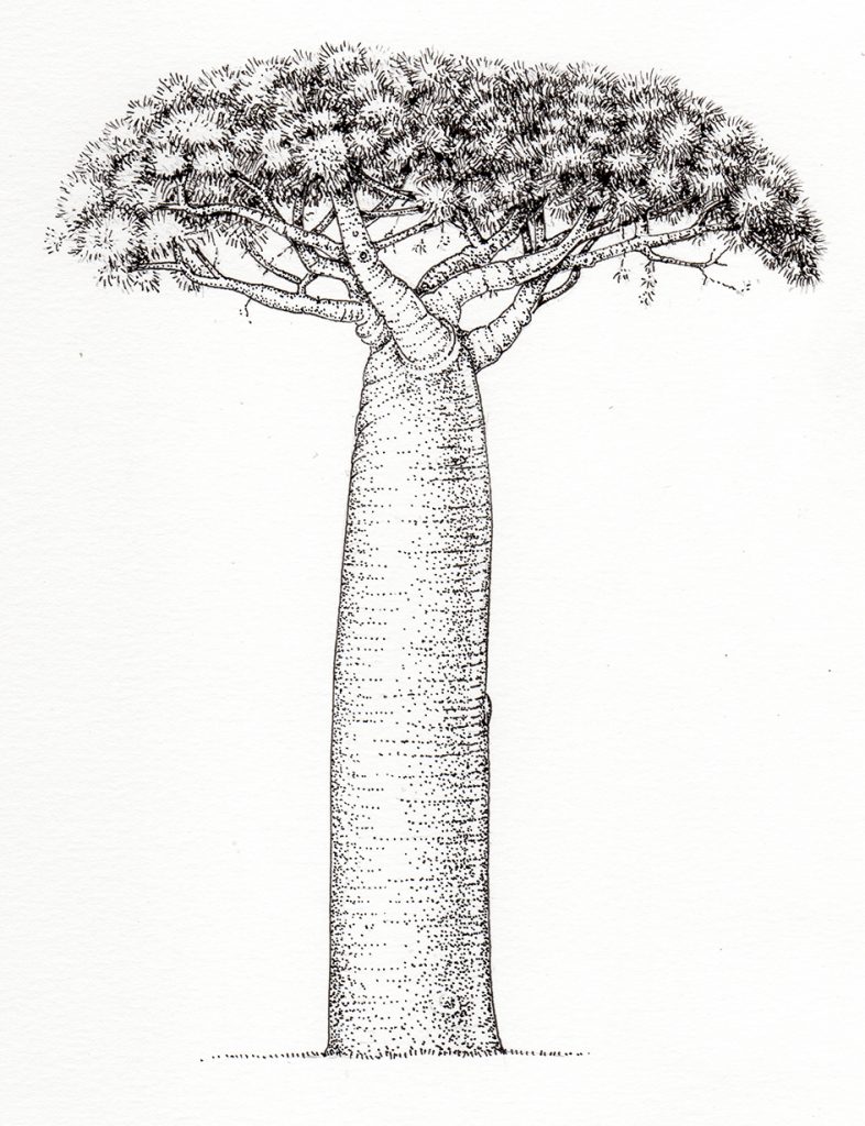
Baobab Adansonia grandidieri
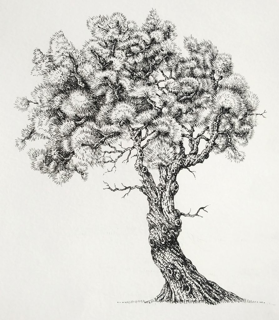
Olive Olea europaea
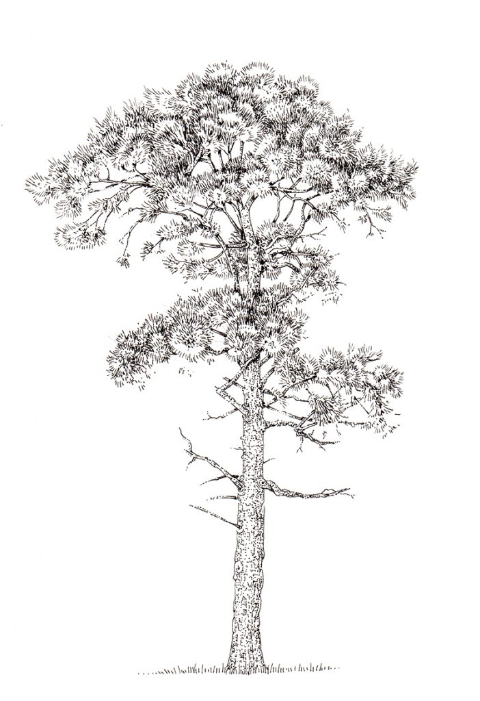
Scots pine Pinus sylvestris
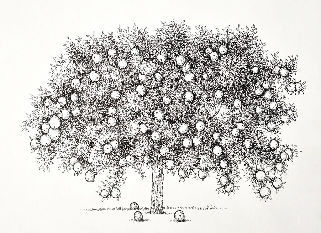
Orange Citrus sinensis
Although this job presented challenges, I ended up really enjoying it, and learning a great deal more about trees. However, next time someone asks for a book’s worth of fully tonal pen and ink illustrations, I may well have pause for thought!
If you’d like to see a film of snippets of me stippling and working on this job in real time, please take a look at the film below.
The post Pen and Ink Illustrations of Trees appeared first on Lizzie Harper.


