
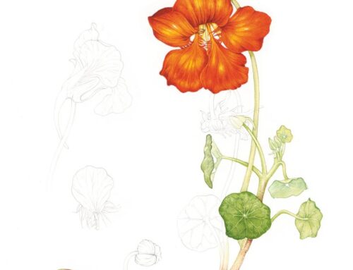
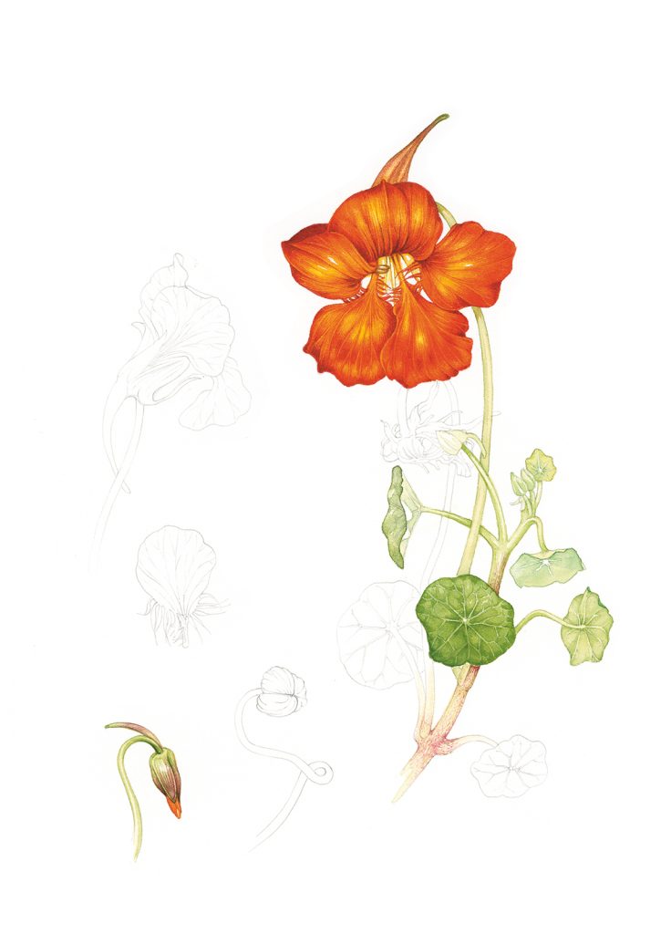
I’m in the process of updating my website. Along the way, I’ve questioned some branding elements, and of course, the logo has come up. Clint suggested a redesign and I’m not sure, but I think I am leaning towards a new one.
I’d like to share the process, and get your feedback along the way! My options are keeping the old logo, designing something new myself, or hiring an outside designer if it turns out I’m too close to the problem – in any case, I’ll have made a decision by the end of this series of posts. Thanks for following and thanks in advance for your comments! I figured it would be cool to see inside the logo creation process, and some of you will have great ideas I hadn’t thought of.
Here’s the current logo in its two versions:


I made this logo in 2010.
The two rectangles were meant to represent either Maya and Clint coming together to create a company, or art and science overlapping in medical illustration. These meanings are obviously not seen by the viewer without my commentary, so I think they are only serving as a design element. The green color was chosen because I wanted a light, fresh feel and it matched a previous website. I still like green, but again, it doesn’t need to be kept. The typeface was intended to be professional looking, and it is, but looking back it’s also reminiscent of hand-lettering on old anatomical drawings. I might want something a little more bold, modern, and clean for the font. (I do work that’s shiny and often high-tech, and even though I build on what my predecessors in medical illustration have taught me, I don’t really want an “old-school look” – or pen and ink anatomy – or Leonardo DaVinci references in my logo.)
Thank you for joining me in this project! Thoughts on the new logo to come in the next post.