
I recently completed a blueberry illustration for a packaging job, and thought it’d be the perfect opportunity to give a quick explanation of how I illustrate shiny dark fruit in pen and ink.
Drawing blueberries
Coming up with the initial drawing was tricky. it had to fit the layout of the product’s box, and the commissioner wanted lots of berries; far more than one would normally see in nature. Every time I submitted a pencil rough an email would ping back – “more fruit!”
Anyway, we finally came up with something that worked. The next step was to make the berries look really juicy and delicious.
The illustration was done on a decent heavyweight cartridge paper, in this case Daler Rowney Smooth Heavyweight (220 gsm/135lb). This paper (like many others) shows up slightly grey on scans, which I correct for at a later stage. This explains why there’s a slight cast to some of the images in this blog.
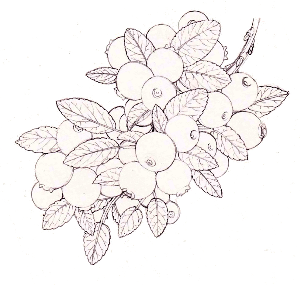
Pencil rough of the blueberries (later rotated)
Showing shine
A good way to show the ripeness of fruit is to emphasize the shine on its surface. Of course, when drawing on the page, this means making sure there’s plenty of white paper left to act as shine. You also need to make sure there’s a good contrast between the dark of the fruit and this highlight.
Once you establish your light source, it’s worth plotting in lights and darks with a pencil line. I tend to put a circle around the area of highlight, a little larger than I want the final shiny area to be.
Next you have a choice. You can build up the dark areas of fruit with thousands of tiny ink dots in a process called stippling. This looks amazing, but takes forever. Or, you can take a short cut.
Short cut to dark fruit
I colour in big areas of the fruit, where I know the deepest shadows lie. My permanent ink pen is used for this (I currently favour Unipin but any thin-nibbed pen with waterproof and fade proof ink will be fine). Use a pen with an 0-5 nib as I want to block in large areas. The larger nib is faster, and also provides more consistent cover.
I outline each blueberry, then block in the darks as solid crescents of black ink. I try to keep the edges a little scruffy as this will make the next step less time consuming.
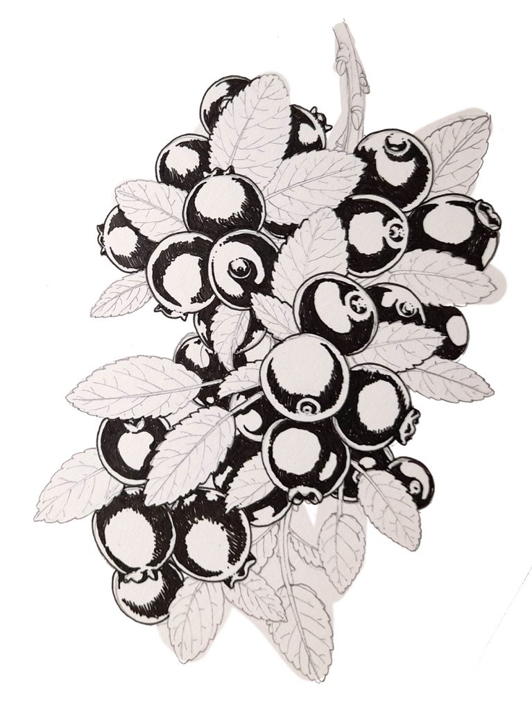
Blueberry sprig with darks of the fruits plotted in
Blending the darks and the highlights
The next step is to make a natural transition between the dark areas and the highlights. This is where the endless act of stippling kicks in. Making lots of tiny dots to represent a tonal value. What you’re after is a smooth transition from the solid black to the white. As you encroach into the white, be sure the dots are further apart.
Be careful. Stippling is cruel. If you stop concentrating you may end up with dots on top of each other, in an area where you’re looking to represent a light tonal value. This can look clunky. In fact, you can see where this has happened in the illustration below. The central berry has a dark spot on the bottom edge of the highlight. This immediately draws the eye, and the whole edifice of pretending to represent light and dark with ink spots threatens to crumble.
You can see why the rough edges of the black areas are important. They give a rugged margin that you can naturally build on, as you reach into the high-lit region of each fruit.
You may also want to soften the external edge line of each blueberry. Do this by adding tiny dots along the inside edge of the line.
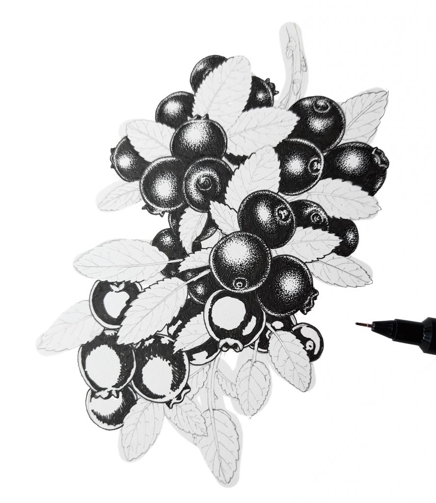
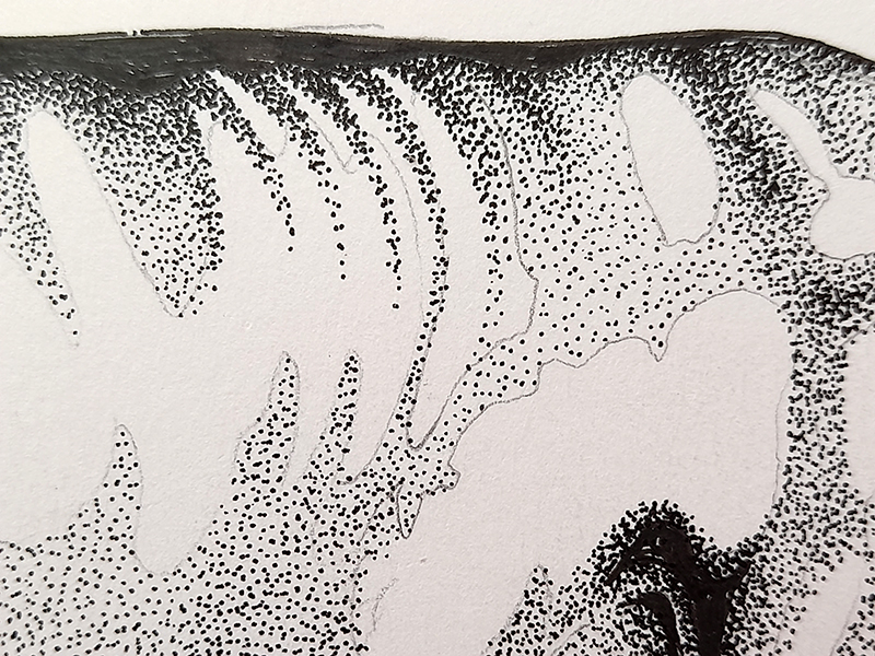
Illustration in progress showing the pen nib and the fruit which have vs those which have not been stippled.
Balancing the illustration
Once you’ve given each blueberry this treatment, take a step back. You may find they’re all too light. In which case, work back into the fruit, darkening the stippled areas and shrinking the regions of highlight. Berries which are tucked behind foliage of other fruits will appear a little darker. To draw the eye, you’ll probably want your central blueberry to have the most light on it.
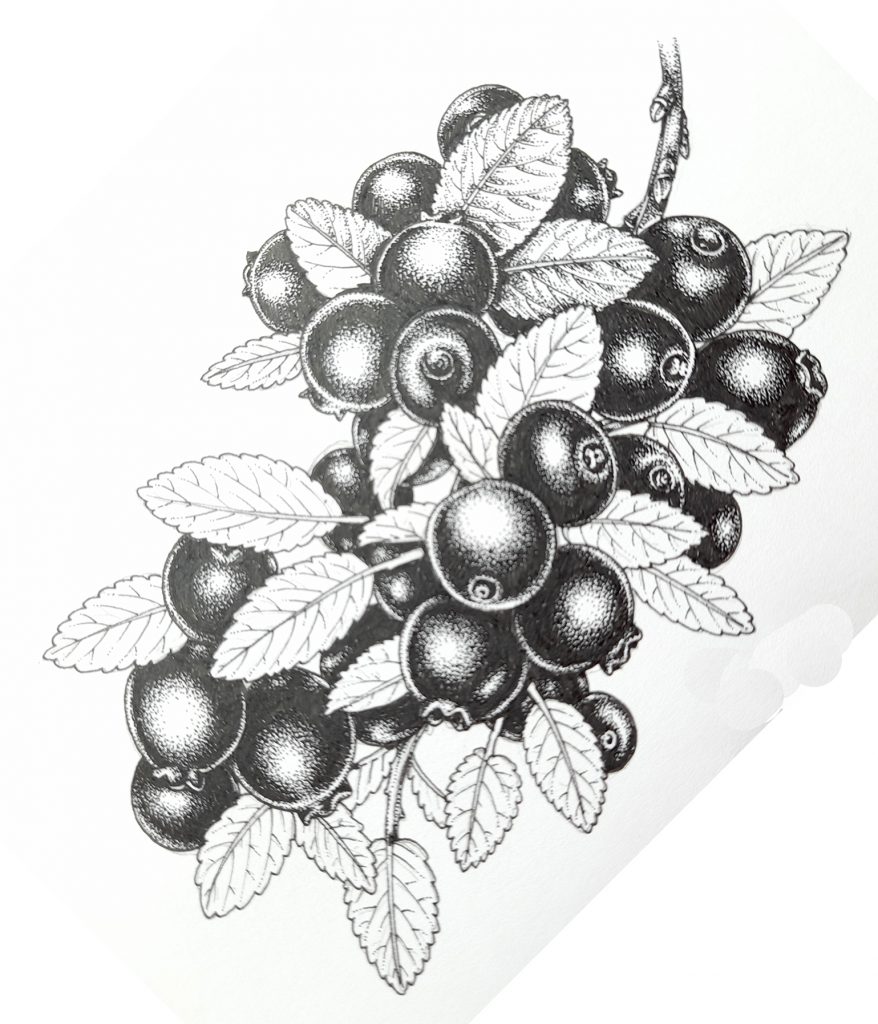
Blueberries with completed berries
Finishing up and applying the technique to other subjects
Once the fruit are done, you can move onto the leaves, which are a little trickier. These need to give information about the way light falls on the veins. A youtube video I recently posted, discussing how I drew the leaves and catkins of the Downy Birch in pen and ink might be of use here.
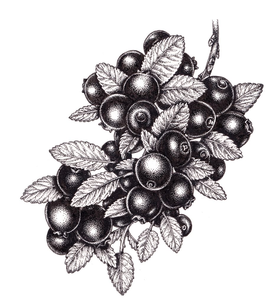
Completed illustration of the Blueberry sprig
You can illustrate anything in pen and ink using this same technique – cherries, beetles, cows….. The image below is a detail of the back of a cow. I took the photo in the middle of illustrating the animal, to show the process. Solid black, stippled areas of darker tone (at the top). These fade out to white where the highlights are. You can also clearly see the pencil lines I mentioned earlier. These show where the lighter areas of the subject are.
Detail of a cow showing the technique in practice
And below you can see the finished illustration, with that back detail in context.
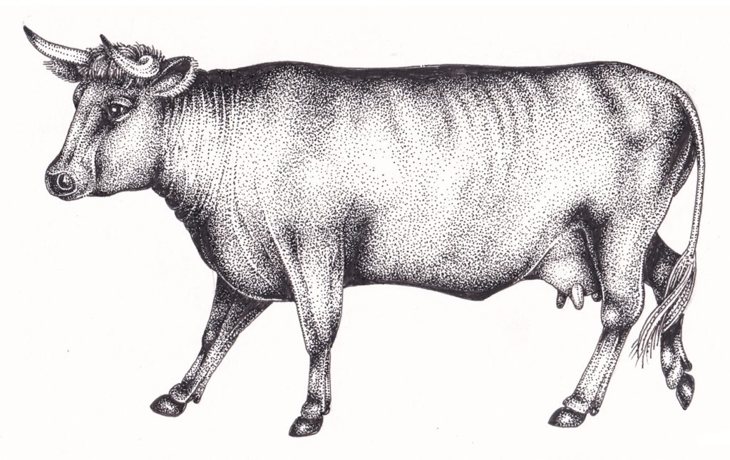
Cow pen and ink illustration
Below is an illustration of another dark fruit, the cherry. Again, it’s the same technique. When seen this close up, you can see what an easy technique it is to execute. Colour in blocks. Do heavy dots round the immediate edges. Do lighter dots where you move into highlights.
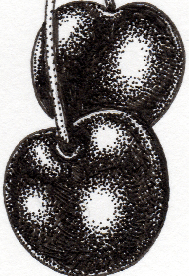
Cherry detail
And then, when you zoom out, you can see how effective the technique can be. Behold! Shiny fruit!
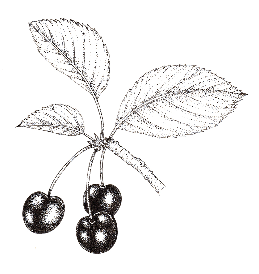
Completed pen and ink illustration of cherries
To be honest, it’s a similar approach when it comes to showing shine on fruit when you use watercolour. Block in the darks, then blend outwards into the untouched paper of the highlights. For more on this, please check out my blogs on showing shine on Hawthorn and Rowan.
Good luck illustrating, and don’t worry if all the stippling leaves you feeling dotty. It’s a common afflication!
The post Blueberry: step by step Pen and Ink illustration appeared first on Lizzie Harper.
