
Illustrating bracken and ferns may seem to be a really difficult job. However, the challenge lies in the drawing, not in adding the colour.
I recently completed an illustration of Bracken Pteridium aquilinum for a forthcoming Field Studies Council Guide to the flora of Woodlands. I thought this was the perfect chance to explain the process.
Drawing bracken and Pencil roughs
Bracken is a large plant, some plants stretch to over 2m tall. The leaves or fronds are sub divided, and each division is divided again. this is called being tri-pinnate. And it’s beastly to draw! Reducing this complexity and size to a sheet of A4 paper is a challenge.
I took two approaches, and drew two versions. One had the bracken in a clump, as it grows in the wild.
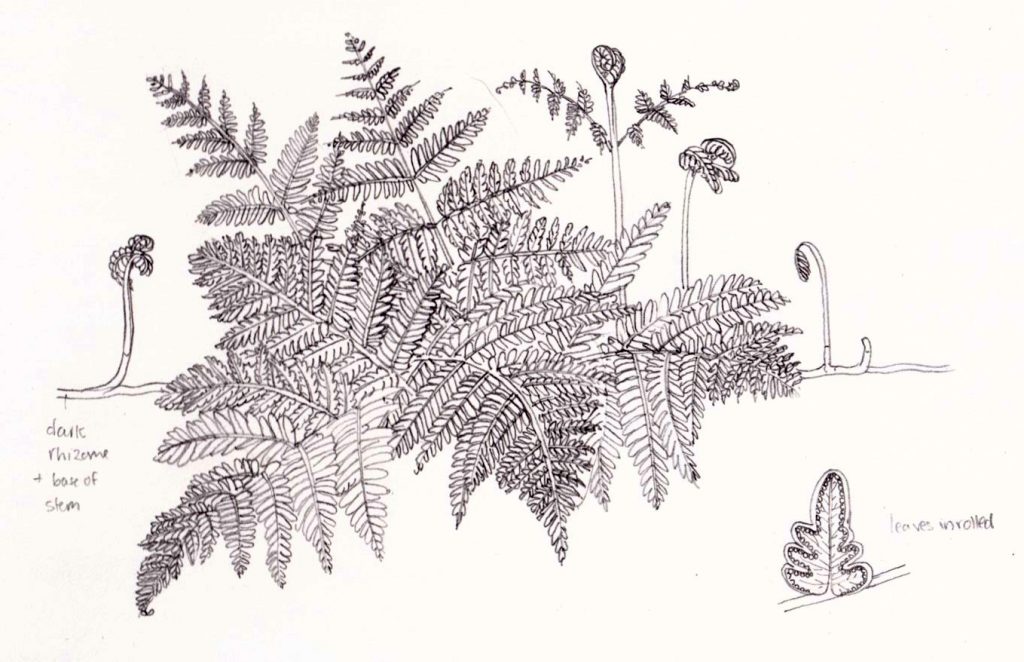
Bracken rough 1
The second shows two separate fronds and made more of the root structure. This meant working from photos as well as filling my studio with bracken. Photos are mighty useful for reducing a plant to a manageable size. However, to guarantee getting the botanical detail correct, you need the plant itself, or at least close up photos. (For more on working form photo reference, check out my blog). The client chose this second rough, which I think was the right choice.
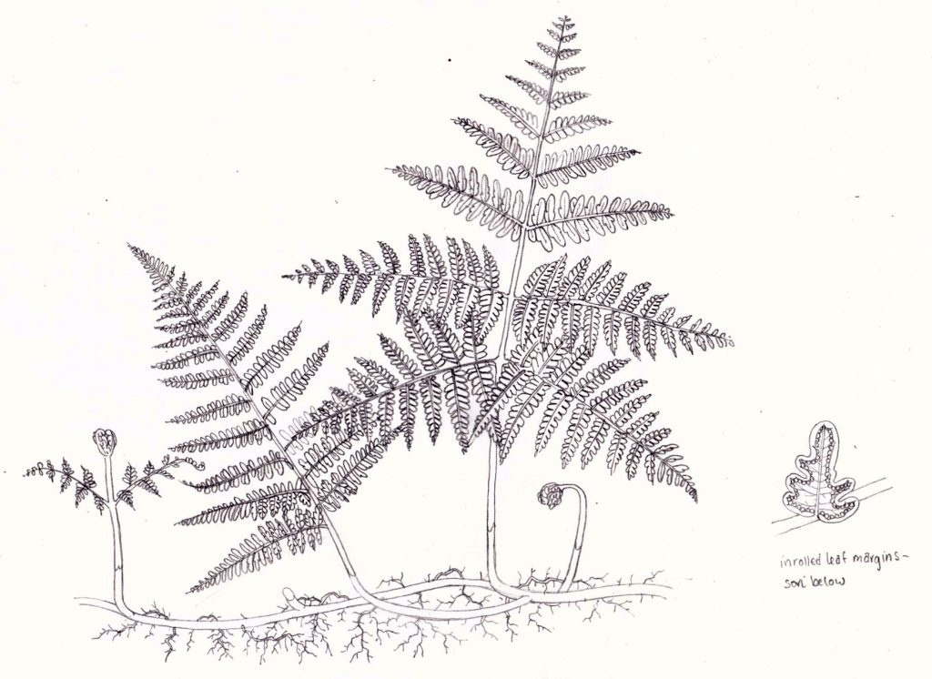
Bracken rough 2
Adding colour
So you have your pencil drawing ready yo go. Surely this is where the hard work begins? Well, no.
The very fact that the drawing of the bracken was so difficult now works in your favour. there’s an enormous amount of detail in the drawing. this means that there are very few large expanses of colour. It’s these areas that end up needing the hard work. They require attention to show the lights and darks, and to add texture.
With complicated structures like the bracken, you need do far less to get a good result.
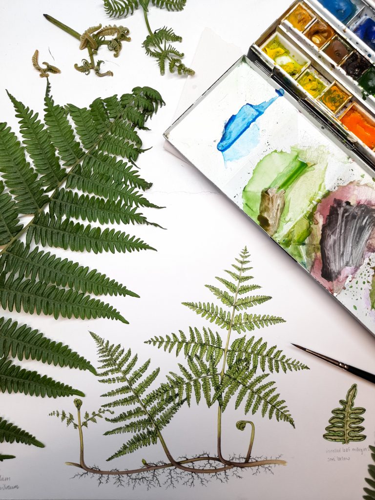
First step is to mix the right green. In this case I’m using Winsor and Newton watercolour paints. To get the right green, it’s a mix of Cadmium yellow light, purple, Yellow ochre, Sap green, Cobalt green, and some greenish blue like Pthalo. Keep mixing until it matches the frond in your hand.
Then all you do is go over your pencil lines with a thin and confident paintbrush line. Brushes that hold their tips well, like my beloved Winsor & Newton series 7 (number 1) are ideal. To make sure your lines are crisp, work on a smooth, hot-press paper. Currently, I’m loving Fluid 100.
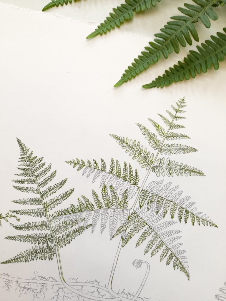
Bracken illustration with leaf edges outlined in green. Areas remaining to be outlined will be done in a slightly lighter shade of green.
If you want to add a little extra dimension to the illustration, you can mix two greens. Make one somewhat lighter than the other. I do this by adding yellow. Then choose which side of your frond is the lighter. Outline these leaves in the same way as before, but this time with the lighter shade. Keep the side of leaf which is lighter consistent across the plant, but be aware it may “flip” as you cross the main stem of the frond.
Tackling stems
You can put in the stems whenever you feel like it. Sometimes I add them quite early as it ties the illustration together. Mix a slightly brownish yellow-green. Outline the stems, with a little more weight to the right side of each stem. Then dilute your mix with water to make it paler. Once the stem outlines are dry, paint over the stems with this dilute mix. You should have stems which look a little darker on the right hand side. Again, this adds to the feeling of light and shade in the illustration.
Once dry, you may want to add other colours to the stem. For bracken, this would include the dark brown which appears at the base of the stems. This needs to be included as it’s species specific. other ferns may have flaky scales at the base of their stems. Be sure to include these if they’re present.
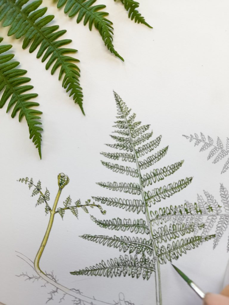
Stem completed, returning to the leaves.
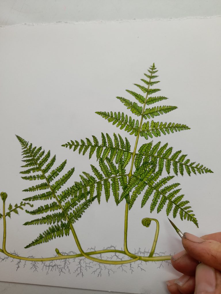
Adding body colour to the fronds
Once the outlines are dry, you can add colour. Mix up a more watery green than before. Tackling one side of each frond at a time, just paint this on top of your fern. Allow the paint to be nice and wet. As it dries, it’ll add its own crisp edges to your outlines and sharpen up the illustration. Be sure not to do both sides at once. If the wet paint runs into other areas, it wont look as sharp when it dries.
In the illustration below, the top of the fronds on left hand side have been outlined in a slightly darker green. The top wash is also been a little darker. The opposite side of each leaf has a lighter and slightly more yellow colour. This difference in colour tricks the eye into thinking that the two sides are slightly curled upwards, with one side casting its shadow on the other. it makes the plant look less flat.
On the other side of the main stem (rachis), flip the pattern of shadows.
I’ve also added some darker green to the areas of the stem which overlap. Again, this is to add depth to the illustration.
Top washes on the fern are drying
Where the fronds of the bracken leaf overlap, I’ve picked out the shadows in a darker shade of green. I mix this by adding browns, blues, or purples to the mix. Be careful with this darker shade, you want it to represent shadow, not to look like the main colour of the plant.
Adding Shadows
Once completely dry, you can add even more definition to the fern by picking out your darkest darks with really quite a deep colour. I tend to use a mix of purple with cobalt blue. Be judicious with these dark shades, and remember you’re adding them to add tonality and clarity, not just to muddy and darken the picture.
You can also add the same colour to pick out the darkest shadows on the roots.
Completed Bracken illustration with darkest darks added.
Finished!
And really, that’s it. If the differences between the sides of the leaves looks too stark, you can add a dilute green top wash to unify them. If they look too pale, revisit and add another layer of wet green.
Compared to the huffing and puffing involved in getting the leaves of something like a rose or a hazel illustrated, this is a walk in the park.
The drawing is definitely challenging. But when it comes to the “colouring in”, the intricate details turn our to be your allies.
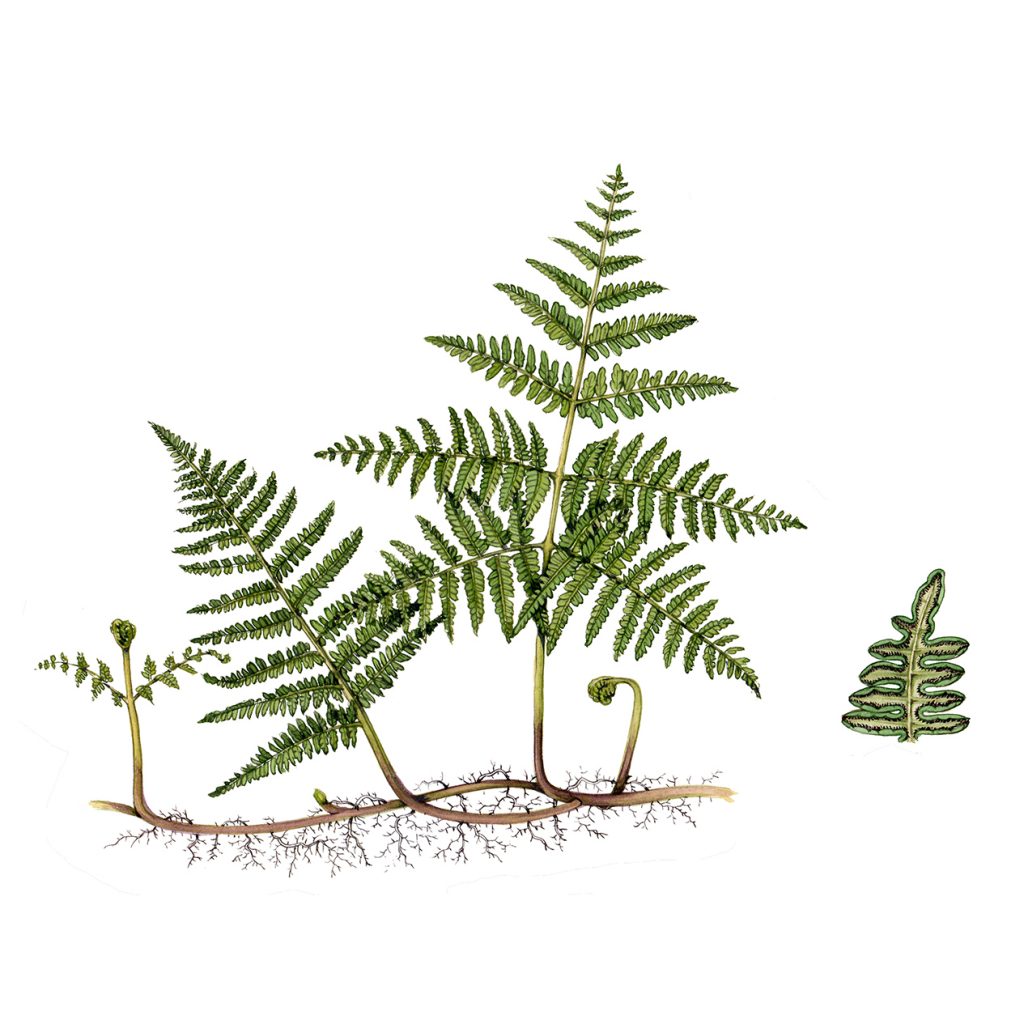
Bracken Pteridium aquilinum with detail
Other examples
Below are some other examples of ferns done using the exact same approach.
The Hard fern has also had the blunt leaf tips darkened a little with a we-tish mix of cobalt blue.
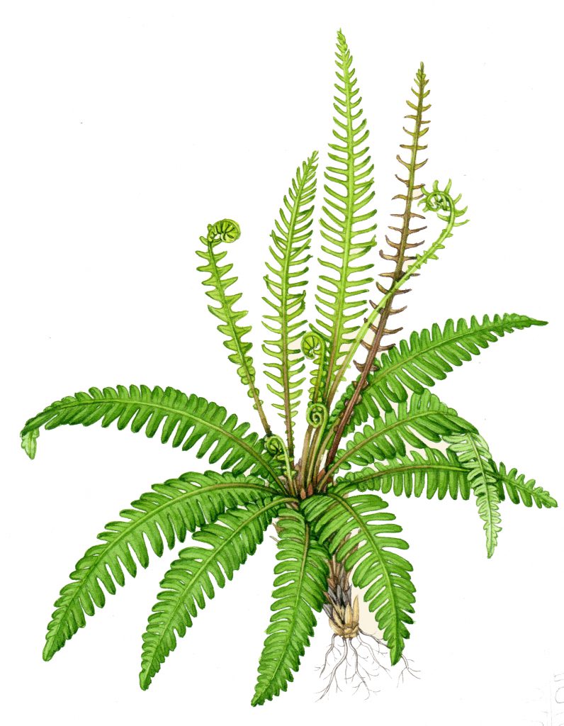
Hard fern Blechnum spicant
The Male scaly fern (below) has also had a darker shadow laid along the right hand side of the central axis. This helps draw the eye up the plant. You can see the same approach we discussed above clearly. The top of each small frond is darker on one side than the other. And once you cross the central axis, that pattern flips.
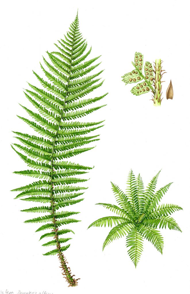
Scaly male fern Dryopteris affinis
With the Maidenhair spleenwort below, a midrib was added to each leaf. Each leaf was outlined. It had a midrib painted in. A flat top-wash of green was added. And that was it. In this example I didn’t even need to play about with lighter or darker shades of green. I just made the leaves at the back of the plant darker by popping a blueish brown shadow on them.
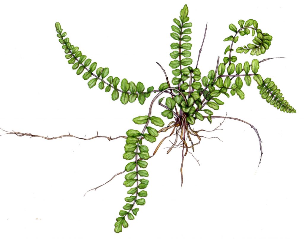
Maidenhair spleenwort Asplenuum trichomanes
Feel free to give it a try. You might be surprised by how easy it is. As the for the drawing of any ferns though, I’m afraid that part of the job is just really hard work!
The post Illustrating Bracken and Ferns appeared first on Lizzie Harper.
