
My earlier blog, Wild Shreds: Illustrating Pet Food packaging gave an overview of completing illustrations of a series of animals for Wild Shreds pet food. In this post I’ll take a look at the work involved in creating one of these illustrations; the Deer. All illustrations in this blog are copyright Spot Farms 2019.
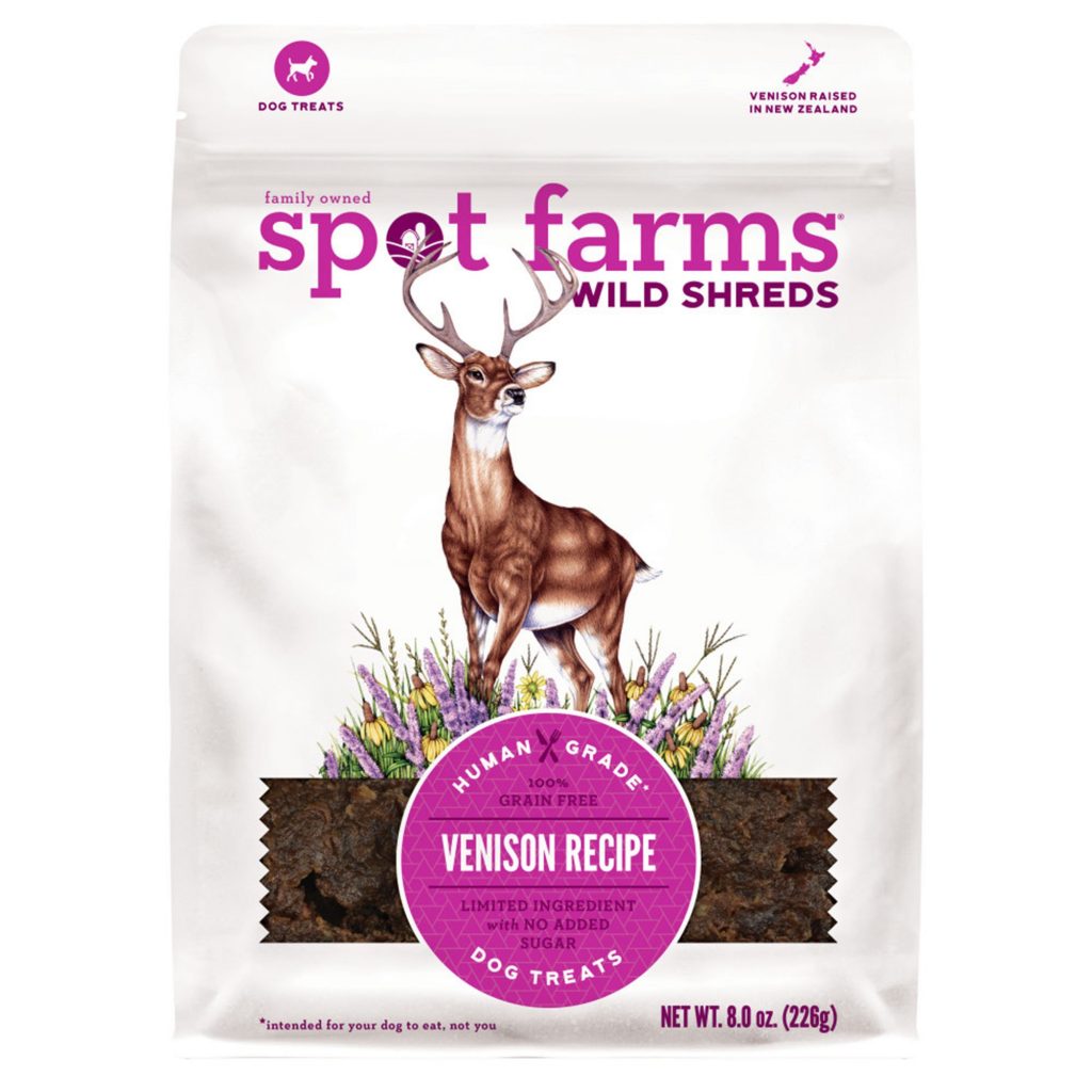
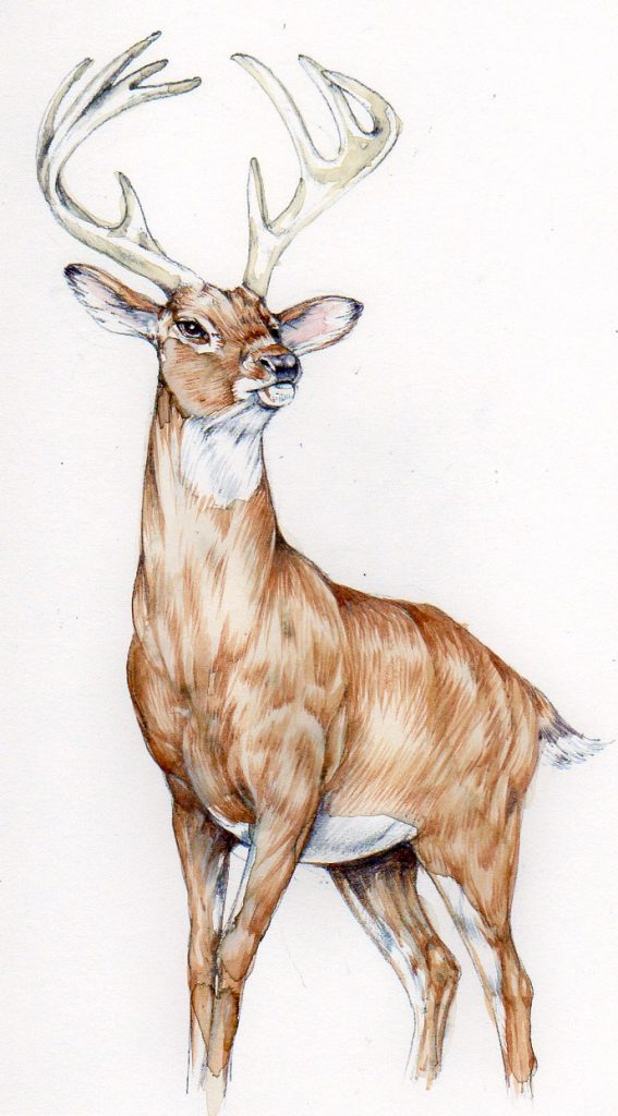
My deer illustration on Wild Shreds packaging.
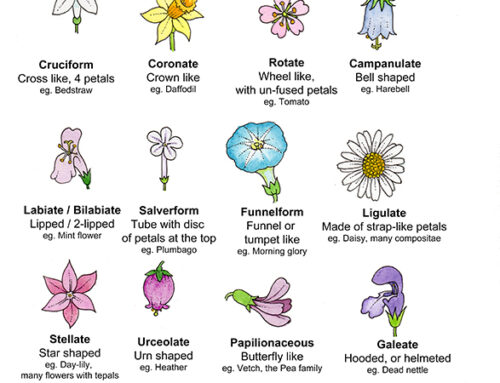
Reference
The first step is to gather all your reference together, and compare sketches, photos, and images with the brief. This illustration needed to have the deer looking majestic and proud; luckily, deer lend themselves to this attitude.
I chose to use a North American species as Wild Shreds is for the American market. The Mule deer Odocoileus hemionus and White-Tailed Deer Odocoileus virginianus fitted the bill perfectly, and these species formed the basis of my research.
I referred to my own photos, and to images online. You always have to be very careful when you work with online imagery, it’s illegal to simply copy another person’s photo as this constitutes infringement of copyright. Also, if you work from photos without questioning them, you’re likely to perpetuate any visual errors. Using lots of different sources help guard against both of these mistakes. For more on working from photo ref, check out my earlier blog or my FAQ page.
A really helpful source turned out to be brilliant taxidermy. Photos of masterfully stuffed deer heads were very useful indeed as most folks wanting a stuffed stag head on their wall want it to look, well, majestic and proud.
Composition
We definitely needed to be looking upwards, with the deer above us. We also needed a species with fine antlers.
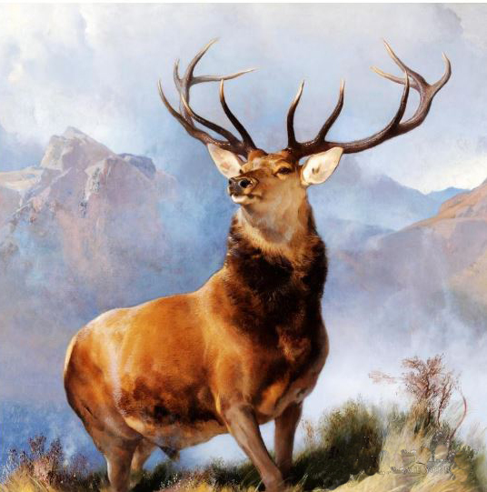
Monarch of the Glen by Edwin Henry Landseer 1851
I also took a look at the iconic masterpiece “Monarch of the Glen” by Edwin Landseer. His remit was clearly along similar lines, so learning from the skill and experience of others is always a good idea.
Piecing together the reference also involved adding vegetation at the feet of the stag. My art Director (Austin O’Connor from Heat) was brilliant with this. he knew what plants he wanted, and had already considered the colour scheme of the packaging and how the flora tied in with it.
I worked up about 20 pencil thumbnail sketches. These are tiny little drawings, postage stamp sized. They include lines to suggest the main focus and the movement in the drawing. From these, I picked about 12, and worked them up to simple line drawings.
Pencil Roughs
Simple pencil roughs are small and include no shadows, just a plotting of the relevant elements on the page.
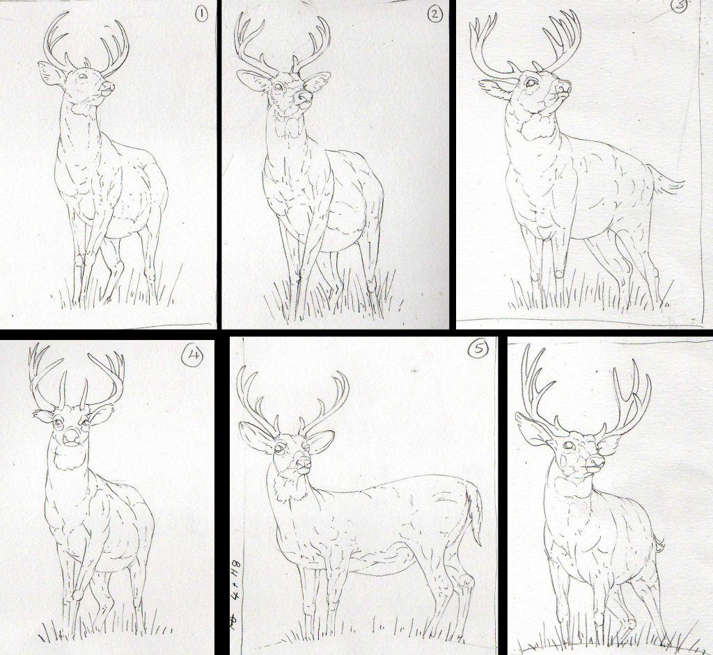
Simple line drawings of deer
You can see similar elements in several of them; the position of the legs in the same in numbers 1, 2, and 4. At this stage although you’re working through ideas, you already tend to have a favourite. In this case it’s number 1 which ended up being pretty much what we worked with. (These were done on heavy cartridge paper with a Pentel P205 mechanical pencil.)
Tonal Pencil roughs
Once Austin and I had decided on a posture, I worked up a tonal rough. This gives a better idea of how the illustration will work, and introduces shadow. I exaggerated the deer musculature (an idea I nicked from Landseer) and enlarged the antlers. These tricks made the stag look more imposing.
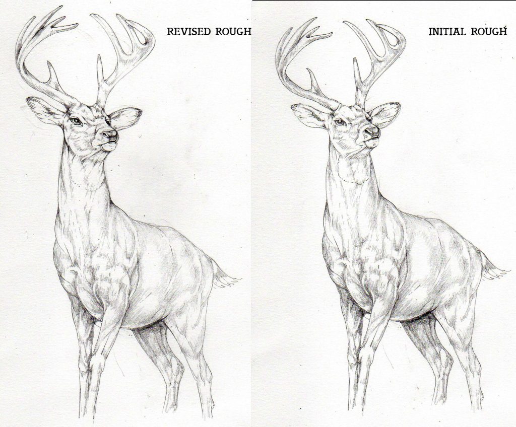
Tonal roughs of the deer
If you compare the initial and revised rough above, it may be hard to see a difference; however, the revised one has removed the slightly quizzical angle from the head. The mouth is marginally elongated and the eye has been tweaked; also, the antlers have been slightly thinned. These alterations may sound minor, but they’re significant both in terms of design, and work load.
Colour roughs of the Deer
The posture was settled and the next step was to produce a colour rough. This helps establish where the markings on the stag are, and gives a better idea of how the illustration will work in context. The shadows are purple which echoes the purple hues I knew would be added when the flora was included.
Colour roughs also give a good chance to figure things out. The antlers are made from bone; how to represent them without making them too yellow? I wanted them to look clean, which meant leaving off some of the distinctive ridging. Two colours worked well together, a pale ochre and a grey blue.
Colour rough of the stag
Colour roughs of the Flora
Having established the details of the animal, we had to consider the flora at its feet. A large part of this would be hidden behind the name of the product, on a coloured disc. However, exactly where this circle would go, and what it would (and wouldn’t) be covering was yet to be established. Austin asked for several variations, using the same plant species.
I scanned in the colour rough and printed out several of the deer onto cartridge paper. The heavy cartridge paper I use takes watercolour, and can be printed on. This meant I avoided having to re-draw the deer four times, and could provide the flowers with a consistent and identical animal.
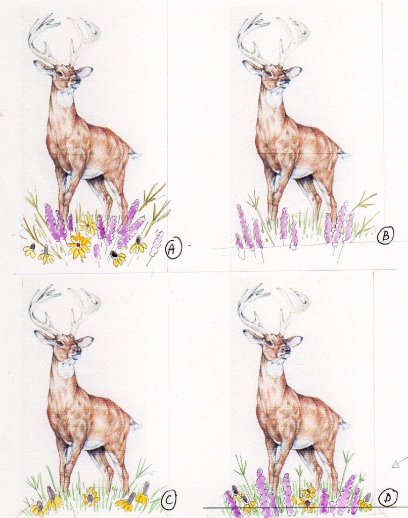
Colour roughs showing different flora
The yellow daisies are Prarie Coneflower Ratibida columnifera, the purple flowers are Blazing Stars Liatrus spicata. Grasses are important too, so I included Big Bluestem (also known as Turkey foot) Andropogon gerardi and elements of Prarie dropseed grass Sporobolus heterolepis. Andropogon gerardi.
Final Colour Rough
We decided to go with option D, a mix of all the species but going heavier on the grass. Another species of daisy was also introduced, and I worked up a more polished colour rough. This helped me know exactly what plants to place where, and also allowed Austin to start designing the layout, knowing where each plant was.
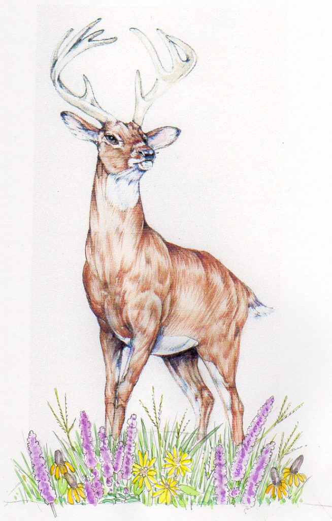
Colour rough with more detailed flora
Austin mocked up the packaging with the colour rough, making sure all the elements tied in together and nothing stood out that would compromise the design.
Mock up of the packaging design with the colour rough
I was ready to draw up and illustrate the final piece.
Final Artwork
I worked on Fluid 100 hotpress paper, using Winsor and Newton watercolours, and a number 1 Winsor and Newton series 7 brush. First I drew the deer onto the page as a pencil line drawing, using my trusty projector to enlarge it to the right size for the prescribed format. I add muscle tone, position and direction of fur, edges of shadows, and texture. I don’t add any graphite tone; so it’s a simple and detailed line drawing. The position of the flowers was also plotted with the projector, but each one was drawn from reference to ensure I got the details correct.
In effect, I have a rather complicated colouring-in sheet to work on.
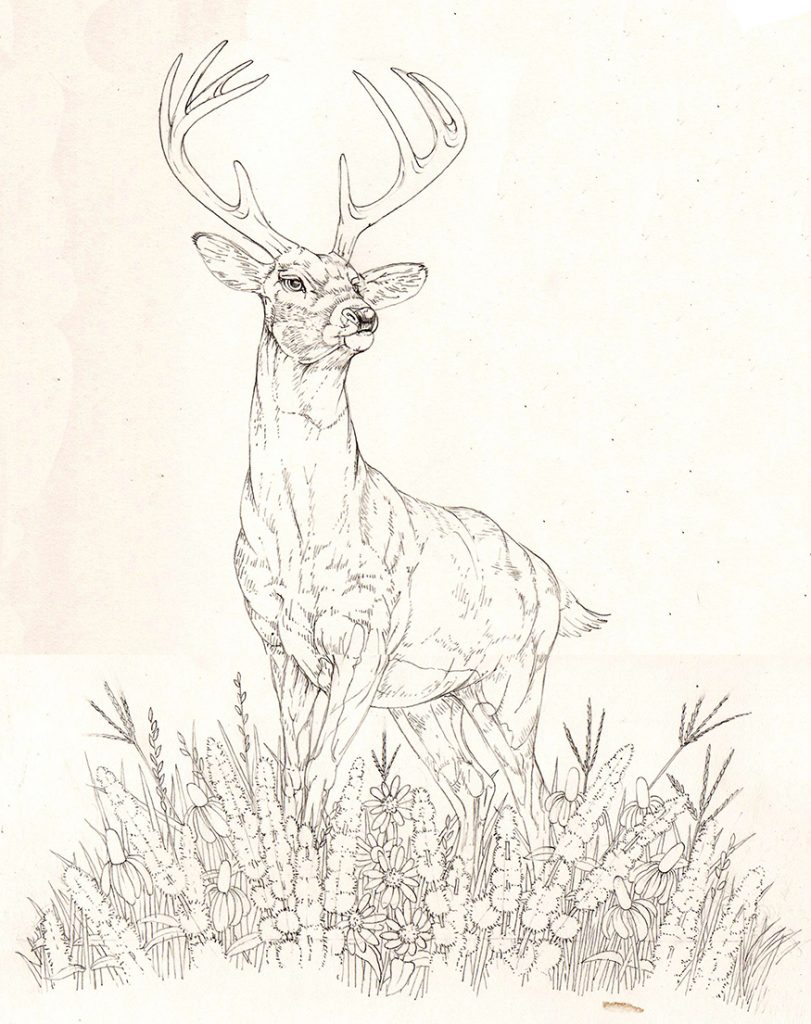
Pencil line drawing of deer and vegetation ready for colour
We decided that the antlers were going to need a little body colour to avoid them being confusing and getting lost. Although this isn’t the same colour as in nature, I worked up a pale brown with tints of purple. It looks natural enough, but is a concession to design requirements rather than a truthful rendition of nature.
Revisions to the final illustration
I always tell my clients that changes have to happen at the rough stage; altering a completed watercolour is not only tricky but almost impossible. The deer needed two alterations at a late stage.
Compare the deer above to the approved colour rough. Notice anything very different? No, nor did I. But when I submitted the final artwork, it became horribly clear that the top of the vegetation had risen much higher up the deer’s legs when I drew it up in detail.
This disaster was solved easily, thanks to technology. I painted an alternative flora, adding a suggestion of the legs so I could see where the vegetation anchored around the stag. Using Photoshop, it was a straight-forward swap to substitute the revised vegetation for the first lot.
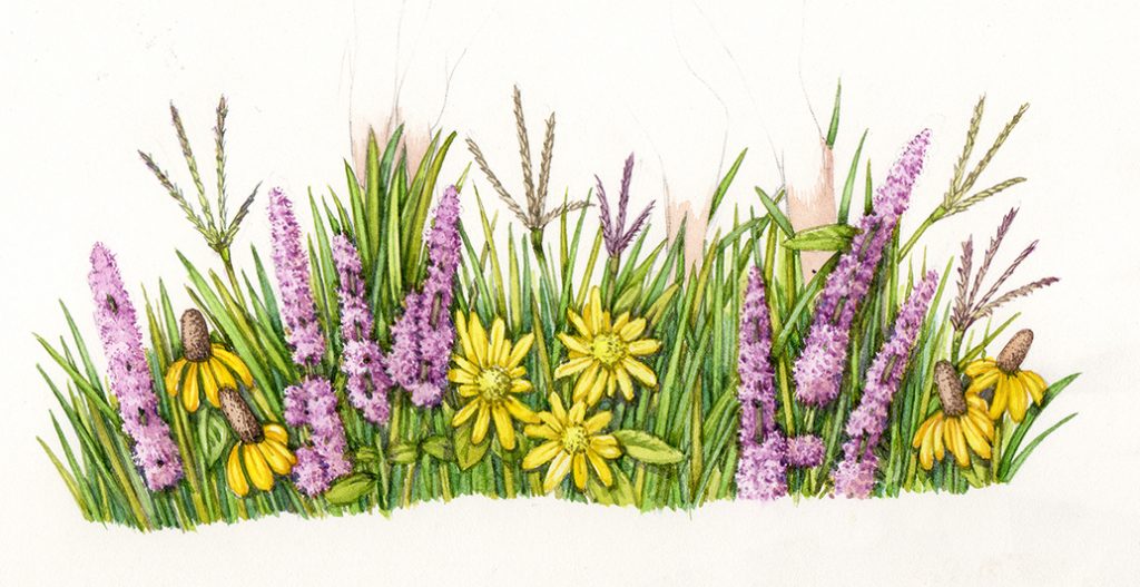
Revised vegetation illustration
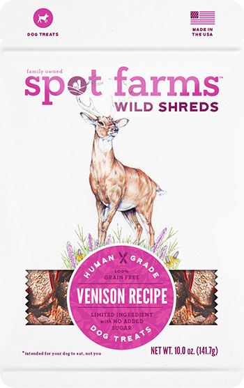
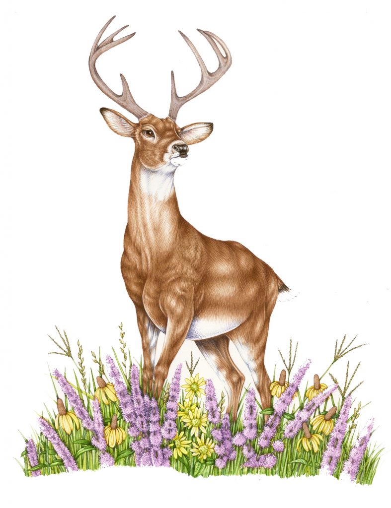
There was some minor additional panic relating to the position of the antlers; the outermost tine needed to be removed. This is because it got tangled up with the logo and brand identity that sits in the letter “O” of “Spot Farms”. A lot of white gouache sorted it out, and the drama was over. The resulting image was the illustration that was used on the Wild Shreds Venison Jerky packaging.
Final illustration, before the vegetation was switched out
Conclusion
The final packaging is successful. I love the way the purple of the Blazing Star is echoed by the purple on the label. The flowers don’t mess up the design. The antlers don’t obscure the wording too much.
Deer illustration on Wild Shreds Venison Jerky packaging
Next time you’re in a supermarket, (or a pet food store!) take a moment to look at the designs and packaging. In many cases, illustrators and teams of designers have spent weeks planning, discussing, drawing and revising their designs. It’s worth taking a moment or two to appreciate their work. Out of all the lessons I’ve learnt doing these illustrations for Wild Shreds, that’s the one that’s stuck with me longest.
The post Illustrating a Deer for Packaging appeared first on Lizzie Harper.
