
Equipment: Paints is another in my series about materials and equipment used for creating botanical and natural history illustrations. Check out my blogs on which watercolour paper to use, and a review of waterproof inks. Future blogs in this series will include one on my paintbrush of choice, one on science stuff you might need, and one focussed on pencils and rubbers. As with the other blogs, I stress that what materials you use van be a very personal choice, and you often end up evolving with the equipment you learn to use first.

Illustrating Lilac Syringa vulgaris
First using watercolours
When I first used watercolour, I used my Mum’s paint-box. She was a fine artist, so had lots of posh art equipment which she always encouraged us children to use. Her paints (a selection of browns, greys, and ochres as her subject matter tended to be broken industrial landscapes and cemeteries) were Winsor and Newton.
My first paint-box, was bought by my parents for my 10th birthday. It was a lovely tin full of Winsor and Newton pans and half pans. I used this until 2015, topping it up and switching in new pans.
My current watercolour paint-box
Finally the white enamel cracked from the palette. The tiny paint flakes kept getting mixed in with my colours. I had to replace the box itself, and I really struggled. The mixing palettes are lovely, deep, and what I was used to! Eventually I found a stockist of the empty tins, Green and Stone. My quest was over.
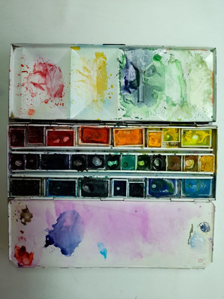
My current paint-box (not in any way cleaned for its photo-op, I’m afraid)
As you can tell from the photo, it’s very much a working tool and is quite often shamefully grubby. This is important, and should be avoided. Having dirty pans of colour will effect the colours you paint with. It’s an ongoing fight to try and keep my yellows clean. I mostly lose.
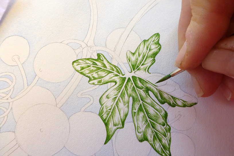
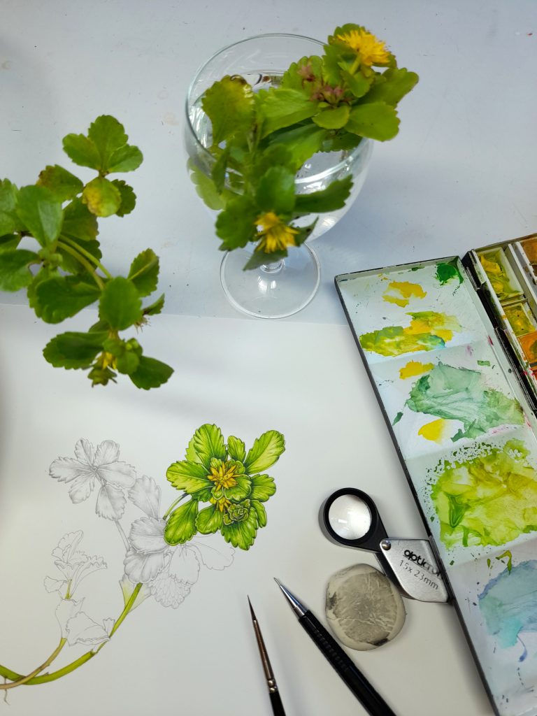
Illustrating a Bryony leaf Bryonia dioica for Jersey Post
Watercolour pans
Watercolour comes in tubes or in pans. I like the pans; it’s so quick to open the box and start painting. Pans come in full, or half sizes. When the pans become empty, I fill them up with paint from tubes. This is frowned on, someone told me the paint is a different composition and the two shouldn’t be mixed. It’s never been a problem for me, but I am willing to listen to reasons why it’s inadvisable.
Paints in pans from my back-up watercolours box. Most are Winsor and Newton, many used.
The paint in the pans is dry, and this is a clear difference between the tubes and the pans. However, the colours seem to be identical.
The main trick with paint mixing is to make notes of the colour mixes that you use, so you can re-create them later. You can do this as a swatch (as on the side of the painting on the illustration below) or in written form.
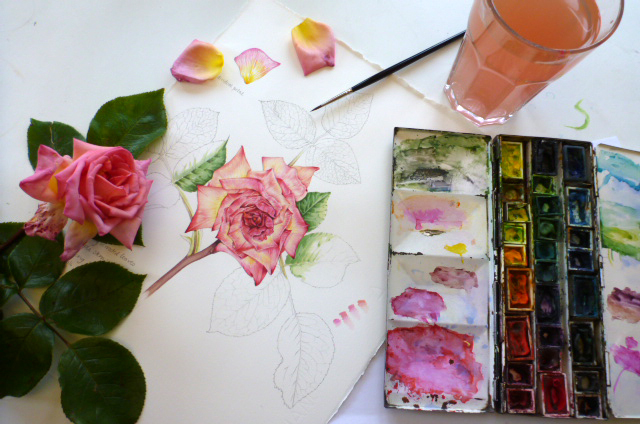
Illustrating a rose
Watercolour tubes
I have lots of these tubes. I tend to buy them up when I’m in an art shop and see them on sale, so have lots of duplicates and different sizes.
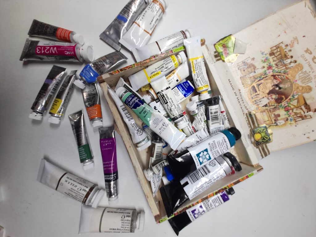
Equipment: paints: My watercolour tubes, which nominally fit into an old cigar box (they don’t fit).
Sometimes I’ll use a blob of pure watercolour and paint from it, this is mostly if I’m tackling the sky of a big landscape (Cobalt blue is good for skies). In general, though, I simply use the tubes to top up the pans in my paint-box.
The brand I favour is Winsor and Newton. I tend to use their professional watercolours, but their Cotman range is good too. They’re clean, strong colours, and don’t go grainy. Some of my W&N tubes date back 30 years or more, and the colours seem as true as the newly purchased tubes.
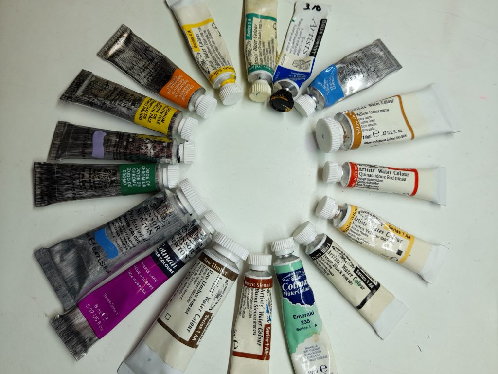
Some of my Winsor and Netwon tube watercolours
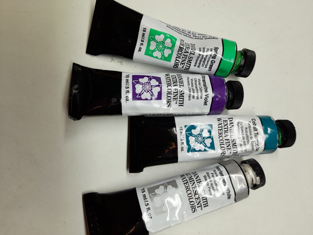
Sometimes I’ll put a spot of tube paint on one of the paint-box dishes, I’ve recently started doing this with Daniel Smith’s Spring Green which is a good base for mixing up realistic green hues.
The ones I use most of are the yellows. Cadmium yellows, Naples yellow, and Yellow ochre. This is because these get mixed up into every single green I use, and as they’re weaker colours than the blues and greens in the mix, I need to use proportionally more of them.
Illustrating Mongolian stonecrop Phedimus hybridus . You can see the heavy use of yellows, and that blob of Spring Green in the top right of the palette.
Learning your paints and your paint-box
Sometimes I make the error of filling up a half empty pan with a rather different hue, and this isn’t a great idea. Topping up a yellowish Sap green with a very blue Phthalo green was a memorable error. Saying that, it actually made for rather a handy colour, the two worked well together.
I tend to mix, and go on mixing until it looks right.
You learn your way around your paint box. As the years go by you end up knowing what different colours look like, both in your paint-box and fresh from the pan or tube.
Why I can be vague on my colour mixes…
This somewhat slap-dash approach to my paints is why I sometimes find it difficult to give precise answers if asked what colours I use for a specific illustration. Often the labels on the pans have rubbed off or are illegible. Remembering what colour I topped up with a few months ago is often beyond me. Sometimes (especially if I don’t to take notes) I simply forget.
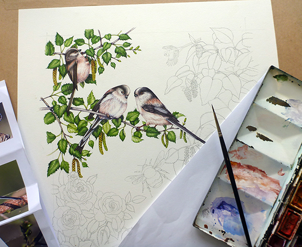
Long tailed tits in progress.
I am aware this lackadaisical approach might horrify some professional and amateur botanical illustrators, and that’s totally understandable. But I do think that sometimes people get tangled up in the details of brands and colours when they’re starting out. Knowing more or less what each colour looks like, and how it mixes is great. But if choosing the correct exact named hues becomes an obsession, or a barrier to just getting out some paints and experimenting, then I’m not sure how useful it is. Perhaps I’m speaking from the luxurious position of someone whose been lucky enough to have the time to learn her paint-box and colours inside out; with less time available knowing names and brands could be more important?
Other Brands of Watercolour paint
Alongside Winsor and Newton, I use other brands of paint. After hearing lots of recommendations, I purchased some Daniel Smith “dot cards”. I figured they’d be a good way to test the different colours without committing to a whole (pricey) tube of paint. I ended up painting from them, until I wore through the paper the dots were on, alongside my normal paint-box. I wish I’d taken a photo of the used cards, they were rather pretty.
Eventually, I decided to buy a few tubes, which I use a lot. My most used is the Spring green. It’s a brutal colour fresh from the tube, but mixed with purples, ochres, blues and yellows; it makes for a beautiful and adaptable hue.
Daniel Smith tubes
I also use Daler Rowney on occasion, and have become extremely attached to Doctor Martin’s Hydrus inks. these transparent colours are almost violent in their vividness, and are incredibly useful. I mix them in with my watercolours and they give an extra punch that helps emulate the bright colours of nature. The colour I use most is their Quniacridone magenta, perfect for mixing up to capture pink flowers.
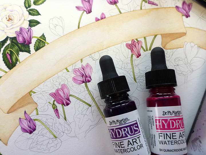
Doctor Martin’s inks – perfect for the pink of a cyclamen
Other brands of watercolour paint I’ve heard about from other botanical illustrators include: Sennelier, St. Petersburg White nights, Talens: Rembrandt, Shinhan, Holbein, Schminke, and Old Holland. I’d love it if anyone who uses and adores these ranges felt like giving a bit of a review in the comments section.
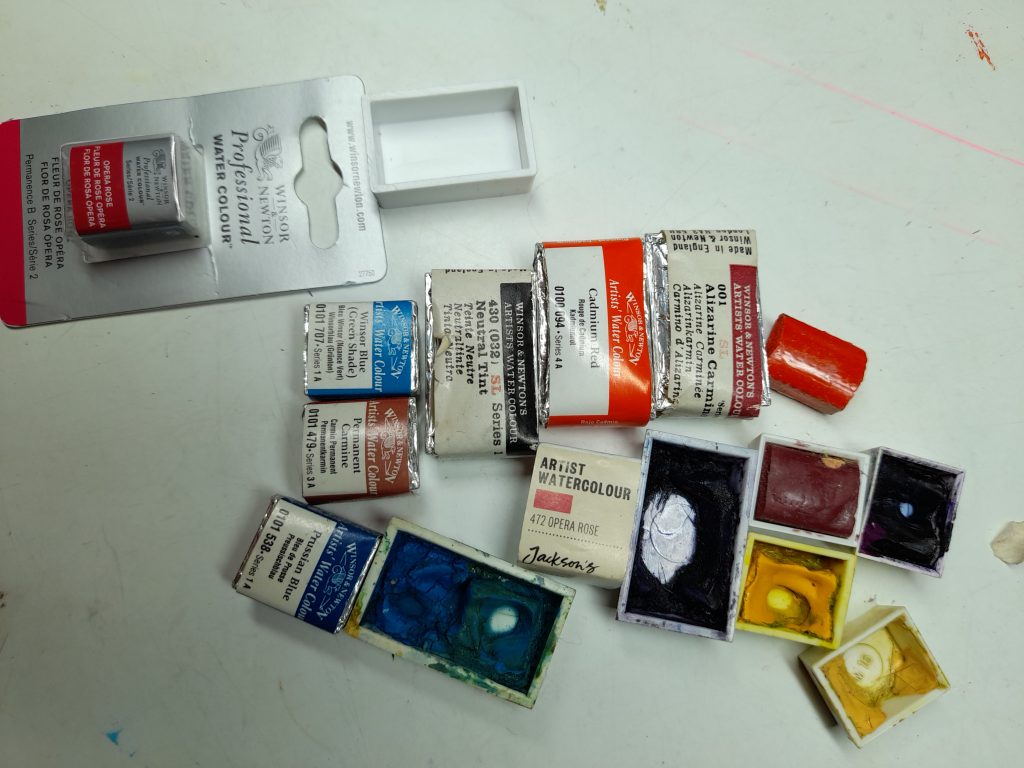
Pink flowers and Opera pink watercolour
When it comes to pink flowers, along with the Dr. Martin’s magenta, I use plenty of Opera rose. Now, although this is a fabulous colour, it is notoriously awkward as it’s known to fade. Artists have tested it’s lightfastness, with varying results (Jane Blundell, and an interesting post on whether or not watercolour paints DO fade from Lee Angold.)
Lots of pigments fade with time, and watercolours are prone to become paler. Some pigments fade more than others. The pinks and purples and reds are most fugitive (prone to fading). You can avoid this by having framed work behind conservation glass (or museum glass), and by keeping original watercolours away from direct sunlight. It can be a problem though. I once painted a Purple emperor butterfly, and put it in the window of a gallery. Within 6 weeks the butterfly had faded to a tawdry (and entirely un-saleable) brown colour.
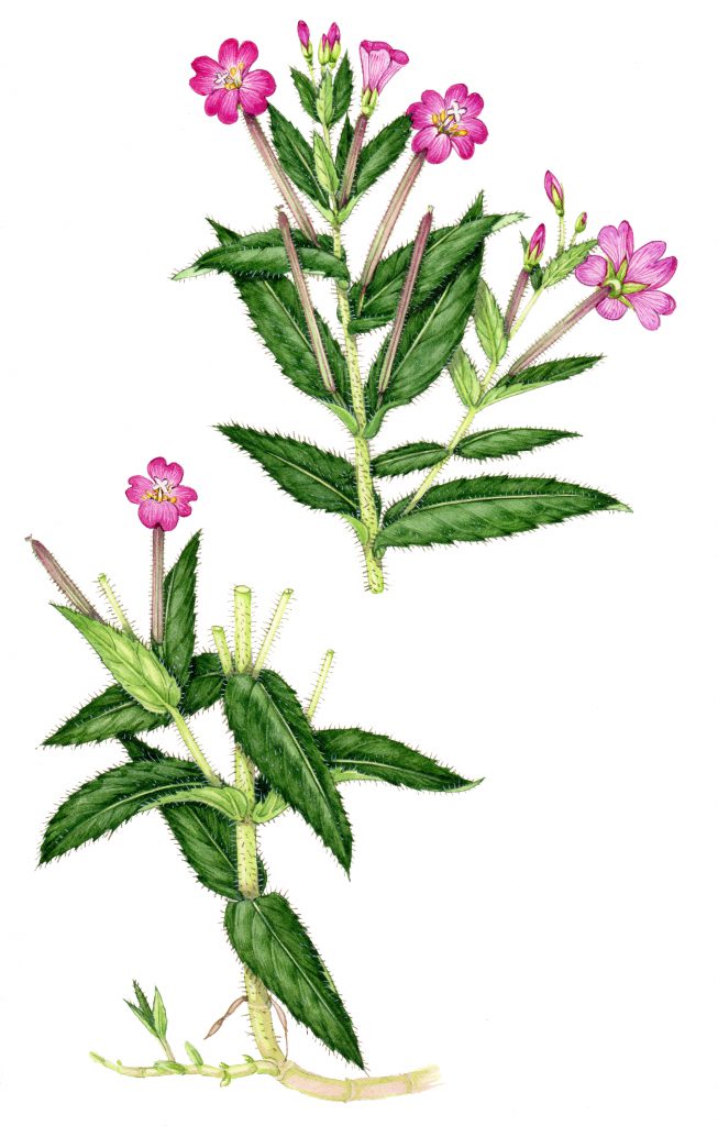
Greater willowherb Epibolium hirsutum
This is less problematic is you’re creating work for reproduction rather than for exhibition, but it’s worth remembering. I bought up a batch of Opera rose from different companies recently; I’m interested to know which brand I end up liking most. I’m not alone in this. There’s a lot of online chat about opera rose, including rather a nice comparison of different brands video on Youtube.
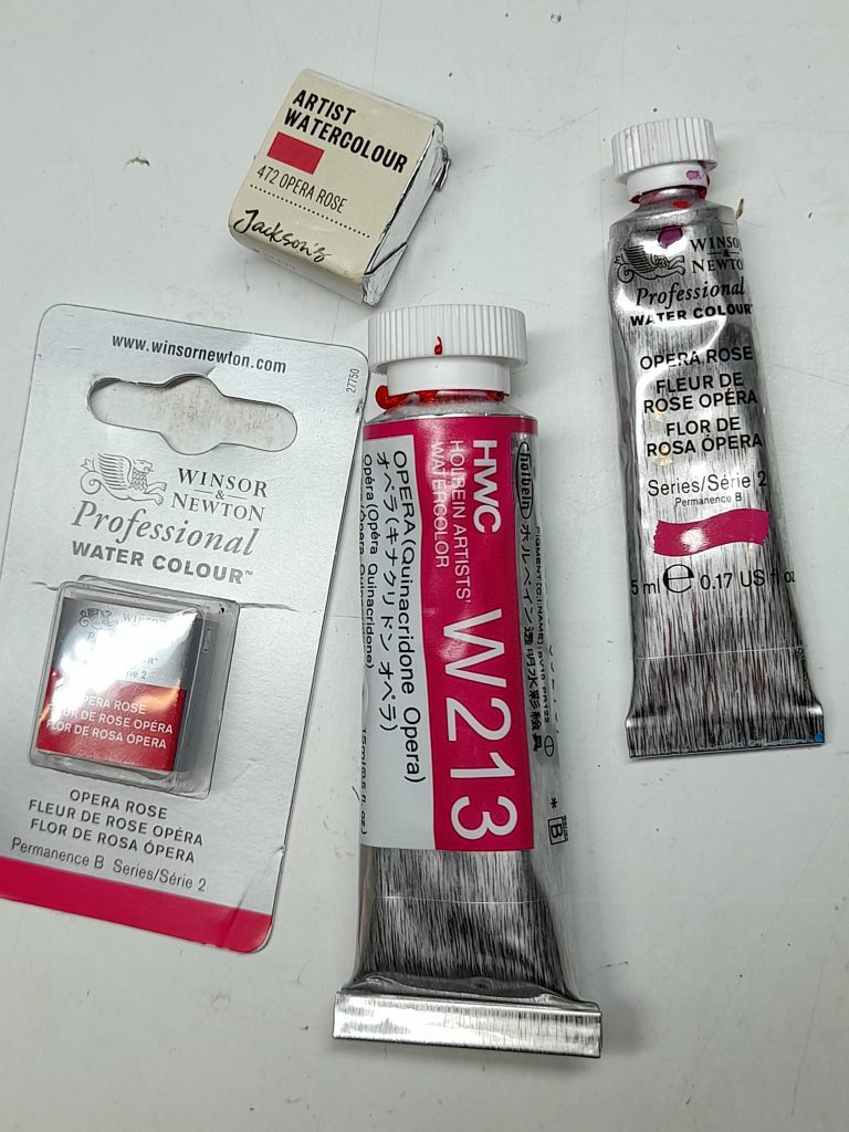
Opera rose paints from Jackson’s, Winsor and Newton, Holbein, and the W&N in pan form.
One more paint…and it’s Gouache!
This last paint is for fixing mistakes. I avoid using it on work I plan to sell, but for work that’s going to be reproduced, it can be a life saver. Permanent white gouache. You mix it to a thick consistency, then paint over smudges and mistakes. It’s easy to blend in with the white of the paper. Avoid touching it until it’s dry, it’ll clump and lift the colour from underneath. Actually, don’t touch it when it IS dry either, the grease on your hands may dull the white. It’s also really useful for adding delicate white hairs against a dark leaf, and it’s an important part of my tool kit.
In the plate below, done for HarperCollins Flower Guide, you can see how white gouache was used to remove the upper leaves of the Dune gentian. This adapted plate went to repro with no quibbles. (For more on mixing mistakes in watercolour, check out my earlier blog).
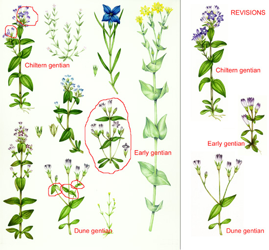
Gentian plate with alterations circled in red
I use this paint quite thick, and it’s important to thoroughly rinse the paint-box and brush when you’re finished with it or it’ll make all your watercolours paler and chalky.
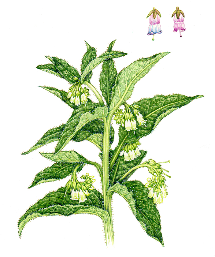
Common comfrey Symphytum officinale with hairs on the stem picked out with white gouache
Conclusion
If you’re looking for comparisons of different brands of watercolour paint, there’s a whole lot of really interesting blogs and youtube videos online. For me, my lifelong relationship with Winsor and Newton continues unabated. They’re easy to come by, good strong colours, not prohibitively expensive, comparatively lightfast, and I love them.
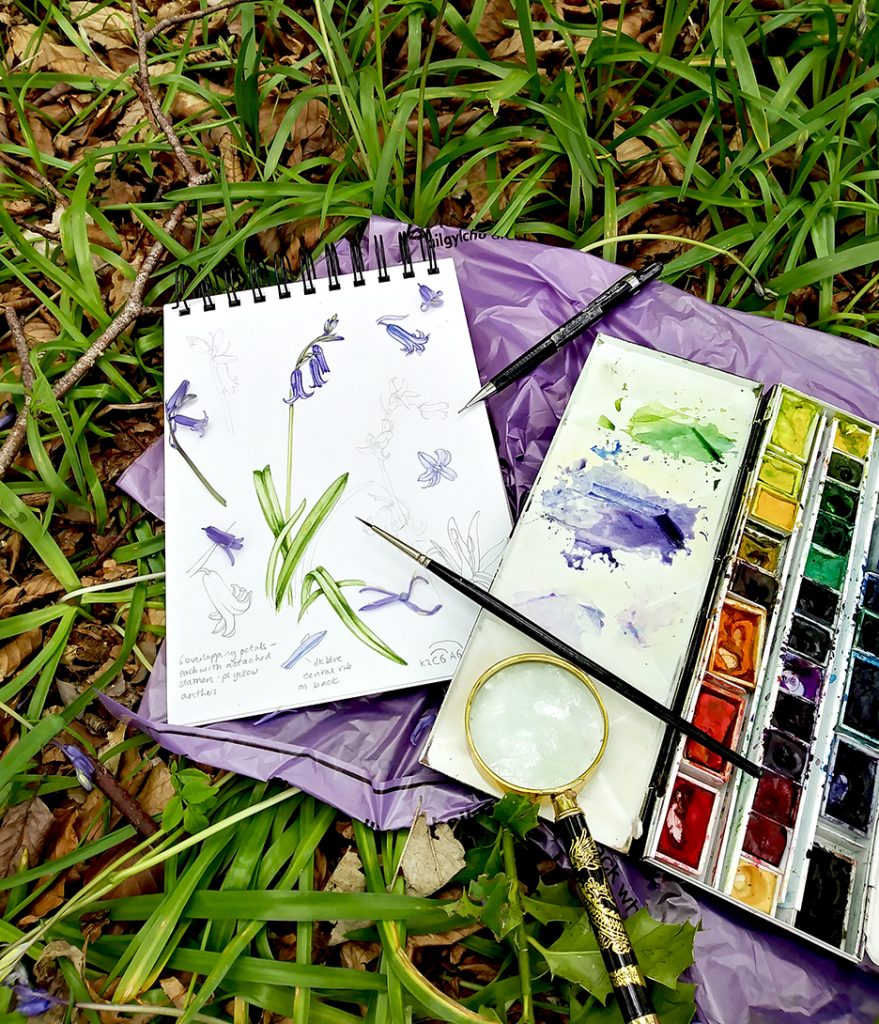
…and you can easily take a paint-box into a bluebell wood!
Most of the materials and paints mentioned in this blog are readily available from art stores. I try to shop local, but if that’s not possible, then I buy from UK suppliers such as Jackson’s, Cass Art, London Graphics Centre, and Ken Bromley. I try to avoid the big online sellers even though they’re sometimes cheaper; it’s my (tiny) way of supporting the art stores that support me. In the US, I believe Dick Blick is a good shop, and sells online.
The post Equipment: Paints appeared first on Lizzie Harper.

