
A recent job involved illustrating the Japanese Rose, Rosa rugosa. It’s not the first time this plant has been commissioned, and I’ve done blogs in the past on my approach to illustrating other roses and this very flower. It’s one of a series of invasive plants that were completed for FOR Sweden, and this week’s blog explains the step by step process of painting the leaves of this plant in watercolour.
Materials
First, assemble your materials. You need a few roses with leaves, and art equipment. I always do my botanical illustrations on hot press watercolour paper, in this case Stonehenge Aqua by Legion Papers. I use a mechanical pencil to draw up the plant, and favour the Pentel P205. Watercolours are Winsor and Newton pans, although I’ve also used some Daniel Smith tubes for this illustration. I add a kick of colour to the flower by mixing in a pink Doctor Martin’s Hydrous watercolour ink, and always use Series 7 sable brushes by Winsor and Newton (a size 1).
Draw up the Rose and rose leaves
It’s always worth taking a good look at your subject before you start to draw it. Rose leaves are actually made of leaflets; one at the tip and a series of paired leaflets below. The Japanese Rose leaves are glossy, wrinkled when young, and have toothed margins. In fact the scientific name for this rose, Rosa rugosa, translates as “Wrinkled rose” which refers to the rough and folded nature of the young leaves.
Using clear and light pencil lines, I draw up the plant onto my hot press watercolour paper.
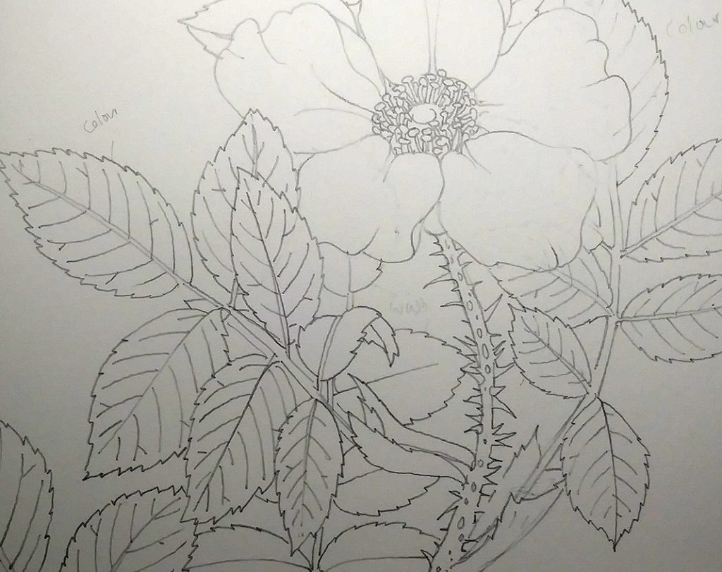
Line drawing of the Japanese Rose, focusing on the leaves
Adding the mid-tones
I work unconventionally in that I put in my mid-tones first. Traditionally in botanical illustration, one works from light to dark, creating a layered effect. Although I sometimes wish I did work this way, I always find and plot in the shapes of the darker areas of each leaf first.
The green colour used is Daniel Smith Spring Green, plus Daniel Smith (DS) Cobalt Turquoise. There’s also some Winsor and Newton (W&N) purple, cobalt blue, and yellow ochre in there.
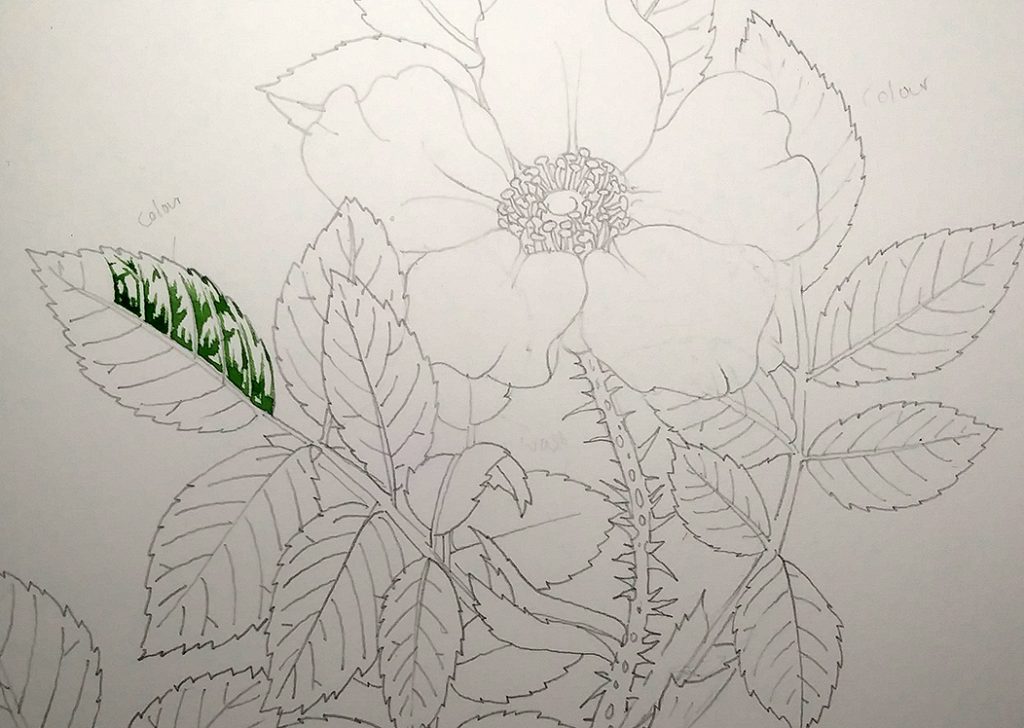
Shapes of mid-tones painted
I try to look for edges in these areas of shadow, and for patterns. If there’s a dark shadow next to the leaf midrib, then it’s likely this will be consistent down the whole length of the leaflet. There’s often a difference in shadow to be seen from one side of a leaf to another; this relates to how the light hits the leaf blade and interacts with the veins.
Traditionally, the light source comes from behind the left shoulder and I tend to stick with this.
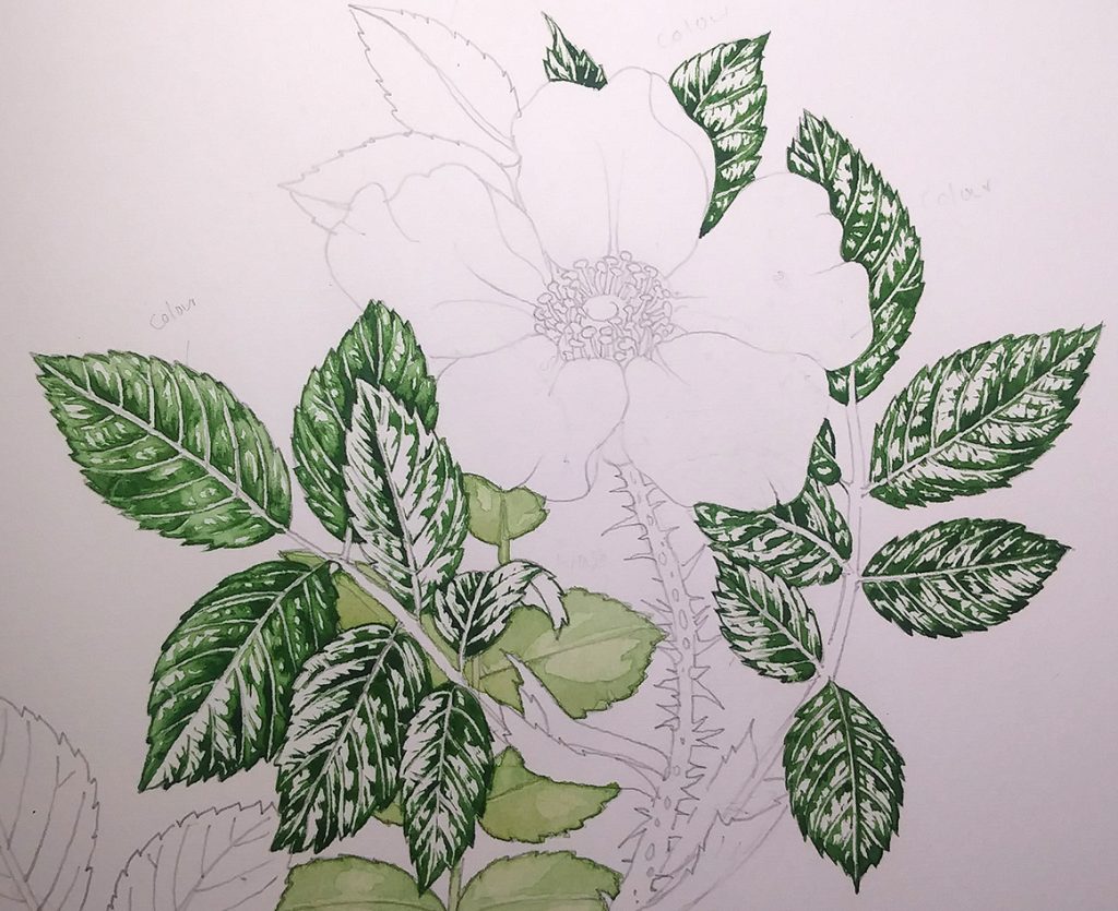
In the image below, you can see how just plotting in these shapes and areas of dark give structure and tonality to the leaf, even at this early stage.
Three leaflets with mid-tones plotted in
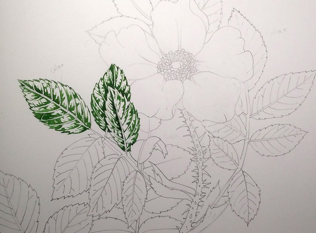
Suggesting other Rose Leaves
This is a sketchbook study, so doesn’t have to be a polished finished illustration. Instead of illustrating each leaflet in painstaking detail, I can use a wet wash to plot in extra leaves. I apply this colour (a mix of W&N yellow ochre, sap green, and DS Cobalt turquoise) very wet and allow it to dry fully.
I leave the main lateral leaf veins and the midribs as white for now; they’ll get knocked back later on.
Midtones of leaves plotted in, with wash suggesting the leaves behind
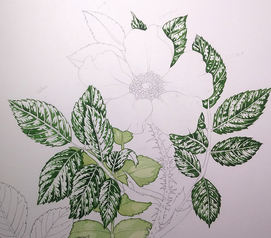
Working into the Rose Leaves
Once fully dry, I work into the edges of the areas of mid-tone. I use the same colours as before but add a little more W&N yellow ochre, some W&N cadmium yellow light, and more water. With watercolour, the water itself acts as a diluting agent and allows you to mix paler tints of a colour.
This process knocks the stark edges off the shadows, and I paint over the dark areas with the new mix as well as the edges of each shape. In a way, you’re plotting a concentric circle of a slightly paler green around the edge of each shape of shadow.
Be careful not to cover all the white of the page. White paper represents the palest light areas in a watercolour, so if you cover it all up with paint then the whole painting will end up dark and rather lifeless. You can always make an illustration darker, but it’s almost impossible to lighten a watercolour. Believe me, I’ve spent years trying to find easy ways to do exactly that!
First paler wash goes onto the leaflets on the left
I tend to do all the leaves with each layer of colour. So I’ll pop this first gentler wash on all the leaflets, and allow them to fully dry before moving onto the next layer of colour.
The third layer is yet paler; more dilute and with more yellow in the mix. Again, it’s the concentric circle method that gets used; the paint getting paler as you move out from those initial mid-tone shapes. Still leave whites on the page. Allow this to dry fully.
The fourth layer (oh yes) is very dilute and pale. It’s really more like tinted water; W&N yellow ochre and DS Spring green. This time, cover the entire leaf including the leaf veins and areas of highlight, but keep it a pale colour. Never use white to try and make a watercolour hue lighter, it tends to result in a muddy mess.
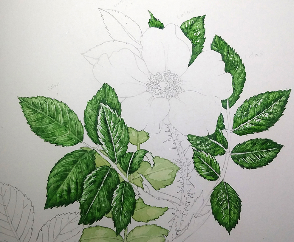
Leaflets almost all covered with four layers of paint
Working into the shadows of the Rose leaves
Once the paint is totally dry (there’s a pattern here…), you can start working into the shadows.
I use a mix of W&N cobalt blue and purple, and just pick out the darkest parts of each area of shadow. You need to look at the leaves all the time to do this, when you try and work without reference it starts to look odd. In many ways, working from life is much easier than working from pictures, but it’s very punishing if you lose concentration and start making things up instead of sticking to direct observation.
I also tend to sharpen up the edges of the teeth of the leaf margin, and any areas where one leaf abuts another. I also have a close look at the mid rib as this often casts deep shadows onto one side of a leaf. The paint is thicker than the washes we’ve just been using; similar in viscosity to the very first green we mixed, it’s almost like the texture of cream.
Be careful not to overdo the shadows, you’re using them to make the contrast in each leaf stand out; not to swallow up the nuances of tone.
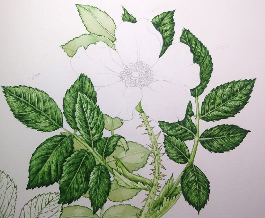
Illustration showing the leaves with shadows picked out
At this point, the leaves of your rose are completed and it’s time to move onto illustrating the rose.
To see this process of painting rose leaves in real time, with me talking through the processes (and other things which may or may not be relevant!) please have a look at my Youtube video:
Once the rest of the plant is painted, you may well find you need to return to the leaves.
Tweaking the Rose leaves once the rest of the plant is illustrated
Adding different elements to an illustration invariably changes the tonal weight and may result in you needing to put in more shadows.
In this case, once the rose was illustrated (sister blog to this one coming soon), there was a need to make it stand out even more dramatically from the leaves behind it.
The shadow is yet again a mix of W&N cobalt blue and purple. Looking closely at the specimen or reference, and remembering that your light source comes from behind the left shoulder, paint in your drop shadows. Here, the petals cast shadows onto the leaflets on the right hand side, and the leaflets on the left cast a crisp-edged shadow onto the petals.
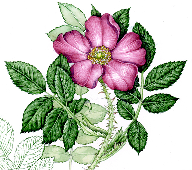
Completed sketchbook study of Rose and rose leaves (detail)
Conclusion
You’ll find that seeing the lights and darks in a subject gets easier over time, as you get your eye in. Drawing the plant will get easier too; and don’t beat yourself up if you find it hard. Transforming a 3D object like a plant to a flat 2D image is quite a challenge, and looking closely at a subject can be totally exhausting (and absorbing).
As with anything, the more you do it, the quicker and simper it becomes. And this is important because it truly is these tonal differences which make or break an illustration. Too much dark and it’s swallowed up. Not enough sharp contrast and the whole thing looks weak and floppy. It’s a matter of respecting the white of the paper, and having the courage to work into the shadows. With those two elements sorted out, you’re well on the way to creating decent botanical illustrations of whatever subject you choose.
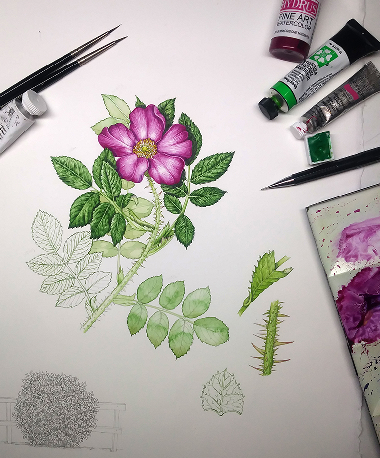
Finished sketchbook illustration with art materials.
The post Botanical Illustration of Rose Leaves appeared first on Lizzie Harper.
