
A Life on Our Planet, David Attenborough’s recent book, is extremely important. In it, he not only details the ways in which mankind has altered and damaged our world; but also tries to suggest positives, and ways we can help save our home planet before it’s too late.
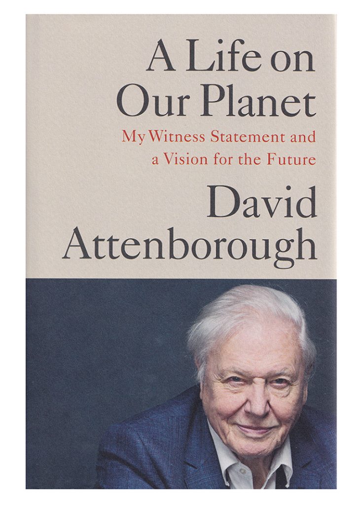
Cover of “A Life on Our Planet”
He refers to it as his “witness statement”, and combined with the accompanying film it makes for a powerful message.
Being asked to complete the pen and ink illustrations for this book is by far the most prestigious and thrilling job I’ve had to date.
A fan since childhood
The BBC series “Life on Earth” came out when I was about 7, and the family crowded round our tiny black and white TV and watched it religiously. I got the book for Christmas. I was smitten, not only with nature but also with the accessible way that David Attenborough presented the series.
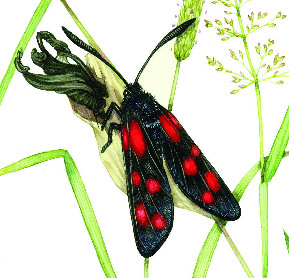
All the subsequent series were devoured with fervour. I even sent the great man a fan letter, about 15 years ago. I mentioned how important the programmes had been in feeding my passion for nature, and sent an illustration of a stickleback.
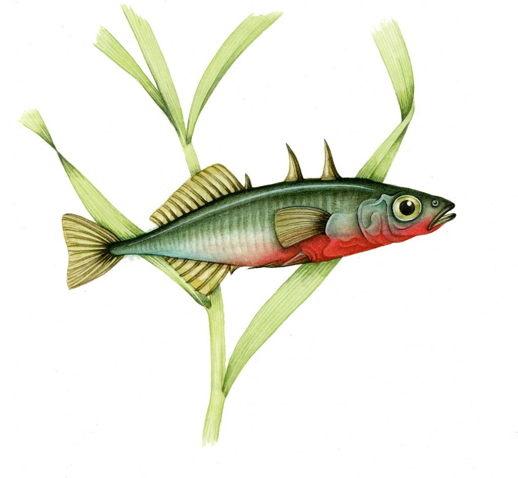
Three-spined stickleback Gasterosteus aculeatus
I got a lovely hand written thank-you letter in reply.
Being commissioned
Commissions tend to come in by email, from art directors and editors. Initially a request as to availability, then a flurry with more detail about what the job entails, and the nitty gritty of pay, copyright etc. This was no different, although I also got to chat to the art director quite a bit, which was lovely.
Was I interested? Uh – YES. Was I available? For this project – YES. Could I deliver by mid July? (Total panic and lots of swearing, deadlines are often tight and this one was no exception) YES.
To say I was over-excited is the understatement of the century. Such a high profile title! A link to such a seminal part of who I am and what I do! Sir David!! I deafened my family and bounced about in a haze of joy. Then got to work.
Species List
The species list came in. Animals (and one plant) associated with the text, and a map. All of them were pretty straight forward, except for the Tarpan and Auroch, an extinct horse and bull. I was also provided with a few pages of the text, with clip art as place-holders. This is useful, it shows you how your illustrations will be used, and gives an idea of the feel the art editor is after.
The illustrations were to be in detailed pen and ink, a medium I love and which reproduces well in books. First things first, draw up the eight illustrations in pencil.
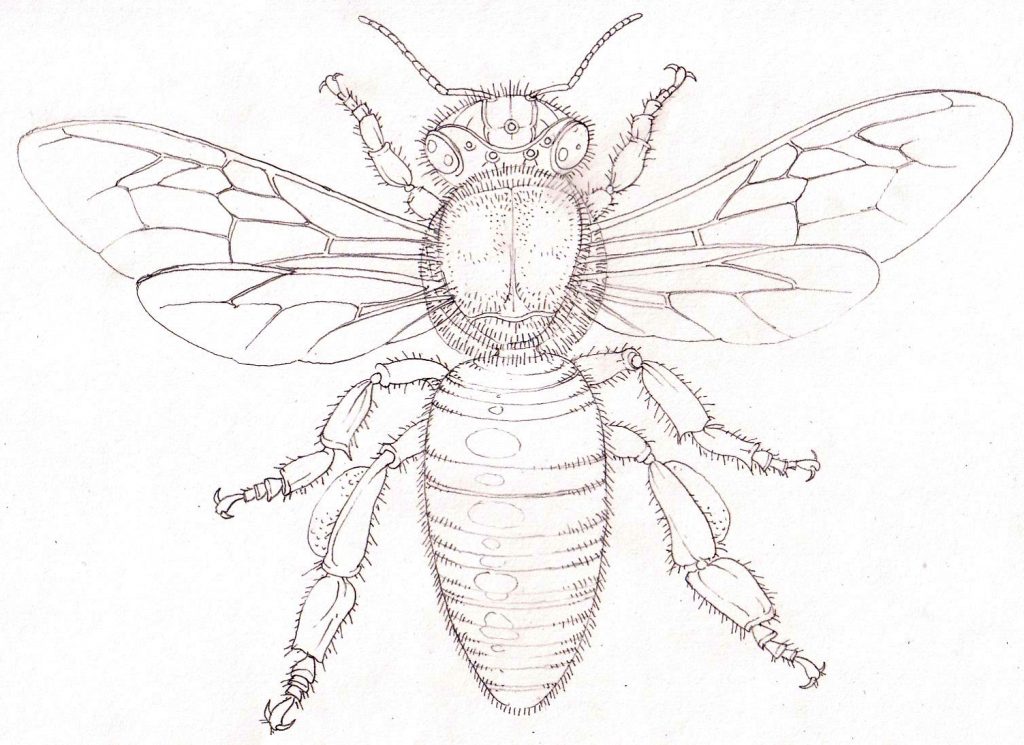
Worker honey bee Apis mellifera pencil rough
Getting reference was easy enough. Some of the illustrations were exacting. The ammonite was to represent Attenborough’s fossil-hunting as a child, so I wanted to be absolutely certain it was correct. I got the art editor to ask him for a couple of species he’d actually collected, and then drew up the ammonite.
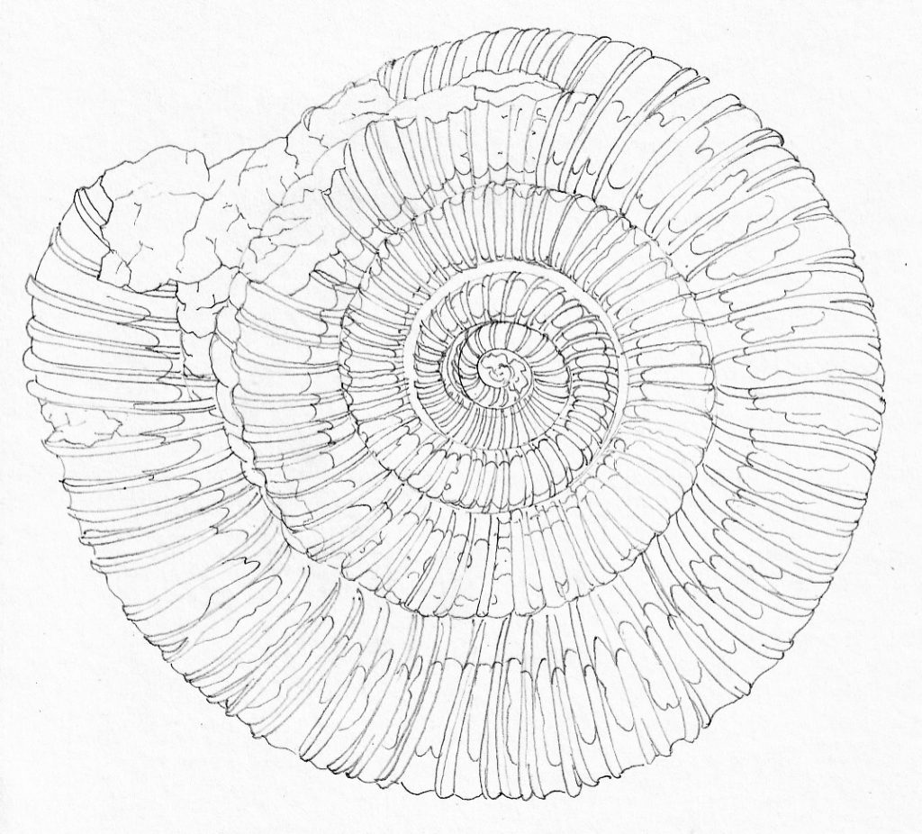
Ammonite Dactylioceras commune pencil rough
Extinct Animals
There was one area where a decision had to be made between two extinct European animals. Which illustration should be included? The ancient Auroch bull Bos taurus pimigenius, or the Tarpan Equus ferus ferus?
I drew up both. This was far from easy. Both animals have been extinct for ages, and reference for them is patchy. Luckily, there remain some older breeds of domesticated cattle and of wild horses who are close relatives. I used visual reference of these species, and combined it with written descriptions of the extinct animals. This helped sort out issues like the fur, size of horns, and bluntness of features, Tricky, though.
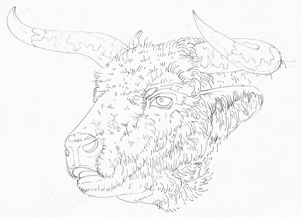
Pencil rough of the head of an Auroch Bos taurus primigenius
I submitted both roughs to the art director, who whizzed them over to Sir David. He decided to go with the Tarpan.
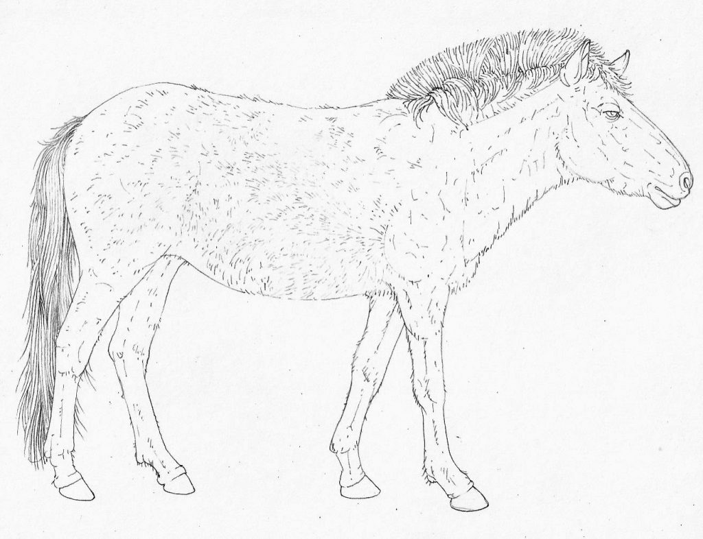
Pencil rough of the extinct Tarpan Equus ferus ferus
Alterations to the roughs
The roughs were scrutinized by the art editor and by Sir David. It felt very strange to know he was looking at my work, and I was elated when the art editor reported back that he thought the illustrator was, “very talented”. I can die happy now.
There were a couple of minor changes. The Thompson’s gazelle was deemed to be smiling too broadly, so I tweaked it’s facial expression to make it more sombre. The pangolin snout needed blunting a little. But on the whole it was all approved. Attenborough also reportedly claimed that my Giant kelp was “one of the best illustrations of this plant that I’ve seen”. Another milestone of joy.
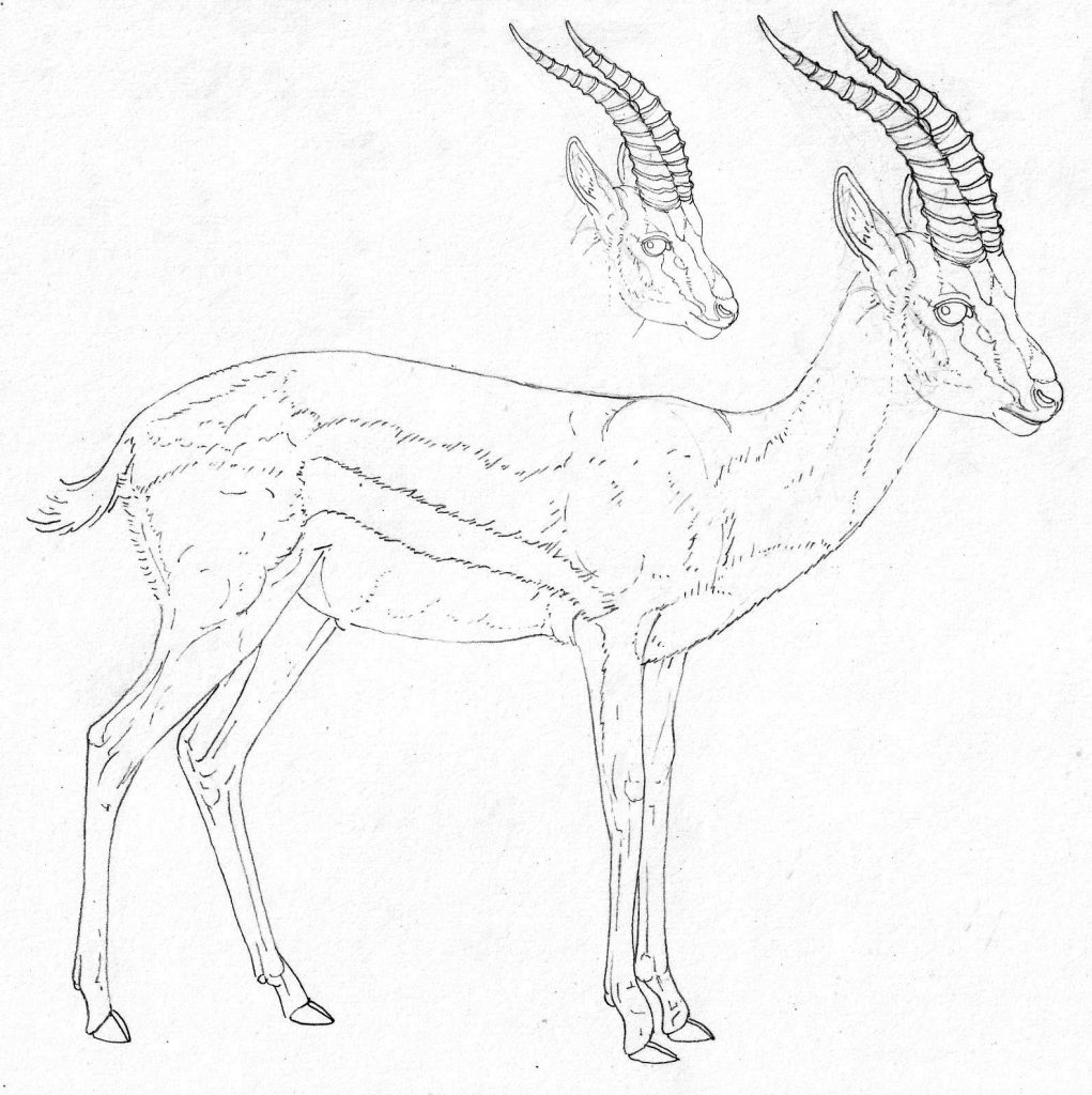
Adjusted pencil rough of Thomson’s gazelle Eudorcas thomsonii. The original head is behind the revised one so you can see how I wiped the smile off the Gazelle’s face…
The alterations were approved, and I could get started on the pen and ink illustrations. Each was A4, done on Daler Rowney sooth cartridge 135lb, and I used permanent ink pens. Brands included Unipin and Sakura pigma. Sizes ranged from 0.03 to 0.2 nibs.
Messing with maps
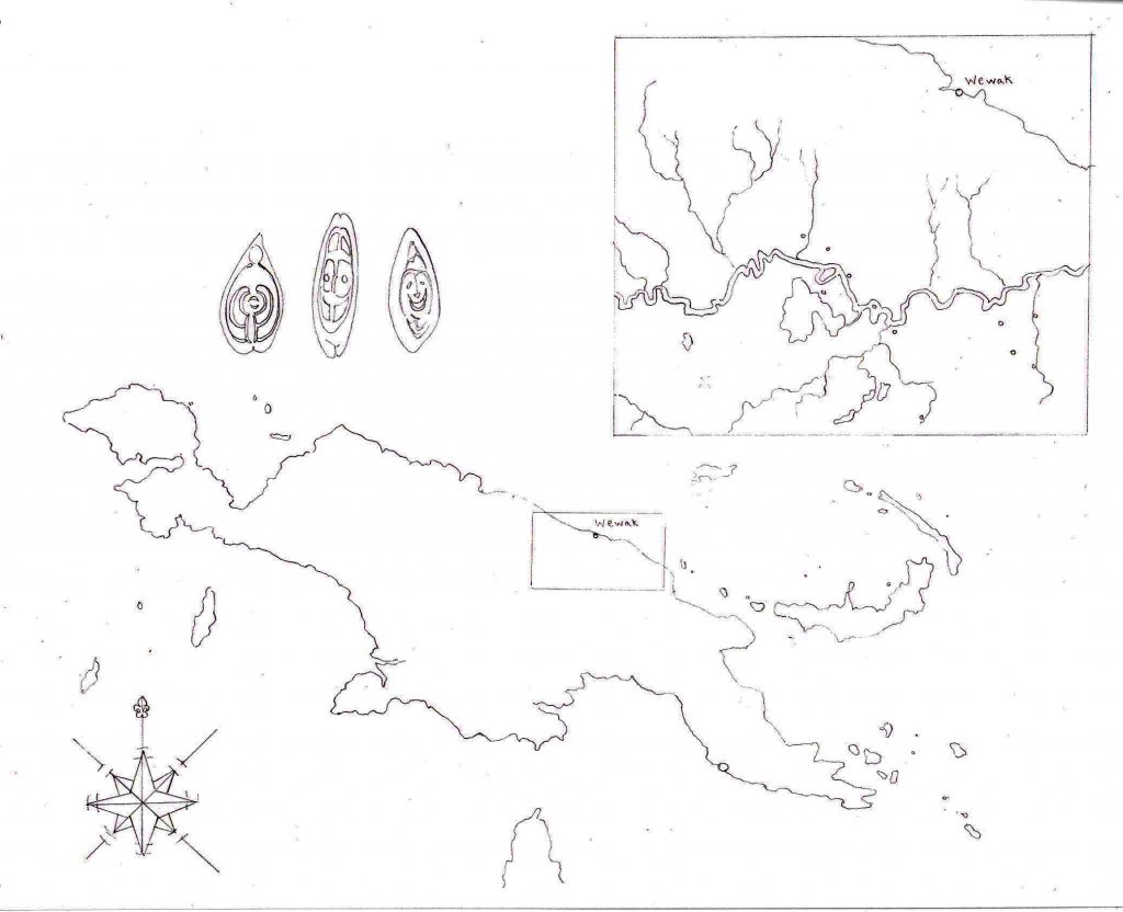
As well as the eight animal and plants, I was asked to illustrate a map of the area of Papua New Guinea that Attenborough explored and filmed back in the 60s. I’m no cartographer, although I’ve illustrated lots of maps for wildlife reserves in the past. I wasn’t sure what approach was needed. I began by adding vignettes to the map, but this was deemed too busy. The compass was popular, though.
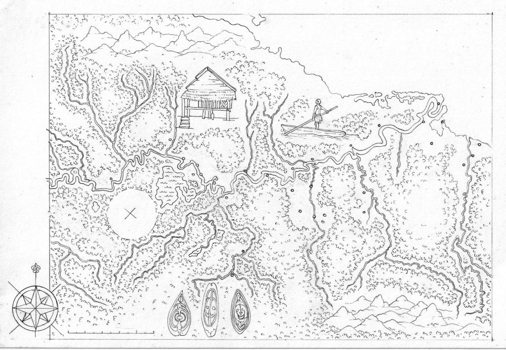
Initial pencil rough of the Papua New Guinea map
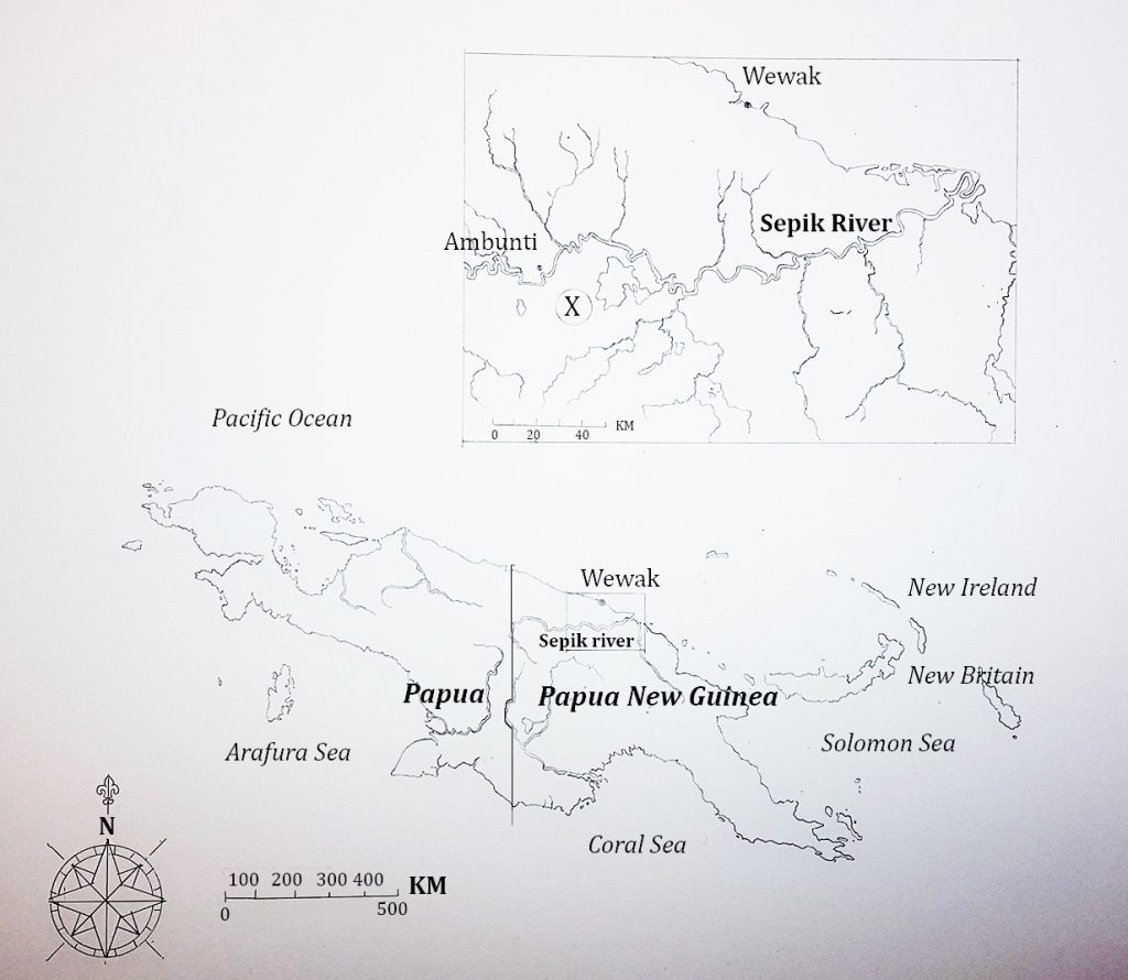
The second map was simpler. But the shields weren’t required, and more of the villages needed to be introduced.
Second pencil rough
I cut all surplus information back to a minimum and got hold of every map of the area I could find online. Piecing these together, I had a detailed map which showed all the villages, rivers, and tributaries. By now I had also become totally intrigued by Papau New Guinea, which remains relatively un-exploited by tourism. I drew it up, and added labels on the computer for clarity. I also added scale bars.
Third pencil rough
This was approved. The next thing was to figure out how to bring a lightness to the illustration that would make the map different to one created on a computer by a cartographer. I suggested a gentle watercolour wash around the coasts and produced a test piece to explain. It can be hard to get a wash to fade out evenly to the white background, but when it works it can look classy. David and the art editor approved the approach, and I could take the map to final. It was decided to cut back on the number of towns on the map, which added to the clarity.
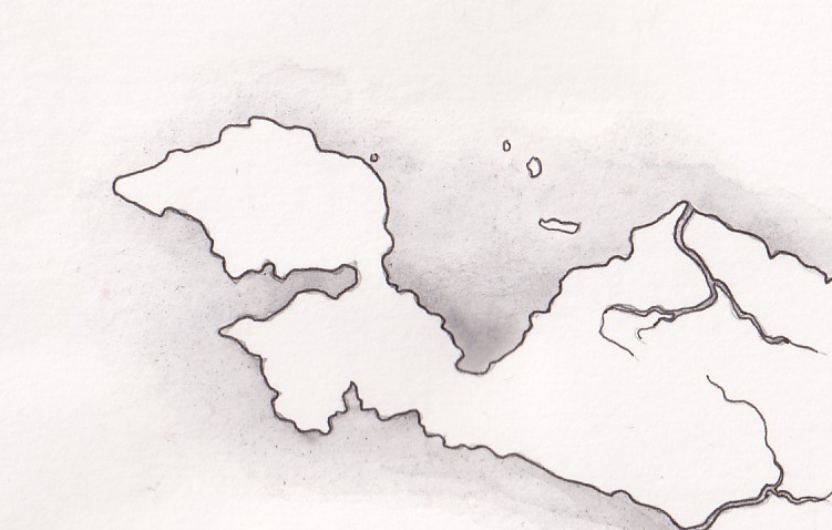
Mock up of the approach used to illustrate the map
The finished map looks good in the book. It is funny though, that of all the illustrations needed, this one was the trickiest to get right.
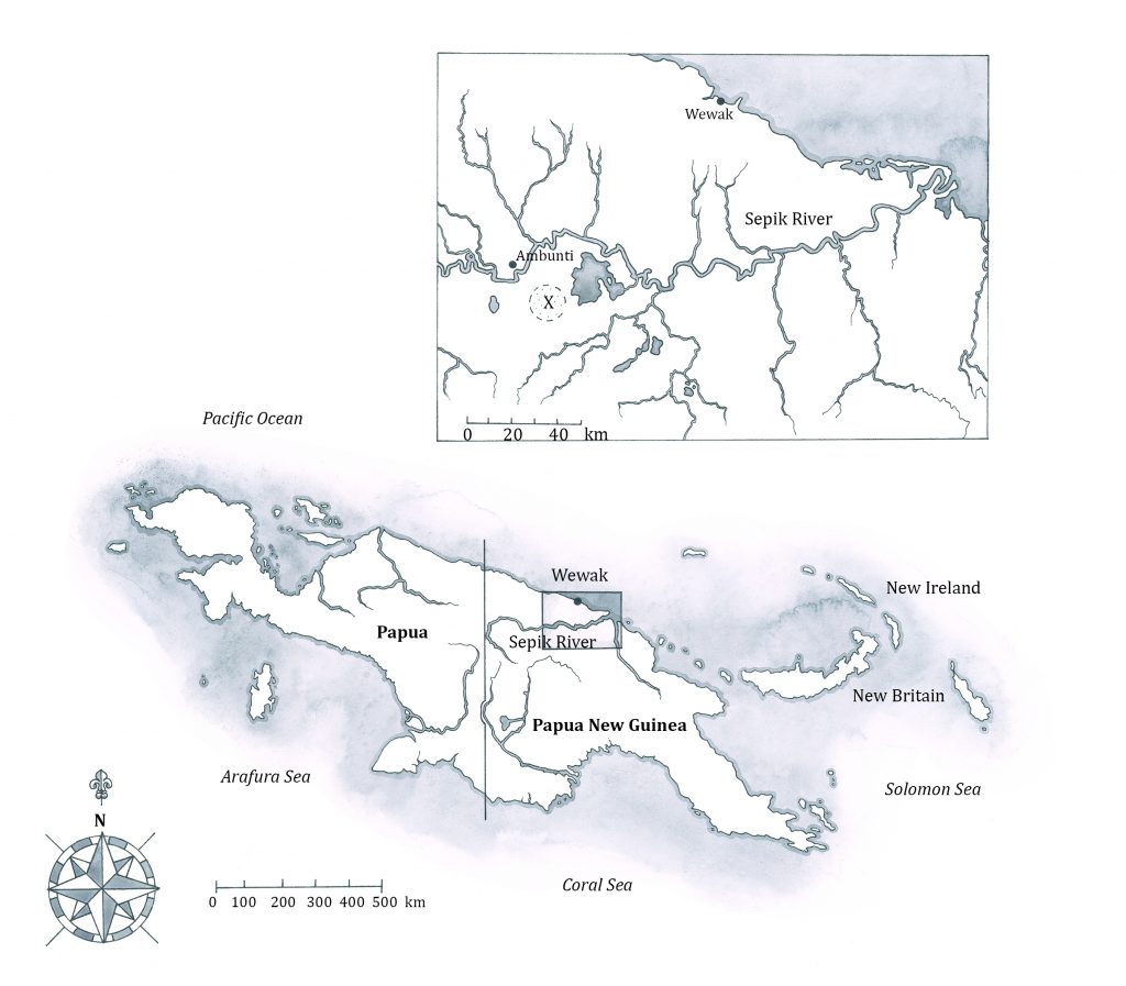
Map as it appears in the book
Final Illustrations
The deadline was tight, so I tried to produce one or more finals a day. This involved very early morning and rather late nights, making for 18 hour days. Working long hours in the summer is never too painful, though. When it’s light until 10, and dawn hits at 5ish, it makes it feel less tough. My hand certainly ached by the end of each day. Plunging it into the hottest water you can stand for 5 minutes is a good way to ease the aches and pains.
I really worked hard on these finals. I wanted them to be the best work I’d done. As it happens, I am pleased with them.
Final illustrations: Ammonite
This one appears on the back cover of the book, as well as inside. I guess that suggests it’s a favourite with the publishers. It’s not perfect. There are some slight irregularities in my rendering of the spiral. Figuring out the shadows on photographs of dark stones was difficult. I enjoyed making the edge look chipped. It’s also a treat, as an illustrator, to be able to “clean up” a specimen. The reference photos had chips further into the spiral, and the centre detail was indistinct. In the illustration I could make it clearer, and more complete.
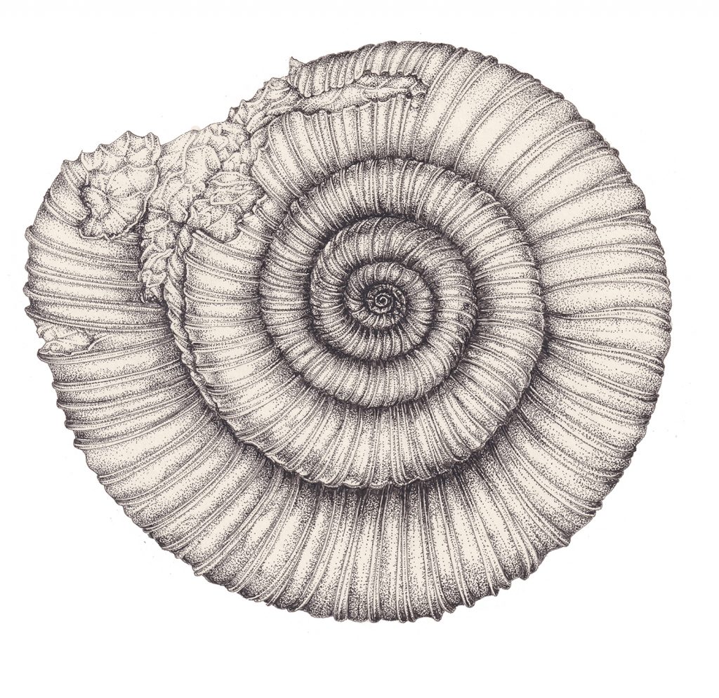
Ammonite Dactylioceras commune
Final illustrations: Tarpan
Despite my reservations, the Tarpan turned out to be one of the best illustrations, technically. I enjoyed capturing the texture of the shaggy fur. I also spent a long time figuring out exactly how fur growth lines lie across the body of a horse, and tried to follow these. Working into the lights and darks of this texture meant a whole lot of little dots were needed. The only photo of a tarpan is a grainy thing taken in a zoo in 1916. There’s speculation that the animals pictured may be cross-bred with a domestic horse, and may be a juvenile. Referring to Tarpan’s living relatives, the Heck horse, also involved a level of caution. The species are similar, but not the same.
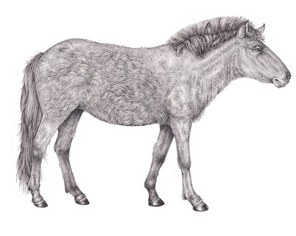
Tarpan Equus ferus ferus
Researching further, I stumbled across a fascinating (and rather unpleasant) interlude during which the Nazis had tried to back-breed a Tarpan into existence. This tied in with ideology relating to purity of ancient breeds and bloodlines. The things you find out when you research your subjects!
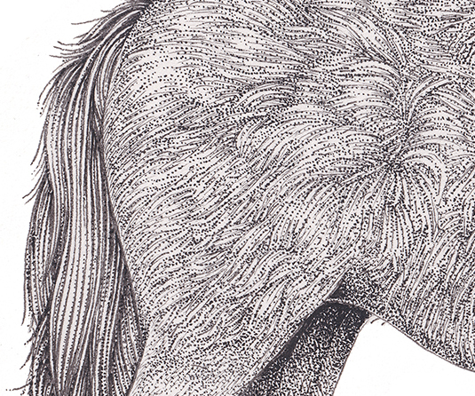
Detail showing the fur of the Tarpan
Final illustration: Blue Whale
The whale was really hard. Figuring out where the striations of the throat finish, and how they finish was very tricky. Getting images that could be pieced together into one coherent whole was hard, too. There was different information on how mottled the whale skin was, and on the darkness or lightness of the flukes. I wanted to be sure you could just see the baleen inside the mouth.
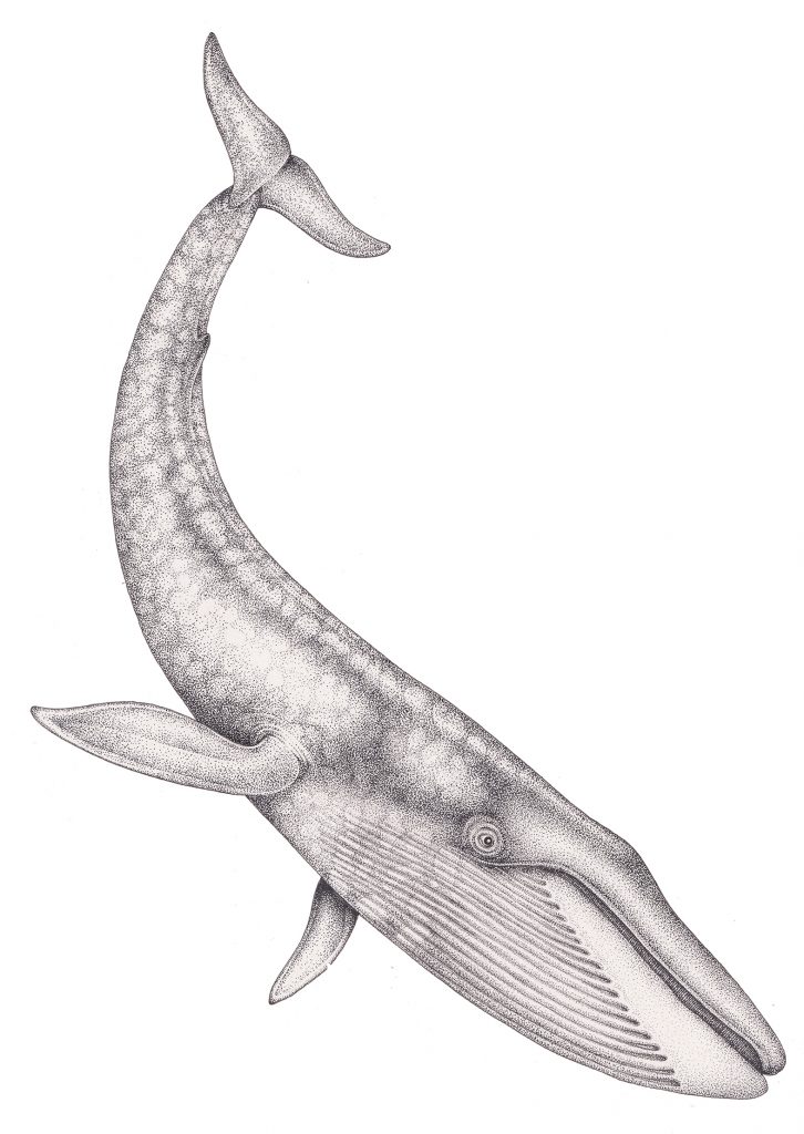
Blue whale Balaenoptera musculus
After submission, I had some tricky feedback. Attenborough thought the eye was significantly too large. I checked my reference. As I expected, he was right. The idea of a total re-draw made my blood run cold. Luckily, I know enough about computers to be able to fiddle with images in Photoshop. As the area around the eye was heavily stippled, it was easy enough to remove the eye, shrink it, then reinsert it. Phew.
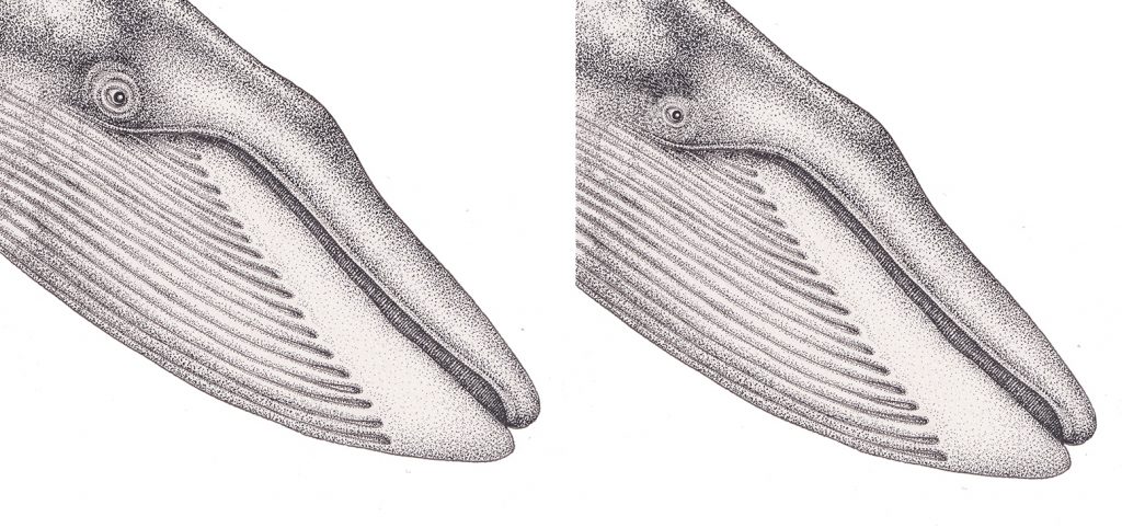
Comparison of original larger eye, next to the smaller (approved) one
Final Illustrations: Coral
The corals were technically very difficult. Not the Staghorn so much, but the brain coral. I have bots of coral in amongst my specimens, so could look at these seashore finds for reference. But how to illustrate that maze-like and striated pattern of the brain coral? I looked to Haeckel for inspiration. He did stunning engravings of corals. Dark lines for the channels. Lighter lines for the channel edges. Then a multitude of stippling on top, at the edges of the coral.
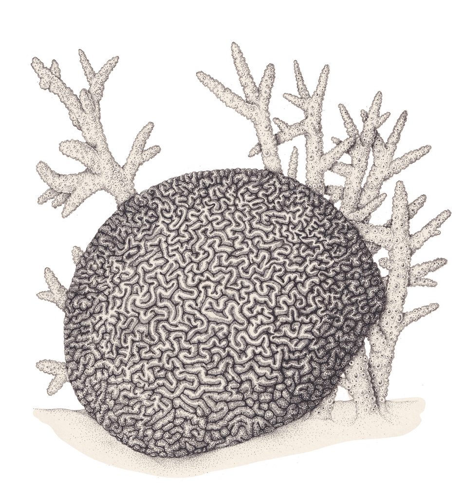
Brain coral Diploria labyrinthiformis with Staghorn coral Acropora cervicornis
Choosing the corals had been tricky too. I needed both species to be found on the Great Barrier Reef. Surprisingly, finding a species list for corals native to Australasia was a challenge. There are no polyps showing in this illustration, as they would confuse the shape. It means you can see then illustration as living, or as dead coral. This ties in with the text which discusses mass bleaching events which occur regularly as a result of the climate crisis.
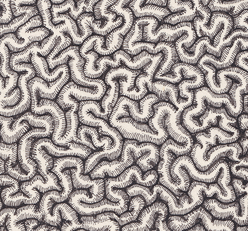
Close up showing the texture of the brain coral (a central area, so no shading from top stippling)
This is now the only original illustration I still have. All the rest have sold, amazingly! Details on price etc are here.
Final Illustrations: Honey bee
I’ve illustrated honey bees frequently over the years, and always insist on retaining my copyright on my illustrations. This was a god-send. I could literally work directly from my pre-existing illustration. Transferring it from watercolour to pen and ink was easy.
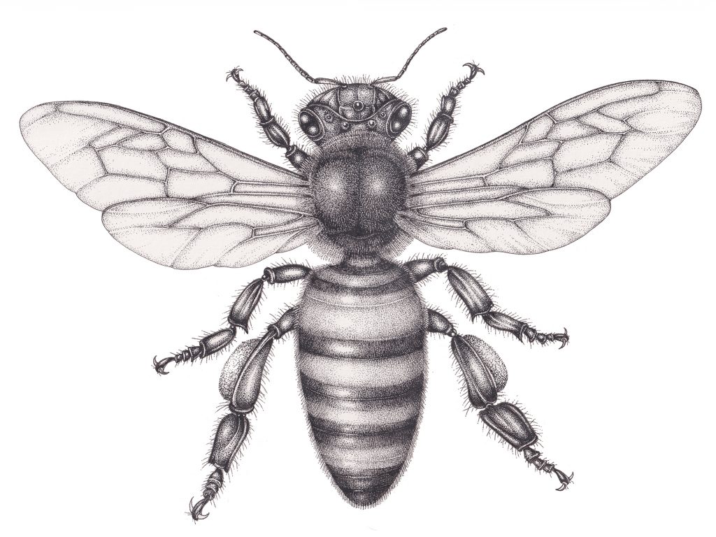
Honey bee Apis mellifera
The textures were key. The bee is furry throughout, but the stripes are the main area of focus. They need to be clear, but also to appear shiny, despite the hairs on the body. Leaving areas of untouched paper provides this shine. Stippling gives the required depth of tone. Little lines show the hairy texture.
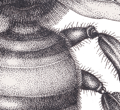
Detail of bee body
The wings require a more delicate approach. Sufficient tonal depth to show they have structure, but enough lightness to suggest transparency. Veins are really useful. A little shading on either side, and at the ledges of the wings works wonders.
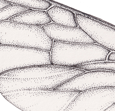
Detail of bee wing
Final Illustrations: Thompson’s Gazelle
After removing the gazelle’s smile, the main challenge was keeping the illustration delicate enough. there’s an elegance to these antelopes which is down to the crisp change between the white stomach, black lateral stripe, and golden back and legs. The facial stripe also needs to be correct, to distinguish it from the superficially similar Grant’s gazelle. Unlike the scruffier Tarpan, the hide of Thomson’s gazelle is shorter and neater. No long pen marks, then. Just a whole lot of stippled little dots.
Along with the markings, I wanted to suggest the anatomy and musculature below the skin. I was also keen to keep the belly white, and looking tight. Most reference of gazelles has the elegant hooves hidden in grass. The angle of the gazelle feet and hooves is key, so it was worth taking time to seek out good reference.
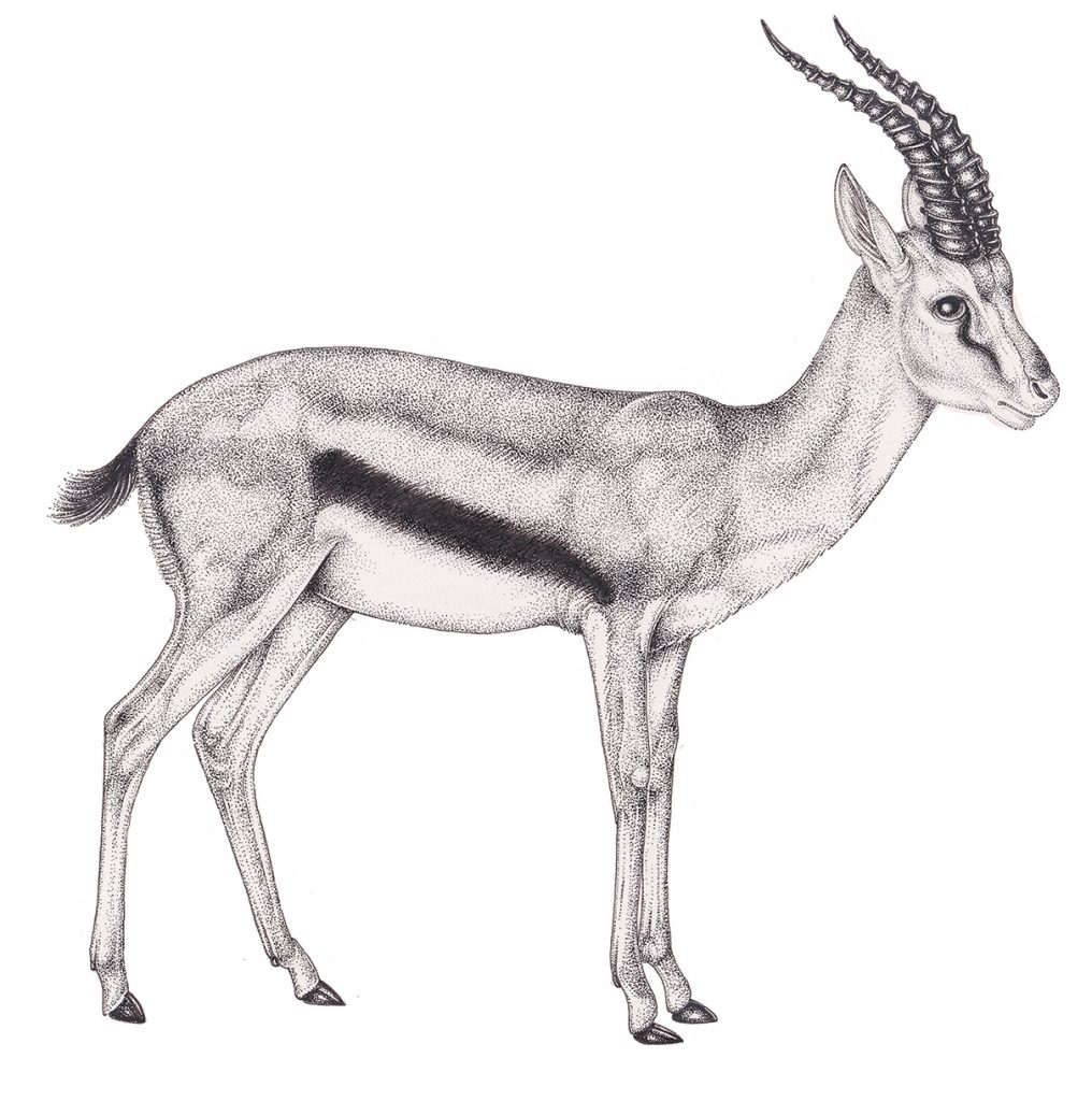
Thomson’s Gazelle Eudorcas thomsonii
Making the horns look spiralled and shiny mattered too. The lines of the spiral that you see need to tally with the structure of the spiral as it curves out of view. The horns matter not only because that’s how they appear in the wild, but also compositionally. The black echoes the tail, side stripe and feet. It anchors the illustration, visually. Eyes are a nightmare. I always leave them til the end. You need to get depth, and also shine. They need to draw the focus, but allow the eye to travel to the rest of the illustration. Solid lines, softened with stippling do the trick.
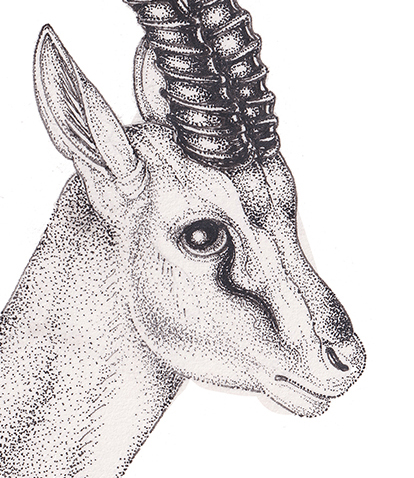
Detail of Gazelle head
Finished Illustration: Sunda Pangolin
I adore pangolins, so was very pleased this animal appeared on the species list. I wasn;t given guidance on the species, so did a bit of research and found that some episodes of past Attenborough programmes had featured the Sunda pangolin, Manis japonica. It’s name refers to it’s geographical location, in Indonesia. Initially, I found very little species-specific reference. However, I have a (very very basic) grasp of a bit of Indonesian. Using this, I found the bahasa indonesian name for this species, and from there could locate a lot more species-specific reference. It’s “trenggiling”, if you were wondering.
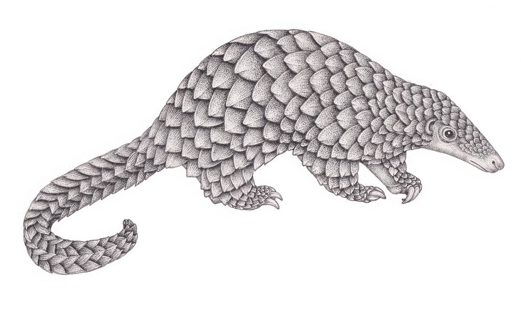
Sunda pangolin, Manis japonica
Sorting through all the thoroughly depressing information on the illegal trade in pangolin scales did produce some good close-up images. The geometry of the way the scales cover the animal took some untangling. I’m still far from certain that my treatment of the scales on the inner arms is correct. Getting the cuboid structure of the scales curving around the tail was highly enjoyable. Once I’d decided where the shadow from each scale fell, it was easy to size that up across the whole animal. I needed to include the linear texture as well. This was done with light pen lines. Central ribs were suggested with a little more shading in the centre of each scale.
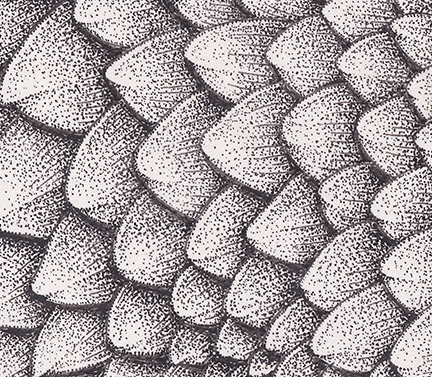
Detail of the pangolin scales
Final Illustration: Giant kelp
The scale of the kelp was a massive challenge. There are loads of images of holdfasts, on the ocean floor. Plenty of visuals showing kelp forests from above. There’s even a healthy stock of underwater views of sea otters and sea lions frolicking in the seaweed-y depths. But an isolated image of one plant, from holdfast to tip? Nope. I looked up the botany of the plant. We had gas bladders to include. Bifurcated fronds. There were serrate margins to the blades, and information on adaptations to let the plant twist and turn in the currents. Collating all this written and visual data took a long time, and lots of thumbnail sketches on scrap paper.
Gas bladders, neumatocysts, are really important. Although they’re often obscured in photos, they are vital to the kelp’s biology. They are filled with air, and allow the leaf blades to float. This means the plants can access the light of the sun and photosynthesize. They needed to be included.
The gas bladders line up along the plant in diminishing size. Each is at the base of a leaf blade. Depending on the angle you view the plant at, they look like alternate bladders coming from the stem, or are neatly stacked up, smallest at the top. Top blades were a different shape and more closely clustered than those at the base.
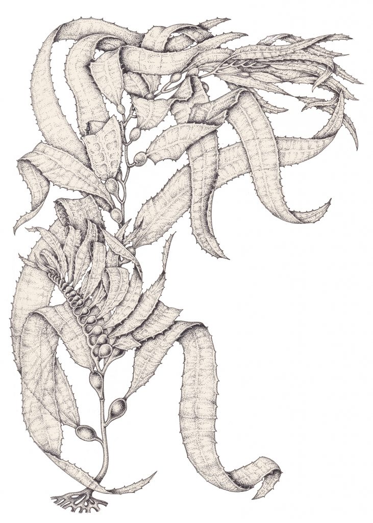
Giant kelp Macrocystis pyrifero
I like the final illustration, although trying to sort out which front tangled in which direction gave me a headache. It looks suitably leafy. And, of course, Sir David likes it, so now it’s my favourite thing ever.
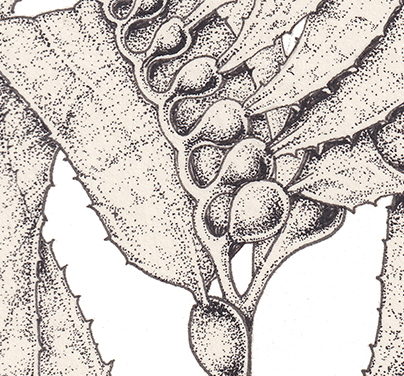
Detail of the bladders
This illustration has been sold, since I posted this blog a few hours ago! It was one of the last two remaining illustrations available to buy.
After Publication
To celebrate publication, the publishers purchased three of the original illustrations, had them framed, and presented them to Sir David. So, in theory, three of my pictures may be hanging in his downstairs loo. This makes a fitting treat to one of my favourite jobs.
The time frame of all of this still surprises me. From initial contact from the publisher, through to the delivery of the final illustrations (including the revised whale eye!) was exactly one month. And I think I was illustrating coastal flowers for the field studies council at the same time. It does have to be said, I do like it when things are a little calmer. But for a job like A Life on Our Planet, any price is well worth paying.
The post A Life on Our Planet – Working with Sir David Attenborough appeared first on Lizzie Harper.
