
Winter jasmine, Jasminum nudiflorum, is one of the only flowers in bloom in Hay on Wye in January. I decided to do a sketchbook study of it, along with some notes on composition.
Thinking about composition
When you have a plant with a distinctive straggly shape, like the Winter jasmine, you want to consider how to present it on the page. This comes down to composition.
The easiest way to sort out your composition is to do a whole series of really quick thumbnail sketches. These should show where the main elements of the plant will fall on the page, and give you a space to experiment. It’s an inexact science, but when you hit on a composition that works, it just feels right. Never be afraid to allow parts of your plant to come off the side of the page. It can look really good, and suggests the plant continues outside of the paper’s edge.
Keep rotating your plant, and looking at it up close or from further back, until you hit on a composition you like. I settled on the bottom right choice.
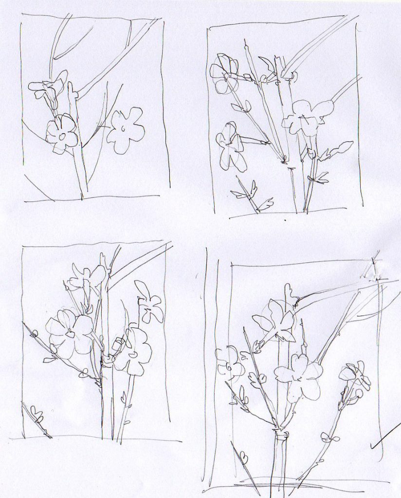
Thumbnail sketches of the jasmine
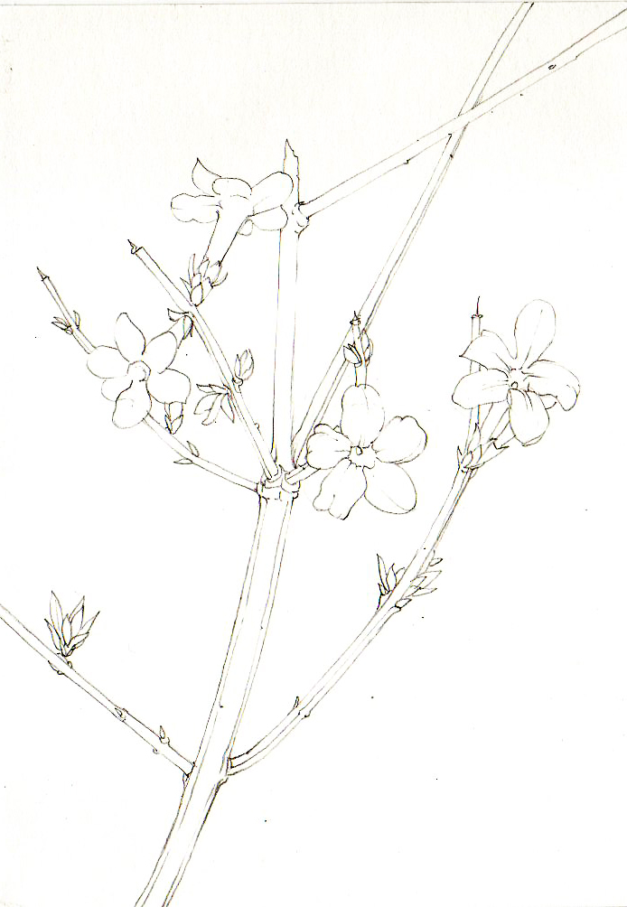
Draw up your plant
I love mechanical pencils because they have such sharp nibs, this one’s a pentel P205.
I was testing out a new paper. This is Cass art’s smooth hot press watercolour paper. I rather liked the paper, it held the paint well, was pleasant to work on, and didn’t bleed. Colour didn’t lift off it with subsequent washes. It’d be worth considering if you;re looking for a botanical illustration paper. (For more on this please check out my blogs comparing watercolour papers: blog 1, blog 2, and blog 3).
Be sure to keep your lines crisp, and to refer to the plant as you draw.
Painting in the stems and shoots
I always paint the darkest areas first, which is unusual in watercolour. For the stems, I mixed up a greyish brown first. This was made from Yellow ochre, Vandyle brown, and a touch of green. (I favour Winsor and newton pan watercolours, and always use a Winsor and Newton series 7 brush.)
I put this on the outlines of the twig, and picked out some of the internal pock marks and details with it. Let it dry fully.
Meanwhile, I mixed up a dark green for the angular side shoots. This was Pthalo green mixed with Cadmium orange dark. Again, this outlines the shoots and is used to pick up details.
Once these initial layer have dried, mix up a watery and dilute version of the paint. You may want to add a few colours in. Allow this to be very watery, and apply it to the shoots and twigs. Allow it to dry. Then work into the details again, with a slightly different mix of your initial colour. I tend to add more yellows to the mix as I repeat the process.
Visit the shoots and twigs one last time, and pick out the darkest regions with a blue-purple mix.
I also popped in the crimson bases of the leaf shoots at this point.
All my colour mixes appear as little dabs in the bottom right hand corner of the page.
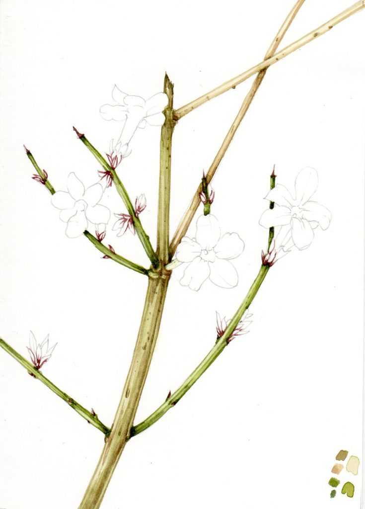
Winter jasmine with twigs, shoots and leaf bases completed.
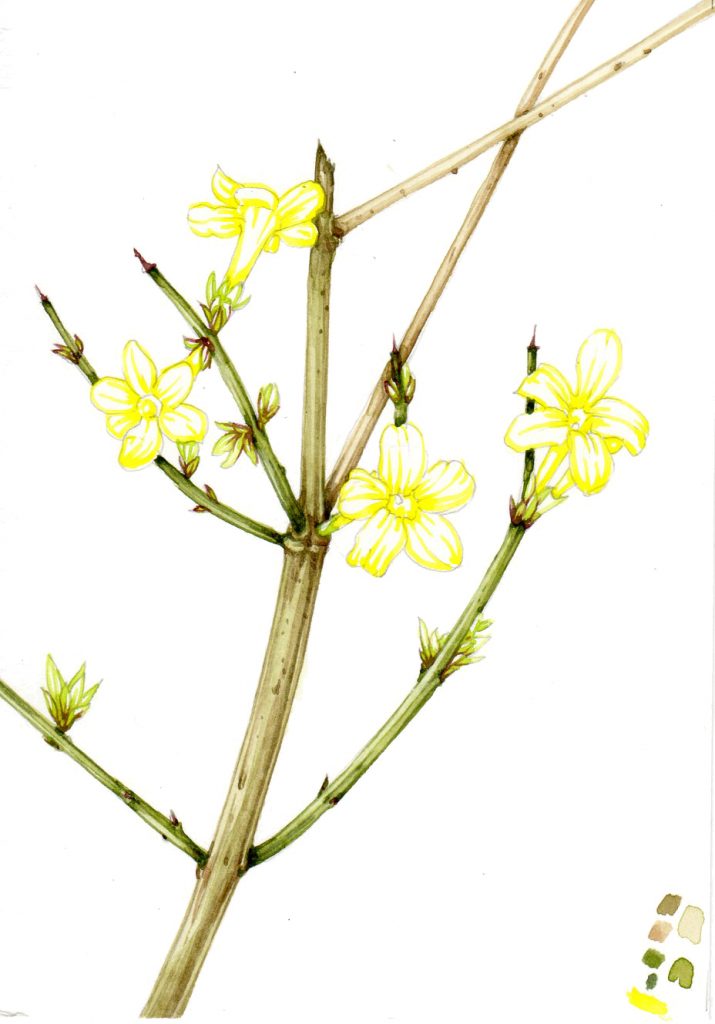
Painting the structure and dark regions of the flowers and leaves
I worked into the leaves next. these are still in bud, more or less, so are a very yellow green. A sap green with lots of cadmium yellow light works well. I outline their individual shapes, being sure to make the paint heavier at the tip and base of each leaf cluster. the scarlet leaf tips will be added later.
The flowers are treated in a similar way. Their petals and structures are outlined in yellow. The bright yellow of these jasmine flowers is so clean and clear that I used cadmium yellow light, and dint mix it with any other colour.
Pay attention to where the darkest areas of petal and corolla tube are, you need to have some tonality. However, you also need to ensure that the brightest and palest areas of the flowers are left as white paper. It can be a tricky balance!
Leaf and petal details are outlined and painted in
Adding body colour and shadows
Adding colour to the leaves was very easy. Just make a dilute mix of the yellow-green and paint it over the leaves. Then pick out any crimson leaf tip details with a tiny brush, once the green has dried.
The flowers are a little more challenging. The problem here is that the yellow is clean and bright. This means that adding shadow and tone may well compromise them and make them seem heavy and muddy. I erred on the side of caution, and kept them quite toanlly flat.
I picked out some details where the petals overlapped, and on the petal edges. The rim of the flower tube also was brought into view. For these touches, I used a mix of yellow ochre and sap green, along with the cadmium yellow light. I was very careful not to overuse it.
The film below shows five minutes of me deciding how to emphasize shadows, and illustrating the jasmine flowers. As you’ll see if you watch it, it’s a stressful set of decisions!
Finishing up
The final step is to paint in the pistil. This is just a spot of green, but it’s important to add it. It’s equally important to not position it wrong.
Some final tweaking of shadows, with a darker purple colour and the sketchbook illustration is complete.
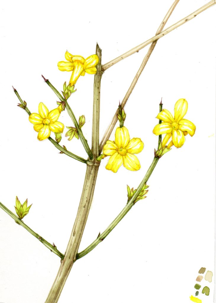
It’s ok. Far from excellent, but it does have something of the feel of these pretty flowers. In Chinese, the flowers are known as Yingchun, or “the flower that welcomes spring”. It’s a pretty plant, and I’m lucky to have it available to illustrate in the depths of winter!
For a brief overview of this process, please feel free to print out my handout from Pinterest.
If you’d like to see more of my step by step botanical illustration blogs, check out this link. Further examples of my sketchbook studies can be seen in the online gallery.
The post Step by Step winter jasmine sketchbook study appeared first on Lizzie Harper.
