
What are Neutral Tints?
Neutral tints (or colours) are grey hues which don’t carry any dominant shade. They are, as the name suggests, neutral. In 1887, a neutral tint was defined by Winsor & Newton as, “‘A compound shadow colour of a cool neutral character.” So a blue-grey or a grey with a pink tinge wouldn’t be neutral.
These tints are designed to make a colour darker, but not to alter the colour itself when you pop the tint on top. A good neutral tint will make a yellow a deeper shade of yellow, but not make it turn greenish or orange.
Why and when should you use Neutral Tints?
Dealing with shadows on pale flower petals is always tricky. If you mix up a colour that’s too feisty it can make a white flower look foolish, or just wrong. (For more on tackling painting white flowers see my earlier blog). If you don’t add shadows you risk creating a very flat illustration.
Yellows need neutral tints too. If you’re putting shadow onto a pale yellow petal, you need to avoid mixing a colour that has too much red or green in it. You also need to apply the tint with care – don’t cover the whole petal with it, it’ll look flat and muddy.
Mixing Neutral Tints
Neutral Tint was first created in the 18th century, from a mix of Light Red (red iron oxide), indigo or iron blue and gamboge or yellow ochre. (Thanks to Jane Blundell Art for the history!) Most watercolour paint manufacturers nowadays make neutral tint using a black pigment (see Daniel Smith and Winsor and Newton), but it’s just as easy to mix your own.
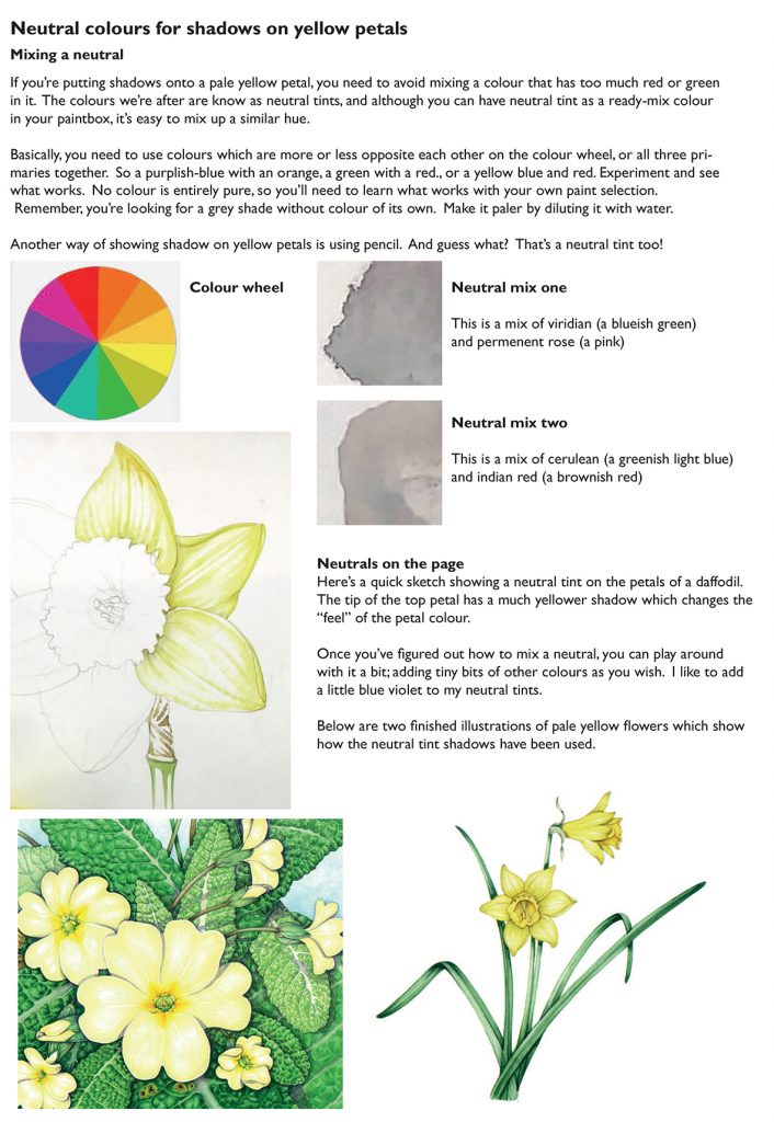
So how do you go about mixing a neutral? Basically, you need to use colours which are more or less opposite each other on the colour wheel, or all three primaries together. So a purplish-blue with an orange, a green with a red, or a yellow blue and red. Experiment, and see what works. No colour is entirely pure, so you’ll need to learn what works with your own paint selection.
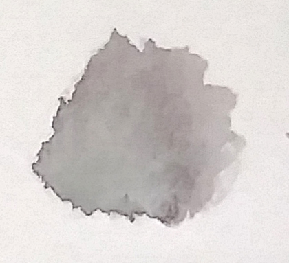
Remember, you’re looking for a grey shade without colour of its own. Make it paler by diluting it with water.
Another way of showing shadow on yellow petals is using pencil. And guess what? That’s a neutral tint too!
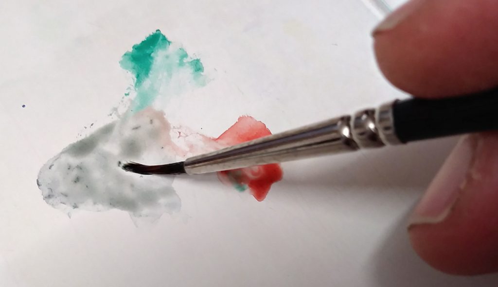
Neutral mix one
This is the dried mix of viridian (a blueish green) and permanent rose (a pink). This is one of the mixes used by Christina Hart-Davies.
Neutral mix two
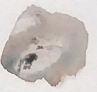
This is a mix of Cerulean (a greenish light blue) and Indian red (a brownish red), a mix favoured by Mary Brewin.
Neutrals on the page
Below I’ve done a quick sketch showing a neutral tint on the petals of a daffodil. The top petal has a much oranger shadow which changes the “feel” of the petal colour. This is because the shadow has colour and is not neutral. The lower petals have the neutral tint and aren’t so heavy.
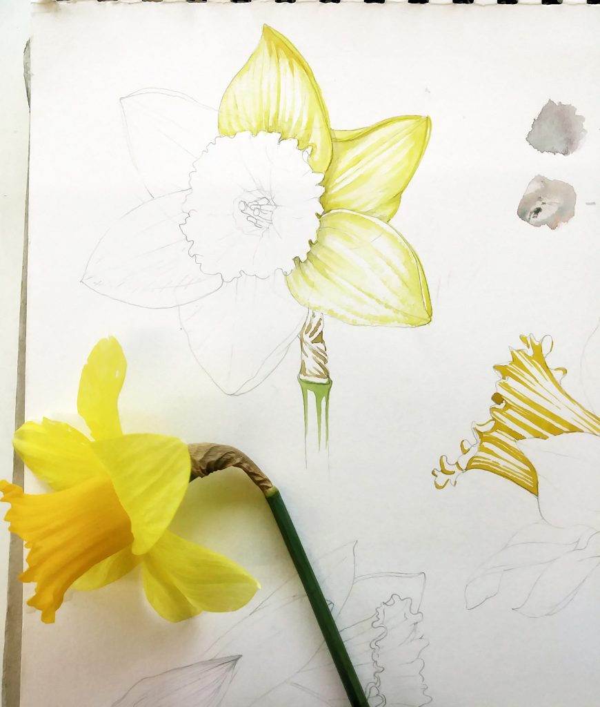
Once you’ve figured out how to mix a neutral, you can play around with it a bit; adding tiny bits of other colours as you wish. I like to add a little blue violet to my neutral tints.
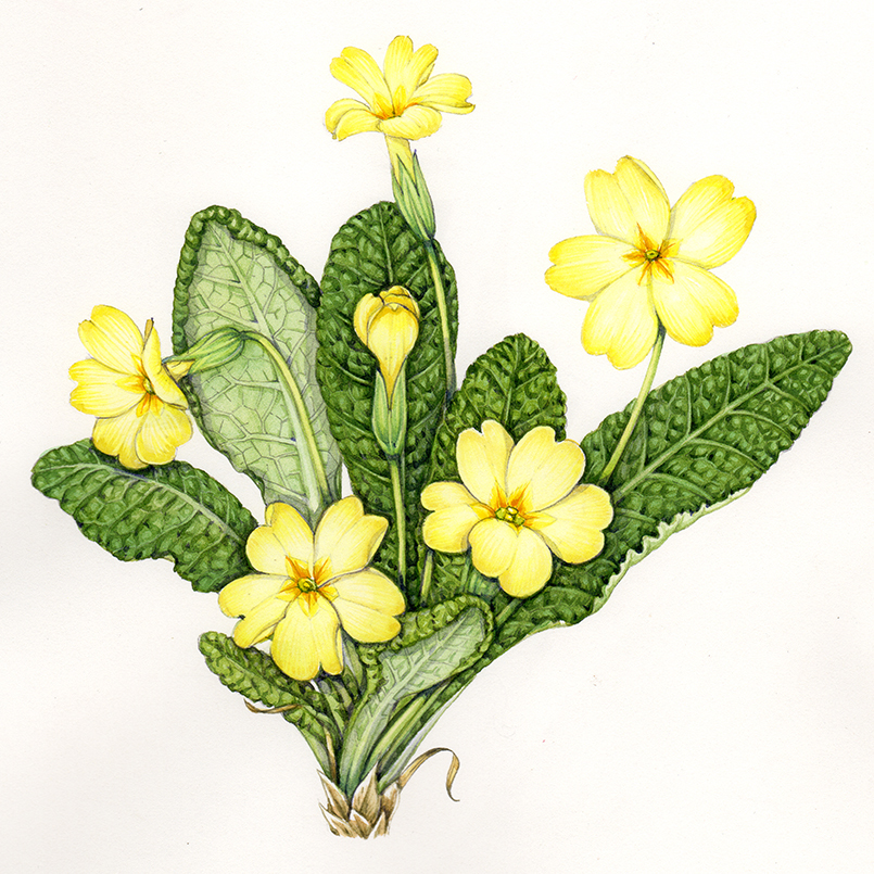
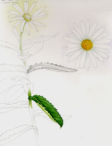
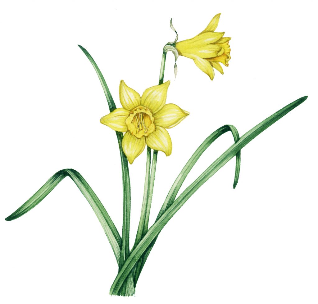
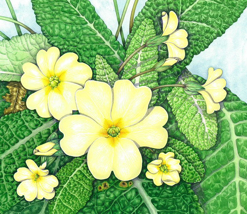
Below are two finished illustrations of pale yellow flowers which show how the neutral tints have been used.
For a summary of this information as an A4 handout, please visit my Pinterest site, where you can also access a handout on how to paint yellow flowers.
If you want to learn more on this topic, check out Coral Guests’s blog.
The post Mixing Neutral Tints and Colours appeared first on Lizzie Harper.
