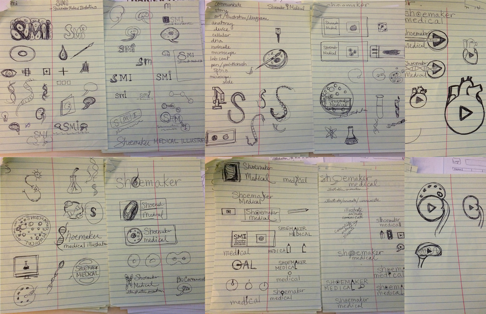
Here are some brainstorming doodles I’ve done. “No idea is a bad idea” at this stage. It could also be a name-only logo with no “mark” or picture associated with it. As you can see, I like brains, kidneys, cells, DNA (although I just spotted a left-handed spiral in an “S” – whoops! Can you see it?) and pencils… I’m not sure any of these are the right choice but I’m getting somewhere; I can feel it.
Here are some fonts I’ve been playing around with. They are not very connected to the above sketches yet, but just looking for something I like. (If I move forward with one, I’ll be tweaking spacing, kerning, maybe playing with graphic elements.)
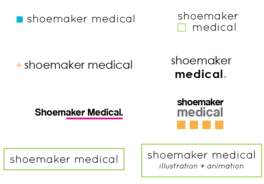
Two questions for you, my dear readers: Do any of the sketches resonate with you as a good representation of my business? Which font looks like a better fit than the old one? Thanks!
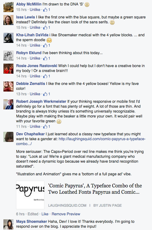
Edited to add this screenshot of facebook comments. 4/23
