
Eighty-one professionals were asked to create a visual definition of information graphics for a book that was published by the Society of News Designers Español.
When I was asked to do this, I froze. Talk about a blank canvas staring you in the face. An information graphic about an information graphic. How meta! My initial ideas involved illustrating the process of going from complexity to simplicity. I considered taking a photo of downtown NYC and then creating a 3-D rendering of the same area with one building highlighted in blue. Lame. One thing my father taught me is to throw out the first idea you come up with; it’s usually too simple or surface oriented.
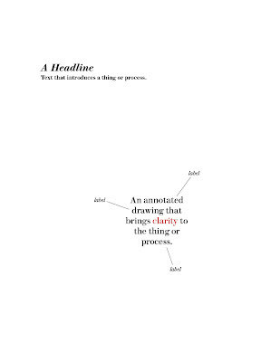
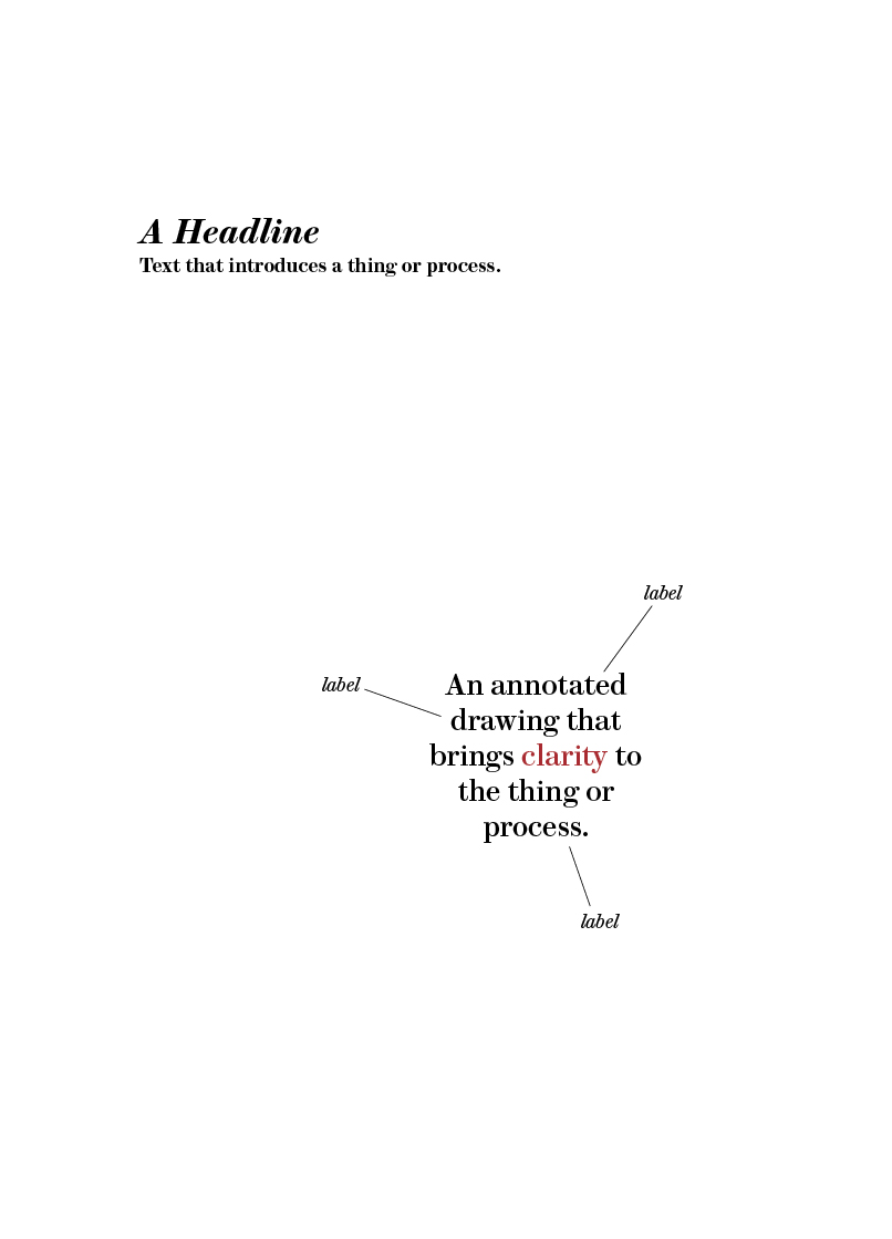
I continued to agonize over the assignment. I felt more and more that the only way to define an information graphic was through words. What are words anyway but organized collections of letters? And what are letters but symbols composed of abstract lines and geometric shapes?
Here’s what I came up with:
After the judging at Malofiej20 I’m not sure I would say that an information graphic must have annotations or words though. There was an entry by National Geographic that was a reconstruction of a primitive man’s face. The general consensus was that it wasn’t an information graphic. I argued that it was— it was a visual that informed the reader of a possible facial structure of our ancestors. I said that there was a science to these reconstructions. Someone then said that they would feel it was an information graphic if it was annotated. At the time I agreed. I’ve since changed my mind. In hindsight I wish I had stuck to my guns on this one.
To prove my point, this is my favorite information graphic:

It’s a color wheel developed by Johannes Itten. I use it all the time. Complementary colors are opposite one another. It shows how the primary colors mix to make the secondary and tertiary colors. It’s informative and extremely useful.


